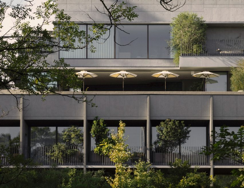
An exposed raw concrete facade fronts the Trunk Hotel Yoyogi Park, which Japanese studio Keiji Ashizawa Design and Danish firm Norm Architects conceived as a minimalist retreat in the heart of the city.
Marking the third location in a trio of Trunk hotels in Tokyo, the design of the boutique hotel was rooted in the concept of “urban recharge”, according to Trunk chief creative officer Masayuki Kinoshita.
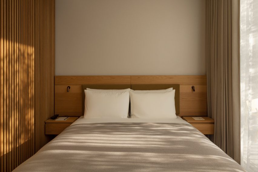
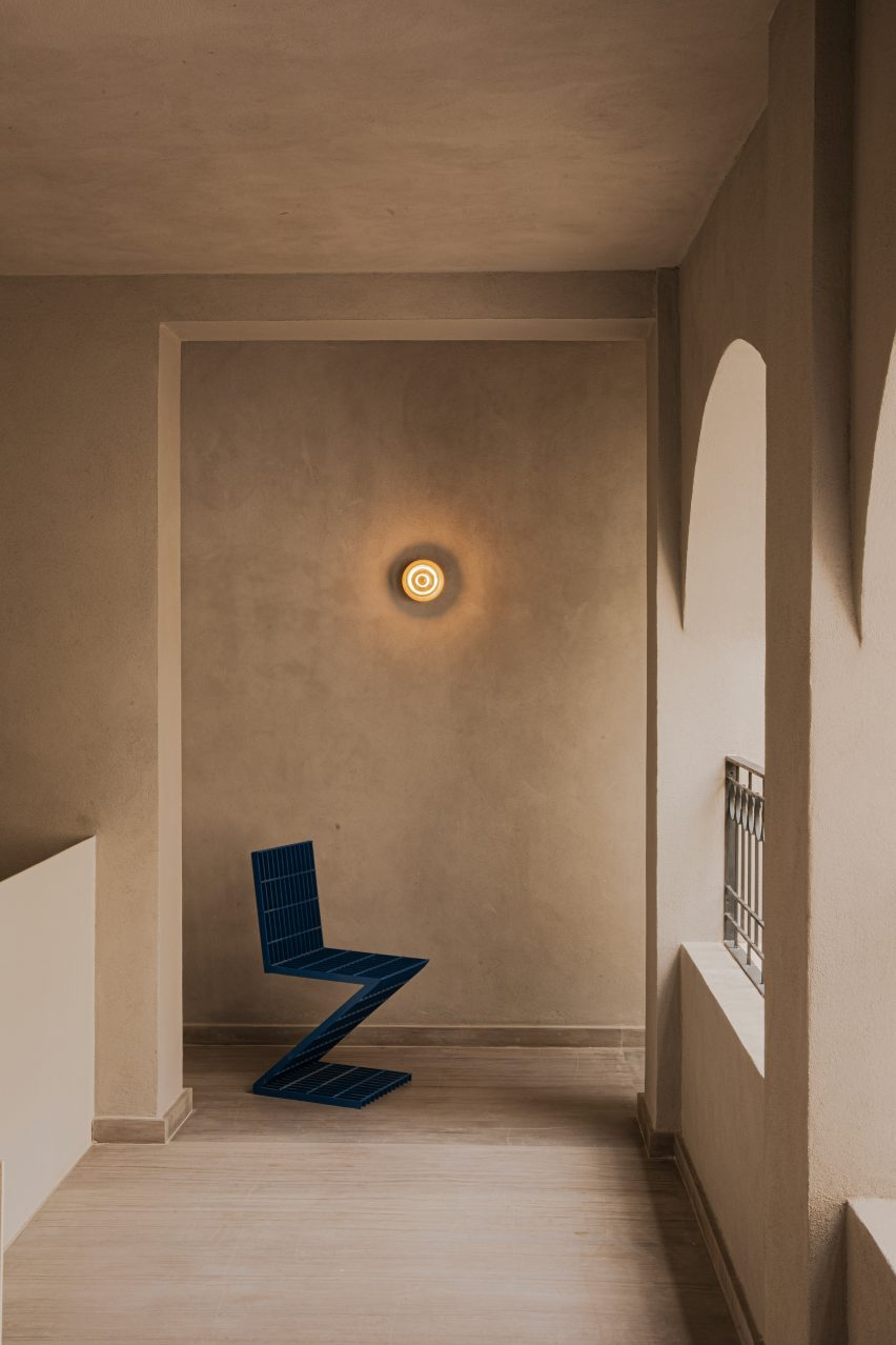
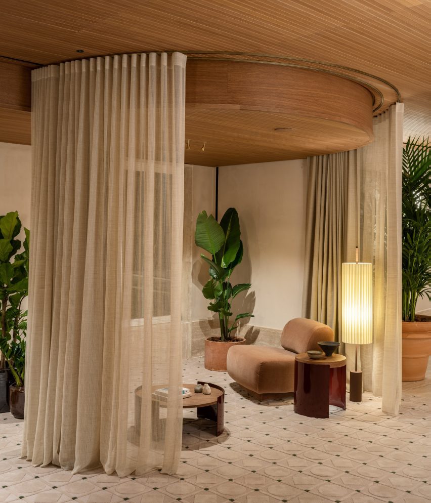
Trunk Hotel Yoyogi Park features a raw concrete facade
The hotel group said the idea was to balance the opposing elements of tradition and modernity as well as nature and the city and the melding of both Japanese and European craft.
Keiji Ashizawa Design created a textured concrete aggregate facade for the seven-storey building, which is punctuated with steel-lined balconies and overlooks Yoyogi Park’s lush treetops.
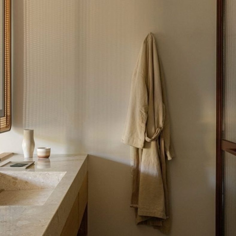
Guest rooms feature a muted colour and material palette
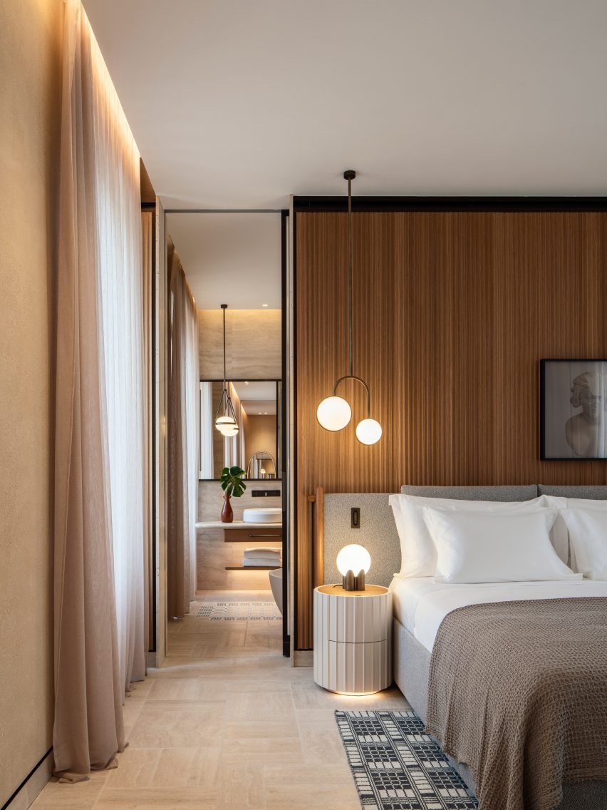
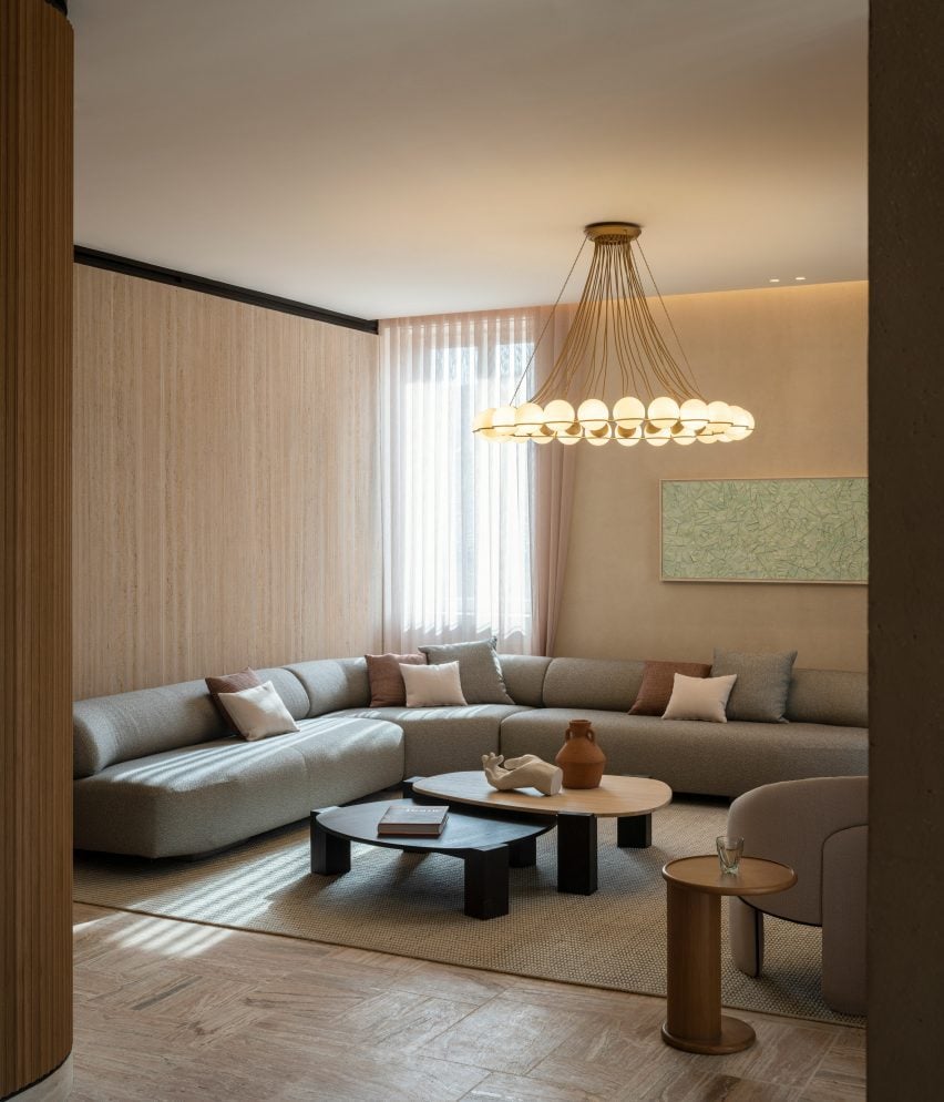
A total of 20 guest rooms and five suites were dressed in a muted colour and material palette featuring hardwood flooring and plush Hotta Carpet-designed rugs informed by traditional Japanese architecture.
Paper-cord chairs and tapered washi pendant lights contribute to the minimalist design
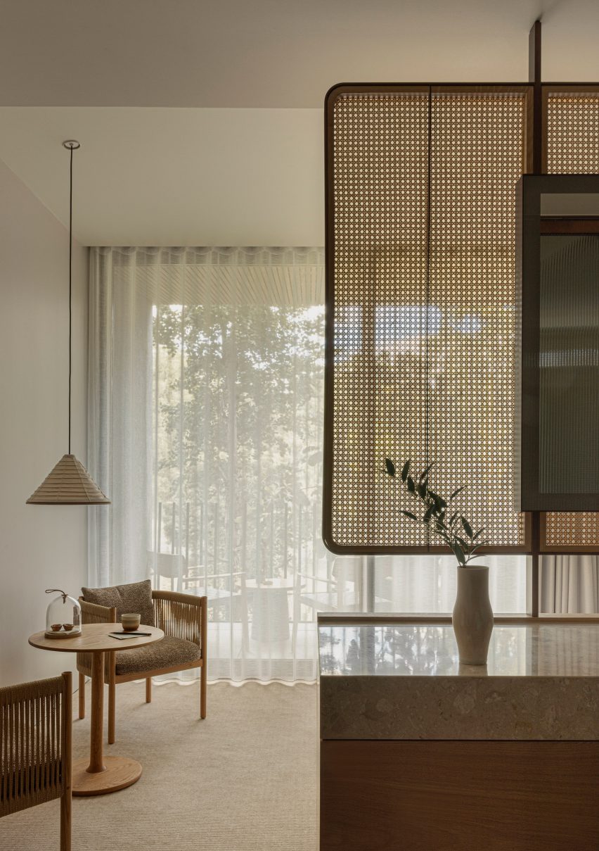
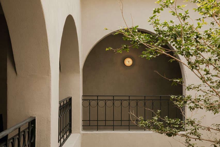
Delicate rattan partition walls delineate spaces within the rooms, which open out onto the building’s balconies that were fitted with slanted ceilings in order to encourage sunlight into each room “as if mimicking the gentle transitions of a day”.
“It’s been an interesting journey for us to find the right balance between a space that is relaxed and vibrant at the same time,” said Norm Architects co-founder Jonas Bjerre-Poulsen.
The interiors were designed to be both “relaxed and vibrant”
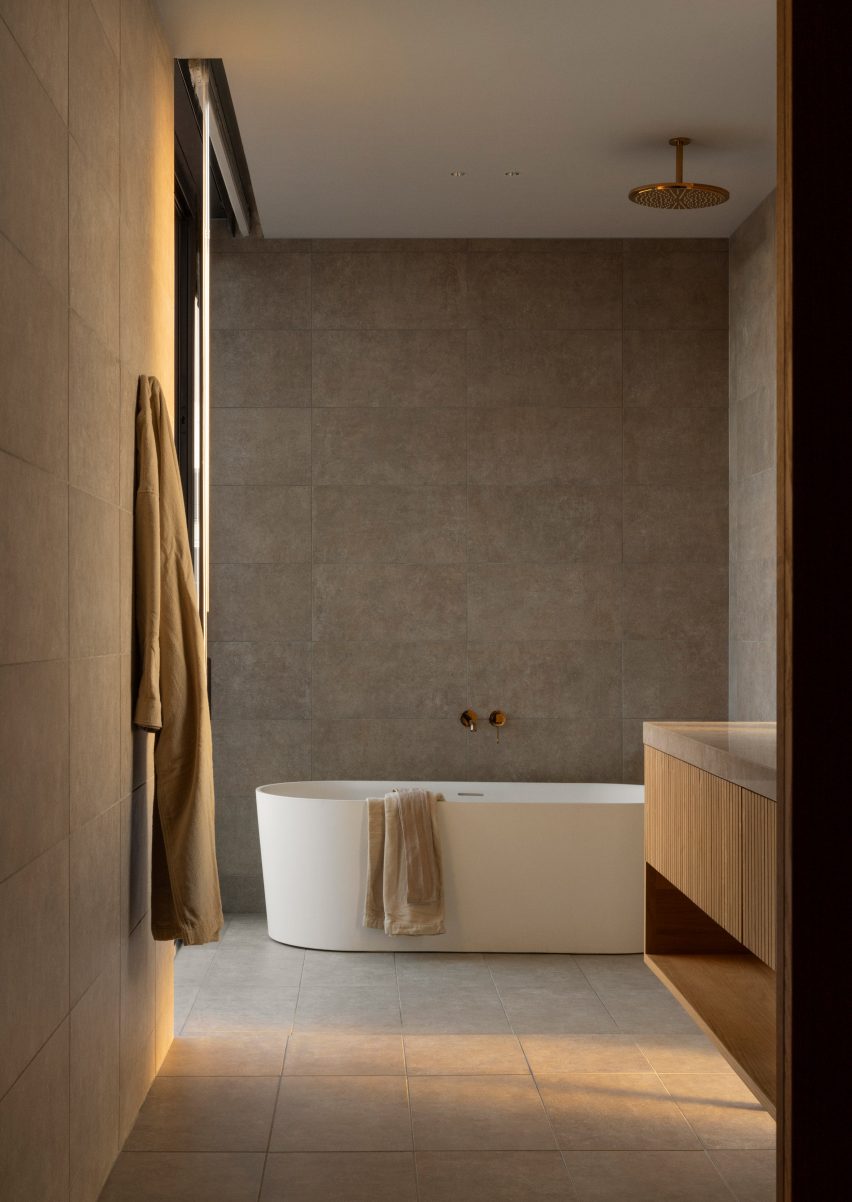
The rooms are also characterised by paper-cord chairs and tapered washi pendant lights as well as abstract artworks, amorphous vases and grainy floor-to-ceiling bathroom tiles.
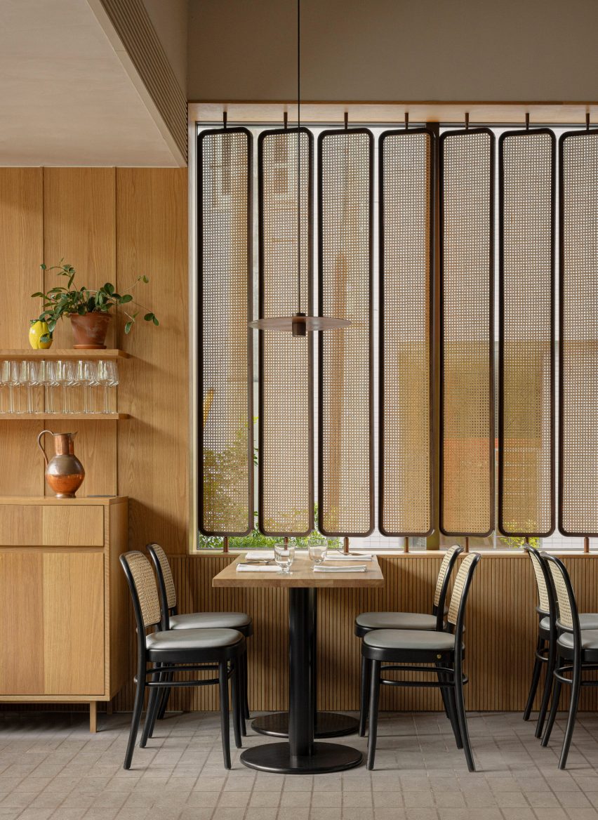
On the ground floor, oak seating designed by Norm Architects for Karimoku features in the hotel restaurant, which includes a striking copper-clad pizza oven and the same rattan accents that can be found in the guest rooms.
Rattan accents can also be found in the hotel restaurant
“It is a very unique and gratifying experience in the sense that the architecture, interior and furniture, as well as the attention to detail, have created a space with such a strong sense of unity,” said Keiji Ashizawa Design.
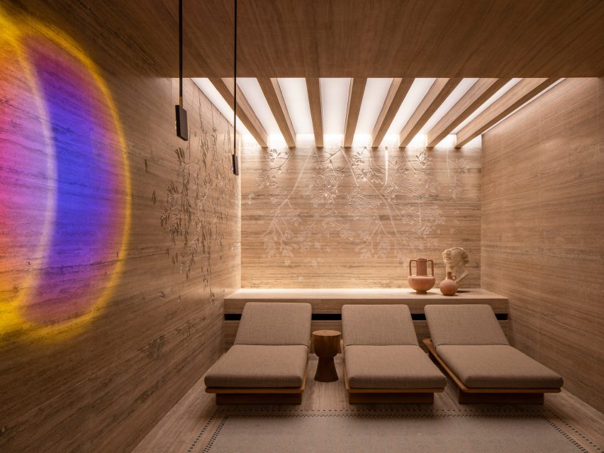
An open-air pool club is located on the sixth floor of the hotel.
Sand-blasted concrete flooring was paired with thin bluey-green tiles that make up the infinity swimming pool, which overlooks the park below.
A “glowing” firepit can also be set alight after dark, intended to create a soothing contrast with the bright Tokyo skyline.
The Trunk Hotel features a rooftop infinity pool
The city’s first Trunk Hotel opened in Shibuya in 2017, while the second location is an offbeat one-room hotel in the metropolis’s Kagurazaka neighbourhood featuring its own miniature nightclub.
Modular kitchens are highly organized kitchen layouts that utilize components that are designed and constructed in modules or units. Modular kitchens are a popular trend in modern kitchen design because they are affordable and efficient in space usage. It also takes some of the stress out of planning one of the most important rooms of the house by presenting you with beautiful options for any style.
What are Modular Kitchens?
Modular kitchens are built with pre-made standardized units, or modules. These units come in multiple sizes so that they can be fitted into unique spaces. The key elements of a modular kitchen include cabinets, countertops, appliances, and storage units that are designed to fit together seamlessly. Modular kitchen design is an extremely cost-efficient way to build a kitchen because the units are made in bulk.
What are the Differences Between Modular and Non Modular Kitchens?
There are modular, semi-modular, and custom-built kitchens. First, consider modular kitchens. These use units that are built in the factory and brought finished to the kitchen.
Semi-modular kitchens feature cabinet units built off-site. However, the designs use parts unique to each kitchen.
They have custom-built cabinets made on-site with unique designs.
Modular Kitchen Cabinets
The most common materials used to make modular kitchen cabinets are plywood, engineered wood like MDF and HDF, particleboard, metal, and wood.
The materials have pros and cons. For example, solid wood is long-lasting but expensive. Meanwhile, plywood and MDF are cheaper but less durable.
There are four things to consider when planning a modular kitchen design.
Layout optimization (L-shaped, U-shaped)
Appliance placement
Cabinet materials and style
Additional accessories
Under-cabinet lighting
Modular Kitchen Design Types
There are so many design styles that are possible in modular kitchens. Now, let’s consider modular kitchen design photos. You will see how much variety is possible. Also, you might be inspired to use modular kitchen cabinets to reflect your style.
Contemporary Modular Kitchen
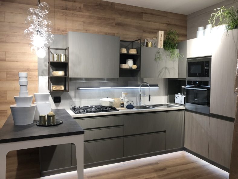
First, from Michael Woodall comes this contemporary kitchen design. The colors of deep gray and white contrast with the warm wood counter on the island. The kitchen uses flat paneled cabinets. Plus, there is no open shelving which minimizes clutter and maximizes storage.
Finally, consider the lighting. The vertical rod pendant lights add task light over the island. You’ll notice recessed lighting above the sink and mood lighting above the cabinets. They bring out the clean simple kitchen style.
Minimalist Modular Kitchen
Next, consider this minimalist-style kitchen in London designed by the Do South Shop. Notice the modular shelves and cabinets. They are adjustable as needed to hold what you have. There is open shelving for accessible tools.
There are closed cabinets for tools and clutter. The light wood color balances the black accents throughout the room. While this design style is edited it’s not spare.
Eclectic Modular Kitchen
This kitchen is fromLogan Killen Interiors and uses light gray-blue base cabinets. Although the cabinets are modular, the kitchen feels unique. Design elements include the mirror above the sink and the antique light fixture.
The butcher block countertops and Shaker-style cabinet fronts complement the kitchen’s design.
Mid-Century Modern Modular Kitchen
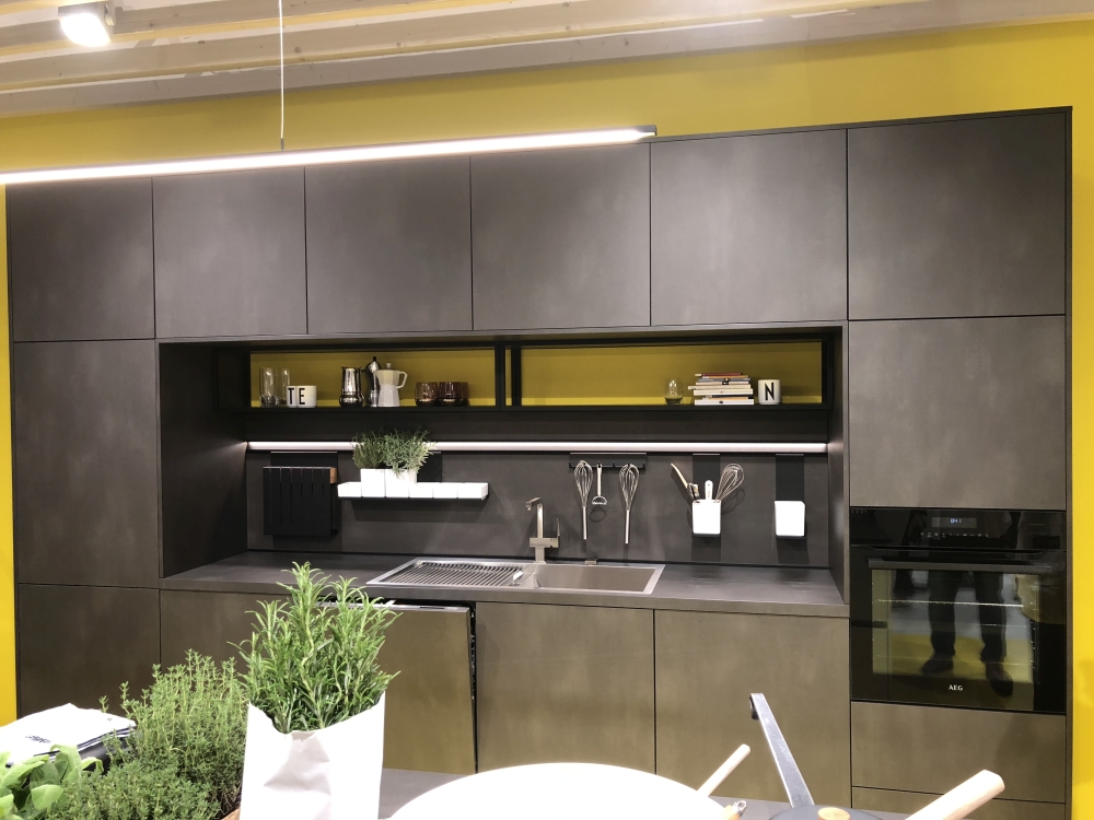
From Cucine Lube, the kitchen offers a mid-century modern style with a refined wood finish and sleek cabinet doors. Also, the gray walls, ring light fixture, and bar stools highlight the mid-century style. Copper splashes provide a contrast to the dark-toned room.
Rustic Modular Kitchen
Rustic style is not one that you think of as a modular kitchen option. However, DWFI Interiors creates a rustic kitchen using pre-built cabinets. The look is enhanced by the wood-paneled walls and ceiling beams. The brick backsplash and utensil bar above the range add to the kitchen’s practicality and rustic style.
Industrial Style Modular Kitchen
This kitchen features elements of industrial style. This includes exposed metals, spare styling, concrete, and open shelving. The island from Aster fits well, providing counter space and storage. Also, the wood walls with open shelving add warmth and color.
Traditional Modular Kitchen
Consider this traditional-style kitchen design from Rencraft Ltd. The kitchen features two-toned basic cabinets. The design also showcases a deep gray island and soft white on the back wall cabinets for contrast.
The wood tones of the seating and plants add texture to the room. Task lighting over the island works well for reading and prep work. The undermount lighting removes dark corners.
Farmhouse Modular Kitchen
Notice the farmhouse kitchen from devolkitchens. Custom options are mixed with the dark blue cabinets. The open shelves, wooden table, beam ceiling, and stone floor complete the look. Plus, the antique gray-wash wicker chair and brass pendant lights add a unique charm. Finally, to create a similar style, consider using base cabinets. You can also customize the top with or without open shelving.
Modern Rustic Modular Kitchen
From David Giral Photography comes this picture of a modern rustic kitchen. The white and wood-paneled cabinets are simple and clean. Likewise, the chrome and black bar stools and the straight-lined kitchen island extend the modern style.
In addition, the antler light fixture over the island adds a rustic contrast. If you like this style, begin with cabinets that have straight lines. Next, add rustic pieces with leather and wood to accentuate the style.
IKEA Modular Kitchen
The most famous of all Scandinavian kitchen designers is IKEA. The Bodbyn doors shown are painted soft white with a raised panel door. Options for glass fronts with a six-light window are available.
The designer uses black and butcher block counters for different prep surfaces. Next, notice the two-toned gray paneled walls which bring the white and black colors together. IKEA provides free in-store kitchen design advice. Further, they provide in-home consultation for $50.
Small Modular Kitchens
This small kitchen from Arclinea offers a modern design in a historic setting. The small galley kitchen uses two sections of white cabinet units. Although the kitchen is small, it has plenty of storage. In addition to the base cabinets, it has open shelving with a minimal style. Also, the cabinet wall offers more storage space.
Modular Outdoor Kitchen Cabinets
Cabinets can be included in outdoor areas. These outdoor kitchens can extend your entertainment space. Plus, they add to the enjoyment of your home. However, outdoor cabinets are outside, so you need to consider the weather conditions before choosing your cabinet material.
Experts recommend stainless steel as it is weatherproof and will not rust or warp. Also, consider adding wood elements to the cabinets. Wood adds charm and color. You need to use stain or paint to create a barrier against moisture. Wood will not be as long-lasting as metal.
A cheaper way to add appliances to your outdoor kitchen is to buy a modular outdoor kitchen kit. These kits include a grill, refrigerator, sink, and bar area. One option for this is the Weber Modular Outdoor Kitchen.
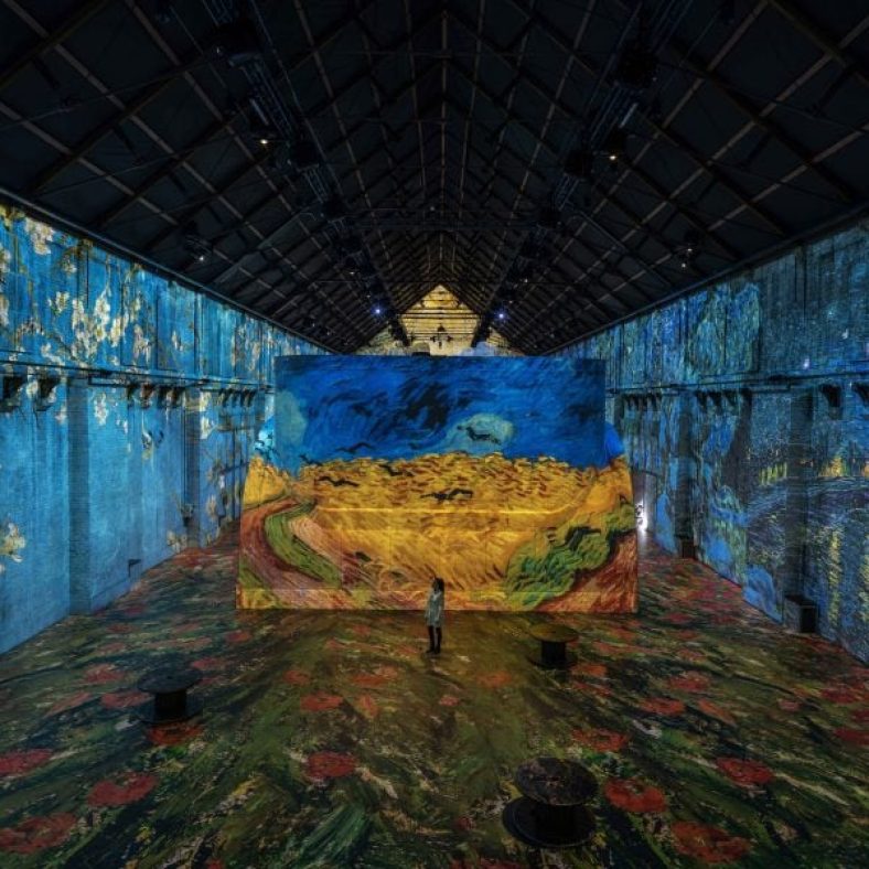
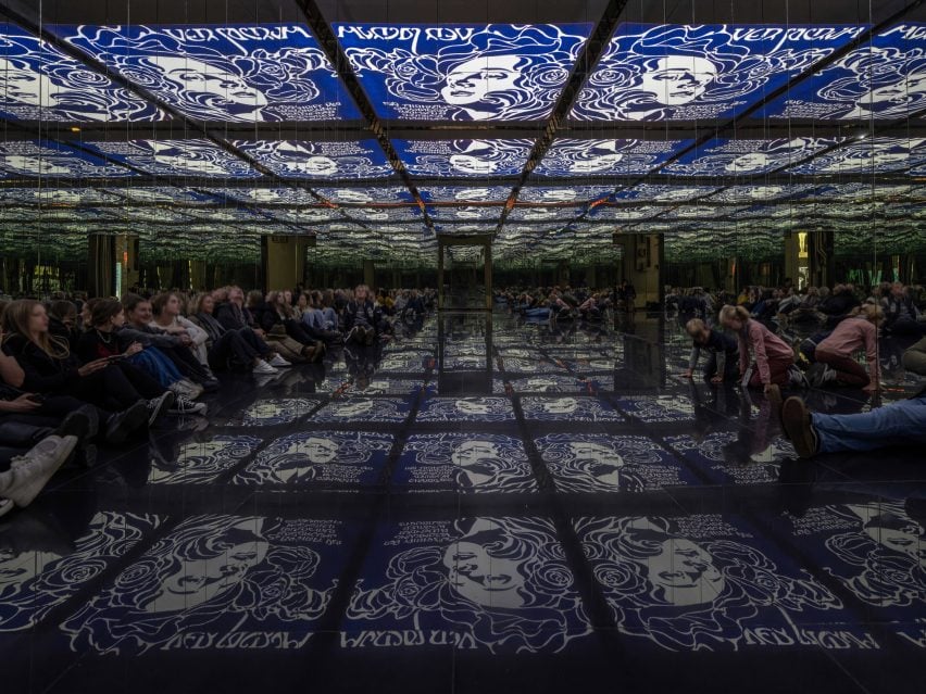
Creative studio D/Dock has transformed a hall inside Amserdam’s former Westergasfabriek gasworks into Fabrique des Lumières – billed as the largest immersive art centre in the Netherlands.
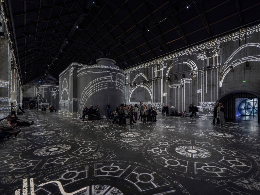
Commissioned by Parisian company Culturespaces, D/Dock‘s design and build team transformed the double-height 3,800-square-metre hall into an exhibition space where bright, colourful artworks are projected across the floor and walls.
D/Dock transformed a gasworks hall into an immersive exhibition space
The space can be adapted through the use of movable seating and adjustable sound and light systems to suit the needs of various exhibitions on everything from space travel to the work of architect Antoni Gaudí.
“[The space] serves as a versatile canvas set against an industrial backdrop, where over 100 projectors and speakers transform the venue into dynamic worlds, from a lively jungle to an interstellar journey or an evocative art gallery, offering a spectrum of cultural and sensory experiences adaptable to various exhibitions,” managing director of D/Dock Sven Butteling told Dezeen.
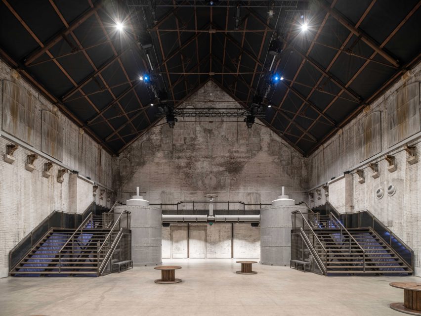
The 17-metre-tall exhibition space has a viewing platform and moveable seating
To achieve a continuous space suitable for light projections, any openings of the 1885 building were closed up with cladding and painted to blend in with the existing brick interior.
Taking advantage of the building’s height and scale, an internal staircase wraps around the rear facade and leads to a raised platform providing views of the main space.
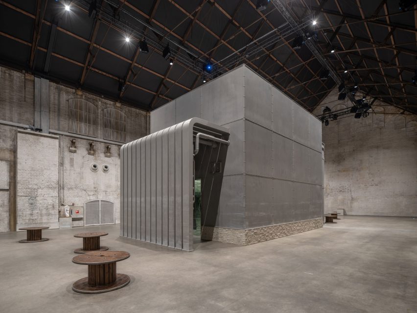
Newly built elements echo the building’s industrial heritage
Two newly built pavilions provide more enclosed immersive experiences within the main exhibition space while also operating as projection surfaces in the main hall.
Among them is the mirror pavilion, which D/Dock clad in mirrored panels and shiny flooring tiles to create “an infinite projection space”.
During construction, the building’s interior was carefully restored to maintain its industrial character, with the addition of newly built and digital elements creating a contemporary arts centre that blends the old and new.
The addition of lightweight insulation on the roof and windows, as well as acoustic and fire-rated doors, helped to enhance the energy performance of the hall.
Pavilions provide enclosed immersive spaces for visitors
D/Dock is a creative studio of architects, artists, designers and engineers based in Amsterdam.
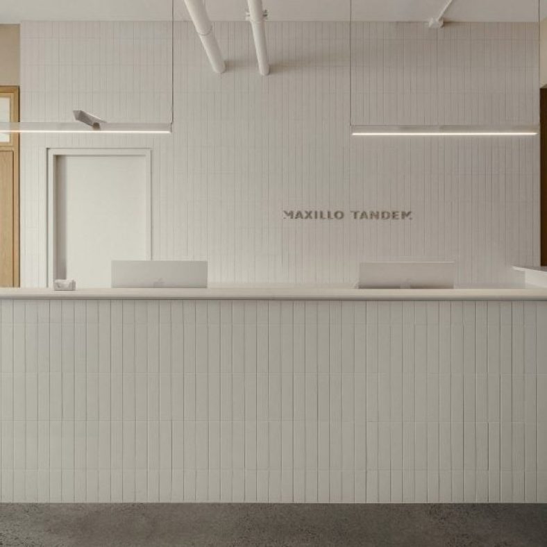
The Maxillo Tandem clinic in the city’s Technopôle Angus neighbourhood provides maxillofacial surgery, which deals with diseases, injuries and defects of the mouth, teeth and jaws.
Appareil Architecture designed the dental clinic to feel more like a home than a medical facility
The clinic’s founder, surgeon Anne-Frédérique Chouinard, gave Appareil Architecture a “carte blanche” to design the space differently to typical medical facilities.
“The clinic adopts a residential aesthetic with durable materials to create an inviting, refined space that centers on well-being,” said the studio.
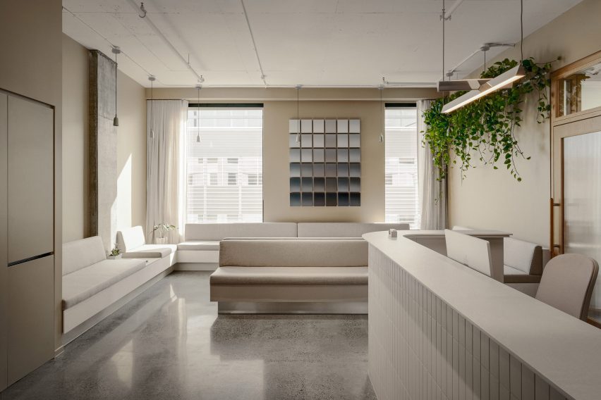
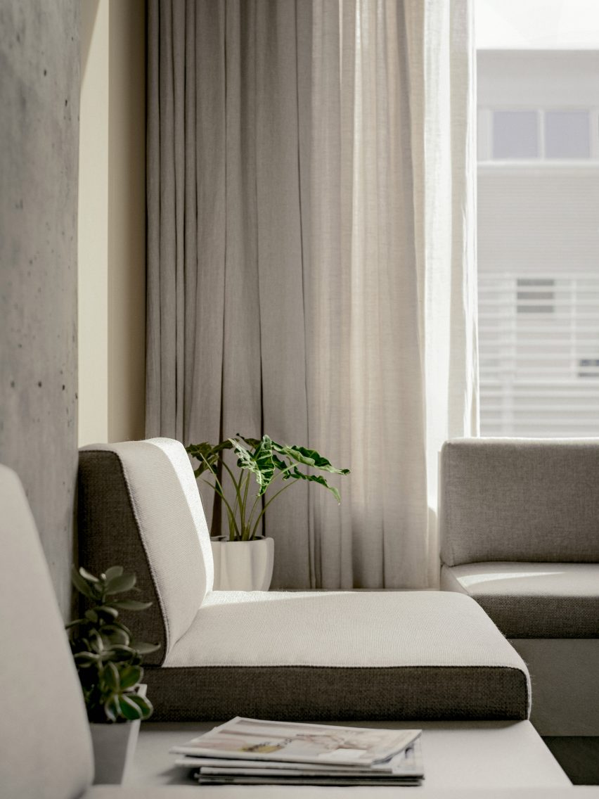
Built-in seating wraps around the perimeter of the reception area
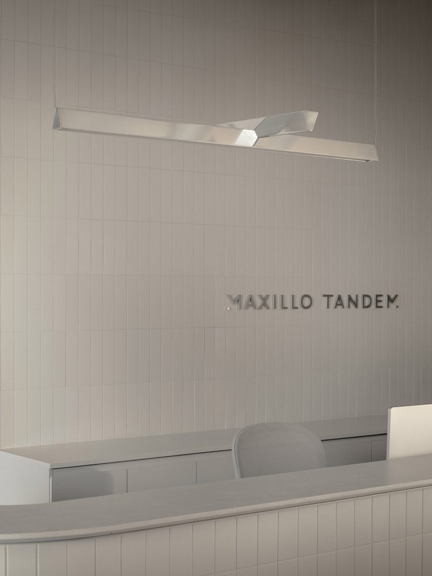
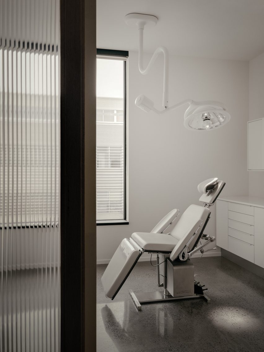
Upon entering, patients are met by a reception desk clad in vertically laid, off-white ceramic tiles that also cover the wall behind.
“Their vertical positioning adds texture and rhythm to the wall, bringing the space to life, while remaining functional and easy to maintain,” Appareil Architecture said.
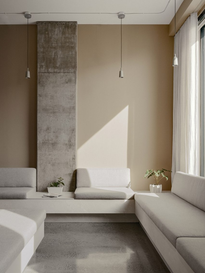
Pale upholstery, linen curtains and beige walls all add to the serene atmosphere
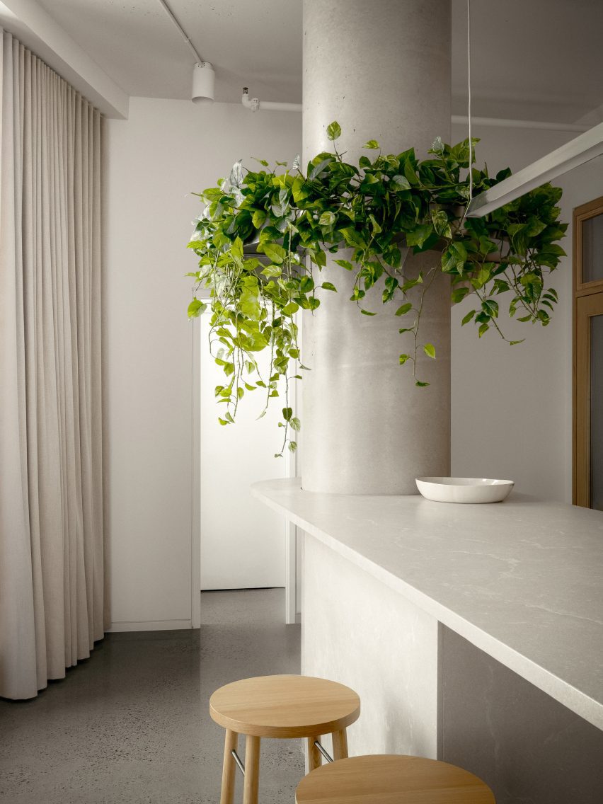
The waiting area to the left is furnished with built-in seats that form a U shape around the perimeter and under a large window, while a double-sided island in the central adds additional seating.
Polished concrete flooring and beige walls complement the pale upholstery and linen curtains, together creating a serene atmosphere.
Off-white tiles clad the reception counter and the wall behind, adding texture and rhythm
“All lend a reassuring character to the space,” said the architects. “In addition to a soft, peaceful colour palette, these materials contribute to the soothing, comforting ambiance.”
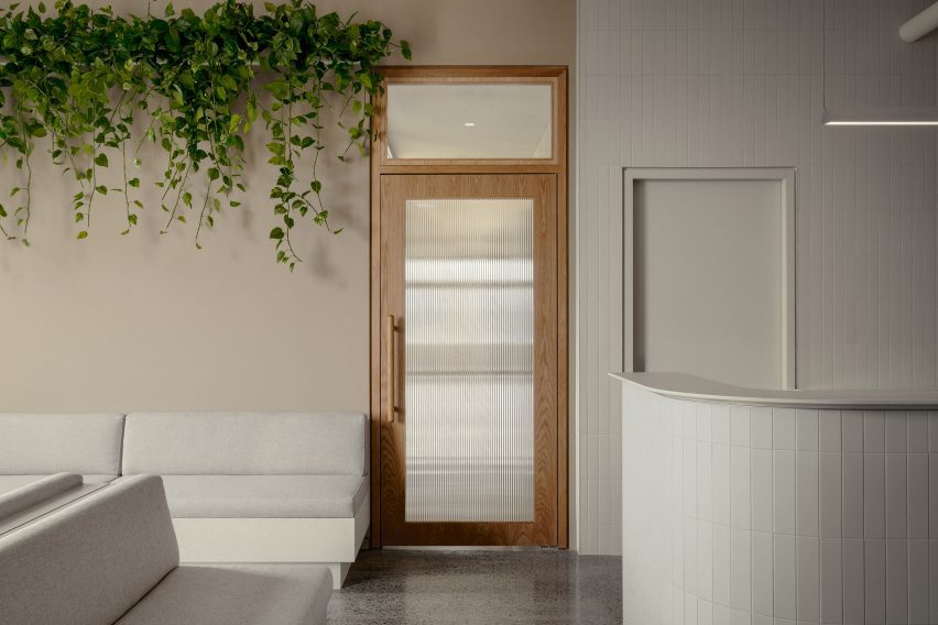
On either side of the symmetrical reception counter, oak-framed doors with fritted glass panes both lead through to the treatment area.
Oak-framed doors with fritted glass panes lead from reception to the treatment areas
A central block of rooms for staff – also wrapped in the off-white tiles – runs back from the reception area, dividing the clinic into two sides.
“This central structure naturally delineates the space, creating an efficient traffic flow that allows people to move easily in both directions,” the studio said.
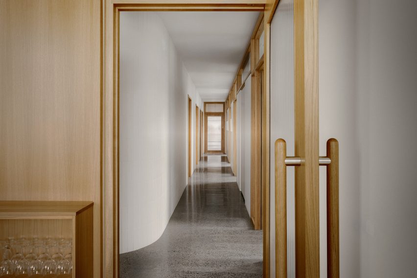
A U-shaped corridor connects the dentists’ offices, operating rooms and staff areas
The corridors continue the white and wood material palette and provide access to the dentists’ offices on the left side and operating rooms along the right.
All of these rooms are also sparsely furnished and have a clean aesthetic, and are purposefully placed away from the reception area for patient privacy.
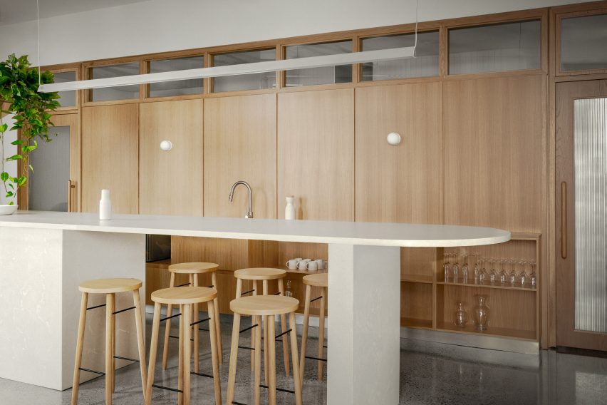
At the back of the clinic is a space with a communal kitchen for employees to take breaks, which is oriented to enjoy afternoon light.
“In the morning, the dentist’s offices, positioned on the window side, are flooded with natural light,” said Appareil Architecture.
A minimalist approach was also taken in the consultation rooms
“In the afternoon, this light pours into the staff areas and illuminates the central structure,” the team added.
A wood-panelled wall topped with clerestory windows incorporates the staff kitchen facilities and storage, while a concrete island with rounded ends incorporates a cylindrical structural column.
A communal kitchen for staff is located behind a wood-panelled wall at the back of the clinic
Since Maxillo Tandem is part of an ecological real-estate project, the architects had to comply with strict energy efficiency targets, on top of meeting the medical operating standards.
Overall, the clinic has been well-received by both patients and staff, according to Chouinard. “The customer feedback is very positive,” she said. “They feel like they’re in someone’s home, rather than a clinic. That was my intention.”
A kitchen island with rounded ends incorporates a structural concrete column
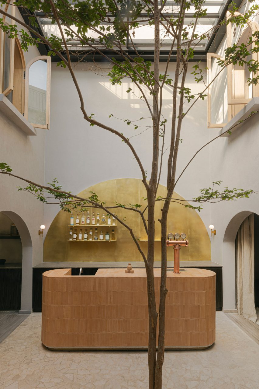
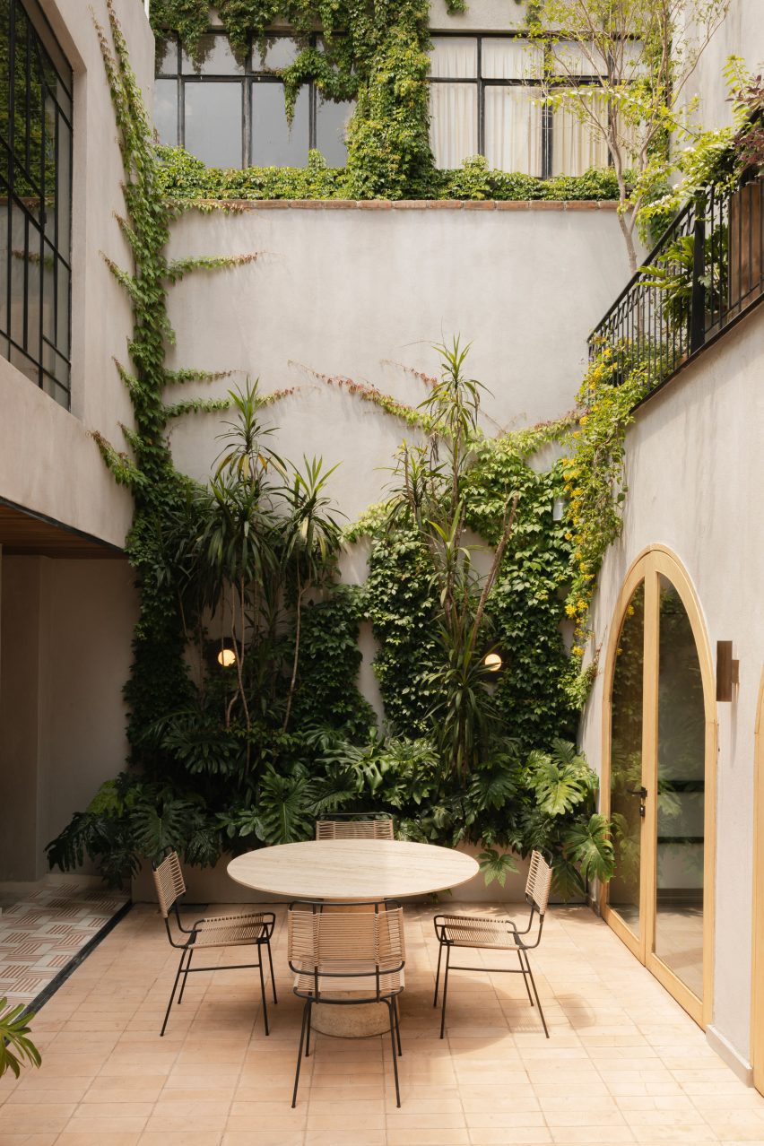
A private mezcal bar forms the heart of this house that Amsterdam interior architecture firm Barde vanVoltt has overhauled in Mexico City‘s La Condesa neighbourhood.
Working for longstanding Dutch clients who live in Mexico, Barde vanVoltt transformed a historic, dilapidated building into a contemporary residence that respects the heritage of the existing structure.
The building’s former life as a mezcal tasting venue influenced Barte vanVoltt to create a bar in its central courtyard
“We walked together into this old, beautiful building, and instantly fell in love,” said studio founders Bart van Seggelen and Valérie Boerma. “Even though the house was falling apart, we felt its soul was fully alive.”
The three-storey house had previously been used as a mezcal tasting venue, and the duo used this as a starting point for the design.
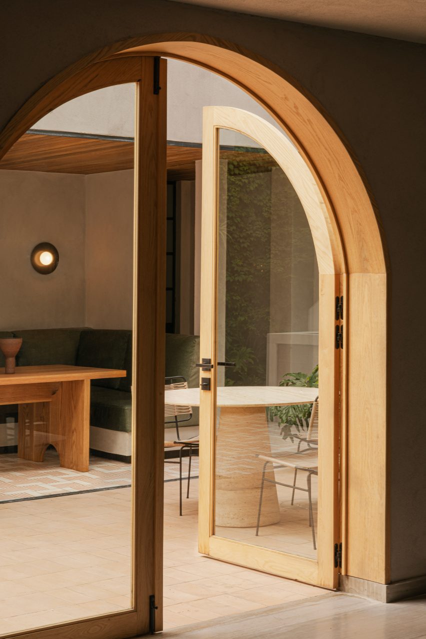
Arched openings create routes through the home, passing through the open kitchen, living and dining space
A primary aim of the renovation was to create a “vibrant oasis in the city” with a better connection to the outdoors.
This was achieved by connecting a series of courtyards, terraces and semi-enclosed corridors to form a route and airflow through the building.
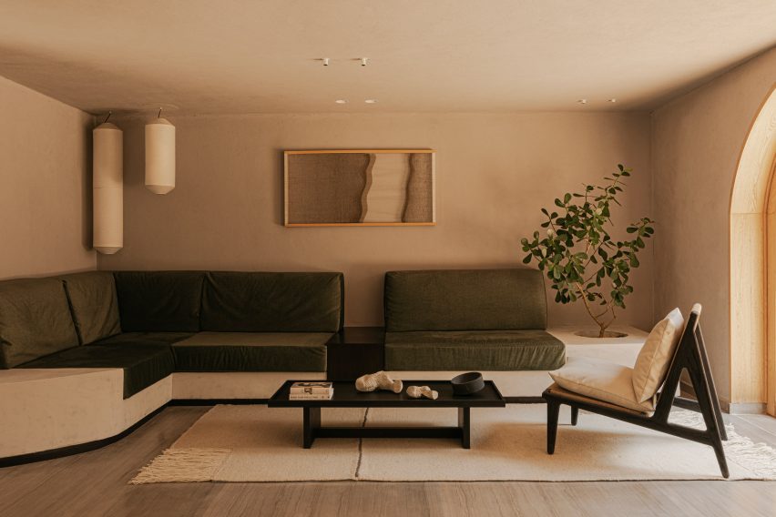
An earthy colour palette was chosen for the minimalist interiors to create a relaxing aura
“We worked together with Thalia from Aldaba Jardines, a talented landscape designer, to create a seamless flow from the indoors to the outdoors and back again,” said the studio..
In the central courtyard, Barde vanVoltt removed the roof from the double-height space and replaced it with operable glass panels to let in more light.
Multiple openings onto courtyard spaces encourage indoor-outdoor living
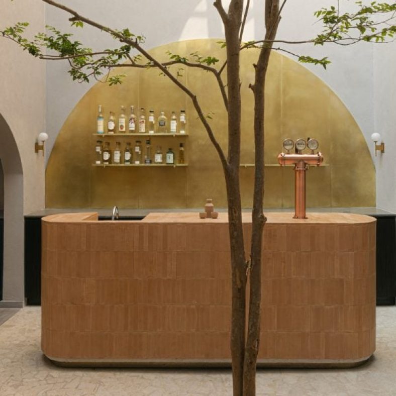
The designers turned this space into a mezcal bar as a nod to the building’s former life that the owners could use for entertaining friends and family.
Backed by a semicircular brass panel, upon which shelves for liquor bottles are mounted, the rounded bar counter is wrapped in narrow terracotta tiles.
The back courtyard is used as an outdoor lounge and features planting up the grey plaster walls
A five-metre-tall guayabo tree was also planted in the courtyard, casting shadows across the surrounding walls.
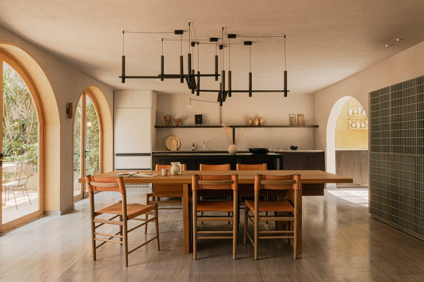
Open archways lead from this central space into various rooms including the kitchen and living area, which features dark cabinetry, open shelving, and a large bespoke wooden dining table.
Floors for the stairs, bathroom and outdoor areas are tiled with handmade bricks by Tata Mosaicos
Beyond a row of French doors is the back courtyard that forms an outdoor lounge, and an annex that accommodates a home office on the upper level.
To retain some of the original character, the architects recreated the cast iron, Art Deco windows and Spanish-style railings. and extended them to the back of the house.
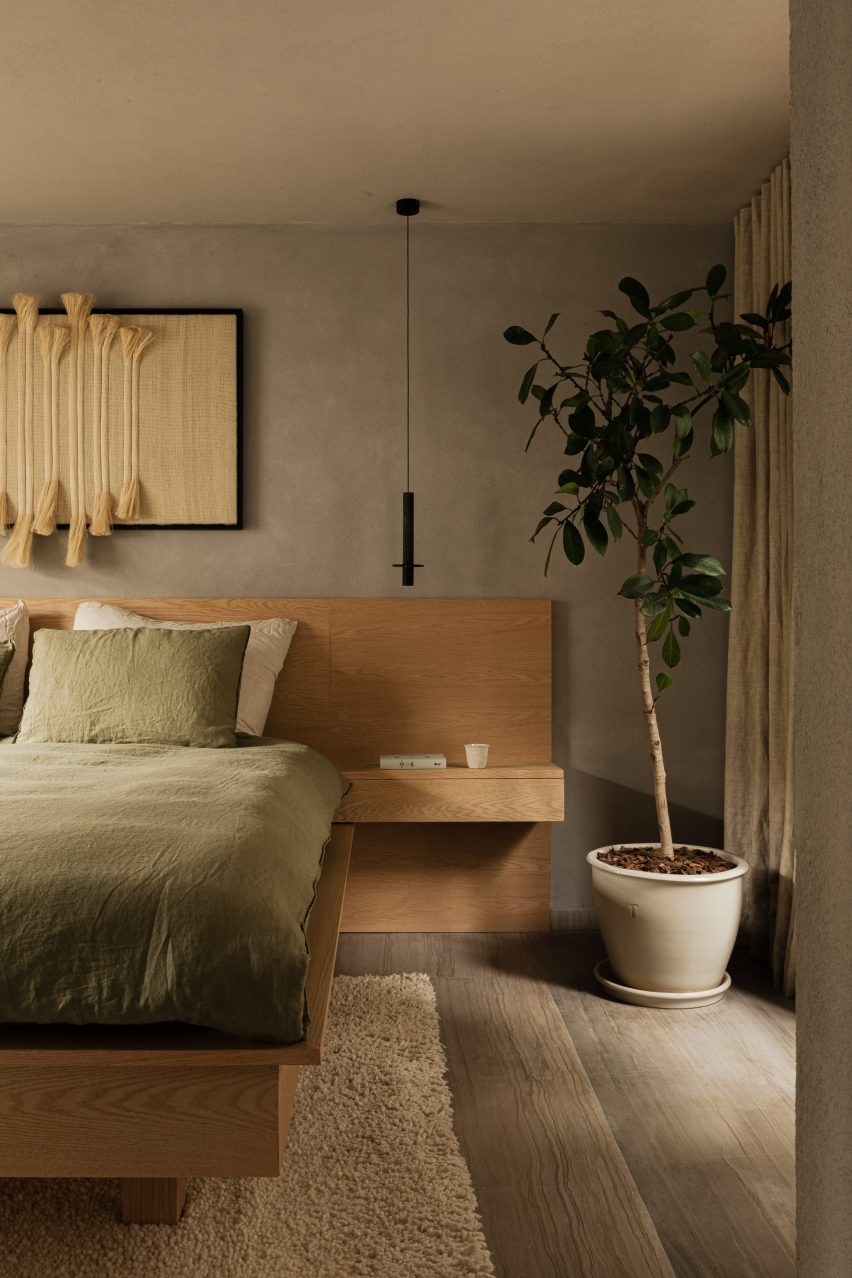
The neutral-toned decor continues in the three bedrooms on the first floor
The overall layout of spaces was kept largely the same, aside from a few walls that were removed to combine or create bigger rooms.
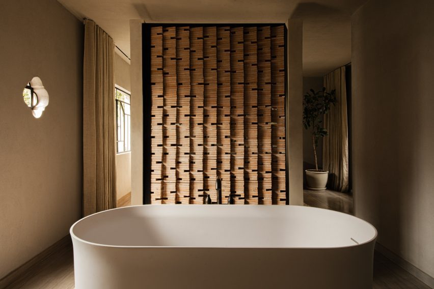
For example, the primary bedroom and bathroom now flow together as one space, divided only by a partition of angled bricks that forms a backdrop to the freestanding bathtub.
The primary bedroom and bathroom were combined into one space, with only a partition of angled bricks dividing them
“We included the bathroom into the space to create a home sanctuary to rest and refresh,” said Barde vanVoltt.
Two further bedrooms are located on the first floor, the other side of the central courtyard void at the front of the house.
A series of semi-enclosed loggias connect the first-floor rooms
The roof terrace features a plunge pool, an outdoor shower, a row of loungers and built-in seats, all accessed via a spiral staircase from the loggia outside the main bedroom.
The building’s exterior is covered in greige-coloured plaster, as a nod to Mexico’s prevalent concrete architecture, while warmer earth tones decorate the minimalist interiors.
Moss green sofa covers and bed linens visually tie to the plants outside, and wood, terracotta and off-white hues complement one another.
“We love the natural feel these colours have together,” said the designers. “According to colour psychology, nature-inspired hues are the best for interiors as they soothe and invigorate.”
The building’s original cast iron handrails were recreated and extended to the back of the property
Floors for the stairs, bathroom and outdoor areas are tiled with handmade bricks by Tata Mosaicos, made from compacted earth sourced from different regions throughout Mexico.
“This unique structure means they need 50 per cent less cement, using the sun and shade to dry naturally and secure the structure,” Barde vanVoltt said. “An environmentally friendly solution, sourced locally.”
Custom lighting and Mexican objects, textiles, sculptures and other wall art are also found throughout the residence.
The terrace also has multiple seating areas so that the family and their friends can gather outside
While it might look complicated, the kitchen plumbing system is not complex. You’ll find most kitchen plumbing components under your sink. These series of pipes and hoses provide hot and cold water, supply your dishwasher, and keep debris from clogging up your pipes.
Parts of a Kitchen Plumbing System
Basket strainer
Drain Tailpiece
Tee fitting
Garbage disposal
Drain trap
Hot water supply line
Cold water supply line
Dishwasher supply line
Dishwasher drain hose
Shut-Off Valve
Sink
Faucet
Components of Under-the-Sink Kitchen Plumbing
Basket Strainer: A metal piece in the sink drain that catches large debris and keeps them from entering the plumbing pipes.
Drain Tailpiece: A short pipe that connects to the basket strainer and a tee fitting.
Tee Fitting: A fitting with a “T” shape that connects to the drain tailpiece. The side portion connects to the garbage disposal. If you don’t have a garbage disposal, the tee fitting connects to the other side of the sink. The bottom of the tee fitting connects to the drain trap.
Garbage disposal: A food waste system located on one side of the sink that grinds food, making it small enough to travel through the plumbing.
Drain trap: A pipe that connects to the tee fitting and has a U shape on the bottom, allowing it to catch hair and debris that shouldn’t go out the pipes—the back end of the drain trap hooks to the plumbing outlet on the wall.
Hot water supply: A supply line (usually on the left) that hooks up to the sink, providing hot water.
Cold water supply: A supply line (usually on the right) that hooks to the sink, providing cold water.
Sink water lines: The sink water lines are the hot and cold water supply. They have flexible braided tubes that connect to the hot and cold water and then run up to the sink connections.
Dishwasher supply: A hot water supply line providing water for the dishwasher.
Dishwasher drain hose: A drain hose that runs from the dishwasher into a tee fitting or through the garbage disposal.
Shut-Off valve: A valve under the sink or near the bottom of the cabinet that allows you to turn off the water to the kitchen sink.
Sink: A basin set into the countertop used for washing dishes, washing hands, and cleaning up.
Faucet: The lever that controls the hot and cold water in a sink.
What About Refrigerator Plumbing?
If you have a refrigerator close to your kitchen sink, the water supply for the ice maker and water dispenser may run through the cabinetry, connecting to the water hookup on the fridge. If your refrigerator isn’t near your sink, chances are there’s a water line running under the flooring and then connecting to the fridge.
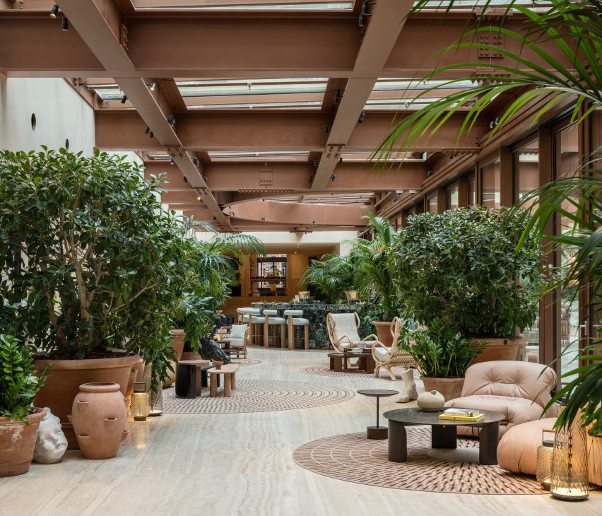
Milan-based designer Patricia Urquiola has converted a palazzo in Rome into a hotel and spa, filled with circular elements and traditional Italian materials.
The Six Senses Rome is located within the Palazzo Salviati Cesi Mellini, close to historic sites like the Pantheon and the Trevi Fountain in the city centre.
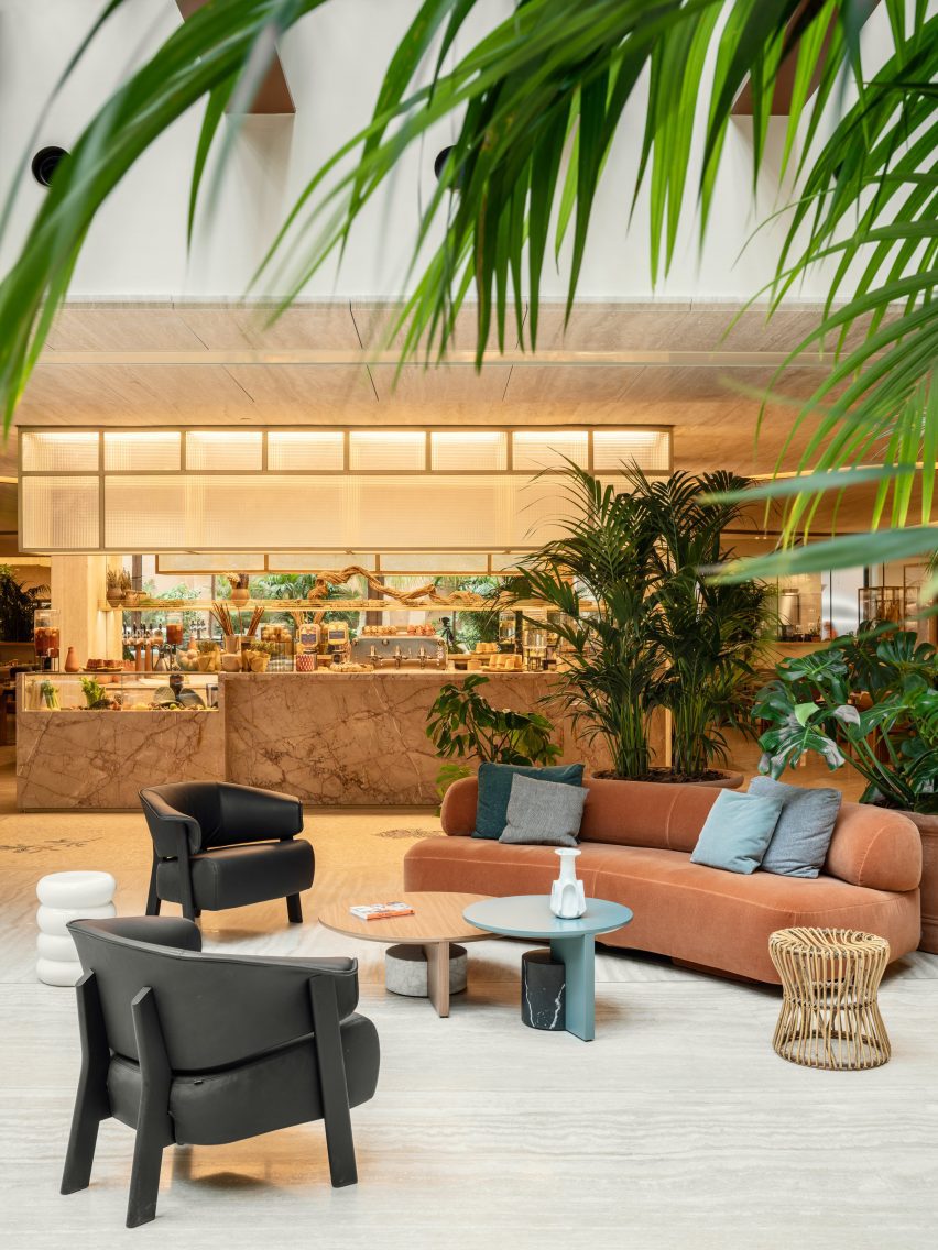
The lobby of the Six Senses Rome is an open social space with multiple seating areas
Adjacent to the Church of San Marcello al Corso, the building was first constructed in the 15th century before being updated in the 18th-century baroque style by architect Tomaso De Marchis.
An impressive central staircase and the building’s main UNESCO-listed facade, which overlooks the bustling Via del Corso, are among the period details that were restored during the renovation works led by Studio Urquiola.
The Bivium restaurant connected to the lobby offers all-day dining
The entrance to the Six Senses Rome from Piazza di San Marcello leads into an open lobby and social area, furnished with a variety of sofas and lounge chairs from Urquiola’s oeuvre alongside classic Italian designs.
These are positioned in groupings with tables and decorative objects on circular rugs, between potted plants spread across the travertine floors.
Circular elements appear throughout the hotel, including rugs and tables in the lobby
“At every turn, the craftsmanship, the finishes, the materials and the graphics create a union with nature while staying true to both Roman classicism and Palazzo Salviati Cesi Mellini’s rich history,” said Urquiola.
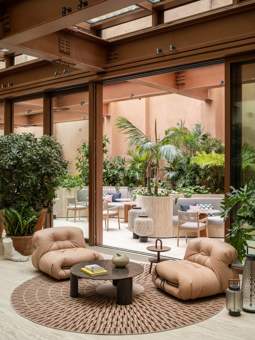
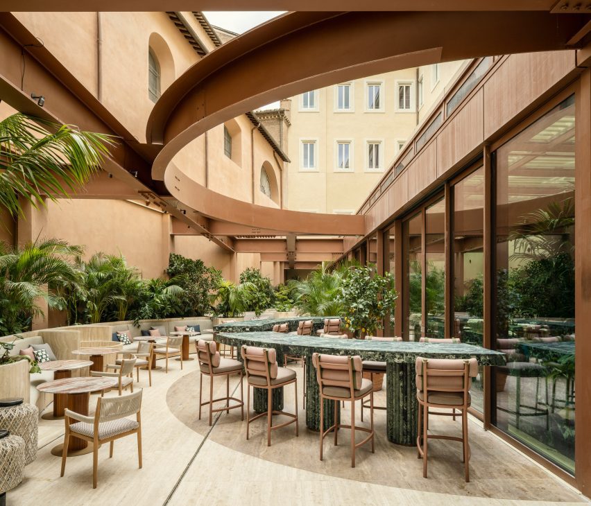
A curved green marble bar is positioned near the windows, forming an incomplete circle with the matching counters in the courtyard, which are visible through the glazing and follow the shape of earth-toned steelwork overhead.
In the courtyard, a green marble bar counter continues from inside
The courtyard also features benches built into planters along the back wall and additional seating, where diners can enjoy food and drinks from the trattoria-style Bivium restaurant.
Circular forms and motifs continue throughout the hotel, including in the Six Senses Spa and Roman baths on the first floor.
The spa waiting area features seating within sheer curtain enclosures
Here, sheer curtains encircle small seating areas for those waiting for treatments or preparing to enter the travertine-lined bathhouse, which offers multiple pools for soaking and relaxing.
Bedrooms across the central levels have “quirky” layouts and a soft neutral decor, including tambour panelling, patterned rugs and a variety of spherical light fixtures.
Travertine lines the walls and ceiling inside the spa and Roman baths
Several of Six Senses Rome’s 96 guest rooms and suites have balconies, and all enjoy either a courtyard or city view.
Plasterwork in the rooms is made from an ancient Roman material known as cocciopesto, which comprises fragments of earthenware or brick mixed with lime and sand.
“The legacy of antiquity is also honoured with the choice of cocciopesto, which decorates the plaster of the rooms and gives a nod to Roman architect Vitruvius,” said the studio.
The hotel also features a roof terrace and bar called Notos that offers views across the city and serves botanical cocktails and light bites.
The bedrooms at the Six Senses Rome have a soft neutral decor
Artworks such as watercolours, sculptures, textile works and canvases throughout the interior are curated by art advisor Federica Sala and are all unique to the hotel.
Plasterwork in the bedrooms and suites is made from cocciopesto
Originally from Spain, Urquiola is one of Europe’s most sought-after designers and has released furniture and product collections with brands like Moroso, Cassina, Kettal and Boffi among many more.
The shortlisted projects, which are in the running for awards in seven different architecture project categories, represent the best buildings recently created in the country.
This is the first edition of Dezeen Awards China, which is in partnership with Bentley Motors. Following the architecture shortlist, the projects shortlisted in the design, interiors and China designers of the year categories will be unveiled throughout the week.
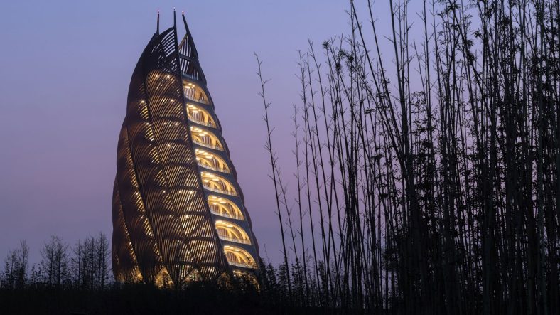
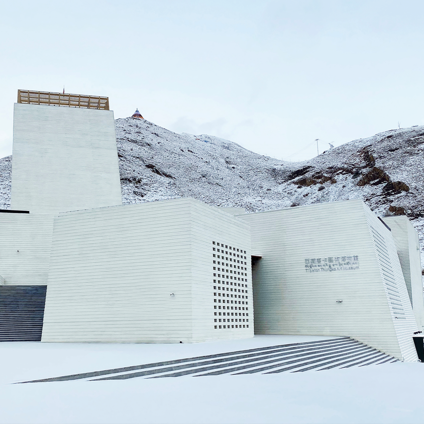
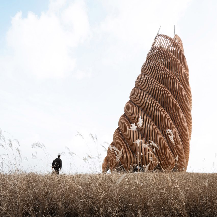
Above: An art museum in Tibet is one of the shortlisted projects. Photo courtesy of And Studio. Top: Other shortlisted projects include a viewing tower at a panda sanctuary
All shortlisted buildings are listed below, each with a link to a dedicated page on the Dezeen Awards China website, where you can find more information about the project.
The winner of each architecture project category will be announced at a party in Shanghai in December, with the seven winners competing for the title of Chinese architecture project of the year, which is sponsored by The Dalmore.
Read on for the full architecture shortlist:
Cactus House by Shi·Ye Architecture Design & Research Practice. Photo courtesy of Shi·Ye Architecture Design & Research Practice
Dezeen Awards China is the first regional edition of Dezeen Awards, to celebrate the best architecture, interiors and design in China. The annual awards are in partnership with Bentley Motors, as part of a wider collaboration that will see the brand work with Dezeen to support and inspire the next generation of design talent in China.
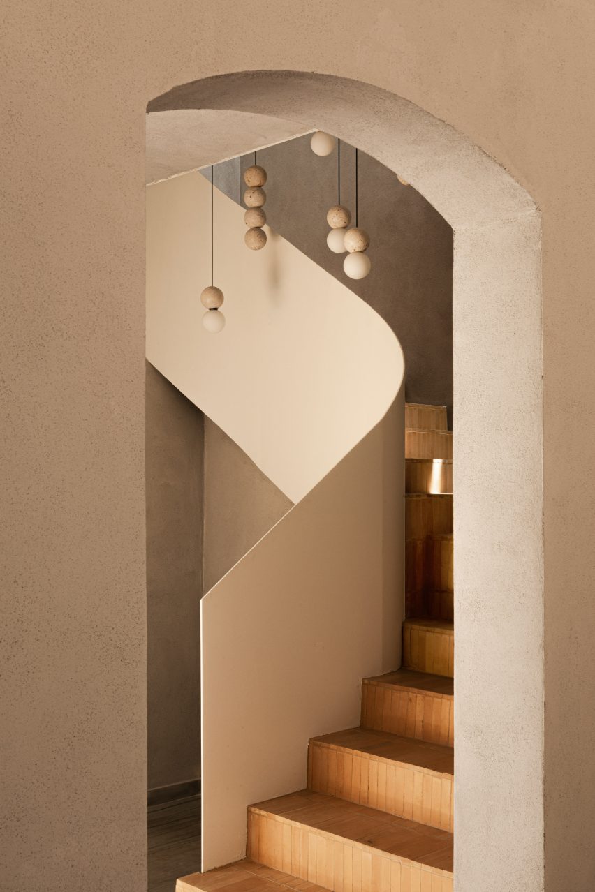
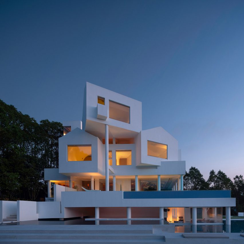
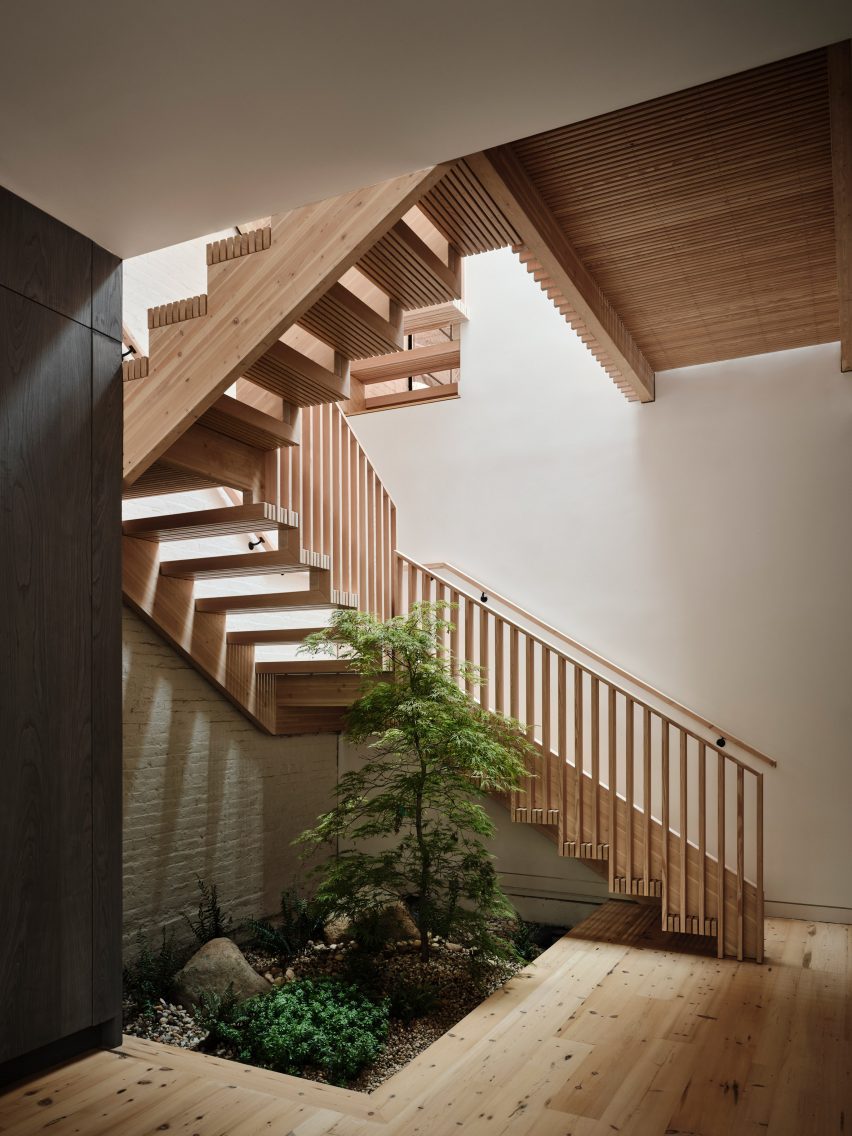
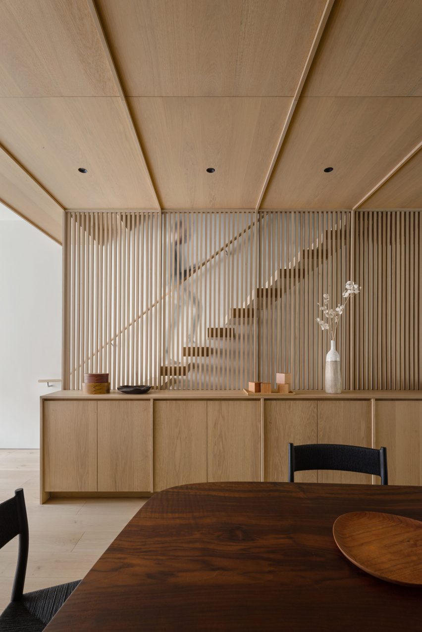
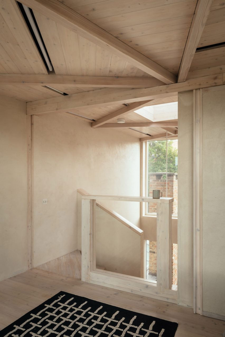
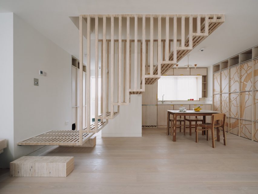
Our latest lookbook features eight sculptural staircases made of wood that make a statement and bring warmth to apartments from Hong Kong to Boston.
Often the organizing principle in the planning of any space, a staircase can either blend in or stand out.
The eight gathered in this lookbook lean into the latter – showcasing both the structural abilities of wood like larch, birch and plywood and demonstrating how circulation need not be boring.
From a completely pre-fabricated staircase in a Boston apartment to a plywood spiral staircase twisting from the loft of a renovated barn in the Netherlands, these sculptural stairs create a visually striking centrepiece, as well as a fun way to traverse a house.
Located in Boston’s South End neighbourhood, this historic townhouse renovation sees a four-storey interior plan wrapped around a white oak staircase that spirals around a 40-foot-high (12-metre-high) atrium.
“Aptly named Hairpin House, the project takes the tight, unpredictable, and ultimately poetic switchback turns of a mountain road as inspiration for the overall renovation – and in particular a new unravelling central stair,” said the design team.
Just a short walk from the beaches of Hong Kong‘s south side, this three-storey house channels “coastal essence” through natural materials and light, Chinese studio Linehouse told Dezeen.
An “easy flow” was also imbued into the design, created in part by a timber stairwell that’s tucked to the side and – save for a white metallic screen – is open to the living spaces.
According to design studio Schiller Projects, this renovated carriage home in Brooklyn is the borough’s first single-family residence that uses mass timber construction.
Besides repurposed wooden elements like timber panels and floorboards used for the project, the house features a pre-fabricated glue-laminated timber (glulam) staircase that can be completely disassembled.
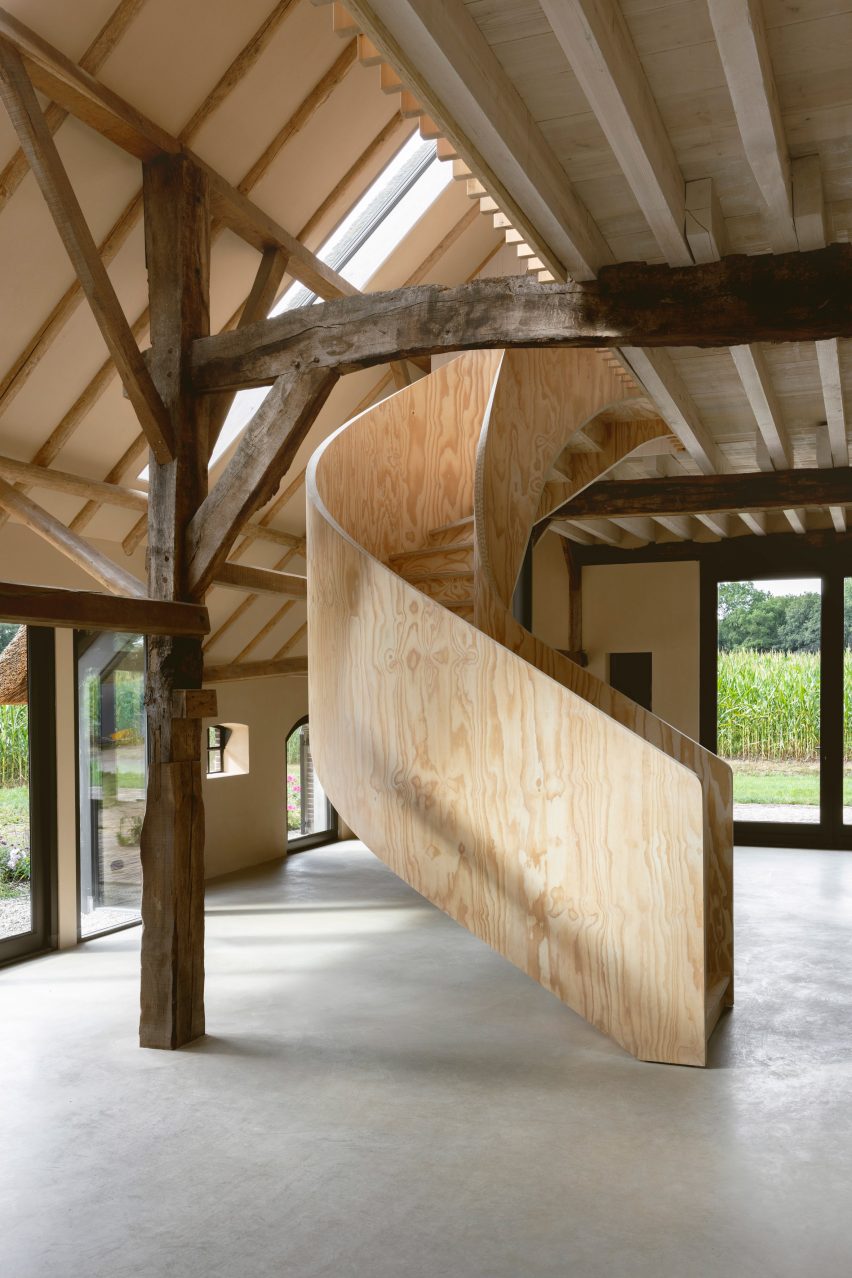
Architectural designer Julia Van Beuningen converted this Gelderland barn into a holiday home complete with a spiral staircase made out of plywood at the heart of the floor plan, which contrasts the more rustic materials of the surrounding building.
“This is very different and very unusual in a barn like this,” said Van Beuningen. “It’s something you either love or hate, but it’s definitely a statement.”
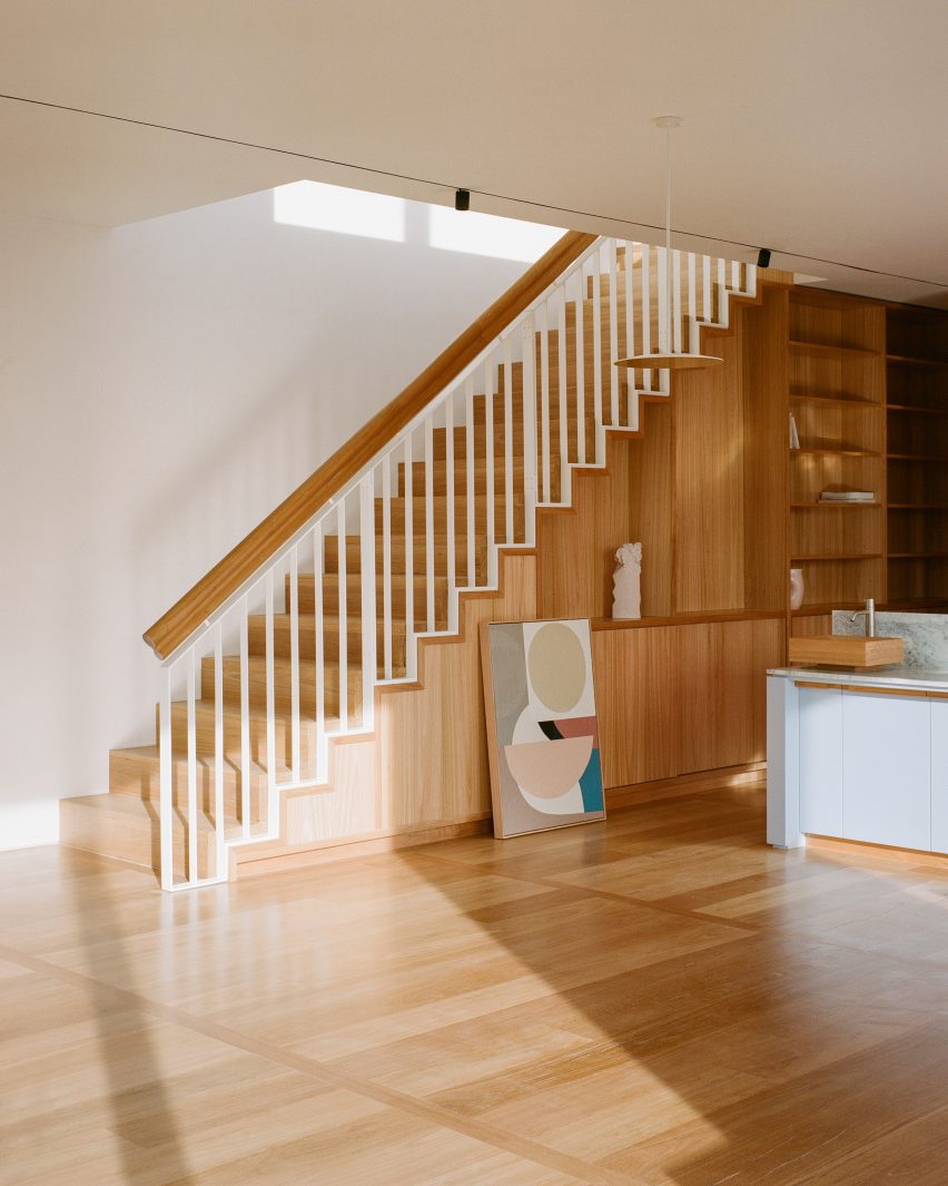
New York studios Starling Architecture and Emily Lindberg Design merged a two-family dwelling into one for the owner’s growing family.
White oak running throughout the two units unifies the project, which includes the addition of a new wooden staircase covered by a slated screen made of the same material.
Architecture firm Whittaker Parsons was tasked with adding a loft to a house in Stoke Newington, London, as well as updating spaces throughout the lower floors.
With efficiency and quality in mind, the studio used prefabricated structural insulated panels (SIP) to construct the new loft. The space is accessed by a spiral staircase made of larch that’s topped with a skylight.
A floating timber staircase features in this flat in London, which is outfitted with walls CNC-etched with images of peonies, dragons, bats and the Thames.
The central staircase allows light to filter into the kitchen and living room below, while solid timber bricks act as landings on either side.
The timber staircases in this Melbourne house were integrated into its “library spine” an organizing corridor that contains the family’s collection of books, art and artefacts.
“From a practical standpoint, it allowed everything to be easily accessible and displayed but it also helps to draw people through the apartment and celebrate the two staircases to the roof garden at either end,” said Office Alex Nicholls founder Alex Nicholls.
Kitchen color schemes are the key to an aesthetic and functional space. The right color scheme makes a tiny kitchen appear bigger, boosting its visual appeal and increasing its resale value.
1. White + White
An all-white kitchen exudes an elegance that never goes out of style. The simplicity and purity of all white surfaces and cabinets create a clean, classic look.
The silver accents also add to the kitchen’s pristine theme. Designer Davide Giannella adds modernity to the all-white scheme using marble effects and geometric tiles.
White reflects light, making your kitchen feel brighter and more spacious. If you’re a minimalist, you’ll appreciate the clean and clutter-free look an all-white kitchen provides.
2. Red + White
The boldness of red against the crispness of white makes for a classic and timeless contrast. Red draws attention, and designers use it to highlight specific areas in the kitchen, like islands or cabinets.
Chrissy Szaszfai Racho captures the stark contrast between the white cabinetry and red countertops.
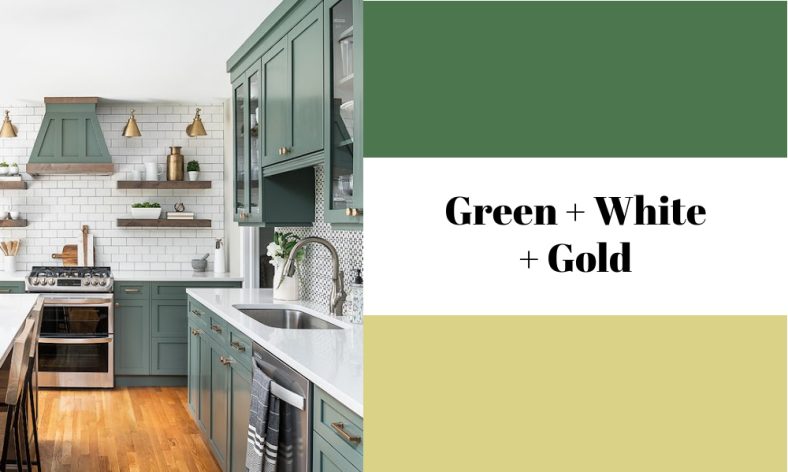
3. Green + White + Gold
A green, white, and gold theme balances tranquility and opulence. Green adds depth and richness to the space. Pairing green cabinets with white countertops creates a bright contrast.
Chad Esslilnger uses gold accents for a touch of luxury. You can introduce gold through cabinet hardware, faucets, light fixtures, and small decor items.
4. White + Brown
White offers a clean and fresh aesthetic, with wood accents adding character and authenticity to a space. Judith Balis breaks the monotony of all white by including statement wooden bottom cupboards with a rustic appeal.
Choose wooden floors with the same material as the cupboards or a different wood style altogether. Use golden light fixtures and cabinet hardware as accents.
5. Black + White
The classic pairing of black and white offers a striking, high-contrast aesthetic. These colors serve as a versatile backdrop for various design styles.
Designer Terri Sears chose a minimalist approach, using white for the walls and countertops. She used black on the cabinetry, adding depth without overwhelming the space. A patterned floor softens the contrast between the two colors.
6. Cool Gray + Marble
If you find white too harsh, cool gray offers a softer alternative. Combine crisp whites and blues with cooler grays. For a warmer shade of gray, choose cream or ivory. In this case, Lisa Buxton chooses marble as a focal point to add character and sophistication.
7. Gray + Blush
A gray and blush kitchen is a contemporary yet timeless choice, as seen in this space by Colombo and Serboli Architecture. The color scheme blends a neutral gray backdrop with the soft, warm hues of blush pink.
Fun kitchen design colors like blush and gray create warm and cool contrasts. Use white or metallic accents for a glamorous finish.
8. Navy + White
A navy and white kitchen oozes boldness and formality. Anna Rae achieves this by combining the crispness of white and navy’s richness in this modern kitchen. Navy and white are a versatile foundation for various design styles, from traditional to contemporary interiors.
The designer chose gold accents, which offer an elegant contrast. Other accent colors that work well with a navy and white scheme are gray, mint green, yellow, and red.
9. Black + Black
Black on black is bold and daring as far as kitchen color designs go. A black kitchen exudes luxury often associated with modern and minimalist designs.
Instead of plain black, play around with textures like Jado Developments did. The designer uses a glossy finish to glam up this space, complete with a kitchen island. The bright floor and ceiling bring more light into the kitchen, so it appears bigger.
10. Cool Blue + White
Don’t pass up a cool blue and white combo when looking for fresh color schemes for a kitchen. Bryant Alsop combines the crisp qualities of white with the calming effect of blue.
The kitchen design features floor-to-ceiling blue cabinetry on one wall and a white kitchen island in the middle. You can play around with varying shades of cool blue, like sky blue, powder blue, and cerulean blue. Use natural wood and blush as accents for added visual interest.
11. Off-White + Neutrals
Off-white and neutral colors are perfect for traditional or farmhouse-inspired kitchen designs. Shirley Meisels captures the warmth and coziness of this neutral kitchen using off-white and cream-beige hues.
The dark wooden floor helps create visual balance while also adding some contrast. Add hanging light fixtures with yellow light for added warmth.