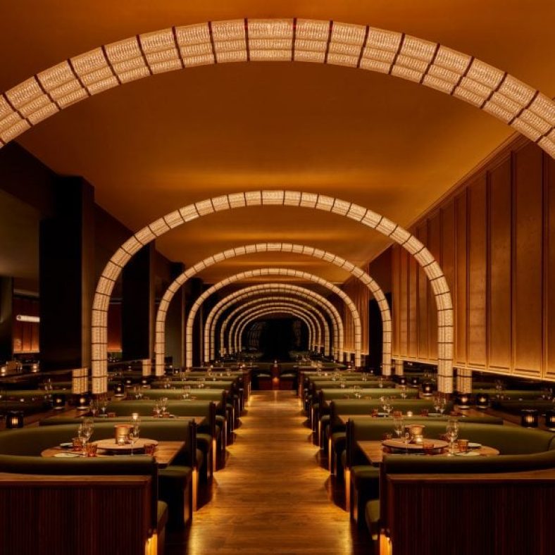
Arches of light warmly illuminate this Korean fried chicken restaurant in New York‘s Flatiron district, designed by Rockwell Group.
Coqodaq is the brainchild of restauranteur Simon Kim’s Gracious Hospitality Management, the group behind the Michelin-starred and James Beard-nominated COTE Korean Steakhouse.
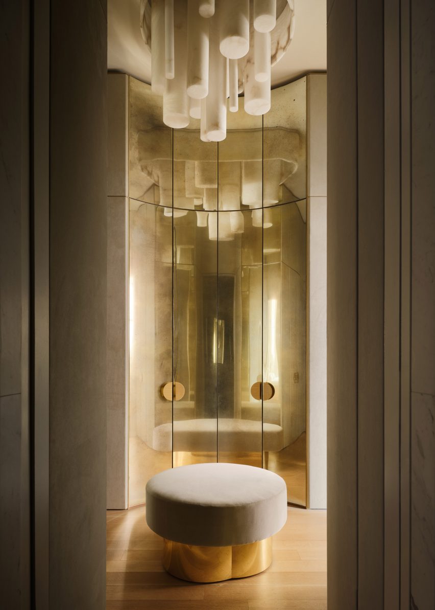
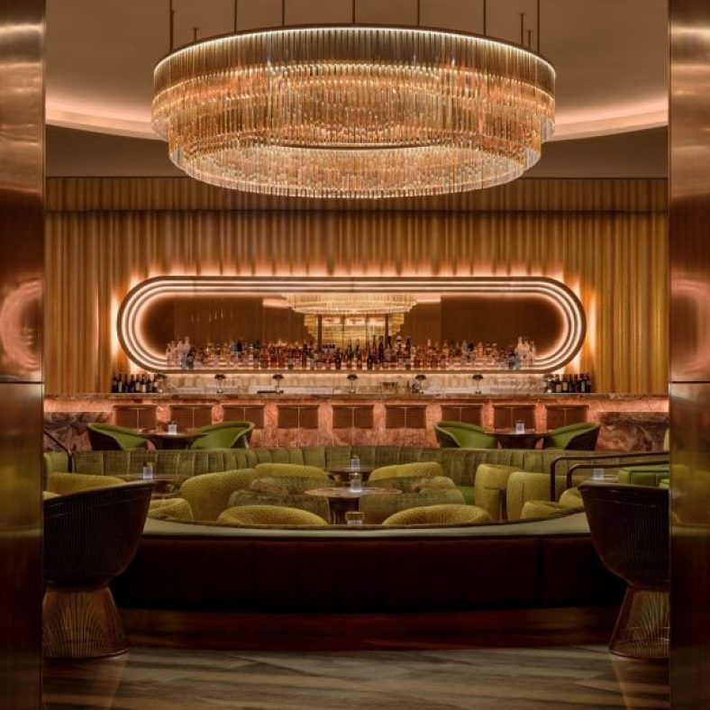
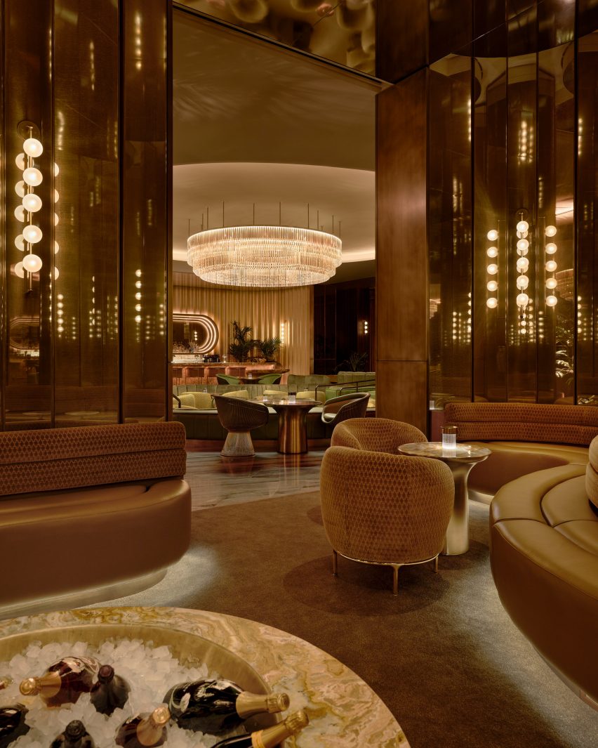
At Cododaq, glass and bronze modules form arches of light over diners
The new restaurant offers an elevated take on traditional Korean-style fried chicken, encouraging diners to indulge in nuggets topped with caviar and to pair its “bucket” dishes with champagne.
“Designed by Rockwell Group as ‘the cathedral of fried chicken’, the restaurant design delivers a daring, yet refined dining experience that skillfully integrates Korean and American influences, placing them at the forefront of this enticing culinary adventure,” said the restaurant team.
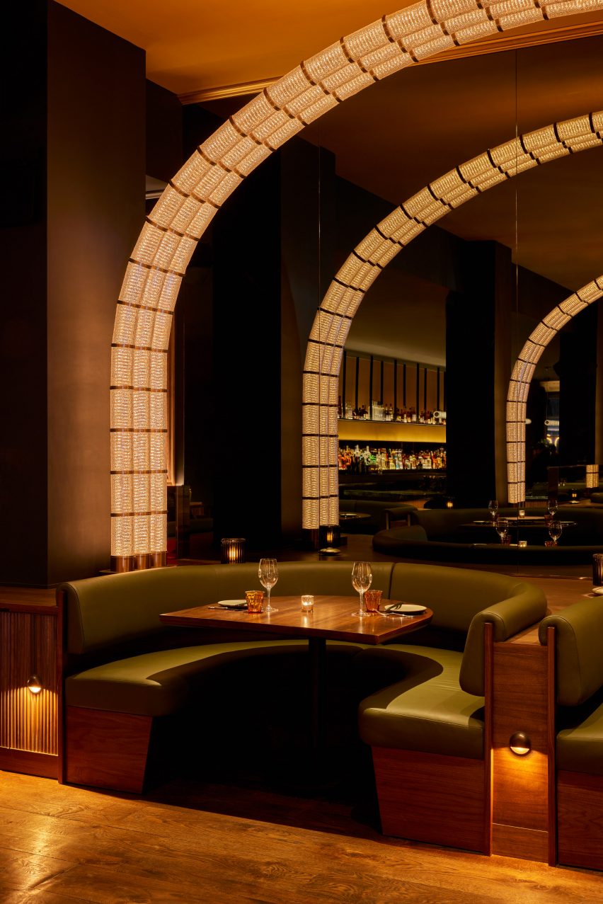
The restaurant’s moody material palette and warm lighting set the tone for an elevated take on Korean fried chicken
To create the right atmosphere for this experience, Rockwell Group opted for a dark and moody interior of rich materials and low, warm lighting.
“Our goal was to capture the essence of this unique concept and innovative approach to fried chicken and translate it into a memorable dining experience,” said founder David Rockwell.
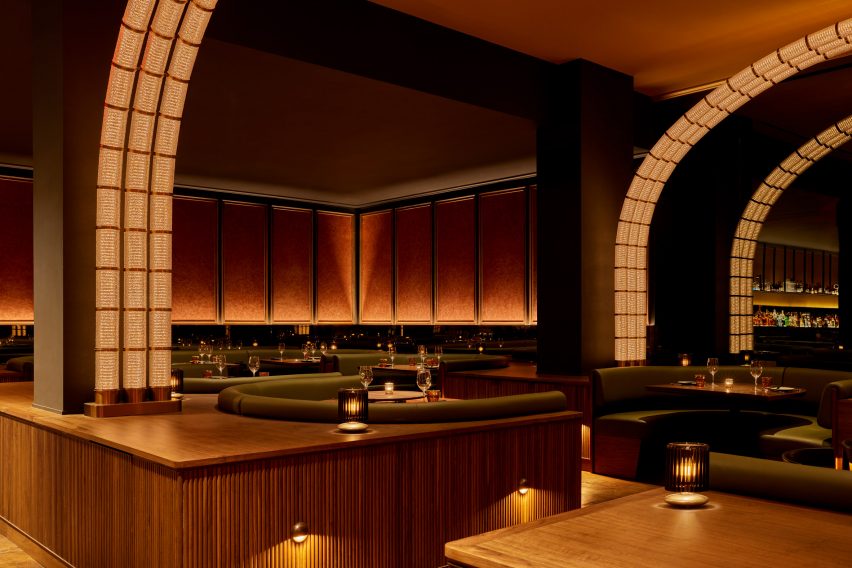
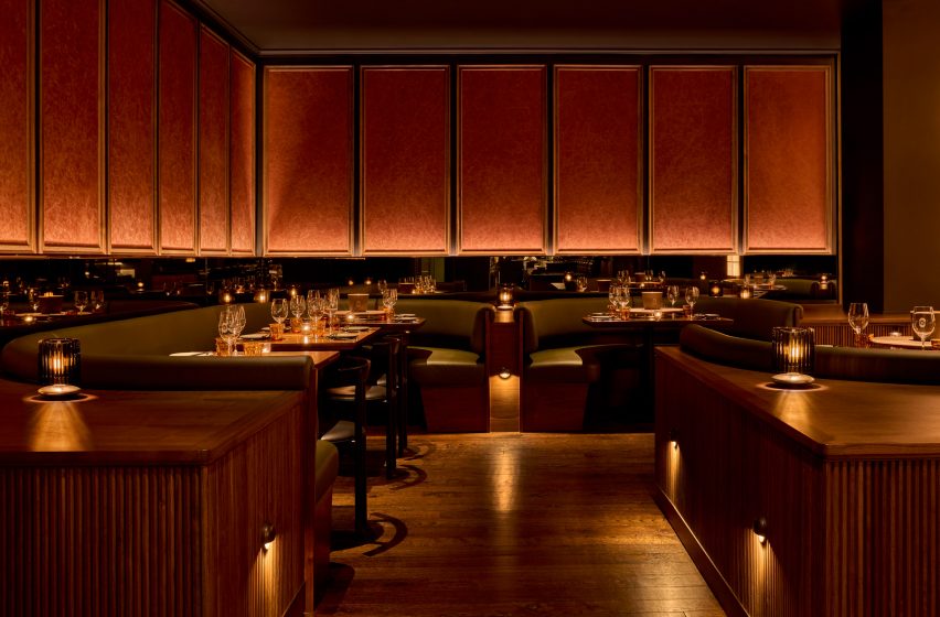
Plaster wall panels feature a crackled effect akin to fried chicken skin
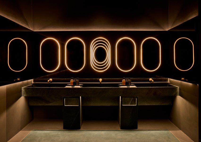
Upon entry, guests are invited to wash their hands in leathered soapstone basins, above which a row of pill-shaped light bands glow within a bronzed mirror that also wraps onto the side walls.
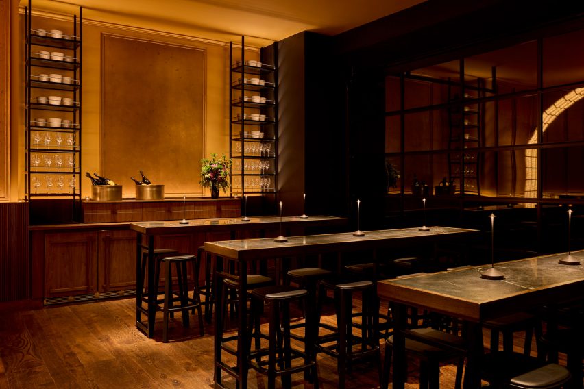
Past the host stand, an area with four high-top tables offers a space reserved for walk-ins in front of garage-style windows.
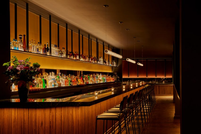
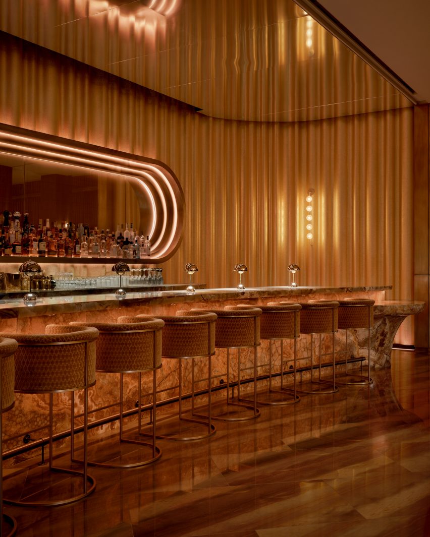
The long bar is topped with black soapstone and fronted with tambour wood
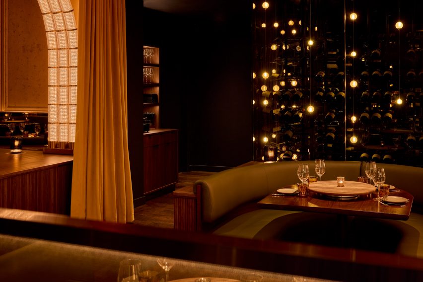
The main dining area is formed by a series of green leather and dark walnut booths on either side of a central walkway.
A series of illuminated arches soar overhead, formed from rippled glass and bronze modules that resemble bubbling oil in a deep-fat fryer.
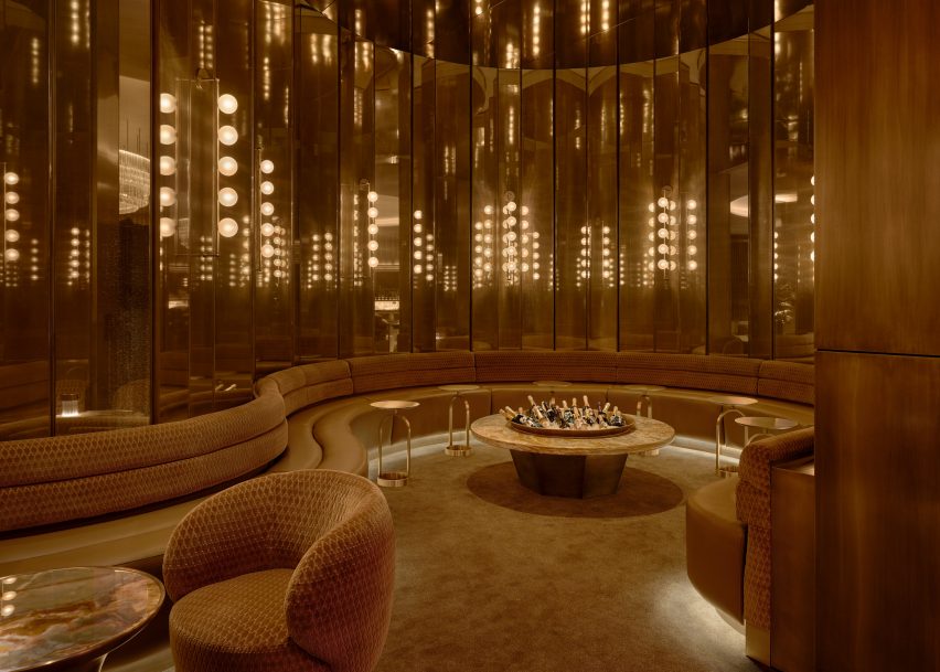
The restaurant’s extensive champagne collection is displayed in glass cases with bubble-like lighting
At the end of this procession, a mirrored wall reflects glowing arches and creates the illusion of doubled space. Meanwhile, plaster wall panels feature a crackled effect, nodding to the crispy skin of the fried chicken.
“The material palette was driven by a desire to surround diners in an envelope of warmth, creating a joyful place to be at any time,” Rockwell said.
Additional booth seating to one side is followed by the long bar, topped with black soapstone, fronted by tambour wood and backed by a luminous black liquor shelf.
The restaurant’s extensive champagne collection – which it claims is the largest in America – is displayed inside glass cabinets installed with globe-shaped lights that look like giant bubbles.
At the front of the restaurant is an area with high-top tables reserved for walk-in diners
“Simon and I share the belief that the most important thing about restaurants is how they ritualise coming together for a shared, celebratory experience and Coqodaq provides the perfect template for that,” said Rockwell.
Since Tony Award-winning designer founded his eponymous firm in New York 40 years ago, the studio has grown to a 250-person operation with additional offices in Los Angeles and Madrid.
Upon arrival, guests are encouraged to wash their hands in leathered soapstone basins
Architecture studio Linehouse has wrapped a food market in a Shanghai laneway neighbourhood around a central atrium informed by Victorian greenhouses.
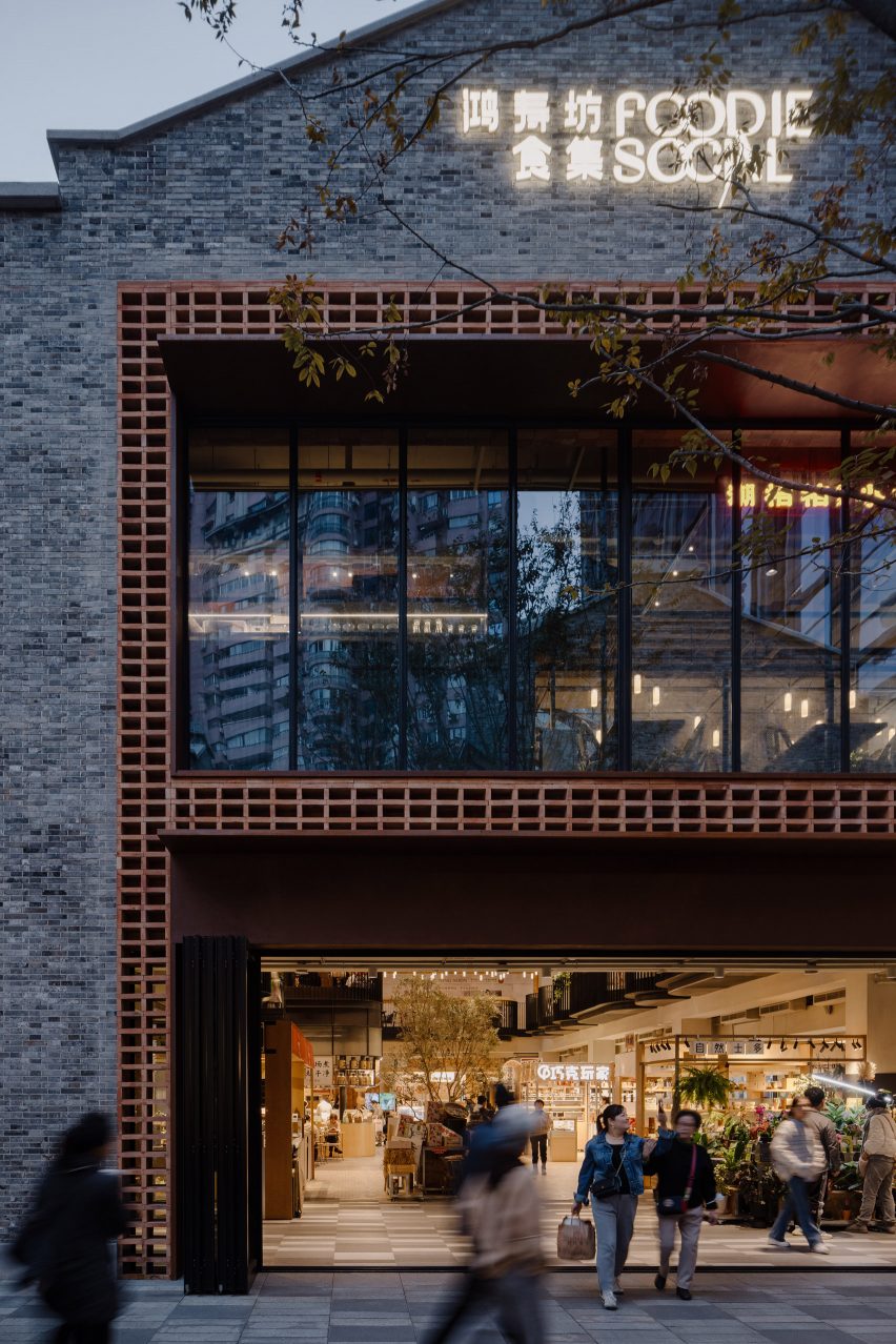
Named Foodie Social, the 2,000-square-metre food market is located within the Hong Shou Fang community – a residential area in Shanghai’s Putuo district known for its classic “longtang” laneway architecture.
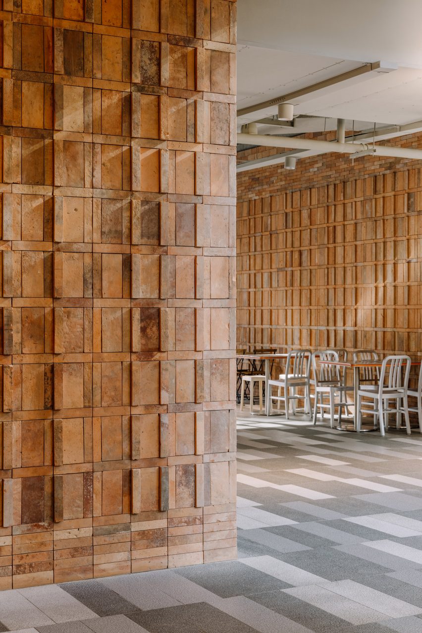
The food market is in a two-storey grey brick building in Shanghai
The entrance to the two-storey market was framed by a double-height arrangement of stacked recycled red bricks, with a corten steel canopy added to provide shelter.
The same recycled red bricks sourced from demolished houses in China can also be found on the interior walls, stacked to create three dimensional patterns.
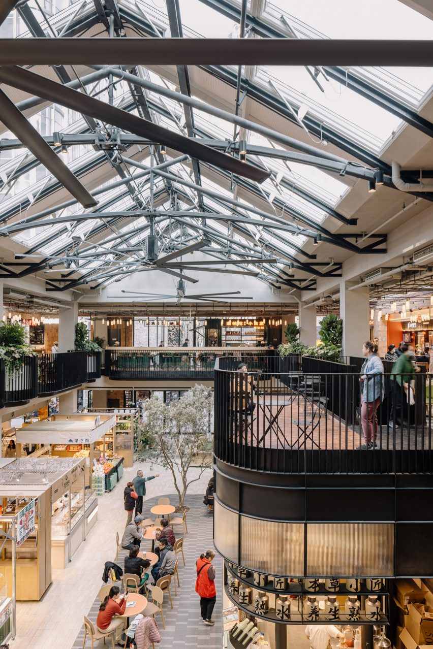
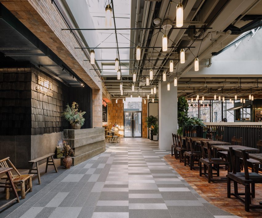
The glass pitched roof is lined with a gently curved metal truss
A large glass door can be pulled open on warm days, with patterned paving from the laneway outside extending to the interior of the market, fully connecting the interior and exterior.
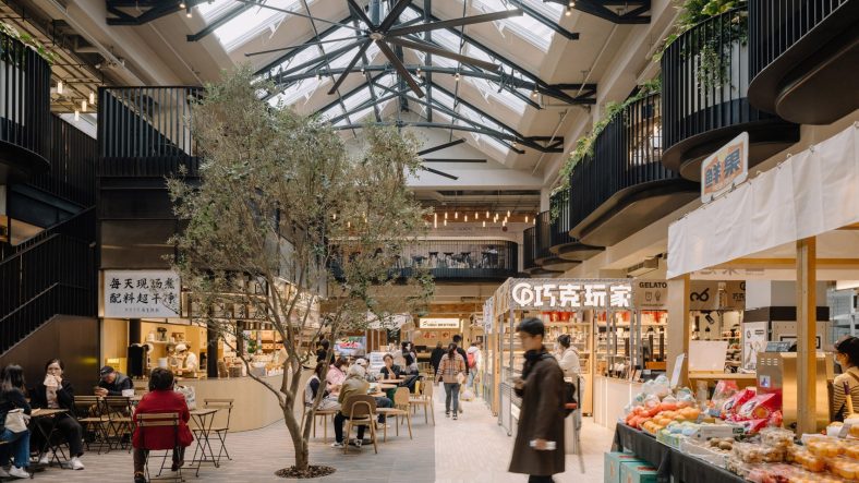
The interior of the market was designed to resemble a greenhouse, with shops and cafe’s arrranged around a central, double-height atrium.
The glass pitched roof above the atrium was lined with gently curved metal truss, in reference to Victorian greenhouses, with three large fans hanging from the metal truss to improve the air circulation.
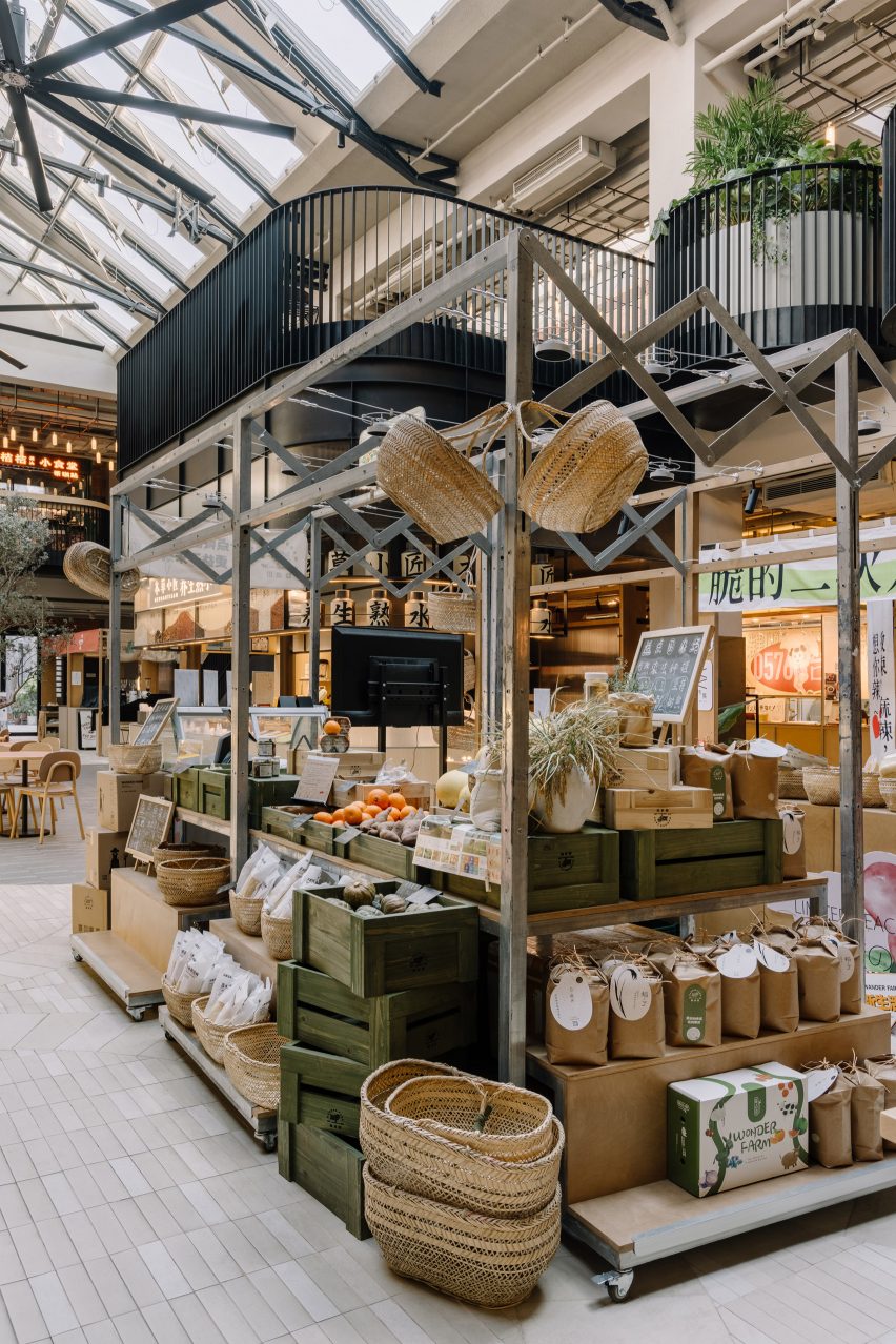
Some vendors are designed to be retractable to allow flexibility
A cafe in the atrium, which contains an olive tree planted into the ground, integrates a metal staircase that leads to the upper floor.
A area describes as a “stage” is located by the staircase with a series of undulating balconies wrapped around the atrium on the upper floor.
Various typologies of food vendors are arranged in the open atrium on the ground floor, some of which are designed to be retractable, allowing flexibility for different types of vendors as well as a large open event space to be formed at the centre.
“This new typology brings together the local with more curated food offerings in a contemporary yet humble and sustainable way,” explained Linehouse‘s Shanghai team who are responsible for the design.
Recycled red bricks can be found both on the facade and interior walls
Smaller snack shops were positioned on the ground floor, while larger restaurants occupy the upper floor.
Each stall was assembled from a kit of parts, so that the vendors are able to create their own signage and layout, but maintain a consistent material and lighting palette.
Larger restaurants are located on the upper floor
Linehouse is a Hong Kong and Shanghai-based architecture and interior design studio established in 2013 by Alex Mok and Briar Hickling. The duo won the emerging interior designer of the year category at the 2019 Dezeen Awards.
Some people find cleaning therapeutic, while others dread it. If you fall into the latter category, deep cleaning your appliances probably sounds like a nightmarish chore — a group of Family Feud survey panelists would agree.
In true Family Feud style, they asked 100 people, “What’s the hardest kitchen appliance to clean.” Here are the top six answers and some expert tips to make cleaning these appliances less of a hassle.
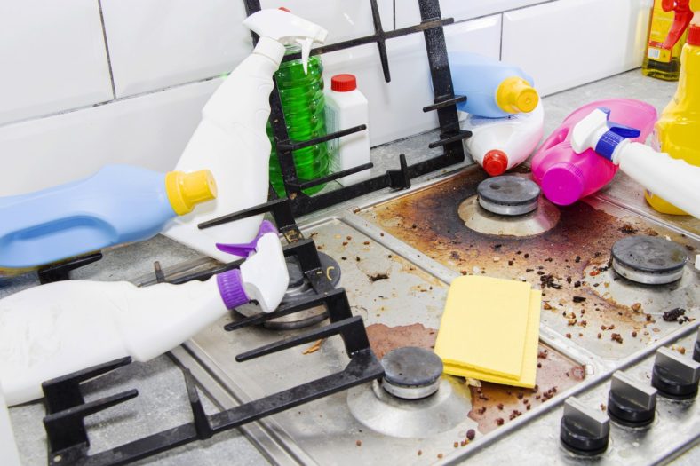
Stove/Oven (45)
Ovens get caked-on grease and burnt-on food, which is hard to clean off. Deep cleaning an oven requires special cleaners and sometimes serious scrubbing power, so it’s no wonder that Family Feud panelists named the stove and oven the hardest-to-clean appliances.
If you want to make the oven a little less difficult to tackle, here’s what to do: With the oven cool, use a vacuum attachment to suction away any crumbs or debris. Then, use an appropriate oven cleaner, like Easy Off, to break down the gunk. Spray it in the oven, allow it to sit for the proper amount of time, and then wipe it with a sponge. You’ll need to wear rubber gloves and may need to ventilate the room, but the cleaner will do all the heavy work for you.
Blender (16)
Blenders are convenient for various foods, including smoothings, purees, soups, and milkshakes. But their small, hard-to-reach crevices provide the perfect environment for mold growth.
Blenders were voted the second hardest-to-clean kitchen appliances. Make the job easier by following these steps: After blending, fill the carafe halfway with water. Add two drops of your favorite dish soap and mix for two minutes. Then, dump out the soapy water and rinse well. Wipe down the outside of the blender with hot soapy water.
Refrigerator (11)
There are a lot of shelves in the refrigerator, which equals a lot of space for sticky drink spills and food splatters. Cleaning the refrigerator isn’t hard, but is a lot of work, especially for fridges you haven’t cleaned in months.
Keep your refrigerator easy to manage by spot-cleaning whenever you notice a spill. Then, once per month, pull all food out and wipe down the interior with a mixture of half water and half white distilled vinegar. The vinegar will clean and deodorize.
Microwave (10)
In most US households, microwaves are worth their weight in gold. They are a hard-working part of the kitchen, often filled with splatters of pasta sauce, mac n cheese, and leftovers. If not dealt with promptly, food splatters in microwaves turn hard and crusty. But don’t worry; we have a foolproof method for cleaning even the dirtiest microwaves.
Start by filling a microwaveable bowl with one cup of water and three tablespoons of vinegar. Microwave the bowl for five minutes to create steam. Leave the microwave door shut for an additional five minutes so the steam can loosen stuck-on debris. Remove the bowl from the microwave and wipe the interior walls.
Toaster (8)
The toaster ranked as the fifth hardest appliance to clean. While toasters don’t succumb to grease and food splatters like other appliances, they do get filled with bread crumbs, which make their way to the counter.
The easiest way to clean the toaster is to regularly empty the breadcrumb tray. All toasters have removable trays at the bottom. Unplug your toaster, remove the tray, and empty it in the trash. Then, hold the toaster over the trashcan and shake it to dislodge the remaining crumbs. Do this every couple of weeks.
Coffee Maker (7)
Family feud panelists voted the coffee maker as the sixth worst kitchen appliance to clean. And it’s true, these small appliances can build up limescale and sludge, affecting the taste of your morning brew.
Clean your coffee maker by running a combination of half white distilled vinegar and half water through the machine — this method works for both drip coffee makers and Keurigs. To rinse, run water only through the machine three times.
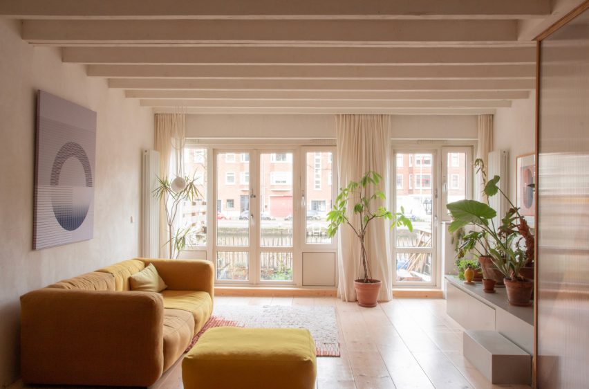
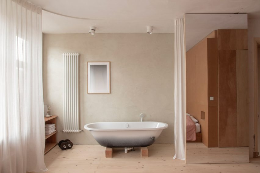
A bedroom incorporating a bathtub and a window bench is one of several versatile spaces architect Ulli Heckmann created when renovating this compact apartment in Rotterdam, the Netherlands.
Heckmann and his partner, the designer Nienke Bongers, bought the apartment in the Delfshaven neighbourhood in 2020 with the aim of refurbishing it to suit their personal tastes.
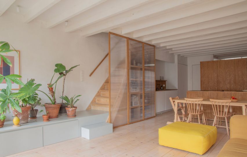
Multipurpose rooms were used to optimise space at Ulli Heckmann’s Rotterdam apartment
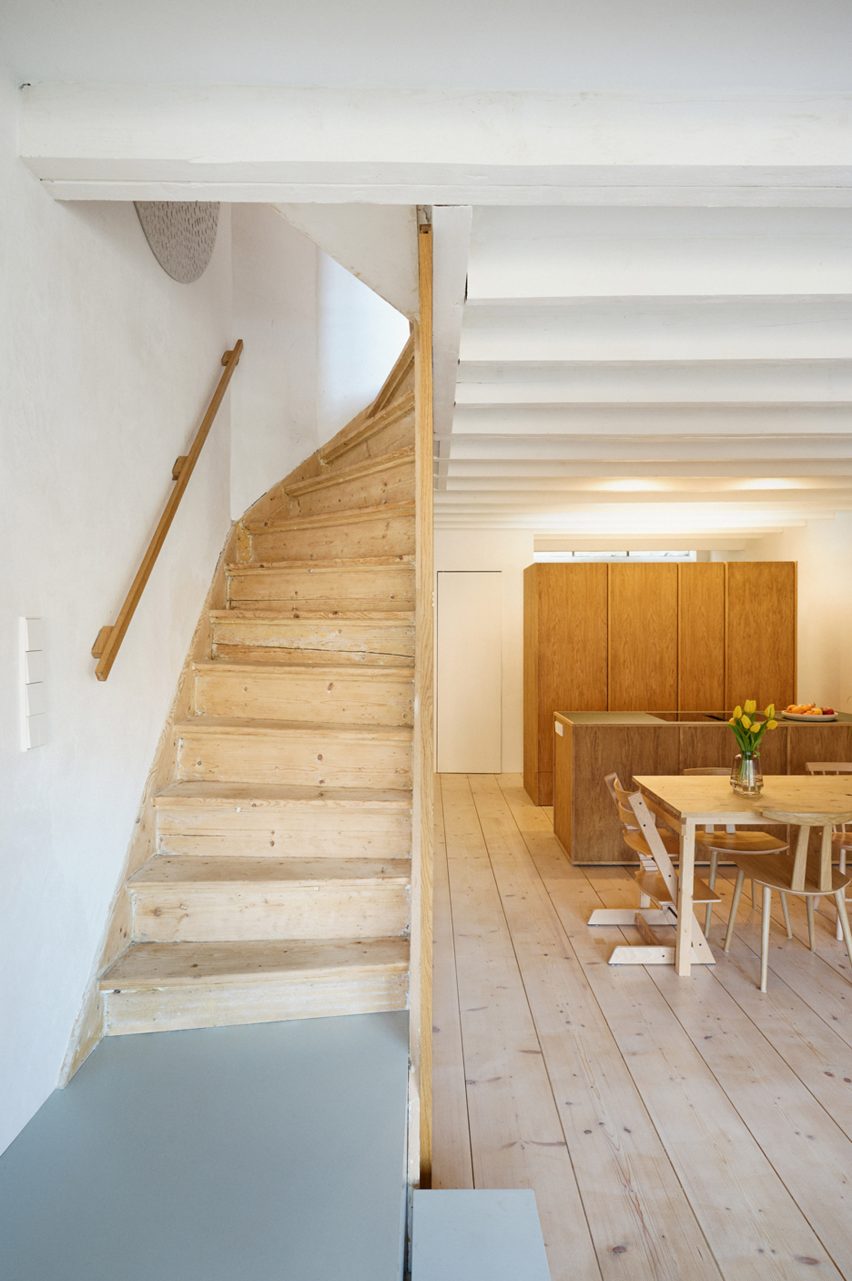
The 100-square-metre property is spread across the ground floor and basement of a brick apartment building dating from 1935 that stretches along a dike on the river Schie.
Previous renovations in the 1980s had stripped away all of the interior’s original features, so the couple decided to completely gut the spaces and rebuild them using a modern and affordable material palette.
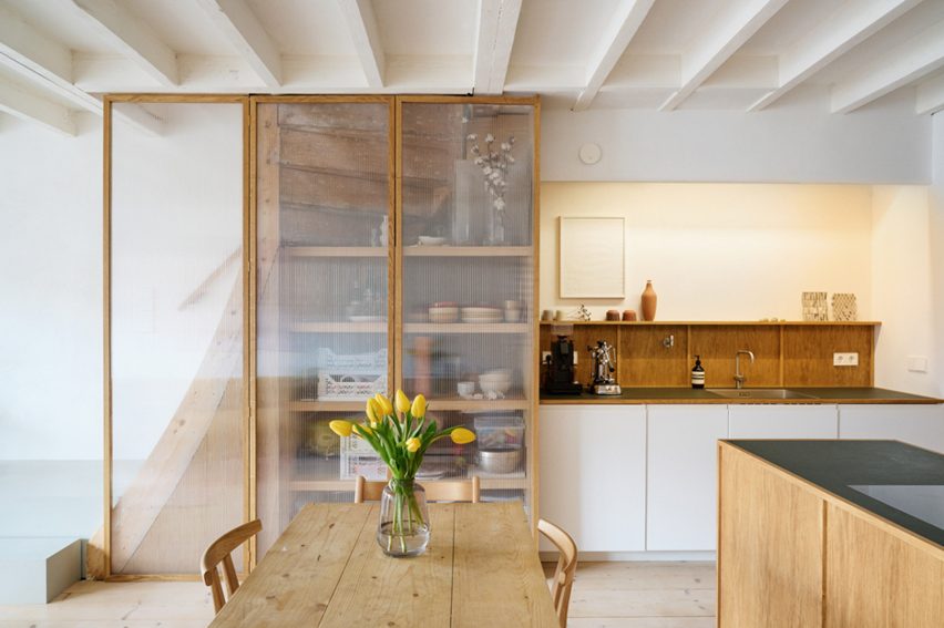
The open-plan kitchen and living area receive daylight from the garden
The existing layout did not make the best use of the garden access, so Heckmann moved the bedrooms upstairs and created a large living space below with direct access to the outdoors.
“The original downstairs plan showed one room facing the garden and one towards the street, which was quite gloomy and dark,” the architect told Dezeen.
“Since the new downstairs is basically mono-orientated, an open layout with the kitchen cupboard as a room divider seemed the best solution in terms of space with an option for privacy.”
Heckmann completely rebuilt the interior spaces using affordable materials. Photo is by Yuta Sawamura
The largely open-plan configuration creates a space for cooking, eating and socialising that receives plenty of daylight from the large windows at one end.
Freestanding cupboards screen a small private space that Heckmann explained can be used for “reading a book, inviting friends to stay over or simply drying the laundry without putting it in the middle of the living room.”
The kitchen is divided by a wooden cupboard unit for privacy. Photo is by Yuta Sawamura
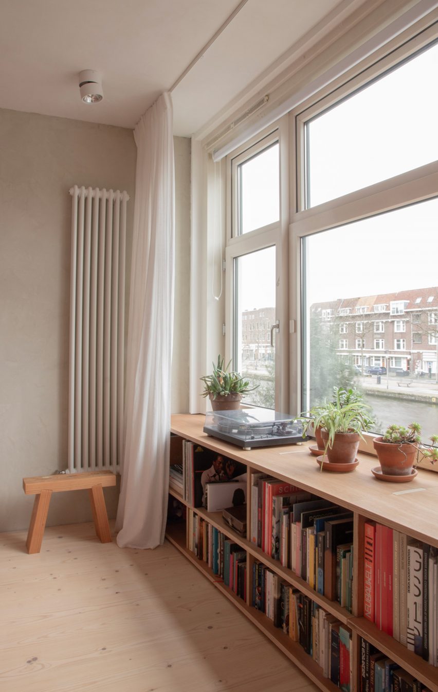
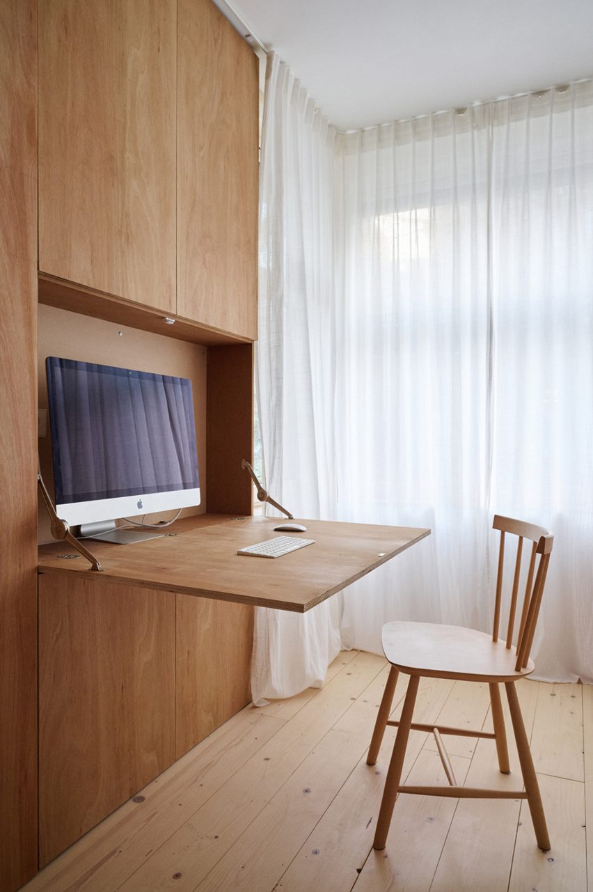
Throughout the property, built-in storage helps to optimise and organise space, allowing the interior to be used in different ways at different times. Examples include a hidden desk in the children’s bedroom and a window bench in the main bedroom.
“Most of the rooms are not limited to only one purpose throughout the day and night,” said Heckmann, “which helps tremendously for the use of the space – especially as a family.”
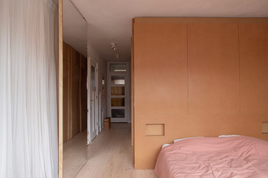
The layout of the upper floor is more compartmentalised than the basement level; however, a full-height mirrored door at the end of the hall can be left open to ensure the spaces feel connected.
The two bedrooms at either end of the plan are separated by a walk-in wardrobe and a shower room hidden behind cupboard-like doors.
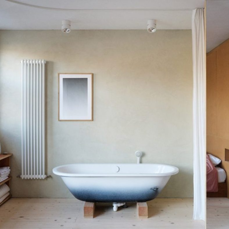
The main bedroom integrates a bathtub that can be hidden behind a curtain
In addition to the bed and window bench, the main bedroom contains a bathtub set on wooden blocks that can be screened off using a curtain.
“The need to create multifunctional spaces is one of the reasons why we decided to have the bathtub in the bedroom,” Heckmann explained. “Also, we quite like that it becomes an object in our daily life instead of hiding it away.”
Most of the furniture was built by Heckmann and Bongers with stained or dyed plywood and MDF
The couple had wanted to use natural materials where possible to completely revamp the interior, but the onset of the Covid-19 pandemic caused prices to soar and subsequent lockdowns made commissioning specialist trades much more difficult.
Heckmann and Bongers therefore designed and built most of the furniture themselves, using plywood or MDF that they stained or dyed to give the materials a more unique finish.
The bedroom shelf and the hall cupboards are made from eucalyptus plywood tinted with an earl-grey mixture, while the bedhead is MDF with a hardwax finish.
The bedhead unit is made from MDF with a warm-toned hardwax finish
Lime plaster was used on the walls throughout the apartment. The downstairs spaces were left raw and natural, while the bedroom has green pigment added to give it a subtle hint of colour.
For the kitchen, Heckmann used MDF boards with oak veneer and a countertop with a dark Forbo linoleum surface. The cupboard under the stairs features an oak frame surrounding polycarbonate panels, while the staircase podium is made from painted MDF.
A hidden desk in the children’s bedroom helps to optimise space usage
Ulli Heckmann completed his Diploma studies at the Technical University of Darmstadt, Germany, in 2006 and worked for several years for agencies in Germany and France, including Maison Edouard François.
He founded his architecture and design studio in Paris in 2013 and now works on projects across Europe, ranging from object and interior design to private housing and architectural competitions.
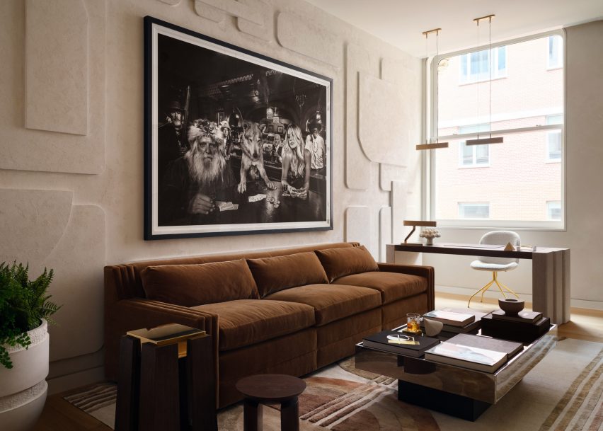
New York interior designer Timothy Godbold has renovated an apartment in a historic Tribeca building, adding various relief treatments across its neutral walls including panels influenced by a 1970s sci-fi series.
The spacious loft is located in an 1881 cast-iron building on Franklin Street, which was formerly a textile factory and was overhauled by Pritzker Prize-winning Japanese architect Shigeru Ban in 2019.
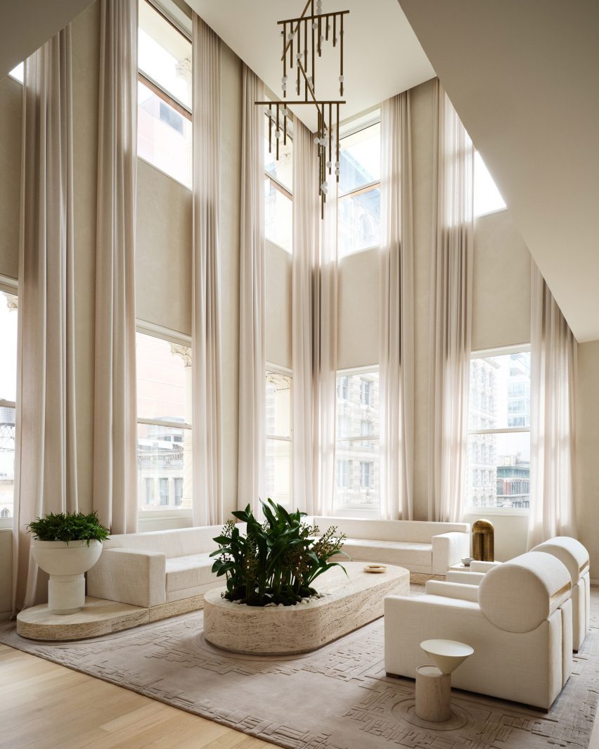
The most dramatic space in the loft is a double-height living room surrounded by windows
“The homeowners, a young family with two children, set out with the objective of creating a great home for entertaining that simultaneously utilized space efficiently to create a comfortable family living space,” said Godbold‘s team.
The designer helped to organise the layout so that it functioned optimally for the family, and despite opting for a neutral colour palette, Godbold upped the drama through the scale of the furniture and artwork.
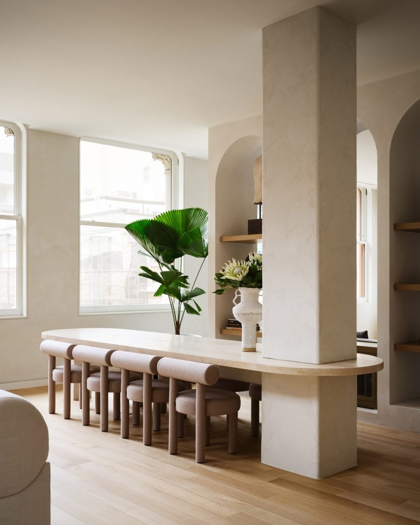
Rather than disguise a structural column, Timothy Godbold used it as an anchor for the dining table
A double-height living room occupies a corner flooded with light from windows on two sides, which can be diffused by drawing the sheer curtains.
To work around a large structural column disrupting the view to the living room, Godbold used the column to anchor a stone dining table to turn it into a focal feature.
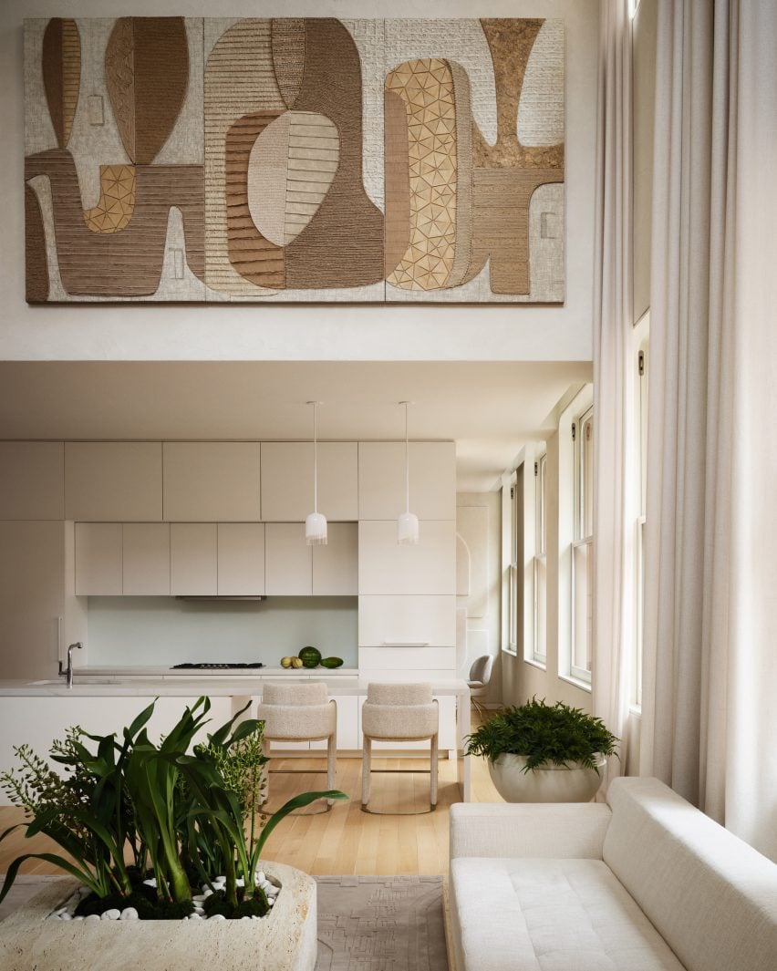
The kitchen is intentionally minimal, benefitting from the absence of cabinet and drawer pulls
The table references a 1930s design by Hans and Wassili Luckhardt and Alfons Anker, in keeping with the industrial style of the building.
The kitchen is very minimal, thanks to the omission of cabinet and drawer pulls, and includes an island with a waterfall stone top that creates space for a breakfast bar.
An area behind the kitchen was converted into a flexible office and bar space
Hidden behind the kitchen is a former TV room converted into a bar room and an office “to maximise the versatility of the space and meet multiple needs”.
The walls in this flexible room are covered in geometric plaster-relief panels, which add shadows and texture, while the furniture is darker and more masculine.
Plaster relief panels based on a 1970s sci-fi series cover the walls
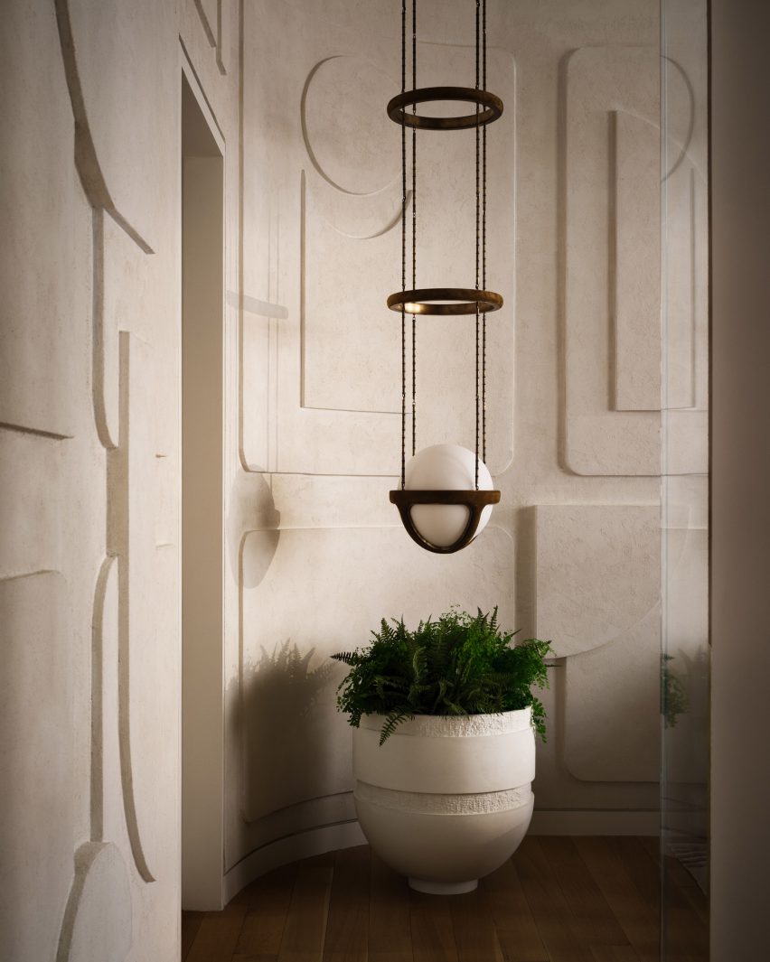
A Reprise pendant light from New York design studio Apparatus hangs in a corner that has been curved to accentuate the modernist-style wall panelling.
“The wall details in this Tribeca space are inspired by a classic 1970s sci-fi series that showcases an all-Italian modern aesthetic within a futuristic environment,” said the team.
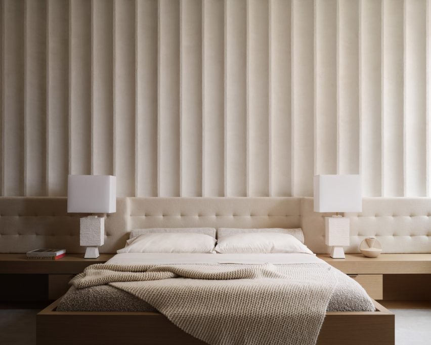
A feature wall behind the bed in the primary bedroom is fluted across its full width
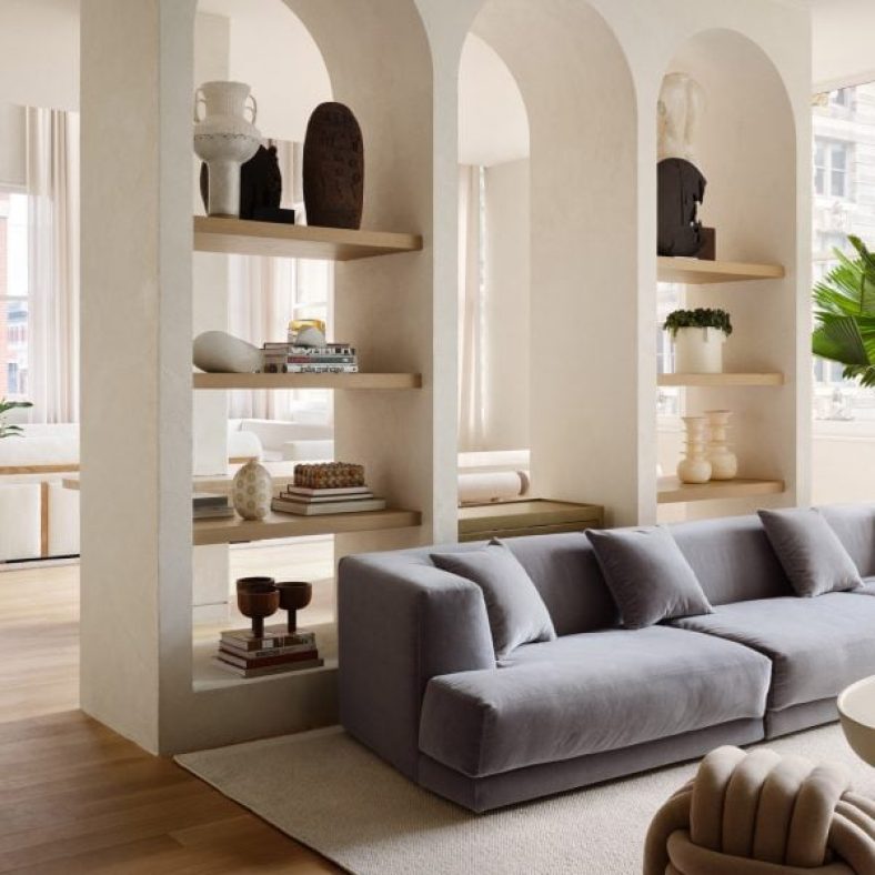
A row of plastered arched niches separates the formal entertaining areas from a more casual seating area, where a large pale grey sofa shifts the tone from the warm whites found elsewhere.
In the primary bedroom, the built-in bed and nightstands are installed below a tufted upholstered headboard that runs the full width of the room, and a fluted wall feature that extends to the ceiling.
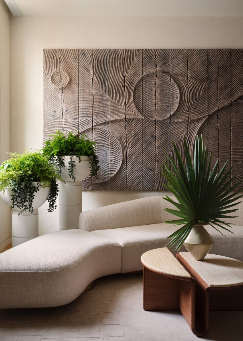
The bedroom also features a sculptural sofa, large planters and a huge artwork by Etienne Moyat
Opposite the bed is a sculptural sofa surrounded by oversized planters and a large, carved relief artwork by French sculptor Etienne Moyat on the wall.
Godbold custom-designed many of the pieces throughout the home, including most of the furniture and decorative elements.
His references included mid-century Italian designers like Joe Colombo, whose space-age shapes are echoed in the dining chairs, sofas, and smaller lighting and decor items.
Godbold also played with proportion to add drama, as seen in the living room’s custom stone sofas that are upholstered in a “brutalist” fabric made in England, and the coffee table with an integrated planter.
A variety of space-age shapes and materials can be found throughout the loft
The rugs also feature custom designs that outline the furniture in the same space.
Overall, the goal was to “marry the industrial, the art deco and the more surreal aspects of 1970s noir cult cinema for a glamorous and intriguing end product.”
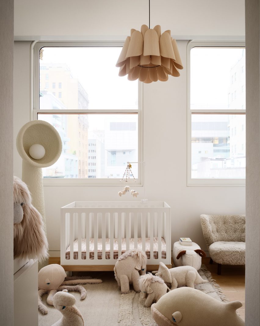
The home’s neutral colour palette continues through to the nursery
Transforming your kitchen into a space that looks more expensive does not always require a hefty budget. While some financial investments may be necessary, with thoughtful and strategic choices, you can elevate the look of your kitchen without breaking the bank. From subtle design tweaks to the incorporation of high-end materials, there are a wide range of options open to help you imagine a space that reflects sophistication and refinement.
Whether you are a seasoned decorator or an enthusiastic beginner, these tips and tricks will help you invest in creating a kitchen that reflects your exceptional taste.
Make Your Kitchen Look More Expensive
Enhancing the appearance of your kitchen can do more than just make it look better; it can also improve the way your room feels and functions. Choose ideas from among these that work for your space and budget. Integrating these design concepts with your own distinct tastes and aesthetics is the best way to proceed with updating your kitchen space.
The first tip for improving the appearance of your kitchen is free; simply clean up and organize your kitchen space more efficiently. Clutter disrupts not only the visual harmony of your space, but also its functionality and atmosphere.
Removing unnecessary items from the kitchen’s countertops and floors allows the eye to focus on key design elements and specific focal points that you can create in the room, adding to the space’s sophistication. Fewer items on display will also make the room appear larger and more cohesive.
Changing the hardware in the kitchen is an easy yet impactful way to improve the style of your kitchen. These elements can become worn and outdated over time. New hardware, including cabinet knobs, handles, faucets, and drawer pulls, plays a crucial role in defining the aesthetic of your kitchen. This choice can give your kitchen an instant visual upgrade; choose a hardware type that complements your kitchen design or one that pushes the style boundaries of the space.
Finishes like brass, gold, and nickel add brightness and a modern look. While the cost of hardware can be prohibitive, shop around for sales and less expensive options. You will also save money by completing this change yourself.
Replace or add statement light fixtures for the most prominent area or areas of the room. Certain locations in the kitchen make the most visible statement in the style of the room. This can include over an island or above an eat-in dining space. Choosing statement pendant lights or a chandelier can completely change the look of the kitchen. It is also a good way to add lights that reflect your unique personality and style.
Adding more lights will not just enhance the appearance of the kitchen; it can increase its functionality by giving it more and better quality illumination for specific tasks like food prep, cooking, and eating.
If your kitchen has outdated cabinet doors but you are not ready to replace them yet, one option is to paint them a fresh and modern color. Choose a color that reflects the mood you want to convey, as the color of the cabinetry in the room has the greatest influence on the appearance of the kitchen. Dark colors give your kitchen a sophisticated and moody vibe, whereas bright or light colors instantly make it feel more open and airy.
Before you begin this project, make sure you have completed all of the necessary preparations, including educating yourself on the types and sheens of paint that you can use and best practices for achieving high-quality results.
Natural materials such as wood, stone, and leather add texture and warmth to the kitchen’s design. Incorporating natural decorations not only connects your indoor and outdoor spaces but also makes the inside appear more vibrant yet relaxed.
This means that displaying natural items such as stoneware and wooden cutting boards will contribute to a more visually interesting and warm space. Other items, like displayed houseplants, cut flowers, and woven textiles, allow you to personalize your kitchen with even more variety and color.
A rug can be a difficult proposition in a kitchen where food and debris are constantly present, but a single, well-placed rug can have a significant impact on the look and feel of the kitchen. Choose the rug’s location carefully; find a spot where it will be visible and/or add softness to a specific area, such as where people sit or to provide comfort while they prepare food. Many rugs come in vibrant colors that can complement the colors of walls and cabinets.
Look for a rug material that is both durable and easy to maintain; wool, for example, has the advantage of being both soft and durable. Many cotton rugs are made with flat weave techniques, which makes them less dense and easier to wash when necessary. You can also opt for rugs made of polypropylene, as they are durable and easy to scrub down when necessary.
By extending your cabinets to the ceiling, you may be able to change their appearance, even if you lack the budget for a full kitchen makeover. This increases storage capacity while also giving your kitchen cabinets a more custom look. Extending your cabinets to the ceiling has additional advantages: it eliminates the awkward space between the top of the cabinets and the ceiling where dust and grime accumulate, giving your kitchen a larger and more expansive appearance.
If you have enough space to add another cabinet above your existing cabinets, this is the most versatile and appealing option. Trim and crown molding can extend your existing cabinets to the ceiling and give them a more finished look if they are near, but do not touch the ceiling.
One smart and deliberate way to improve the look of your kitchen is to display select countertop elements. When selecting your countertop decor, it is important to strike a balance between style and utility. Once you have decluttered your space, you can begin to add back.
One tip is to use a set of canisters to organize your food or to showcase items in groups on a tray, such as spices or cooking oils. Choose high-quality materials for your display, such as glass, marble, and select metal accents. For example, use a high-quality container for your dish soap and hand lotion instead of the plastic ones that come with them. Always designate spaces for the arrangement of cut flowers or greenery, and use the countertop to switch up seasonal displays such as fall foliage and fresh fruit.
Curtains are a great way to add texture, color, and privacy to the kitchen. Kitchen curtains can be more varied than curtains in bedrooms or bathrooms. Short curtains are possible in kitchen spaces; options like cafe curtains, Roman shades, and blinds can allow you to keep the style of the kitchen simple but elevate the look with quality materials like linen and heavy cotton.
Allowing in as much light as possible is usually the best strategy for a kitchen space, so heavy drapes are not usually a good choice. Yet, you can still dress your windows with custom-looking long panels that add height and elegance to the kitchen windows. Be sure to hang curtains above the window frame to visually heighten the appearance of the room.
Open kitchen shelves are a contentious topic in kitchen design. Many people appreciate their aesthetic appeal; others dislike them because they are less practical than closed cabinets, and items on display attract difficult-to-clean dust and grime.
Whether you are drawn to open shelves or not, shelves help to improve the appearance and function of the kitchen. Even a small section of tastefully arranged shelves can make an impressive visual impact in the room. A small shelf footprint will also help keep costs low.
For the most impact, select a shelf material that reflects quality and substance, such as solid hardwood or a natural stone like soapstone or marble. Display high-end or visually appealing items such as attractive cookware, cohesive dinnerware, sparkling glassware, solid wood cutting boards, and sculptural decor. Maintain an organized and consistent shelf to add sophistication to your kitchen. Add interest to shelves by strategically hanging small wall art and cutting greenery.
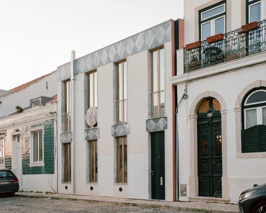
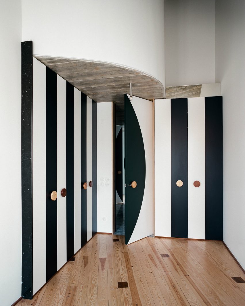
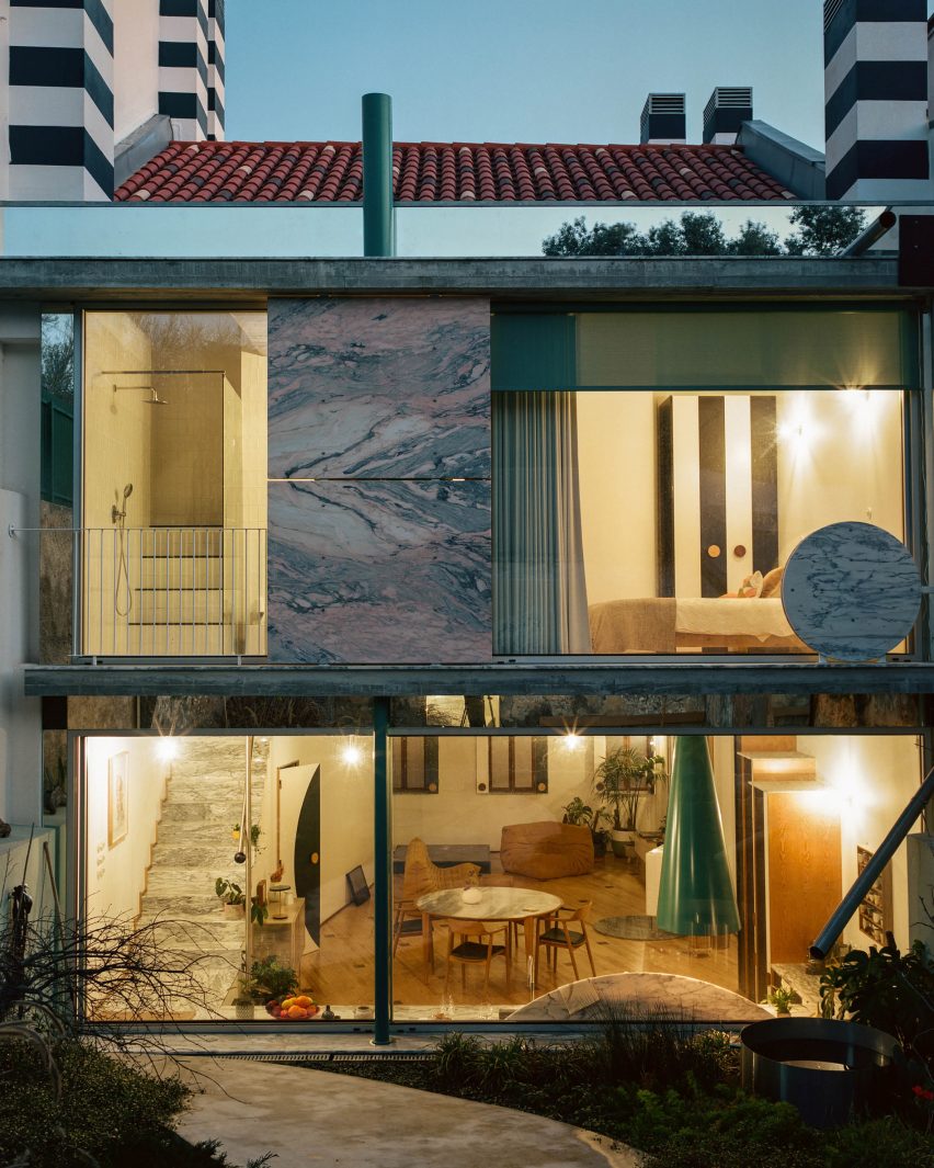
Architecture studio Fala Atelier decked out the angular spaces of the 087 house in Lisbon with oversized spots and stripes, which also feature on its bold marble facade.
Designed by Porto-based studio Fala Atelier, 087 is a three-storey home in the Portuguese capital with a rectilinear facade decorated with chunky marble shapes.
The 087 house features a facade decorated with chunky marble shapes
The studio, known for its playful use of geometry, created custom carpentry from locally sourced materials to accommodate the home’s curved and staggered walls and the sloping ceilings within the building.
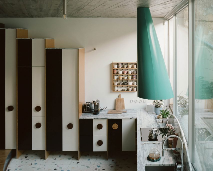
A garden-facing kitchen on the ground floor includes terrazzo flooring and stepped timber cabinetry decorated with bold black and white stripes and topped with marble slabs.
A funnel-shaped extractor fan adds an eclectic touch
Unusual features such as a funnel-shaped, teal-hued extractor fan add an eclectic touch. This Fala Atelier-designed piece can also be found in a windowless garage in Lisbon that the studio converted for a couple.
“There are no elegant extractors on the market,” Fala Atelier partner Filipe Magalhães told Dezeen.
“All of them look like nasty appliances. With the kitchen in the way of the window, we knew we would have to integrate the fan. Since we couldn’t make it disappear, we celebrated the piece,” he added.
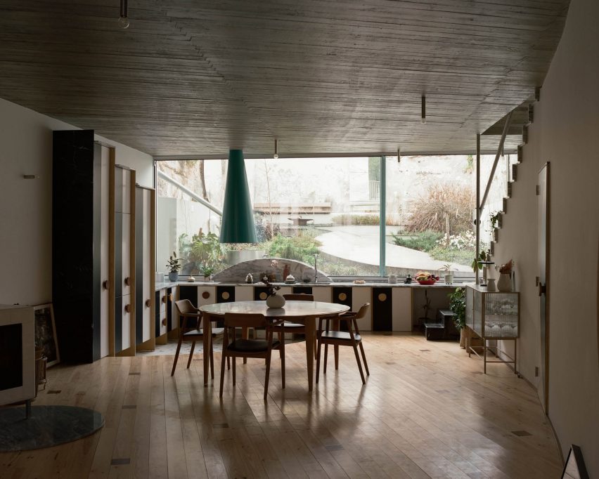
The open-plan kitchen is connected to the living space
The open-plan kitchen connects to the living area, which is characterised by pinewood flooring dotted with geometric walnut accents.
“The colours of the stripes and the dots on the floor really try to be noble,” said Magalhães.
Bespoke Fala Atelier-designed doors and window frames match the kitchen cabinets
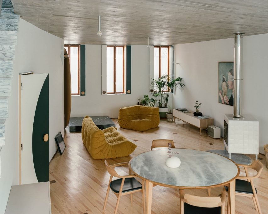
The space also features doors designed by the studio and caramel-coloured Ligne Roset Togo sofas – a quilted and low-slung design classic created by Michel Ducaroy in 1973.
This seating was positioned next to a boxy fireplace clad with gleaming white ceramic tiles and a squat display plinth finished in veiny black marble.
Custom cabinetry also features on the upper floors
“We tried to diversify the material palette as much as possible while still making it quite banal,” explained Magalhães.
“The choices are very Portuguese, but the mixture aims at being more than just that,” added the architect.
Board-formed concrete ceilings were included throughout
Upstairs, the same bespoke cabinetry as in the kitchen was used to form larger cupboards across the curved and angular private spaces of the two upper floors.
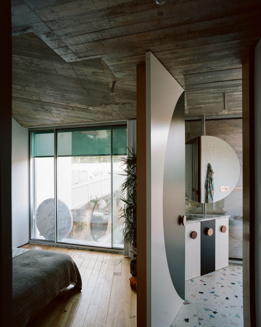
Board-formed concrete ceilings, which also feature downstairs, were paired with oversized rounded mirrors in the bathrooms and a mixture of timber and marble flooring.
The garden-facing facade follows the same geometry as its street-facing component, also featuring circular and rectilinear decorative shapes.
“This house is a lot about the relationship with the garden,” said Magalhães, noting the floor-to-ceiling glazing that connects the indoor and outdoor spaces.
087 focuses on “the relationship with the garden”
Fala Atelier has designed several homes in a similar style, including six micro-houses in Porto with geometric forms and concrete finishes and another Porto property topped with a striped concrete roof.
A kitchen remodel is one of the most expensive projects most homeowners take on, which makes material selection a big decision. To avoid your kitchen going out of style or losing resale value, it’s important to put thought behind major purchases.
Some kitchen cabinet colors come and go with trends, while others remain timeless. If you want to ensure you don’t regret your kitchen cabinet investment in five years, avoid choosing these outdated kitchen cabinet colors.
Gray
Gray was big in the early 2000s, with homeowners opting for gray walls, cabinets, and flooring. This color had its time in the spotlight, but most designers now view it as outdated. While it’s okay to choose a brown with gray undertones, avoid overly gray cabinet colors.
Bright White
White cabinets are not out of style, but bright white cabinets with white countertops are. Bright white cabinets can make a kitchen appear stark or blinding, especially in small spaces. They also show every finger smudge, blob of grease, and food splatter. If you want white, choose an off-white or cream color—just make sure the white you choose complements your countertop and backsplash.
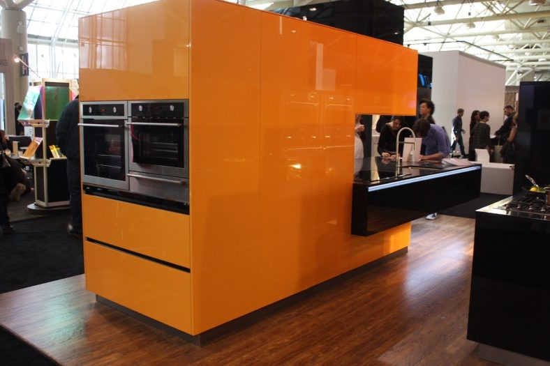
Orange Stain
Orange oak cabinets, prominent in the 1990s, are now considered one of the most outdated options. Steer clear of any orange wood stain or orange paint. It’s difficult to make orange cabinets look modern, and they could hurt your home’s resale potential.
Trendy Paint Colors
Every few years, new kitchen cabinet color trends emerge. In the past few years, dark green have been one of the most popular but are now dying down in favor of deep blue shades. You might feel like your kitchen is in style by jumping on a new color trend, but in five years, the trend may be obsolete.
Yellow
Yellow is bright and cheery, but unless you’re living in a retro mid-century modern, it’s not a good kitchen cabinet color. Save yellow for easy-to-swap accents, like wall art and cookware. Stick to something neutral on permanent finishes.
The Best Kitchen Cabinet Colors
The best kitchen cabinet colors are timeless. If you don’t want to worry about your cabinets going out of style, opt for natural wood tones and neutral paint colors. Some top paint colors include cream, taupe, and off-white. As far as cabinet style, shaker cabinets are a great option. They fit many home styles and are classic.
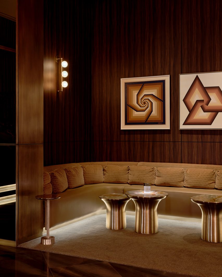
Musician Bruno Mars and design studio Yabu Pushelberg have teamed up to create the interiors of a cocktail lounge and live music venue at the Bellagio casino in Las Vegas.
Named The Pinky Ring, the 5,000-square-foot (465-square-metre) lounge is accessible directly from the casino floor, but designed as an entirely separate experience away from the bright lights, bustle and noise.
The stone bar at The Pinky Ring is surrounded by golden drapes that are reflected in the mirrored ceiling
The bar serves a curated collection of cocktails and hosts live entertainment by top musicians and DJs – though no phones are allowed inside.
A huge crystal chandelier hangs in the centre of the lounge and is visible from all corners
The entry sequence begins with a dimly lit mirrored passageway, where Mars’ collection of Grammy trophies is displayed.
“Inspired by contemporary museum design, the corridor was designed as a soothing and discreet exhibition space where guests can cleanse their visual palette from the outside world and begin to submerge into The Pinky Ring,” said the design team.
A VIP area is lined with faceted mirrored panels that create infinite reflections
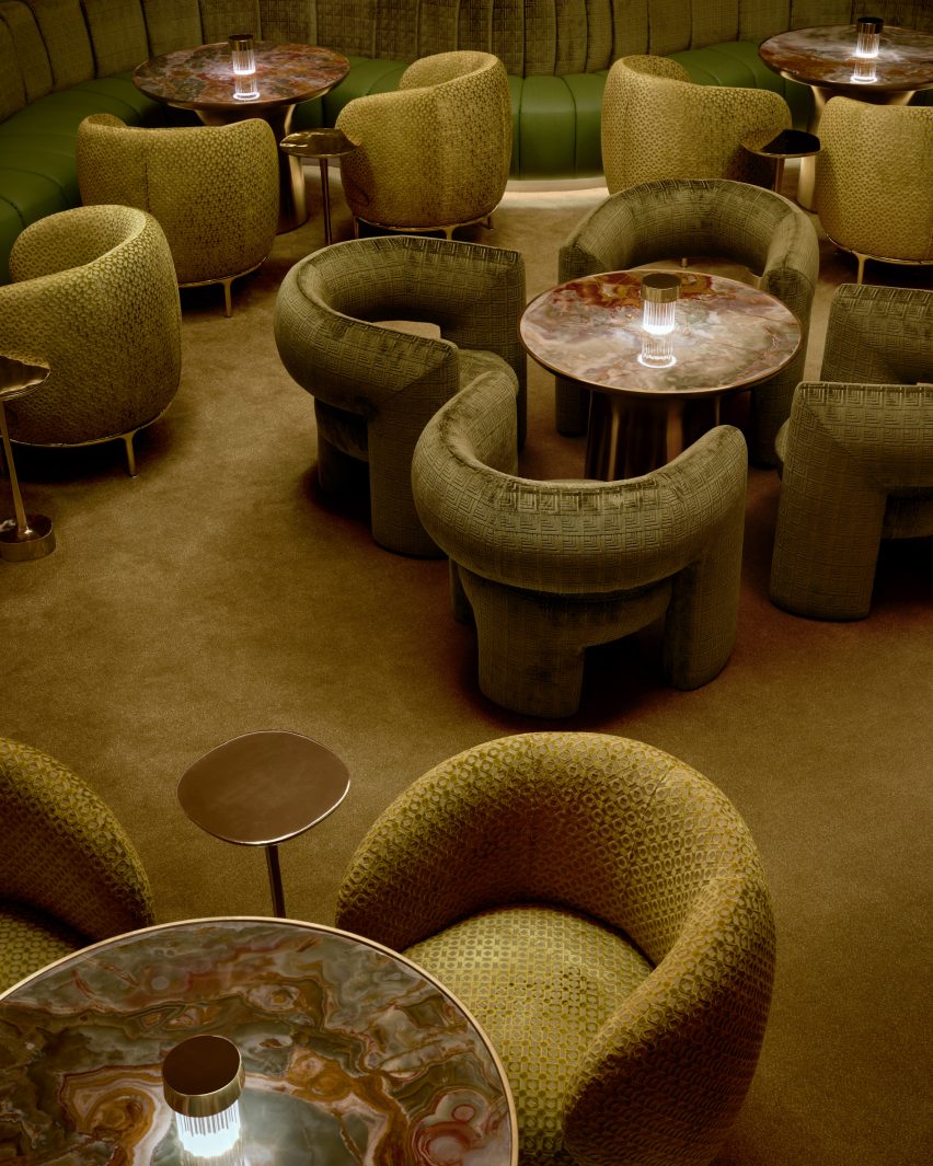
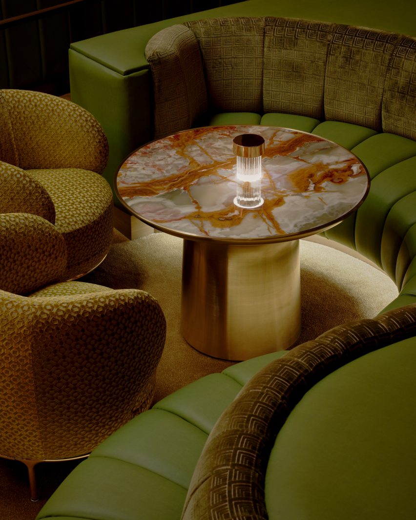
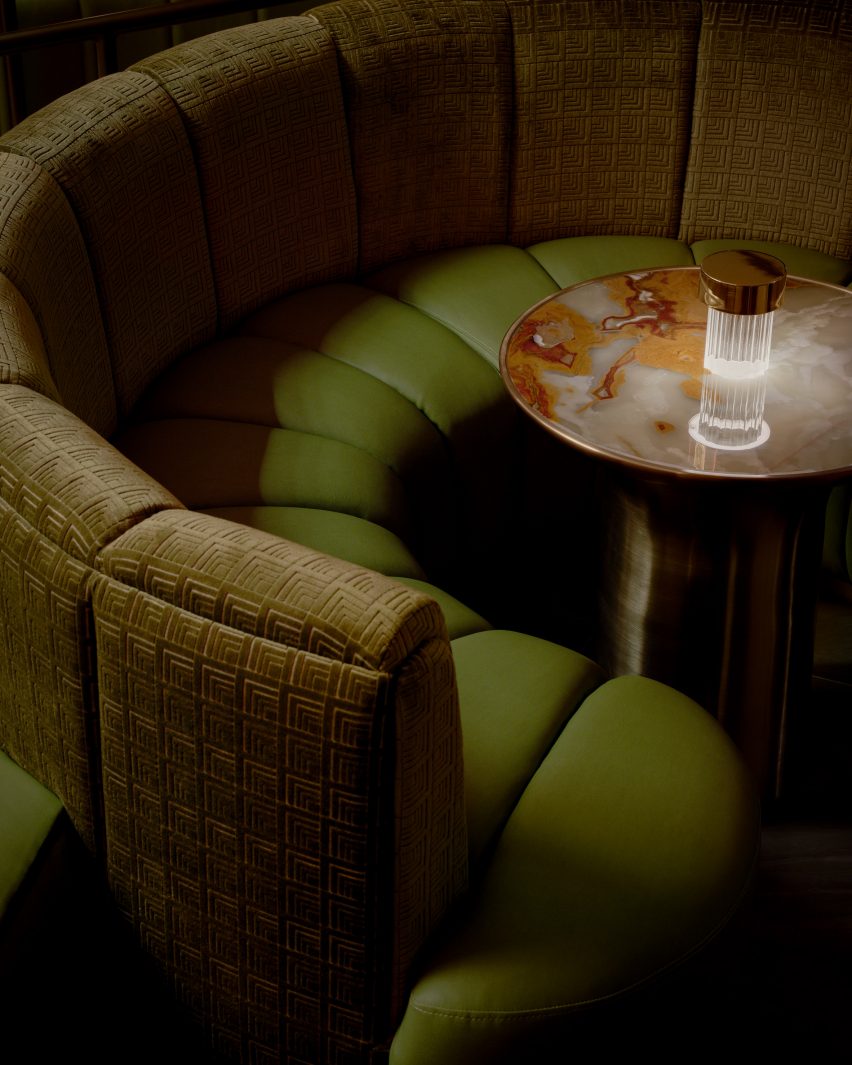
Guests arrive at the main bar and lounge in front of a sunken conversation pit, wrapped with a wavy banquette and furnished with soft armchairs gathered around a series of small tables.
The carpet, the leather and the velvet chair upholstery are shades of green – colours also found in the richly veined stone tabletops.
Other niches with additional seating feature dark wood-veneer panels
A giant halo-like chandelier with tiers of glowing crystal hangs from the ceiling above, providing a central focal point that can be seen from every corner.
At the rear of the space is a gently curved, dramatically patterned stone bar, topped with a row of metallic Flowerpot lamps by Verner Panton.
In the central conversation pit, various shades of green were chosen for the carpet, chairs and banquettes
The back bar is housed within an elongated pill-shaped, mirrored recess, which displays a wide range of liquor bottles and is ringed with stepped cove lights.
Golden drapes run floor to ceiling across the back wall and are reflected in more mirrors on the ceiling.
The green hues of the seating are echoed in the richly veined stone tabletops
Off the main lounge are various niches and VIP areas that offer additional seating, some lined with dark wood-veneer panels.
“See or be seen, each area is composed of its own suave and purpose that echoes into the next,” said the team.
One organically shaped space is lined with faceted, smokey mirrored panels that create infinite reflections, and features a banquette that wraps around a large table fitted with a giant ice bucket for chilling drinks.
An important factor in the design was the lighting, which comprises under-seat and ceiling coves, along with wall lights with five globe-shaped diffusers attached to vertical brass rods.
Patterned crushed velvet covers the curved banquette back, while the seat is wrapped in leather
“In the pursuit of perpetual allure, where lighting not only transforms spaces, but perceptions, The Pinky Ring unveils a strategic lighting innovation, schemed to make people look and feel their best,” the team said.
“Through a strategic interplay of low-level, contrast, and accent lighting, The Pinky Ring lighting design unveils the unseen.”
Pink-red stone tiles across the bathroom walls nod to the lounge’s name
Yabu Pushelberg was founded by George Yabu and Glenn Pushelberg in 1980, and the studio has designed some of the most recognisable hospitality interiors over the past four decades.
Shortlisted for Dezeen Awards 2021 design studio of the year and judges for the program in 2023, Yabu Pushelberg’s recent projects include the Moxy and AC Hotel in Downtown Los Angeles – of several they’ve completed for the Moxy brand – and The Londoner hotel on Leicester Square in the UK capital.
Outdated kitchen design rules, which once seemed unbreakable, now feel suffocating and restrictive. Gone are the days when we had to follow kitchen rules that dictated the appearance and color of the kitchen. Rules that ensure uniformity in finishes, standard layouts, and specific colors are giving way to a more personalized approach. Modern kitchen designs celebrate individuality by incorporating eclectic materials, asymmetrical arrangements, and bolder color palettes.
Functional spaces such as kitchens value versatility and adaptability over strict adherence to tradition. Knowing outdated kitchen design rules can help you break free and create a space that encourages creativity and experimentation.
We all want a kitchen design that is distinct to our home and style, but everyone is susceptible to style trends that can influence our decisions. Many of our kitchen design ideas are out of date, so it is time to take a fresh approach. Breaking these outdated rules allows for more creativity and personalization in kitchen design, reflecting your individual style and preferences.
The kitchen work triangle is a kitchen design concept that originated in the 1940s. This concept stated that the three primary work areas, the sink, stove, and refrigerator, should be designed in a triangular configuration and kept close together to maximize space efficiency.
While the kitchen work triangle remains an important concept, it is out of date for a variety of reasons. First and foremost, the modern kitchen serves as more than just a workspace. It is a busy hub of the home and accommodates many non-cooking activities. Second, this design can hamper creativity and flexibility in kitchen design. Finally, as kitchen appliances evolve and new cooking innovations are introduced, this approach has become less useful.
The necessity of kitchen islands sparks a lively debate among kitchen design professionals. Almost no one disputes the usefulness of kitchen islands; they provide an excellent space for food preparation and eating, as well as a place to hide unsightly appliances such as dishwashers and microwaves.
However, many designers want to create kitchens that are more adaptable to modern spaces and aesthetic preferences. Kitchen islands work well in large kitchen layouts, but they are less useful in small kitchens or those with plenty of countertop space. Some homeowners are opting for either small or movable kitchen islands, kitchen tables, or countertop peninsulas to occupy what used to be the space of a stationary kitchen island.
Standard counter height is 36 inches, which is a combination of the height of countertops and cabinets. While there is a case for using standard counter height, such as for resale or design consistency, some people prefer to deviate from this common kitchen design rule for aesthetic or ergonomic reasons.
If you are significantly shorter or taller than average, you may want to install lower or higher countertops. This will make food preparation more comfortable, potentially saving you from future physical problems. A unique countertop height may also work better for your space if your kitchen serves multiple generations, including children or grandparents. Customizing your countertop height recognizes that there is no one-size-fits-all when it comes to designing a workable kitchen.
Using a consistent metal type in the kitchen for elements such as hardware, lighting, and plumbing fixtures was once thought to be the key to visual harmony. Designers are abandoning this approach in favor of combining metals to create a more layered and eclectic kitchen design. Mixing metal colors such as brass, nickel, gold, and chrome can add character and depth to some kitchen designs, breaking up the monotony. It is a technique for highlighting specific visual elements while allowing others to provide background interest.
The key to mixing metals in the kitchen requires a thoughtful and deliberate approach. Use complementary pairings that work well together, like brass and nickel or matte black with chrome. Consider the proportions and distribution of the metals throughout the space to ensure that you are highlighting the features that you want to elevate in the room.
Kitchen experts are constantly praising the benefits of cabinet storage for making your kitchen look more cohesive and organized. Cabinets are unquestionably important in the kitchen, but they can also make the space feel cramped and closed off.
Instead of using upper cabinets, many designers and homeowners are choosing to replace certain cabinet sections with open shelving. Some people dislike open cabinets because they tend to collect dust and grime, but this does not have to be an all-or-nothing design element. A few open shelves in place of closed cabinets can make a kitchen feel more spacious and welcoming. This can provide you with a prime location to showcase a collection of beautiful dishes or glassware that would otherwise sit in the dark.
Other people are going without any cabinets or shelving on top altogether. This works well in large kitchens that have adequate lower storage, eliminating the need for upper storage. Eclectic kitchens are best suited for this approach, as are those with large windows or other architectural features that make upper storage difficult to accommodate.
Avoid Bold Kitchen Colors
Historically, kitchens have been designed with light and neutral colors, giving them a more classic and timeless appearance. The logic of this approach is undeniable, but it should not be applied universally because everyone’s taste is not the same. Avoiding bold colors limits creative expression and opportunities for personalization. It also fails to recognize how colors can help create a specific mood and atmosphere while also serving as an integral part of your home’s overall design.
There is a growing interest in using vibrant colors throughout the home, including the kitchen. The kitchen’s walls, ceiling, cabinets, and trim are all excellent surfaces to experiment with bold colors. Using bright colors can help you express your personality and create a more inviting atmosphere for cooking, dining, and entertaining.
Galley kitchens have had their detractors for many years. Galley kitchens became common in the mid-20th century and were characterized by their long, narrow layout, with countertops, cabinets, and appliances arranged along two facing walls. While these were once relegated to the history of outdated kitchen ideas, galley kitchens are once again becoming popular in certain types of houses.
Galley kitchens are ideal for certain home layouts due to their efficient use of space. Galley kitchens work well in small homes with limited space. These kitchens provide an intimate and cozy cooking experience that is suitable for small households. These kitchen layouts are small enough to allow the user to customize the look and design of the kitchen without having to invest as much as larger kitchen footprints.
There is a general design rule that you must never block windows, and this is an easy one to understand. After all, maximizing natural light is vital in interior spaces. This is a rule that you can break at times, but it is worth proceeding with caution. Some homeowners are extending open shelving over windows. This works well as a way to maximize your upper storage without sacrificing too much natural light. Opt for slim and organized shelves to create a design that is effective and natural.
Many homeowners and designers prefer light and bright colors in kitchen design to amplify natural light and create a cheerful and welcoming atmosphere. While this design approach is effective for many people, it is not suitable for all. This approach fails to recognize that some homes work better with dark and moody colors that complement the overall color palette of the home.
Dark colors enhance the depth, drama, and sophistication of interior spaces. They add an unexpected look to kitchens, making them both surprising and unique. Contrary to popular belief, dark colors do not make rooms appear smaller; instead, they can enhance the perceived proportions of a room. Dark colors also make an excellent backdrop for highlighting specific design elements or bright hardware, which can help make your kitchen feel more personalized. Dark shades of blue and green are especially popular today, but other colors, such as brown and black, are becoming more common.
Using matching surfaces such as countertops, cabinets, hardware, and colors was once thought to be a safe way to create a cohesive and harmonious kitchen space. This approach works well in small or modern-style kitchens but can be modified in large and more eclectic kitchen designs.
Layering different colors and materials can help give your kitchen a more dynamic appearance. Different elements are being adapted by designers for specific uses, such as introducing a variety of light fixtures to facilitate work in various kitchen spaces or employing different countertop materials throughout the kitchen for specific purposes.