Everything’s bigger in Texas… Laissez les bons temps rouler!… I reckon you’re seeking inspiration from an emerging style from below the Mason-Dixon that is sure to impress your guests. No need to run to Pinterest; we’ve got some of the best things about a southern-style kitchen right here in this blog!
There are four standard butcher block sealer options: mineral oil, an oil and beeswax combo, Waterlox, and polyurethane. The product you choose will determine how often you need to seal your countertops, ranging from weekly to up to ten years.
Why Seal Butcher Block Countertops
Butcher block counters contain several strips of wood glued together. While these counters offer a natural texture to your kitchen, they are porous, requiring sealant on a regular basis. A sealer protects the counter from absorbing liquid, staining, and growing bacteria. Sealers also offer some protection against divots.
Choosing a food-safe sealer for your butcher block is essential, especially if you use your counter as a cutting board.
How to Use Each Type of Butcher Block Sealer
The butcher block sealer you choose will affect the appearance of your counter and how often you need to reseal it.
Mineral Oil – Leaves a matte finish, use once daily for the first week and then switch to every 1-4 weeks, depending on use.
Oil and Beeswax Combo – Leaves a soft shine. Apply every week for a month and then apply every 3-4 weeks afterward.
Waterlox – Available in gloss, semi-gloss, and satin sheens. It can offer protection for up to ten years.
Polyurethane – Comes in various finishes. It can last up to 1-2 years, depending on the frequency of use.
How to Seal a Butcher Block Counter with Mineral Oil
Food-safe mineral oil works by soaking into the butcher block and creating a barrier on the surface. It’s one of the easiest butcher block sealers to apply but requires frequent application.
For a brand-new butcher block, you’ll need to apply a coat of mineral oil every day for the first week, then every week for the following month. From there, apply a coat of mineral oil every week or two to prevent your wood counters from drying out or warping.
If your butcher block counters have a polyurethane or wax coating, you must sand it off before using mineral oil. The oil can’t penetrate through a wax, Waterlox, or polyurethane coating.
Clean Your Counters
Scrape off any food residue, clean your counters, and allow them to dry. If there was a previous finish on the counters, sand it off and clean them again.
Apply the Mineral Oil
Apply a liberal amount of oil to your countertops with a lint-free cloth, ensuring you coat the entire counter and edges. Allow the oil to set for fifteen minutes, then wipe off the excess with a fresh cloth.
How to Seal a Butcher Block Counter with an Oil and Beeswax Combo
A combination of mineral wax and beeswax (also known as butcher block conditioner) will fill in small divots in the wood and leave a waterproof coating on the countertop. Many homeowners prefer a butcher block conditioner over mineral oil for dark-colored wood.
If your counter has a stain, polyurethane, or film finish, you’ll need to sand it off before applying a butcher block conditioner.
Howard’s Butcher Block Conditioner is one of the most popular oil and beeswax sealers for butcher block. It contains food-grade mineral oil, beeswax, and carnauba wax. Here’s how to use it.
Clean Your Butcher Block
Ensure your counters are free from all food debris, clean, and dry.
Apply Butcher Block Conditioner and Allow to Sit Overnight
Use a soft, clean cloth to apply the product to the countertop and edges. Allow to sit overnight, and wipe away excess in the morning.
Apply a Total of 3-4 Coats for Brand New Counters
If your counters are brand new, repeat the process, adding a total of 3-4 coats.
Reapply as Needed
When the counters start to look or feel dry, reapply one coat of the product.
How to Seal Butcher Block with WaterLox
Waterlox is a resin-modified tung oil product. It will leave a protective film on your countertops that can last 7-10 years. It’s food safe when cured but contains VOCs, so be sure to work in a well-ventilated area and wear safety goggles and a mask.
For the first coats, you’ll use the WaterLox original formula, which has a medium sheen. If you want a different sheen, such as semi-gloss, satin, or gloss, you’ll use that as your last coat.
Sand and Clean Your Butcher Block Counters
Sand your butcher block counters to remove the previous finish, then clean them with mineral spirits.
Apply Your First Coat of WaterLox
Apply the first coat of WaterLox with a soft cloth or buffing pad. Wipe off excess and allow the first coat to dry overnight.
Apply the Second Coat
Apply the second coat with a brush or pad and allow it to dry for 24 hours.
According to the WaterLox website, after 24 hours, you must dampen a microfiber pad with mineral spirits and gently wipe the counter to remove any sanding residue before moving to the next step. Allow the mineral spirits to evaporate (about 30 min) before applying the last coat.
Apply the Third Coat
For your final coat, switch to your desired sheen if applicable. Apply with a brush or finishing pad and allow it to dry for 24 hours.
Don’t use your countertops for at least 24 hours after the last coat, and continue with light use for seven days.
How to Seal Butcher Block with Polyurethane
Polyurethane forms a protective waterproof coating, preventing your butcher block from absorbing water and staining. One of the benefits of polyurethane is that you can get multiple finishes, allowing you to customize the sheen of your countertops.
Sand and Clean Your Counters
Sand your countertops to remove any previous finish. Then clean them with mineral spirits and allow them to dry.
Apply the First Coat
Use a brush to apply the first coat of polyurethane, coating the top of the counter and edges. Work fast so you don’t leave brush marks on the counter. Be mindful of drips.
Wait at least six hours before applying the second coat.
Apply the Second Coat
Apply a second coat of polyurethane with your brush. Again, don’t overwork the product or brush strokes will be visible.
Refer to the product’s package for full dry/cure time before using your countertops.
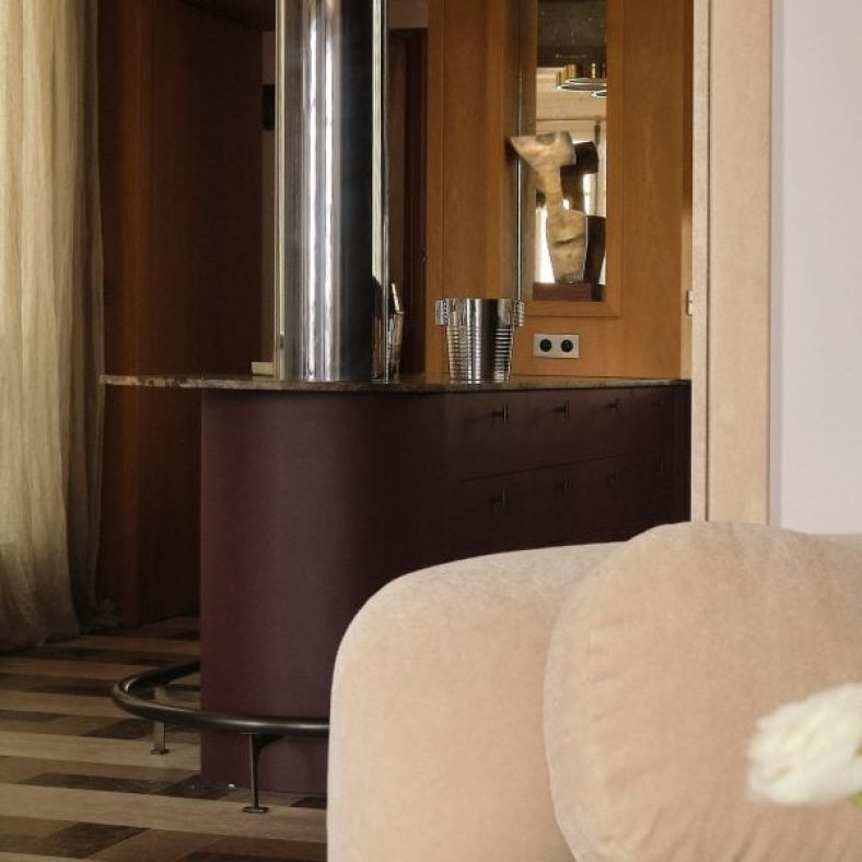
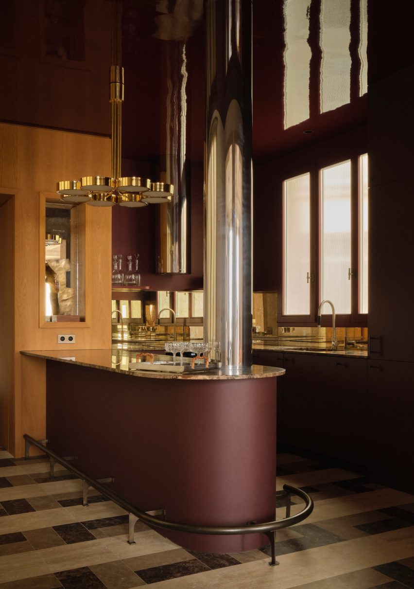
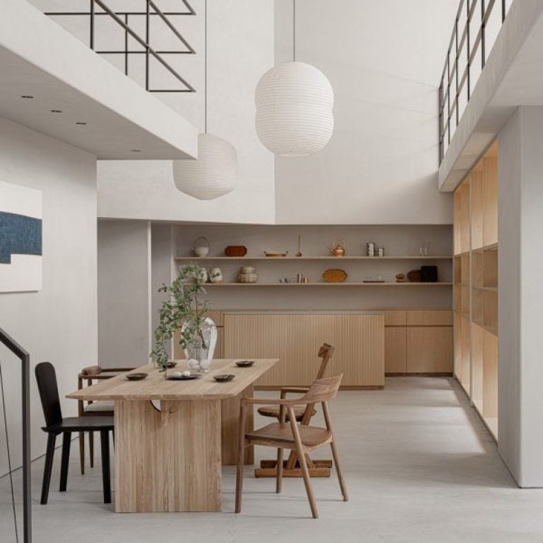
Interior design studio Hauvette & Madani has made a sumptuous wine-red kitchen the focus of this otherwise neutral apartment in Paris.
The Republique apartment is set within a typical Haussmann-era building in the French capital’s 11th arrondissement and belongs to a family with two children.
From the outset of the renovation, the clients called for the home to orbit around a “spectacular” atmospheric kitchen.
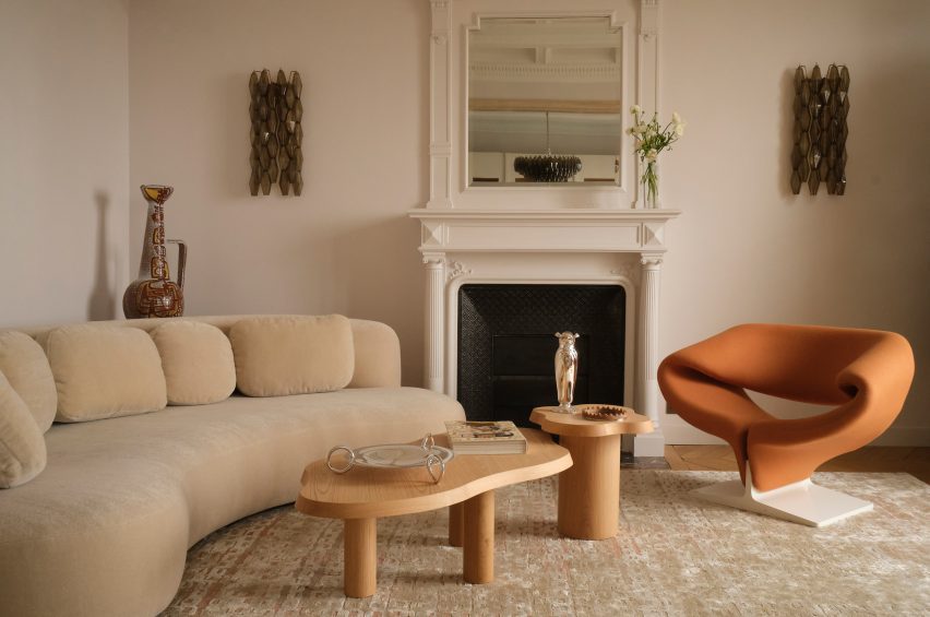
A wine-red kitchen is the focal point of the Republique apartment
Hauvette & Madani responded by using a striking colour scheme, rendering all of the kitchen’s linoleum cabinets and its curved breakfast island in a wine-red colour. The same shade was also applied to the ceiling but in a glossy lacquer.
“We wanted a dark but joyful colour and ended up deciding on this substantial red,” founders Samantha Hauvette and Lucas Madani told Dezeen. “We also love the fact [the colour’s] eccentricity matches the rest of the calm and soft apartment.”
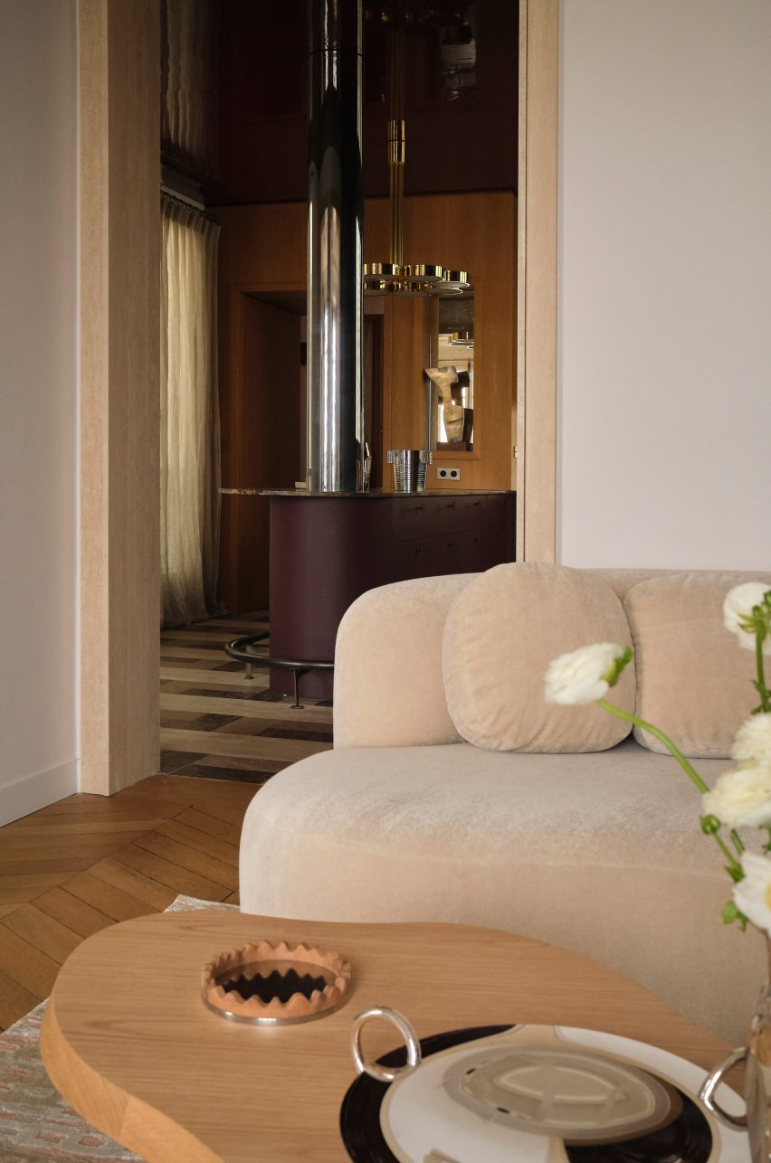
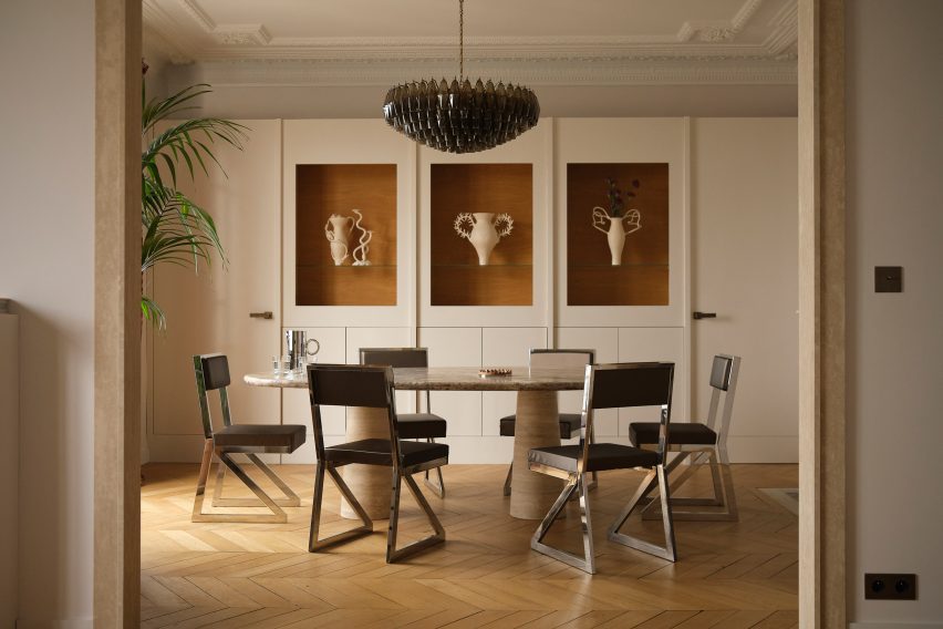
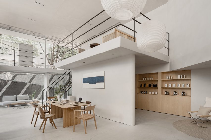
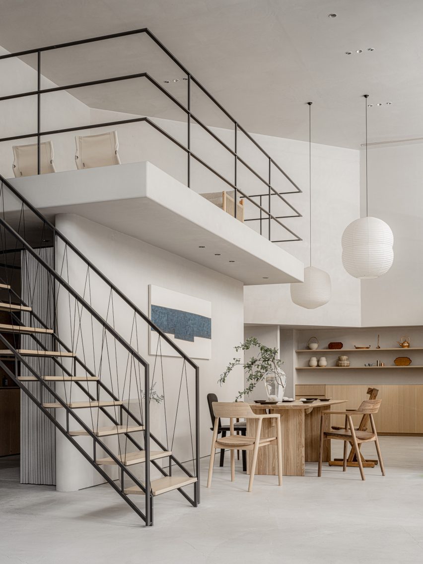
Spaces are connected by travertine-framed doorways
Lustrous decorative elements such as an aged-mirror splashback and brass light were also introduced to the space, and a support column was wrapped in stainless steel.
The room’s original wooden flooring was overlaid with travertine and Emperador marble tiling.
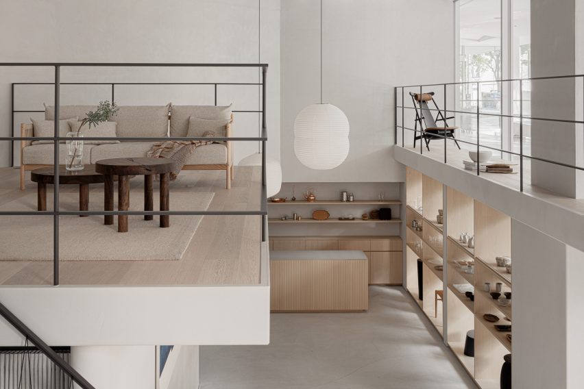
Shades of beige can be seen throughout the living room
A travertine-framed doorway looks through to the adjacent living room, where walls were painted an oatmeal beige, matching a bean-shaped velvet sofa from French brand Pierre Augustin Rose.
A pair of wriggly-edged oak coffee tables and a terracotta-coloured edition of French designer Pierre Paulin’s Ribbon chair were also used to dress the space.
The dining room next door is centred by an oval travertine table, around which steel-framed leather seats have been arranged. At the rear of the room is a tall white dresser inset with oak-lined niches where ornaments or artworks can be displayed.
A Murano glass chandelier hangs from the ceiling, where ornate moulding was carefully preserved.
The nearby dining room has a travertine table at its centre
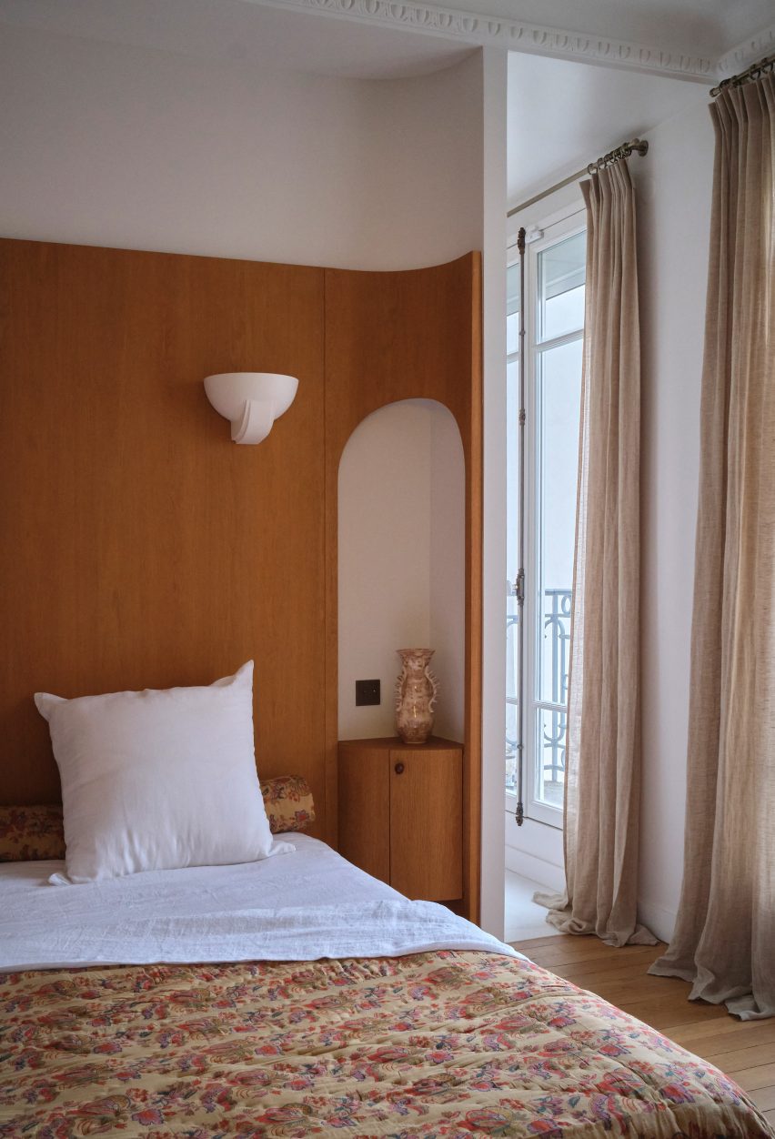
The project also saw Hauvette & Madani refresh the parents’ bedroom, which now features 1930s-style lighting and a bespoke oak headboard. This winds around the back of the room and has arched cut-outs that accommodate bedside tables.
A walnut-wood vanity cabinet and vintage Italian mirror were also fitted in its en-suite bathroom.
A bespoke oak headboard was installed in the parents’ bedroom
Often considered the heart of the home, the kitchen is where architects and designers enjoy getting playful with colour.
Other examples include the kitchen inside Sans-Arc Studio’s Plaster Fun House, where a pink terrazzo breakfast island contrasts duck egg-blue cabinetry.
For our latest lookbook, Dezeen has selected eight examples of rustic yet contemporary interiors, including but not limited to an apartment in Sao Paulo and a Tuscan boutique hotel.
Rustic interiors have a strong focus on natural and aged materials as well as traditional wooden or stone furnishings.
These material choices are often used to create a homely and welcoming atmosphere that is somewhat reminiscent of a farmhouse style.
From an inn with nautical-leaning decor to a mid-century home in Joshua Tree, here are eight examples of how interior designers are bringing rustic design tropes into the 21st century.
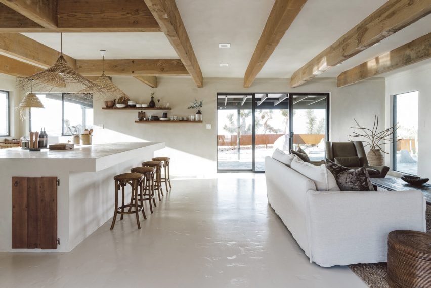
Los Angeles interior design studio Mini Inno renovated this mid-century ranch-style home in Joshua Tree National Park and converted it into a holiday home.
The studio opted for a neutral interior scheme that serves as the background for various wooden furnishings and fixtures.
Wood beams were left exposed across the ceiling of the living area while wooden barstools, shelving and cupboard doors are contrasted against the white-painted walls and floors.
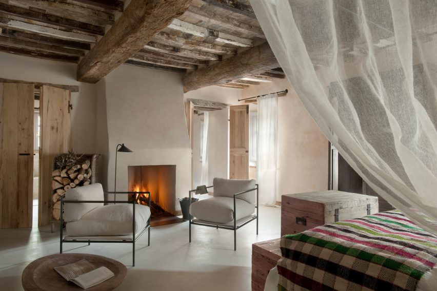
Located in a hamlet in Val d’Orcia, a UNESCO World Heritage Site in Tuscany, Monteverdi Hotel was transformed from a crumbling building to a 29-room hotel over a 14-year renovation.
Materials and finishes throughout the interior were chosen for their textural quality and walls feature uneven surfaces with indents and niches. Salvaged wood was used for ceiling beams, timber archways and closet doors, which were constructed from old farm doors.
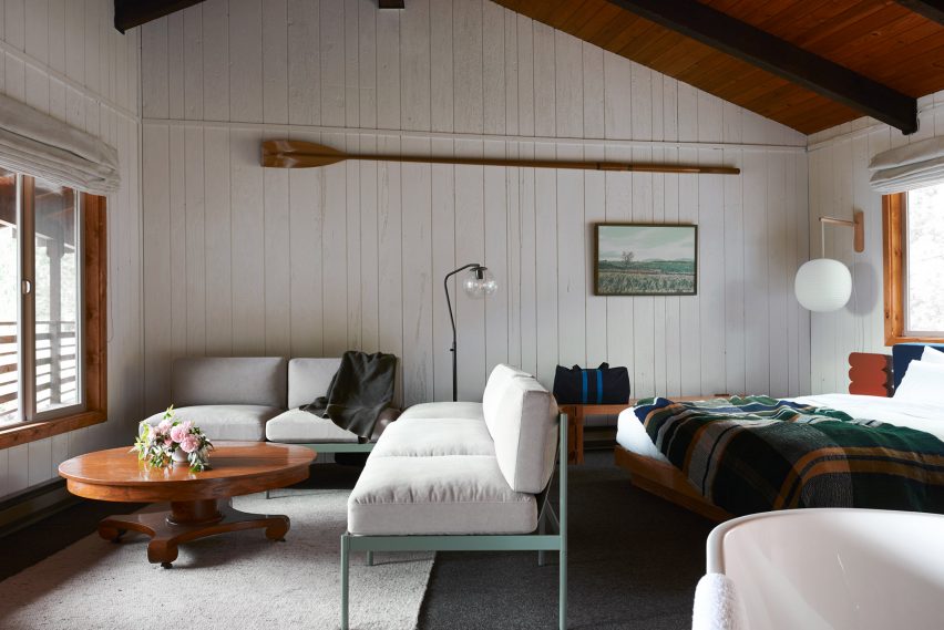
Mike and Matt French collaborated with friends and local designers to update this historic inn on Widbey Island near Seattle.
The team renovated the property, which was built in 1907, and decorated the interior with a contemporary yet rustic approach with subtle nautical influences. Wood panelling in various shades was used across the interior and paired with timber furnishings.
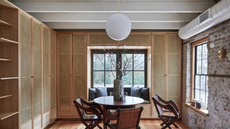
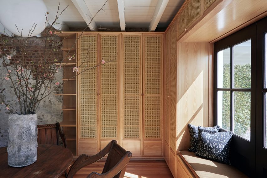
This home is set inside a converted kitchen house in South Carolina – a small outbuilding that was originally used to prepare food for the main residence.
Workstead decorated its interior using an imperfect approach that saw the US studio make a feature of exposed, paint-splattered brickwork and crumbling plaster walls.
In one of the home’s living areas, cypress and woven cane cabinets with an integrated window seat were built around a window, extending from the wooden floors up to the white-washed ceilings.
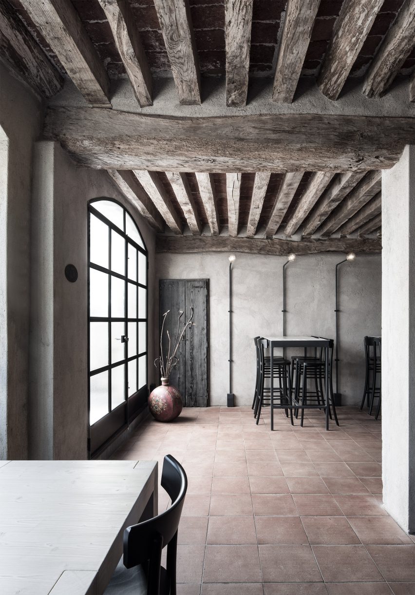
A material palette of plaster, timber and iron defines the rustic interiors of this restaurant in Brescia, Italy, which was designed by interiors practice Studio Mabb.
The former farmhouse dates back to the 16th century and was renovated to have a simple aesthetic with earthy components. Large wooden beams stretch across the ceiling above a tiled floor and grey-washed walls while dark wood and iron furnishings complete the moody atmosphere.
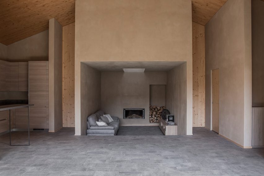
At this home on Lake Como, which was informed by Japanese architecture, materials were chosen for their likeness to the surrounding nature and the vernacular architecture of the historic village of Dizzasco.
Textural wall finishes in earthy tones and stone-lined floors were combined with exposed wooden ceilings, pine skirting boards and doors in an effort to reference the rustic look of traditional tea houses.
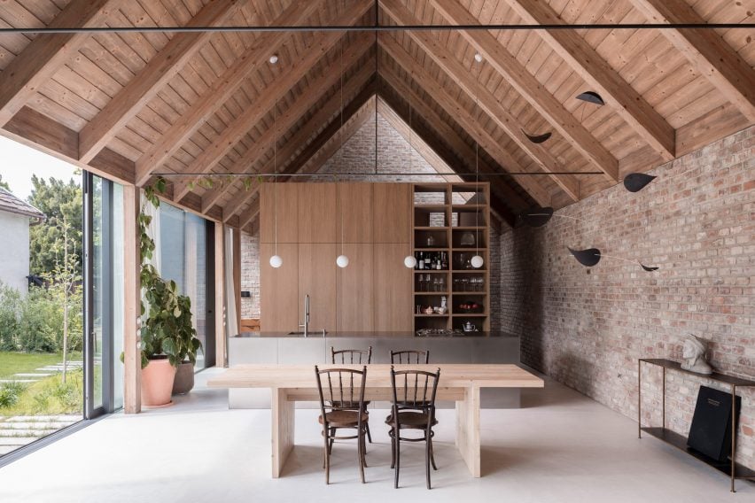
Slovakia-based architect Martin Skoček used salvaged and time-worn materials in the interior of this gabled home near Bratislava.
Bricks walls are exposed in the open-plan living area at the centre of the home beneath a wood-gabled ceiling that spans the entire length of the space.
Contemporary additions such as a steel breakfast island and oak storage wall anchor the kitchen area, providing a contrast with the raw brick walls and wooden ceiling.
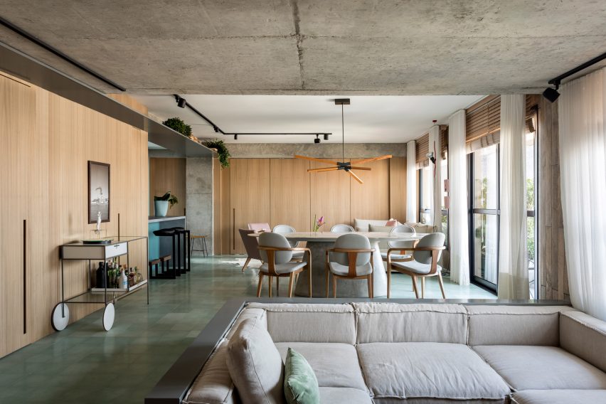
Brazillian studio Nildo José Architects highlighted many of the existing architectural features when renovating this two-bedroom apartment in a condominium tower in Sao Paulo.
The interior scheme draws on a more contemporary idea of rustic, using exposed concrete elements combined with bleached wood and glazed tiles.
“The kitchen is open and funky, blending rustic and modern with colours, design and materials,” the studio said.
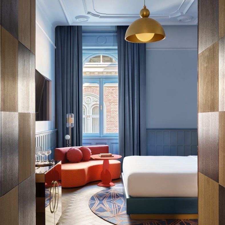
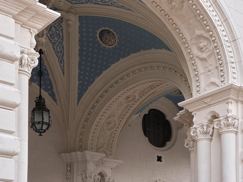
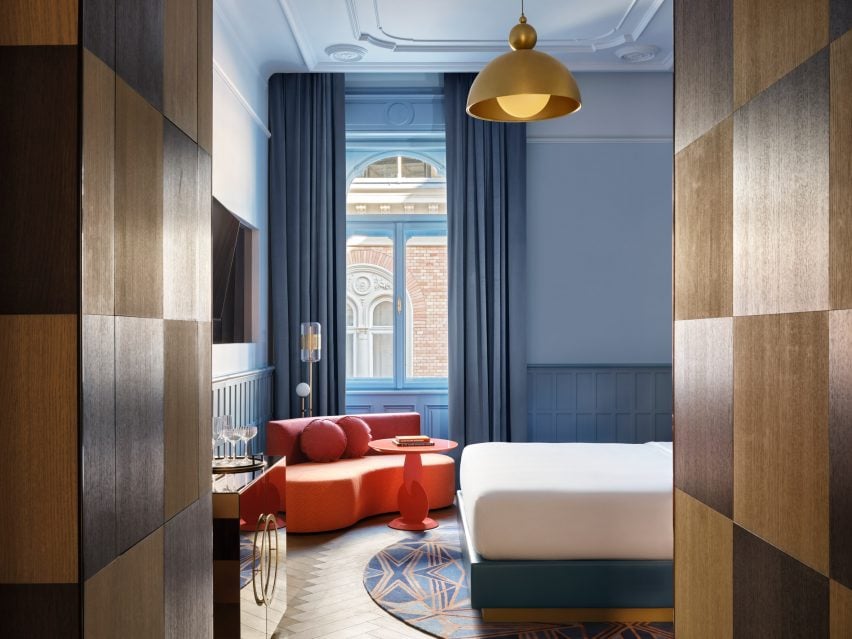
Interior design studios Bowler James Brindley and Bánáti + Hartvig have transformed a 140-year-old neo-Renaissance building in central Budapest into the latest outpost from hotel chain W Hotels.
W Budapest is set inside the 1886 Drechsler Palace designed by architects Ödön Lechner and Gyula Pártos, previously home to a grand cafe and the headquarters of the Hungarian State Ballet Academy.
Bowler James Brindley and Bánáti + Hartvig have renovated Drechsler Palace
Working with local studio Bánáti + Hartvig, London-based Bowler James Brindley (BJB) wanted to draw out the glamorous history of the building, which had stood empty for 15 years before being acquired by W Hotels’ owner Marriott International.
BJB aimed to “playfully modernise” the interiors while drawing on the architecture of the surrounding area on Andrássy Avenue – a UNESCO World Heritage site that’s also home to the Hungarian State Opera House.
The building now houses the 151-room W Budapest hotel
Alongside 151 rooms and suites, the building now houses a restaurant, lounge, spa and speakeasy.
“The challenge from the outset was not to be overawed by the beauty and strength of the building,” BJB partner Ian Bayliss told Dezeen.
“Many original details of Drechsler Palace were studied and re-imagined, as were original colours and textures. Protected architecture has been carefully restored and celebrated, and original glazed tiles have been reused.”
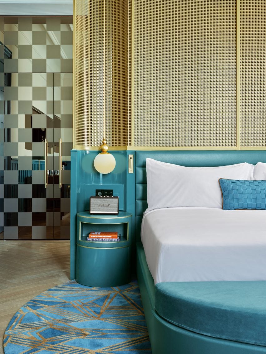
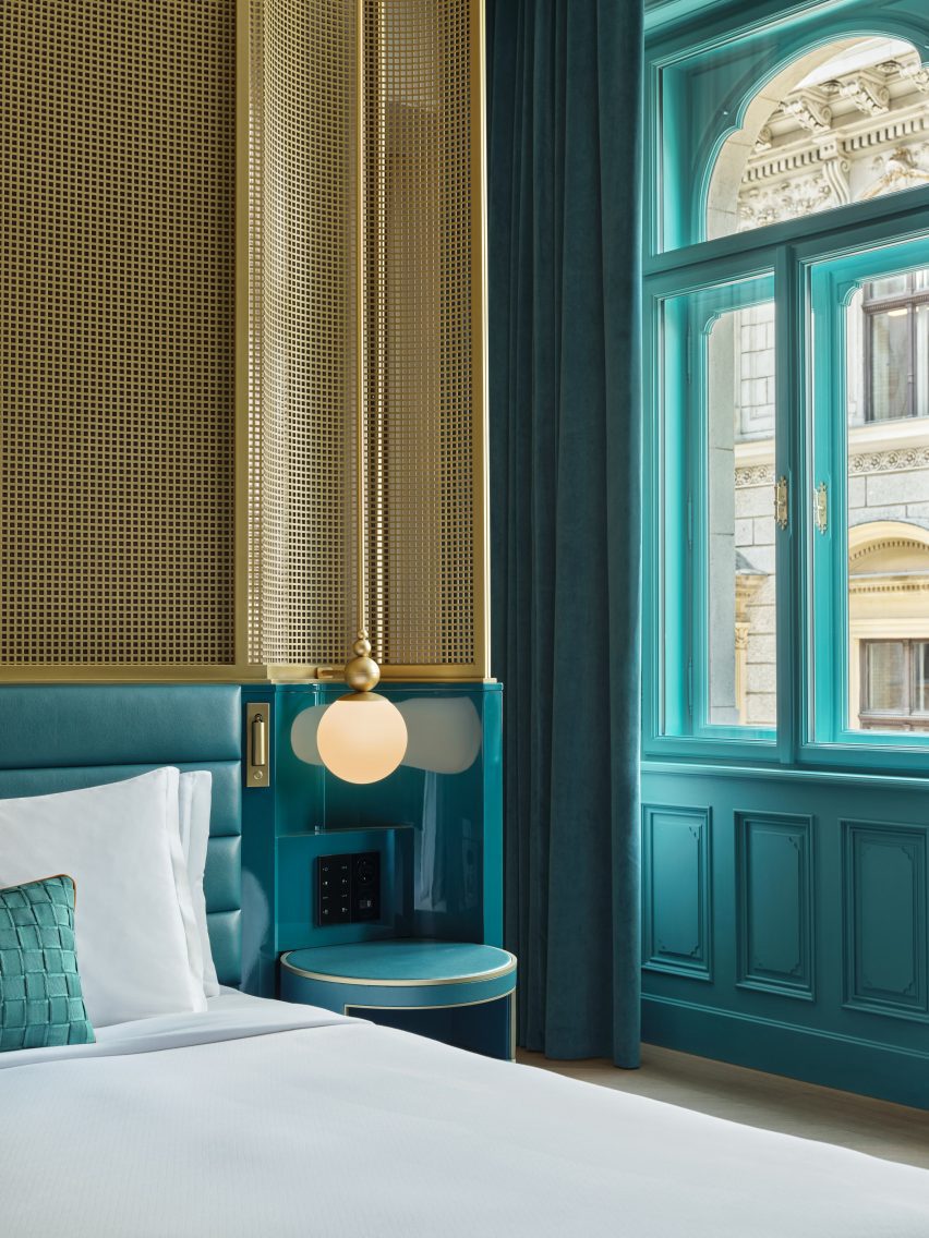
Gridded metal screens surround the beds in the guest rooms
Central to BJB’s conversion was the re-establishment of the palace’s two original entrances. This allowed the studio to free up the spaces bordering Andrassy Avenue and create a “living room” within the building’s light-filled inner courtyard, which has been enclosed by a glass roof.
Tasked with modernising the building’s interiors while adhering to heritage protection rules, BJB made what it calls “second skin” interventions, which included the creation of new “corridors” within the palace’s ornate arches using freestanding, fret-cut installations.
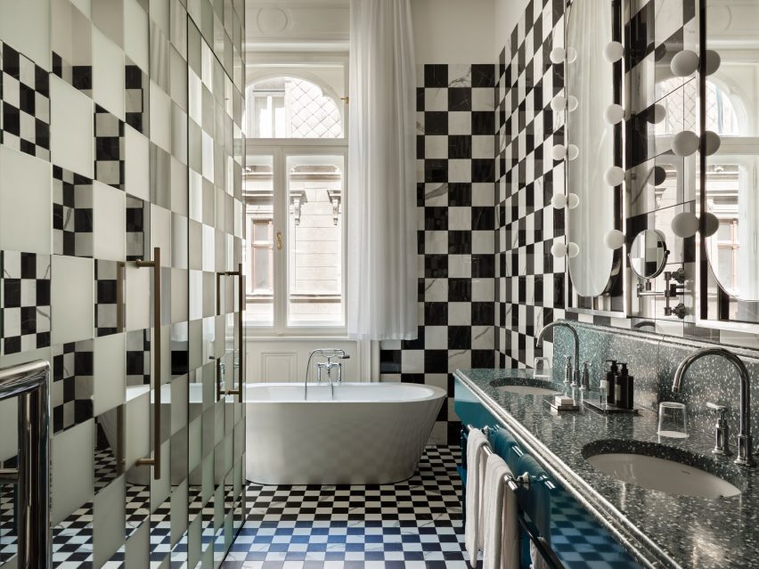
In the bathrooms, checkerboard tiles reference Hungary’s affiliation with chess
“We wanted to respect the fabric and ‘skin’ of Drechsler Palace so we set about designing spaces, which created a new atmosphere while not touching the beautifully restored fabric,” Bayliss explained.
The studio took the same approach to the restoration of the palace’s vaulted basement spa, which uses “Houdini-inspired” mirror illusions to create a feeling of never-ending space.
Curving bronze metal installations follow the vaulted ceilings, while dimly lit treatment rooms were inserted within the natural spaces left by existing columns.
“In homage to Houdini, the treatment rooms are completely mirror-clad and essentially disappear, literally reflecting the existing architecture and the new second-skin installations,” Bayliss said, referencing Hungarian-born magician Harry Houdini.
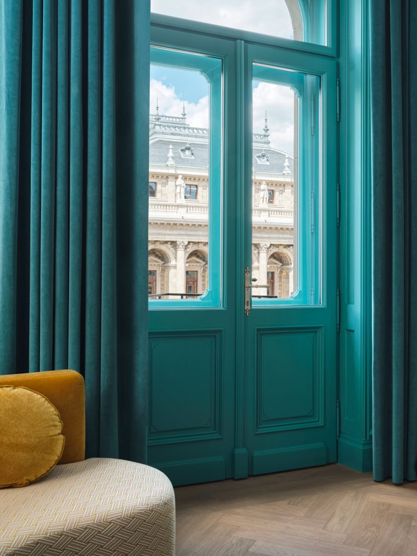
Turquoise wall panelling is contrasted with gold-toned details
In the guest rooms, turquoise wall panelling is contrasted with the gold-toned screens that wrap the beds, while mirrored checkerboard doors with brass details nod to Hungary’s long ties to the game of chess.
The chess theme continues in the bathrooms, where monochrome checkerboard tiling is offset by handmade terrazzo-lined double sinks and lightbulb-framed Hollywood mirrors that pay tribute to Hungarian-American socialite Zsa Zsa Gabor.
“The combination of a beautiful free-standing French Renaissance-inspired building by a famous local architect with a modern, idiosyncratic interior inserted into it could only happen in Budapest,” Bayliss said.
The hotel opens later this month
Set to open later this month, W Budapest follows the opening of the brand’s Rome outpost in 2021.
It all starts with an idea, solving a problem or addressing a concern. This is exactly what JT Norman, design expert at Kitchen Magic, wanted to accomplish. A big part of design is constantly trying to push the envelope and see what’s possible. In an ever-changing landscape, what’s next? And what are the ways you can contribute to influencing the course?
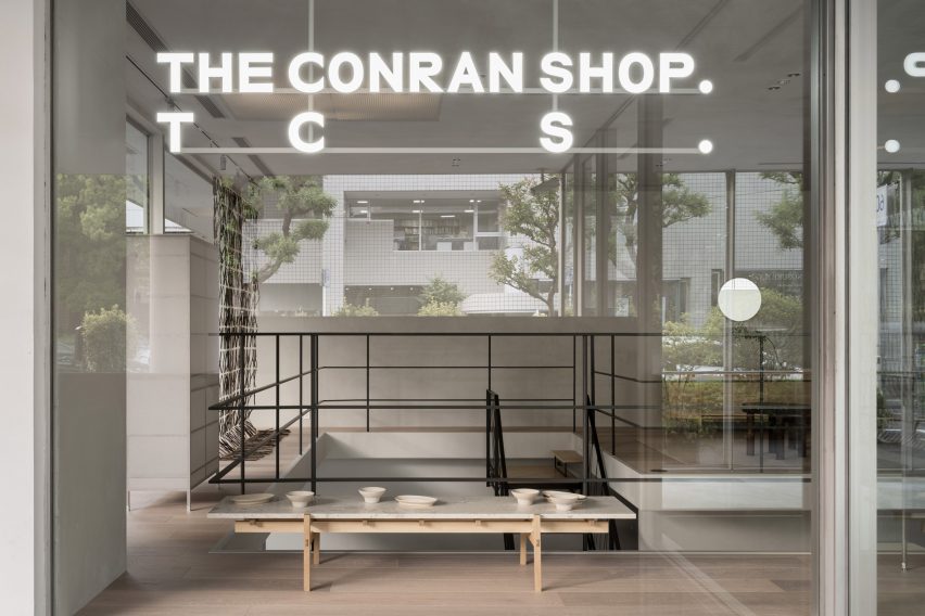
Designer Keiji Ashizawa has devised the interiors of The Conran Shop Daikanyama in Tokyo, which is located inside a building by architect Fumihiko Maki and spotlights products from Japan and Asia.
The latest outpost from British retailer The Conran Shop is located in the modernist Hillside Terrace in Daikanyama, a quiet area close to the Tokyo city centre.
The complex was designed by Pritzker Prize-winner Maki and constructed between 1967 and 1992.
The Conran Shop Daikanyama was designed to resemble someone’s home
Ashizawa aimed to take the existing architecture of the two-storey building into consideration when designing the interior of The Conran Shop.
“Since the existing space had great potential, we knew that the work had to be put into elevating what was already there – thinking about the proportions of the space, the dry area and so on,” he told Dezeen.
“Although it is inside a well-known architecture, there were elements where we thought we could bring change to the inside.”
It features pieces by Japanese and Asian designers
These changes included turning one glass section into a solid wall.
“Glass walls were used extensively as part of the architectural concept so that the store space could be viewed through the layers of glass,” Ashizawa said.
“While building the store, we decided that there wouldn’t be a problem in making a section of the glass wall become a solid wall, considering its serenity as a space and its relationship with the street.”
A mezzanine showcases a sofa and other living room furniture
The designer created the 200-square-metre store to look like someone’s home, in a nod to the peaceful nature of the surrounding area. It features a large atrium on the ground floor, connecting it to an adjoining courtyard.
“Daikanyama is a very calm neighbourhood in Tokyo, where we wished to design a store where people could feel relaxed and away from the stimulation of the city,” Ashizawa said.
“We intended to create a space for people to stay for a long period of time and feel the space.”
The store is located in the iconic Hillside Terrace complex
The interior design was also based on The Conran Shop’s three keywords – plain, simple and useful – CEO of The Conran Shop Japan Shinichiro Nakahara told Dezeen.
The store’s product selection also places a special focus on Japanese and Asian design.
“Specifically for The Conran Shop Daikanyama, the selections were focused on objects from Asia, including Japan,” Nakahara said.
“The process of [founder] Terence [Conran] travelling around the world, finding and buying items in each place by himself, has not changed,” he added. “Many of the objects selected by the Conran team in Japan have a sense of craftsmanship.”
“We created the space by imagining a situation in which such objects would be displayed alongside each other. For example, the details of the objects are reflected in the interior design.”
It features a staircase with a handrail made from black paper cords
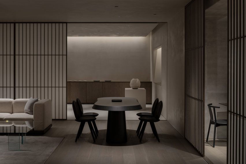
The interior uses materials that are common in Japan including concrete, steel, wood, plaster, Japanese stone and paper.
“The use of Japanese paper in interior design is an element that is distinctively Japanese,” Ashizawa explained.
“Shoji screens are an important element in creating a Japanese-style room but I realize that they can also be well used in both functional and aesthetic ways in a modern space.”
Concrete walls and shoji screens were used for the interior
The studio also used Japanese paper that had been dyed in a grey hue as wallpaper to give the space a “soft and contemporary feel.”
“Since we weren’t building an actual house but rather a home-like Conran store, the materials were thoughtfully instrumented to achieve a balance,” Ashizawa said.
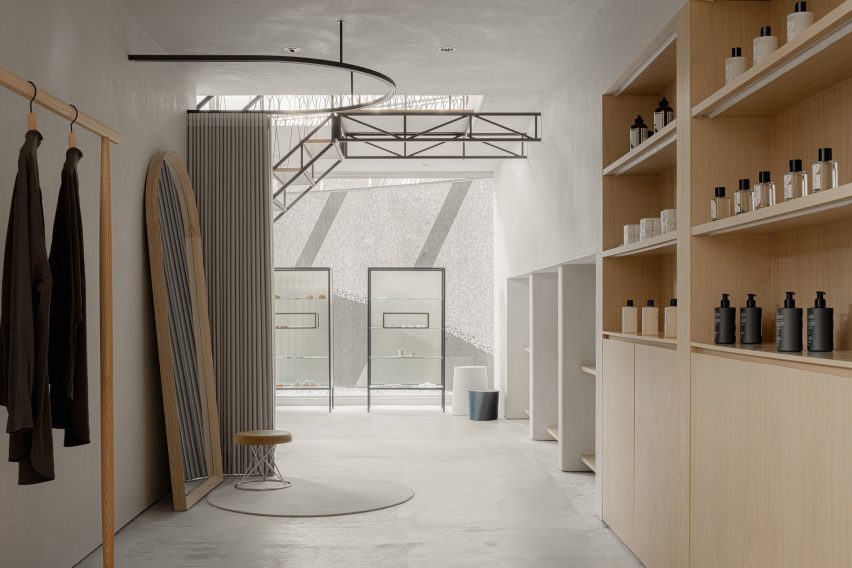
The ground floor of the store holds furniture, homeware and apparel, and also has a mezzanine floor that is accessible by a staircase featuring a handrail made from black paper cords.
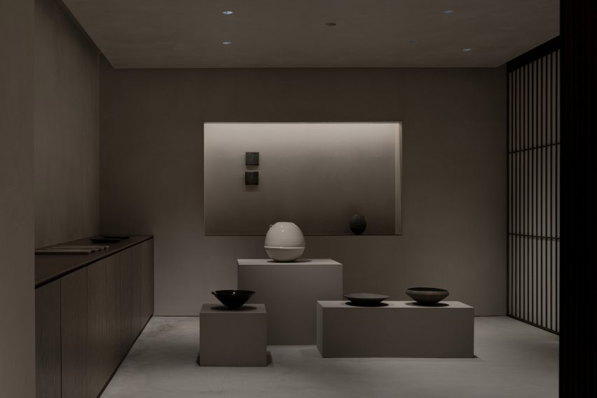
A gallery-like space is located on the basement floor
Ashizawa designed the basement floor, which functions both as an additional shopping area and a gallery space, to have a calmer atmosphere.
“Filled with natural light, the ground floor uses colours that bring grandeur and a sense of calmness,” he said.
“The basement floor is toned to create a more private feeling. We respected the natural colours of the materials as much as possible, while also considering the harmony with the objects on display and in the gallery.”
The store has a neutral colour palette and wooden details
The Conran Shop Daikanyama also has an adjoining bar where visitors can enjoy teas such as sencha and macha.
Rounded walls and archways create a flow through this Montreal boutique, designed by local studio MRDK for Canadian sportswear brand Ciele Athletics.
The first boutique for Ciele, which sells technical headwear and apparel for running, opened in April 2023 on Notre-Dame Street in Montreal – the brand’s hometown.
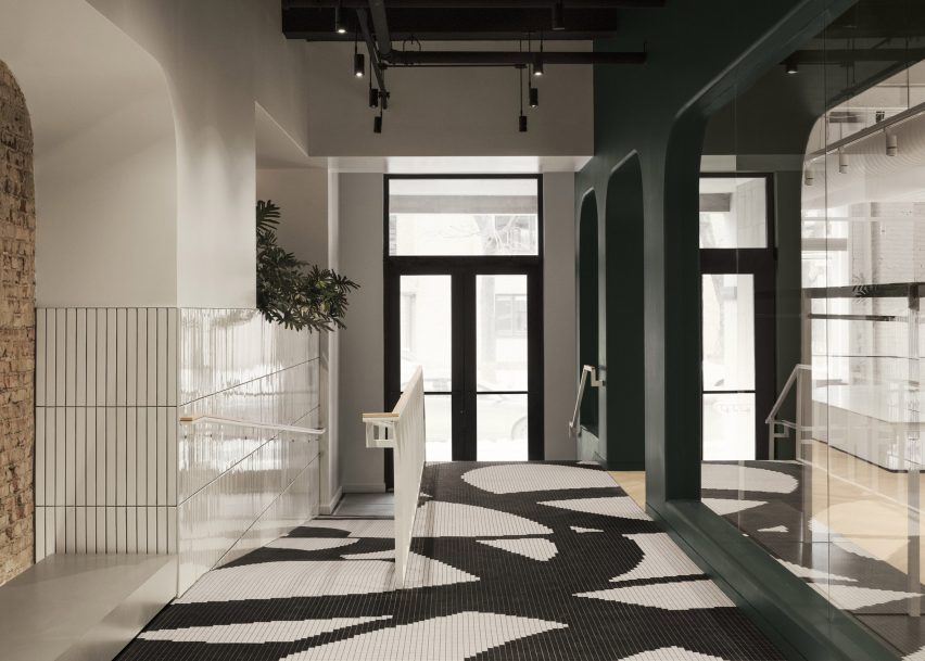
Black and white mosaic tiles form a pattern based on Ciele’s apparel at the entrance to the store
The 3,000-square-foot (279-square-metre) flagship store was designed by MRDK to be as much a boutique as a community space for runners to meet and socialise.
Along the narrow entryway, flooring comprises black and white mosaic tiles that form a graphic pattern based on select items of the brand’s apparel.
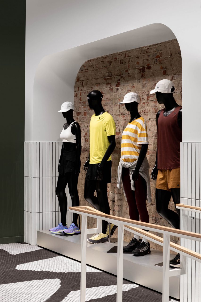
Visitors are lead past a quartet of mannequins to a community lounge area
Ascending four steps or a ramp leads visitors past a large white-tiled planter, then a display of mannequins lined up in front of a brick wall.
A lounge area at the end is designated for gathering and conversation, offering “anyone with an interest in movement and connection a chance to experience running and the many facets of its dynamic community through regular meet-ups and events”, said MRDK.
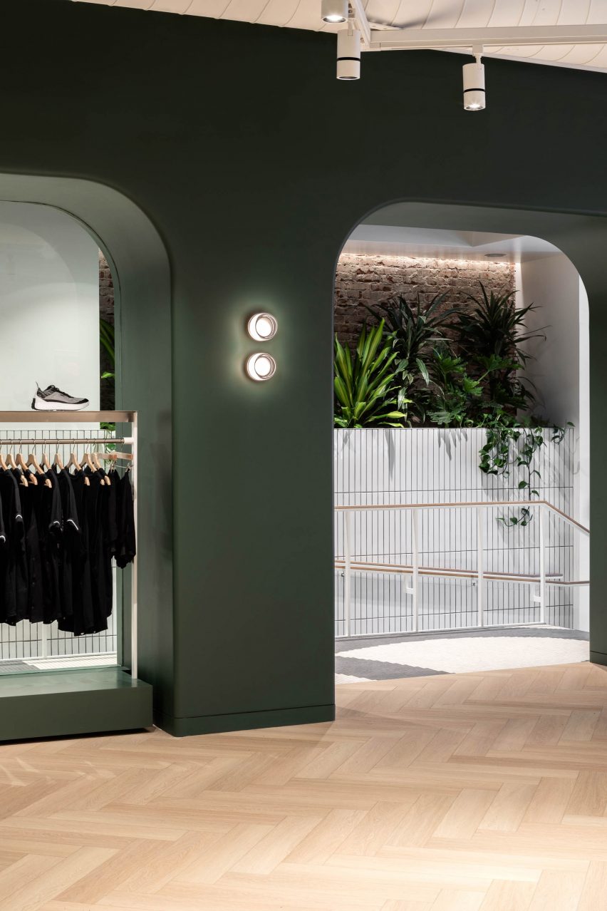
Access to the main retail space is via an archway that punctures a dark green partition
Access to the main retail space is through an archway with rounded corners that punctures a deep, dark green partition.
“An arched wall gracefully separates the more public community area from the rest of the store, creating a sense of intrigue and inviting exploration,” MRDK said.
The green hue continues behind the fluted white service counter
Other similar openings in this spatial divider are used to display clothing on single or double-stacked rails.
The same forest green shade continues on the wall behind the service counter, which is fronted by a white fluted panel and includes a small glass vitrine set into its top.
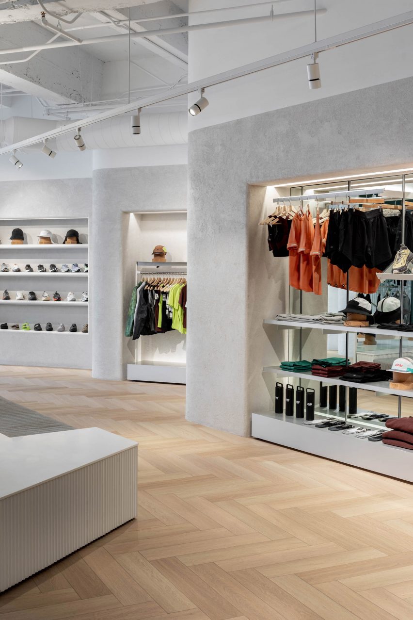
Lime plaster covers the angled walls, which feature bull-nose edges that soften their appearance
Herringbone white oak parquet floors are laid wall to wall, running beneath a low central island that is designed to be broken apart and moved around the store depending on merchandising needs.
A textured lime plaster finish was applied to the walls, wrapping around the bull-nosed corners that soften the angles created by the offset displays.
“The play of light and shadows on these textured surfaces creates a sense of dynamism, accentuating the uniqueness of the space,” said MRDK.
In one corner, a 12-foot-tall (3.7-metre) shelving system presents Ciele’s range of hats on cork mannequin heads.
A tall shelving system displays Ciele’s hat collection
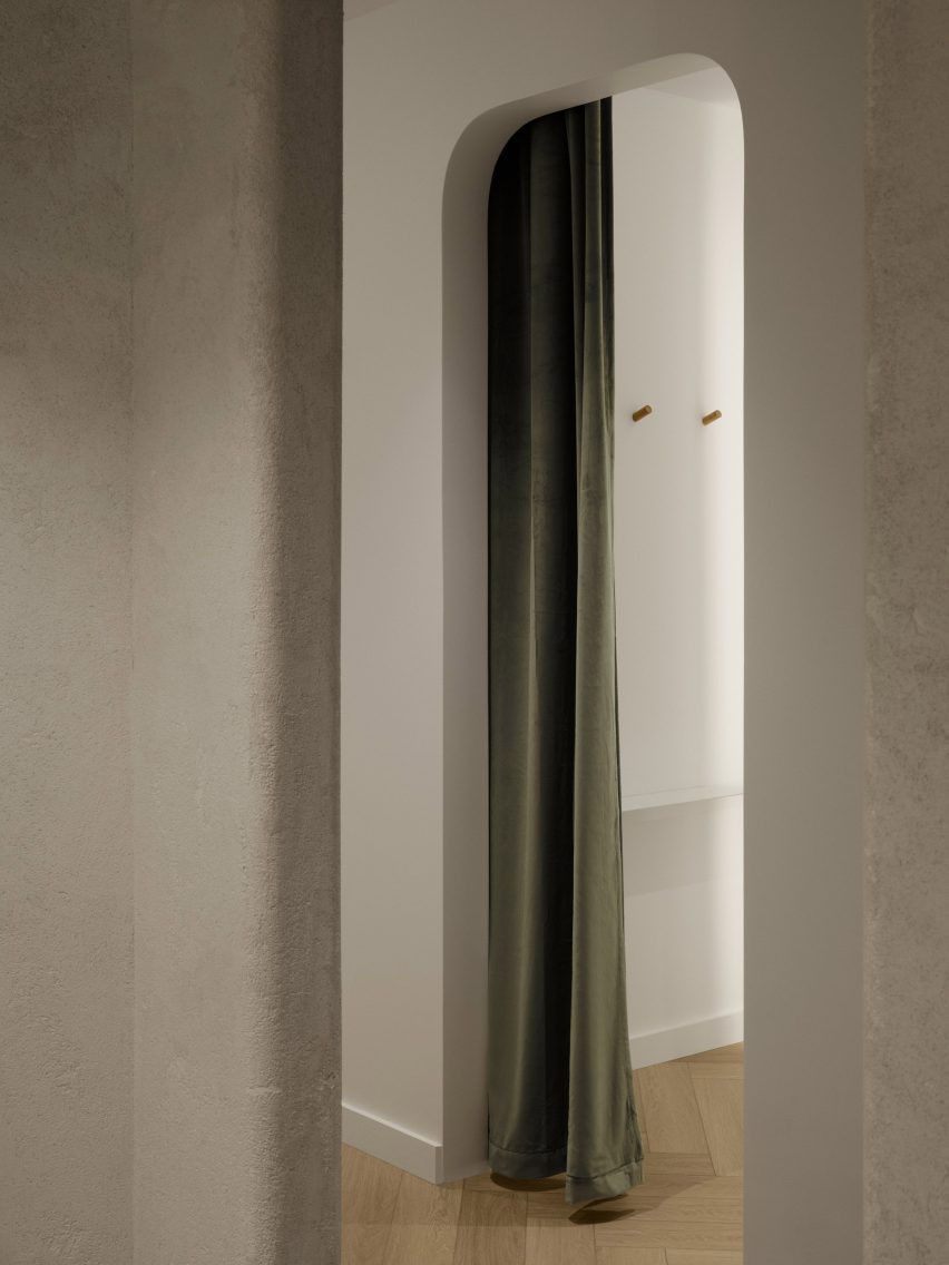
Fitting rooms at the back of the store are kept minimal, with green velvet curtain draped behind the arched openings to the cubicles.
“The thoughtful combination of materials, textures, and colours creates an atmosphere that seamlessly blends modernity with a touch of timeless elegance,” said MRDK.
The fitting rooms are kept minimalist and feature green velvet curtains
Formerly known as Ménard Dworkind, the studio was founded by Guillaume Ménard and David Dworkind, and has completed a variety of retail spaces in Montreal and beyond.
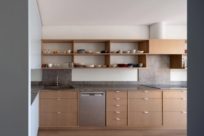
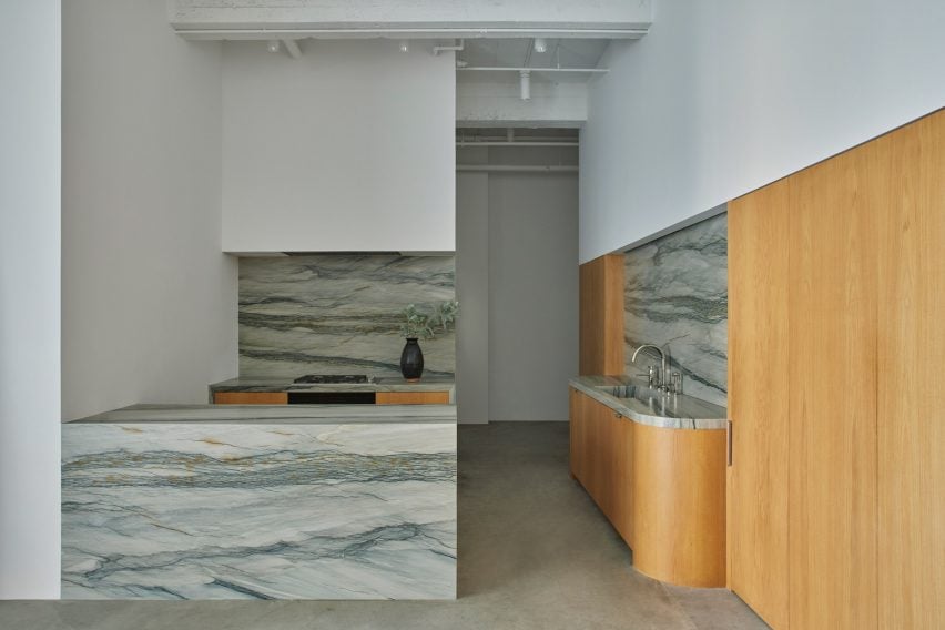
Sometimes the simple solutions are the best, as seen in this lookbook featuring tidy kitchen interiors where minimalist closed cabinets are combined with decorative materials.
In these kitchens, found in homes from Sweden to Mexico, architects and designers largely chose simple storage solutions but added material interest in the form of marble, steel and brick details.
By hiding utensils and crockery away, benches and kitchen islands are freed up to use for food preparation. In some of these kitchens, open shelves above the work areas also provide spaces to hold decorative plates, bowls and cookbooks.
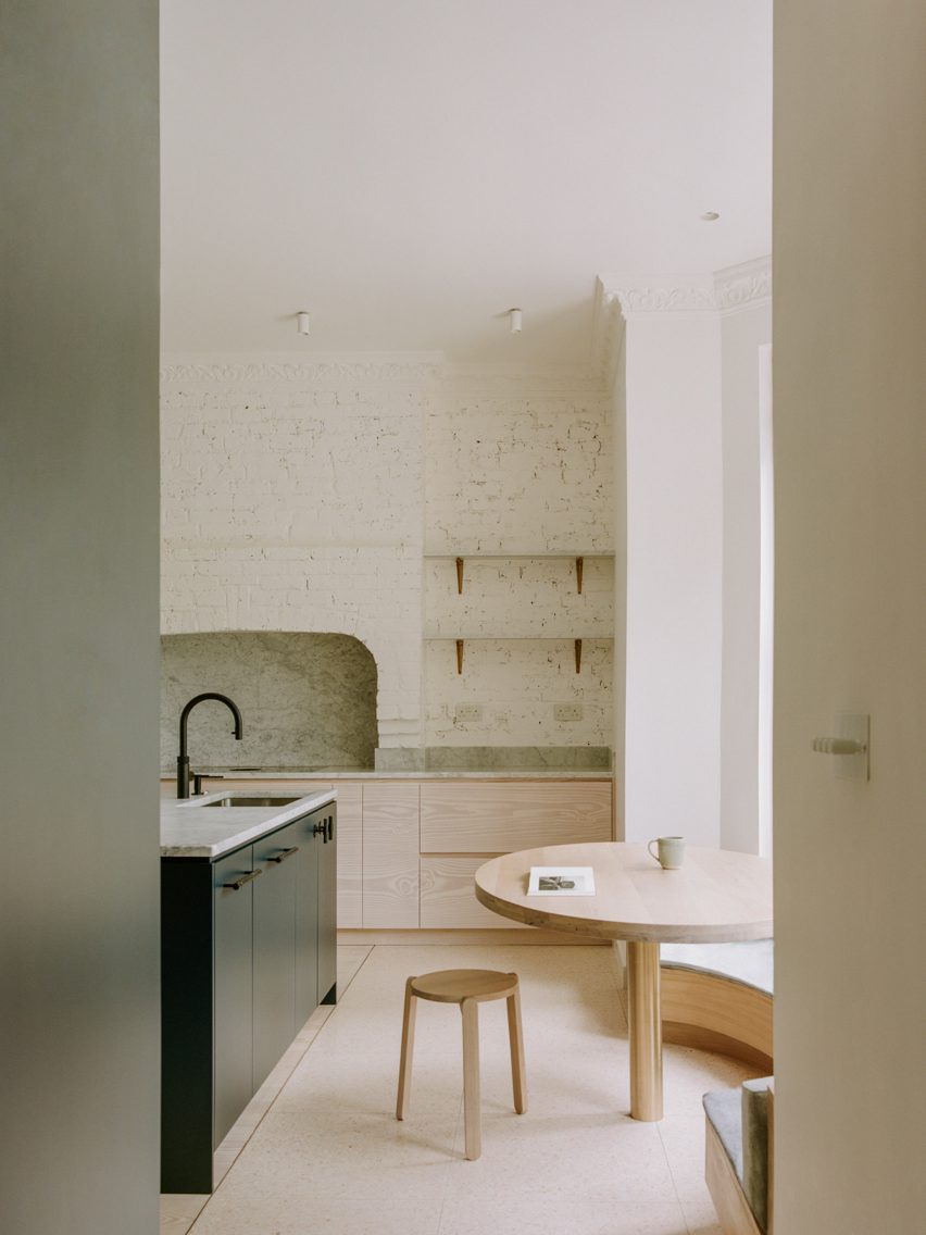
The original brickwork was uncovered in parts of this London flat, including in the kitchen where it forms the backdrop to the room’s minimalist cabinets.
Pale-wood cupboards sit underneath the brick wall, which also features shelves to add more storage.
Designers Neiheiser Argyros added a curved window seat, as well as a wooden kitchen table and stool to match the cabinets and give the room a more natural feel.
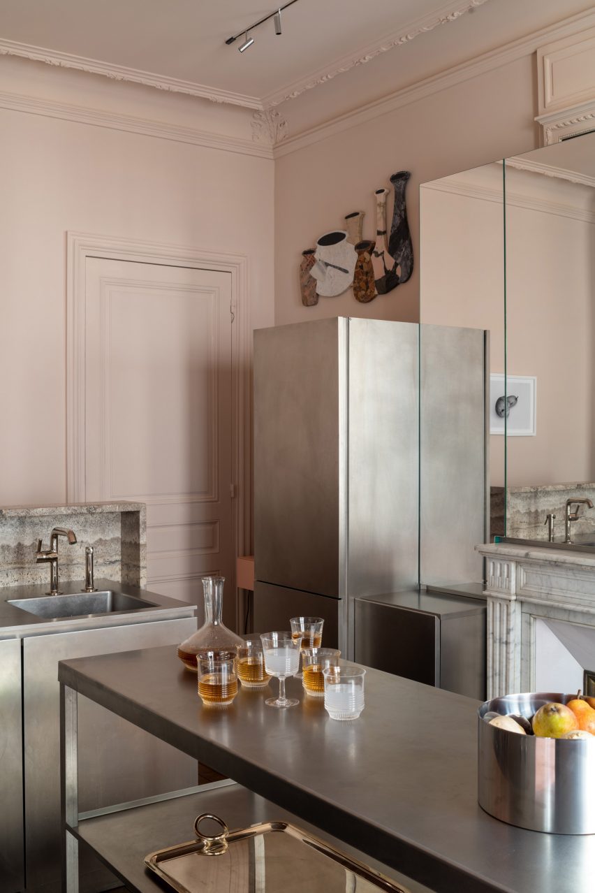
This Parisian apartment in a 19th-century Haussmann building in Paris was given an overhaul by interior designer Rodolphe Parente, who took cues from the owner’s art collection.
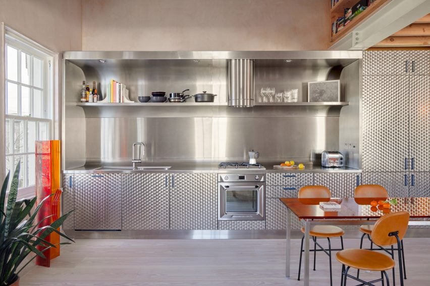
In the kitchen, stainless steel cabinets were used to form storage and workspaces, creating an industrial feel that is tempered by pastel-pink walls.
“The kitchen is a deconstructed block sitting in the Haussmanian environment,” Parente told Dezeen. “It is connected to the historical elements through its composition.”
Studio Vaaro used oak cabinetry for the kitchen of this home in Canada, while matching oak shelving provides additional storage above the workspaces.
To contrast the warm wood, the studio chose grey marble for the countertops and splashbacks, which gives the kitchen an organic feel. Additional storage can be found in the pale grey cabinets that frame the kitchen.
A kitchen clad in circle-brushed stainless steel clads one wall in this London flat by local studio Holloway Li. Designed in reference to the city’s many fish-and-chip shops, it features a striking curved splashback.
Above the workspaces, a built-in open shelf provides space to store glasses and cooking utensils, with the rest of the storage is hidden behind patterned-steel cabinet doors.
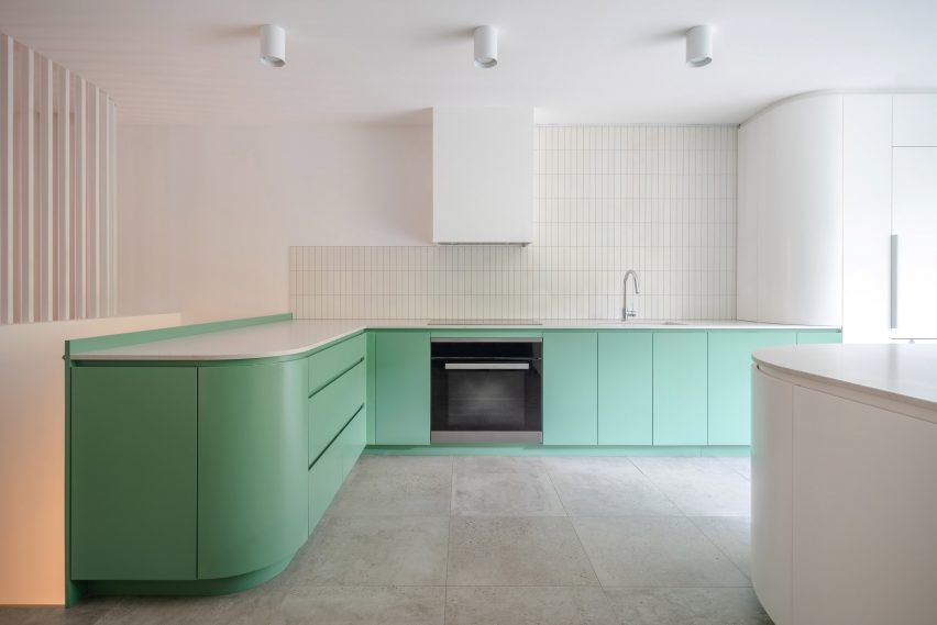
Fresh minty hues decorate the kitchen of this Montreal apartment, which was given a modern update while retaining many of its traditional details.
The green colour matches that of the apartment’s existing stained glass doors. And the kitchen island and cabinets both have inviting curved forms, finished in a glossy paint that complements the rougher tiles above the counters.
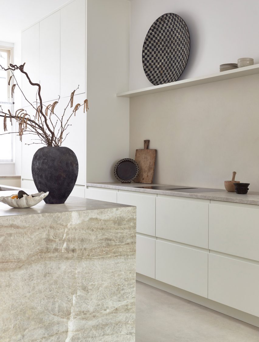
Located in Highbury in north London, this home juxtaposes a gallery-like minimalism with more organic forms.
This is evident in the kitchen, where pared-back storage cabinets in an unusual rectangular shape sit underneath a decorative marble countertop.
Sculptural vases, plates and cooking utensils decorate the matching marble kitchen island as well as a small ledge that functions as both storage and display counter.
Architecture studio Sheft Farrace renovated this flat, which is located in the iconic art deco Eastern Columbia building in Los Angeles, creating minimalist interiors that draw on the building’s exterior.
In the kitchen, this can be seen in the curved corners of the counters and the elongated cabinet hardware, which reference 1930s design. Florida Brush quartzite was used to cover much of the kitchen, adding a striking decorative detail that is complemented by white oak.
Danish studio Norm Architects designed this home on the west coast of Sweden to embody both Scandinavian and Japanese aesthetics.
In the white-walled kitchen, a stainless-steel kitchen island offers both a practical workspace and cupboards for storage. Open wood shelving was decorated with black ceramics to create an art installation-style feature on one wall.
“I think that the evolution of retail for Apple is really interesting – starting with very bold statement with stores that look like nothing else,” said Bill Bergeron Mirsky, a global retail design lead at Apple, at the opening of the brand’s Battersea Power Station store.
“And then over time, you move to the Apple Store being very ubiquitous. And now it’s come around to being a responsibility approach,” he continued. “As we see the rise of Apple in the world and the importance people place on the brand and the values that it represents.”
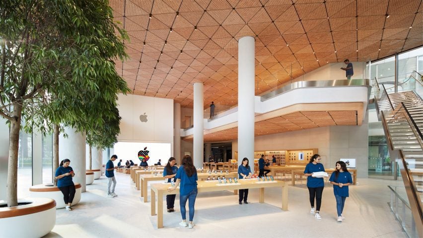
With Apple now having stores in 526 locations across the world Dezeen has selected 10 striking recent stores from its archive:
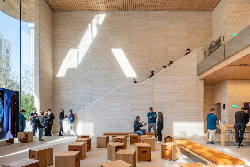
Apple’s most recently opened store is located within the newly renovated Battersea Power Station in London, which marks the technology company’s 40th UK store.
The store is set on the ground floor of the shopping centre within the power station’s 1930s Turbine Hall A. The interior was organised around four original brick columns and beneath steel roof supports that were left exposed.
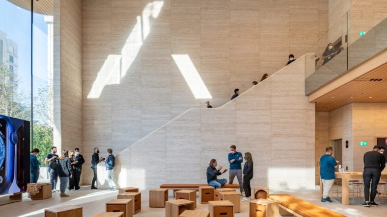
India’s first flagship Apple Store contains a wooden canopy made from 450,000 hand-crafted oak elements that form 1,000 triangular ceiling tiles.
The walls of the store were made from stone sourced from Rajasthan and have a fine grain that is meant to convey the texture of Georgette fabric. It was enclosed by two eight-metre-high glass walls that allow light to flood the double-height interior.
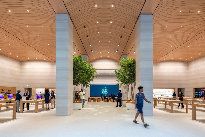
An arched timber ceiling with seven-metre tall interiors defines the Brompton Road Apple store in west London. The arched timber ceiling mirrors the profile and shape of the window bays located at the facade of the building.
The studio removed a mezzanine level from the shop interiors and incorporated six Castagna stone columns, four Ficus trees and a terrazzo floor made from castor oil resin, aggregate and recycled glass.
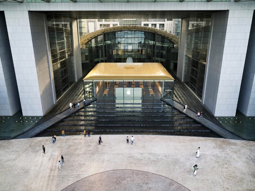
Apple’s Abu Dhabi store on Al Maryah Island was built on top of a raised podium and surrounded by a stepped waterfall around all of its four sides.
The podium the building is set on is pyramid shaped and constructed from black granite stone. The store is accessed via two bridges that extend over the water feature from a waterfront promenade.
In Downtown Los Angeles, Foster + Partners worked with Apple to renovate a historic 1920s, baroque revival-style movie theatre that was designed by American architect S Charles Lee in 1927.
The sensitive renovation of the formerly abandoned theatre saw the studio restore its corner clock tower, terracotta facade, exterior canopy, and grand entry hall that is complete with bronze handrails and marble columns.
Two large travertine walls flank the interior of Istanbul‘s Bagdat Caddesi Apple store. Benefitting from a column-free interior encompasses two levels with a sunken double-height space at its rear.
The building is set back from the street and appears to be a single-storey structure as a result of its sunken lower level. The structure was topped with a large overhanging roof.
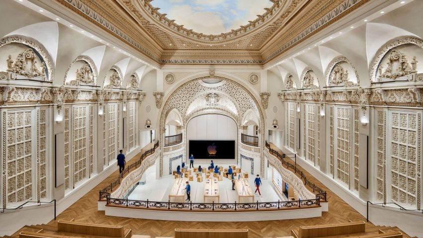
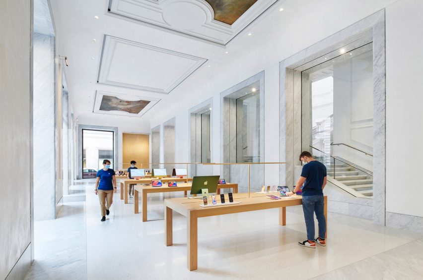
Another restoration project saw Foster + Partners convert and restore a historic palazzo in Rome, which is located in the centre of the Italian city.
Palazzo Marignoli was constructed between 1873 and 1878 and served as a home for Italian politician Marquis Filippo Marignoli. Foster + Partners wanted to celebrate the building’s history by restoring and highlighting its grandeur and historic features. Hand-painted patterned ceilings and frescos were restored throughout.
Noted as Apple’s “most ambitious retail project”, its Marina Bay Sands store in Singapore is a spherical glass structure that is completely surrounded by water and accessed via a 45-metre-long underwater tunnel.
The store’s interior is an open-plan space that measures 30 metres wide beneath a self-supporting glass and steel dome, which is made from 114 pieces of glass with 10 steel vertical mullions that provide structural support.
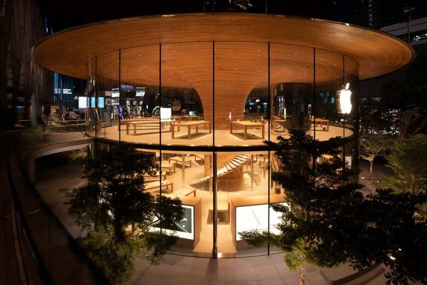
Named Apple Central World, this Bangkok store is organised around a timber-clad column and a large overhanging roof that was designed to resemble the canopy of a tree.
The store has a 24.4-metre diameter with a timber column that is clad in 1,461 slats of European white oak at its centre. The column fans out at ceiling level and adjoins the roof and extends past the glass perimeter of the store, forming a three-metre cantilever over the glazing.
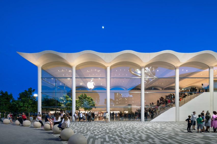
An undulating white concrete roof, which draws on Miami’s art deco buildings, tops the Apple Aventura store that is located in Aventura Mall in the north of Miami.
The structure is a boxy, two-storey building with glass walls and indoor trees. The roof of the store is made up of seven, precast six-metre-wide white concrete arches to form a barrel-vaulted ceiling.