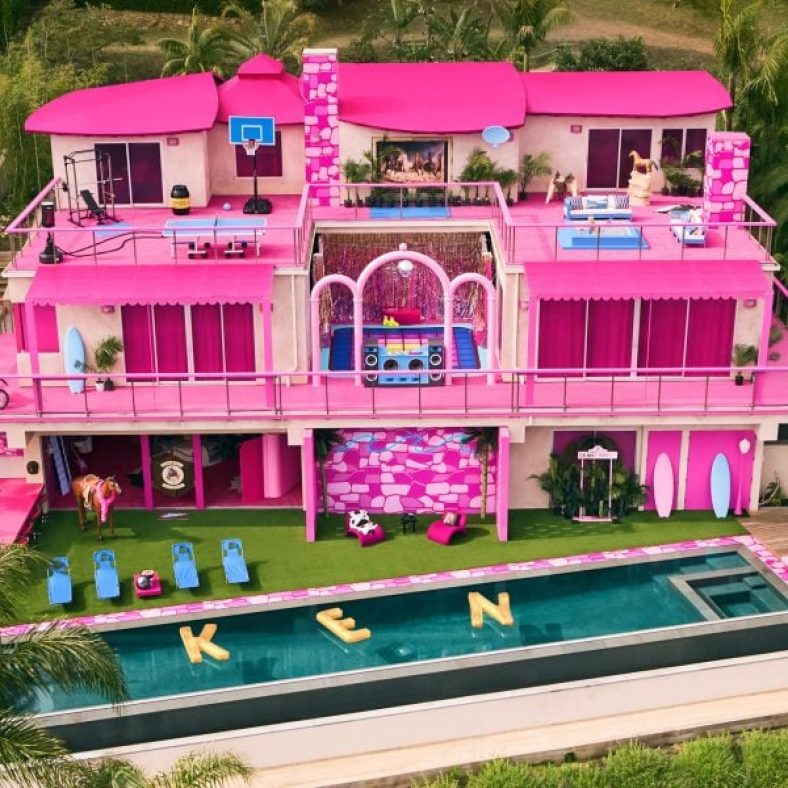
Rental website Airbnb has created Barbie‘s Malibu Dreamhouse, an all-pink California mansion with an outdoor disco, infinity pool and Western-themed bedroom.
Located on the oceanfront in western Malibu, California, the lifesize dollhouse is being rented out by Barbie’s partner Ken via an Airbnb listing written as if by the doll himself.
“We all have dreams, and Barbie is lucky enough to have a house full of them,” Ken said. “But now, it’s my turn, and I can’t wait to host guests inside these one-of-a-kind – dare I say, one-of-a-Ken? – digs.”
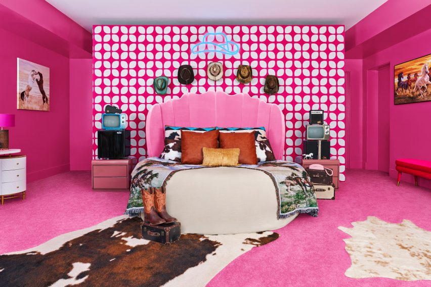
A cowboy-themed bedroom nods to Ken’s style
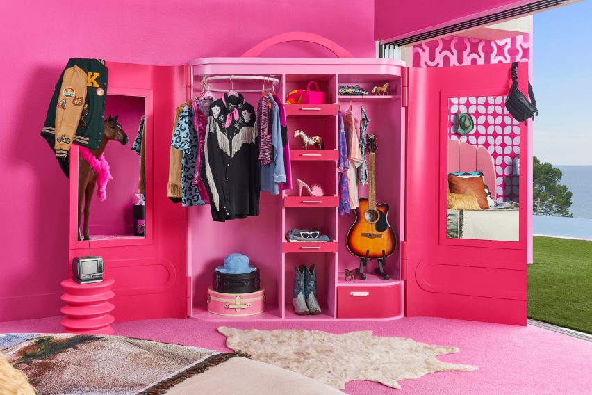
The large oceanfront house features a pink bedroom decorated with cowhide rugs, cowboy hats and horse-printed throws as well as a closet from which guests can borrow Ken’s fringed cowboy shirts and his guitar.
Some of Barbie’s clothing, including the iconic high-heeled pink shoe with a fluffy feather decoration from the movie, also hang in the closet.
Barbie’s Malibu Dreamhouse is located by the beach in California
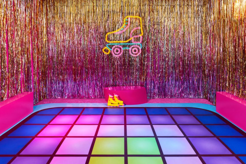
At the centre of the building, on one of the house’s many terraces, guests can make use of an outside disco dance floor in pink, purple and yellow with its own DJ deck.
“I’ve added a few touches to bring some much-needed Kenergy to the newly renovated and iconic Malibu DreamHouse,” Ken said.
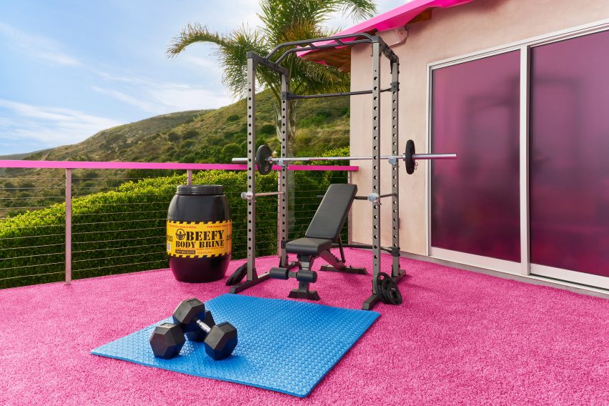
The Dreamhouse also has a bright-pink outdoor lounging area, an outdoor gym – complete with a barrel filled with “beefy body brine” – a pink outdoor kitchen with a barbecue and an infinity pool.
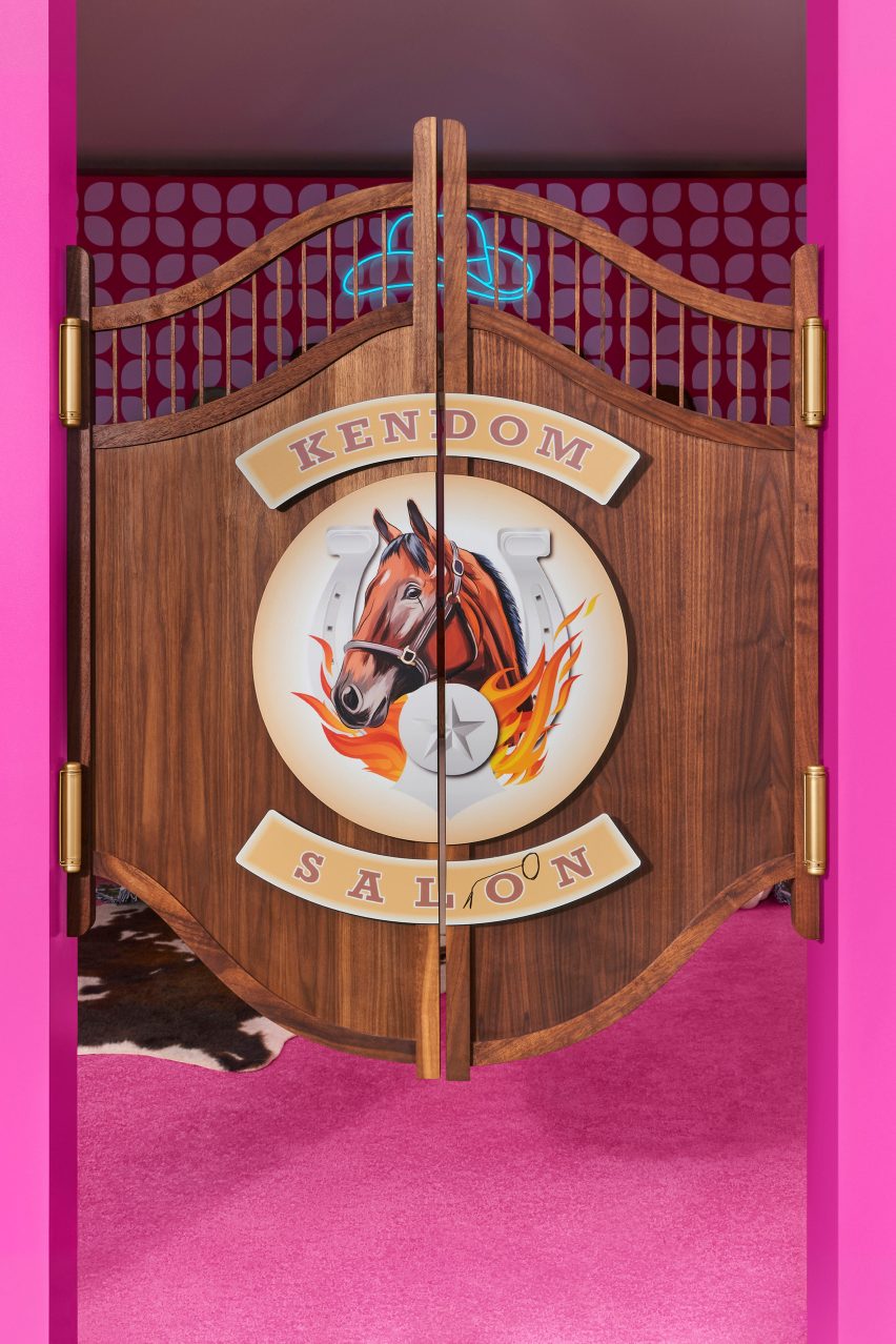
Other details that nod to Ken’s takeover include a Western-style swing door, decorated with an image of a horse and the words “Kendom Saloon”, and a crossed-out “Barbie” sign above the outdoor kitchen that now reads “Ken”.
Guests can disco outdoors
Guests can enjoy nearby activities such as shopping, surfing and roller blading on the boardwalk, and will also get to take home their own set of yellow-and-pink Impala skates and surfboard.
Barbie’s Malibu Dreamhouse will be available to book for up to two guests each on July 21 and July 22, 2023, with bookings opening on 17 July.
An outdoor gym features weightlifts and “body brine”
“All stays will be free of charge – because Ken couldn’t figure out how to put a price on Barbie’s Malibu DreamHouse – after all, Ken’s thing is beach, not math!” Airbnb said.
The company will make a one-time donation to the charity Save the Children in celebration of the Barbie movie.
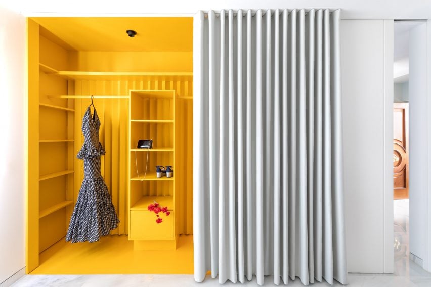
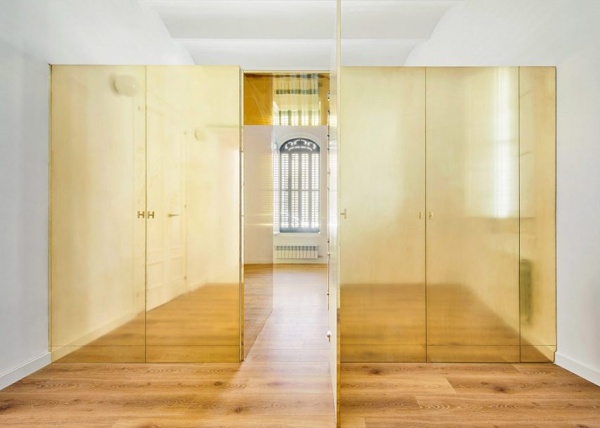
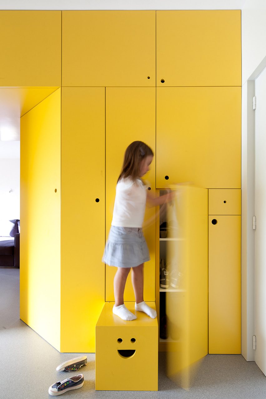
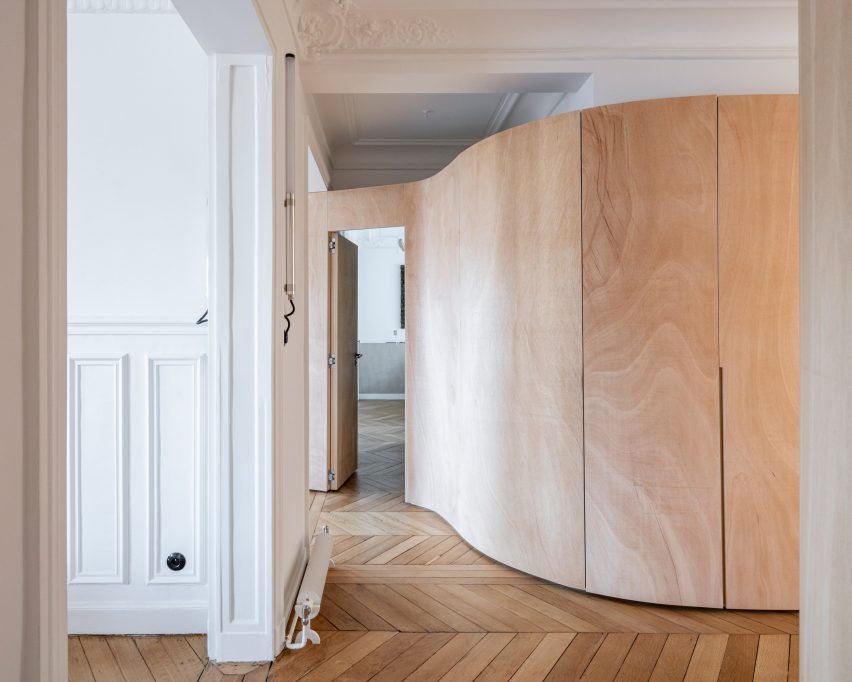
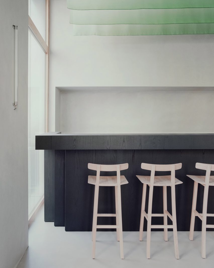
Statement wardrobes with red-leather doors and bright yellow shelving feature in this lookbook, which proves clothes storage does not have to be a blight on the interior.
It’s not unusual for wardrobes to be pared-back and concealed in residential interiors, often in an attempt to hide clutter and retain focus on other furnishings and finishes.
However, this lookbook spotlights the works of architects challenging this idea and using essential clothing storage as an opportunity to create a focal point in a home.
This is the latest in our lookbooks series, which provides visual inspiration from Dezeen’s archive. For more inspiration see previous lookbooks featuring pergolas, guesthouse interiors and bedrooms with bathtubs.
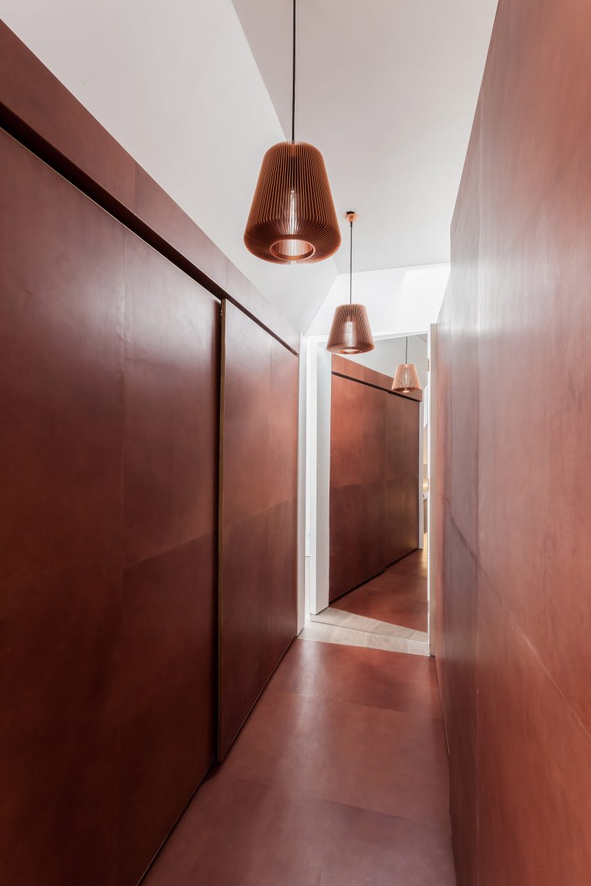
Rust-coloured leather lines the floor and sliding wardrobe doors of this dressing room, which architect Simon Astridge designed as an eye-catching centrepiece in a refurbished London house.
“The best part of the leather tunnel is the lovely fresh leather smell you get every time you get out of bed to get dressed,” said Astridge.
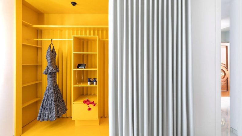
This vivid yellow wardrobe is among the brightly coloured spaces in Casa Triana, an open-plan apartment by Studio Noju in Seville.
Its bright shelves and surfaces pop against its white surroundings and form a striking backdrop to the owner’s clothes. While forming a feature of the home, it also helps to create the illusion of having separate spaces within its open plan.
This shiny brass wardrobe at the centre of an apartment near Barcelona in Spain was intended to resemble a precious jewellery box. It also acts as a partition between two rooms, featuring a “secret passageway” in its middle.
“I love brass, and in this precise project it gave that magic look, that look of a precious object,” said architect Raúl Sánchez.
Yellow was also used by architects Pedro Varela & Renata Pinho to colour this wardrobe, which is located in an apartment in Portugal.
The wardrobe forms part of a wall of storage that divides the apartment. Finishing touches include different-sized circular openings for use as handles and a step that is pulled out of the wall with a smiley-face cut-out.
This Parisian apartment is named Wood Ribbon after the sinuous plywood wall that snakes through its interior.
While dividing the residence into three zones, the structure also incorporates several doorways, a dressing room and storage areas for clothes, including one in the hallway.
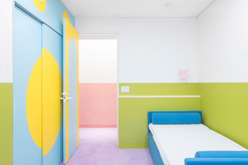
A sugar-sweet colour palette fills every corner of the Nagatachō Apartment, which designer Adam Nathaniel Furman created for a retired expat couple in Tokyo.
This includes the bedroom, where a built-in wardrobe is outlined by bright baby-blue doors and yellow semicircular motifs that stand out against the white and green walls on either side.
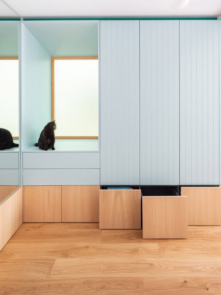
Though it sits seamlessly against the wall, the detailed design of this wardrobe ensures makes it a standout feature of the Galla House in Spain.
It features wooden drawers for shoes and taller blue-painted cupboards for hanging clothes, alongside a deep window seat that is enjoyed by the home’s feline occupants.
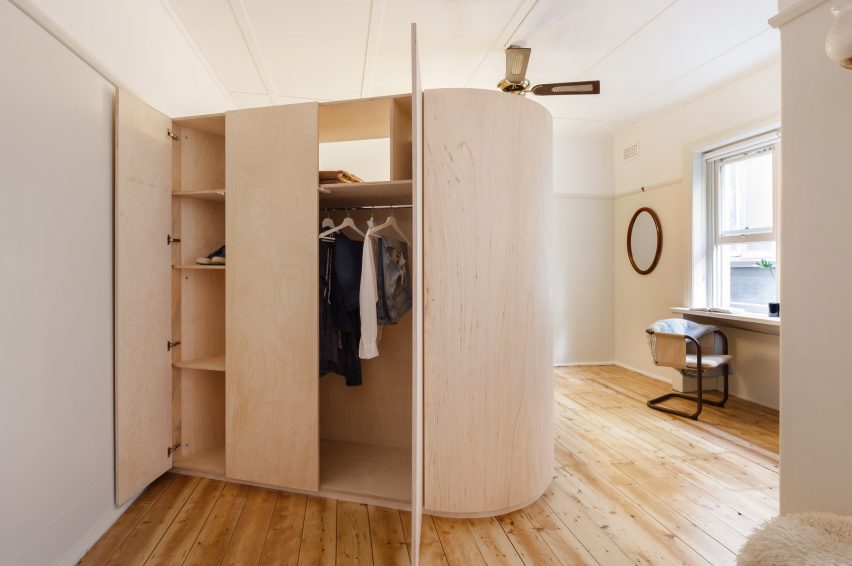
Catseye Bay Design designed the wooden wardrobe of Versailles Studio Apartment to double as a privacy screen for the bed.
Projecting diagonally from one of the bedroom walls, the two-metre-high structure incorporates clothes storage and shelving on the other side. Alongside the bed, it conceals an upholstered bench that looks out to a window.
This is the latest in our lookbooks series, which provides visual inspiration from Dezeen’s archive. For more inspiration see previous lookbooks featuring pergolas, guesthouse interiors and bedrooms with bathtubs.
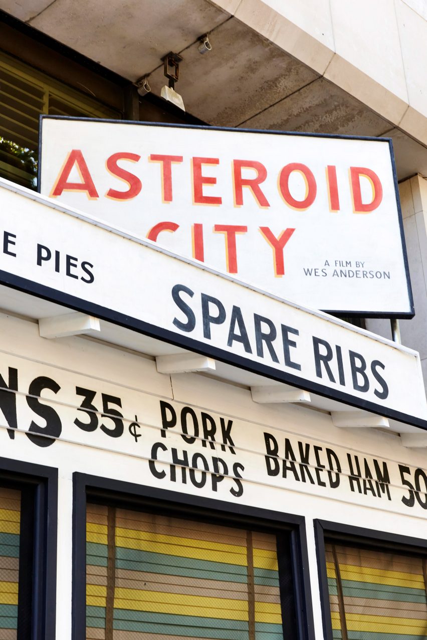
An exhibition of the 1950s sets, props, miniature models, costumes and artwork used in Wes Anderson‘s latest film Asteroid City has opened at 180 The Strand in London.
The exhibition was designed to immerse visitors in the film’s fictitious world – a desert town in 1950s America famous for its meteor crater and celestial observatory.
The exhibition is on display at London’s 180 The Strand
Its aim was to give visitors insight into the “1950s Americana world the film is set in”, said Asteroid City associate producer Ben Alder.
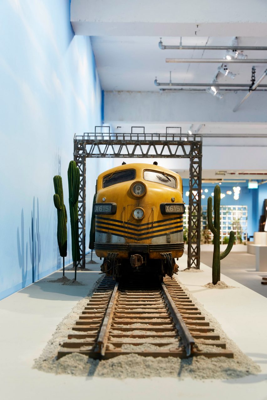
Asteroid City was filmed on flat farmland in Spain, with the buildings made for the film set up to appear like a town.
The exhibition features large sets
“Everything you see in the film was physically built and laid out in a way that gave the actors and crew the sense of living in this real town,” Alder told Dezeen.
“The exhibition is a great way for people to see how much work went into all the elements of the film, like the costumes, because you can spend more time looking at how they are made and how much care went into them.”
Film sets used in the Asteroid City movie are on display
Pieces in the exhibition are spread across three main spaces, with audio clips and parts of the film projected onto walls referencing scenes relevant to the nearby displays.
“The idea was to use the largest open space for the sets to give people the sense of how big they were on the film, and you can imagine how massive our Asteroid City town was,” said Alder.
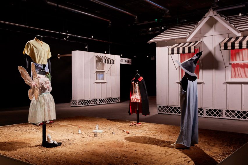
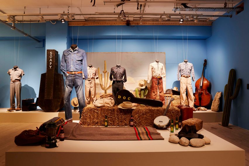
Costumes and props are on display
“Then there’s another space that’s a more traditional gallery-type curation where you can see smaller objects and props, going into the details of the characters,” Alder continued.
Mimicking the exterior of the cafe featured in the film, a temporary wooden structure decorated with menu lettering and a desert scene spans the entrance of 180 The Strand.
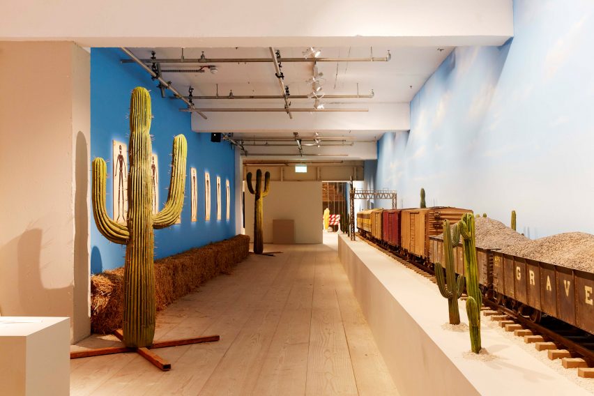
Sets displayed in the exhibition include white wooden residential shacks, a train carriage and a bathroom scene.
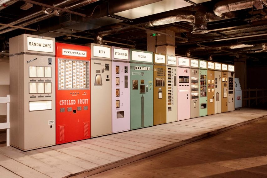
Other life-sized scenery props include telephone booths, billboard posters and humourous vending machines that dispense martinis and bullets in the film.
The exhibition provides a close-up view of the Asteroid City film props
“There are moments where visitors are invited to be in the sets and interact with them,” said Alder.
“Not only can visitors see all the pieces from the film really closely but they can go inside some of the sets – they can sit inside the train compartment, recreate the scene with [actor] Scarlett [Johansson] in the window, or go into the telephone booth – which is something really special that not a lot of exhibitions have.”
Visitors can explore a desert set
Some of the character costumes are arranged together with set pieces to recreate scenes from the film.
Also on display are puppets made by Andy Gent, who previously created puppets for Anderson’s films Isle of Dogs and Fantastic Mr Fox, and a series of glass flowers used in a stop-motion animation sequence where they transition from blooming to wilting.
The Asteroid City exhibition showcases many details from the film
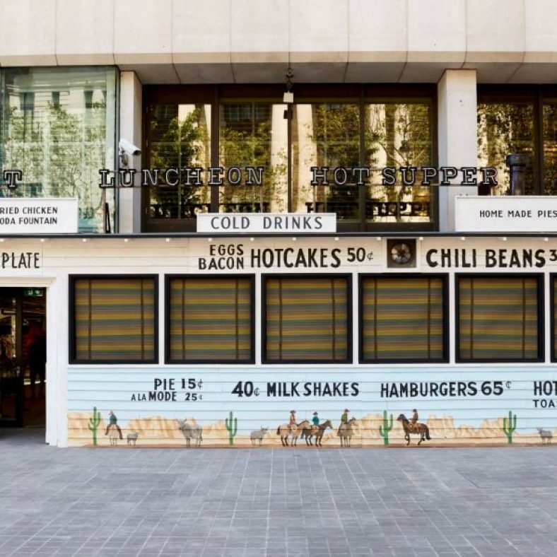
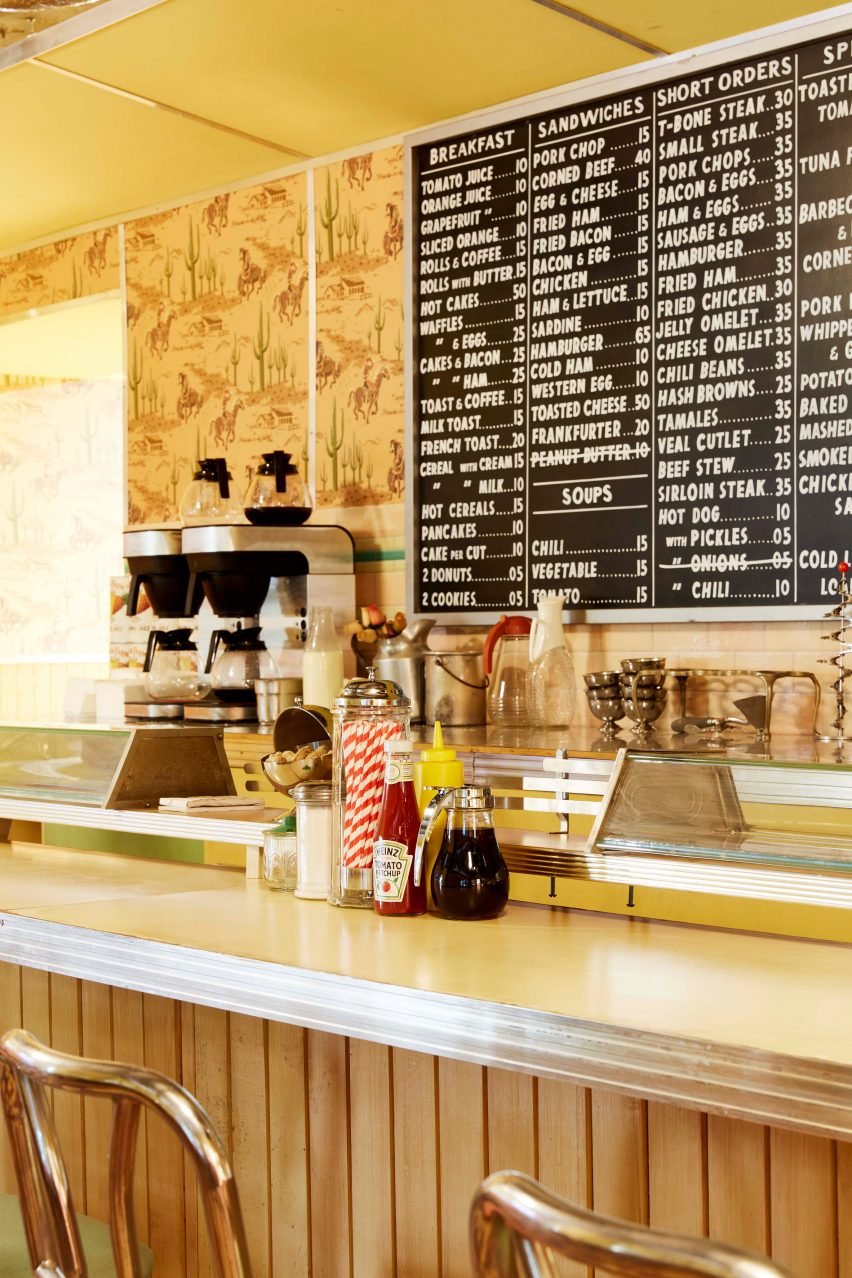
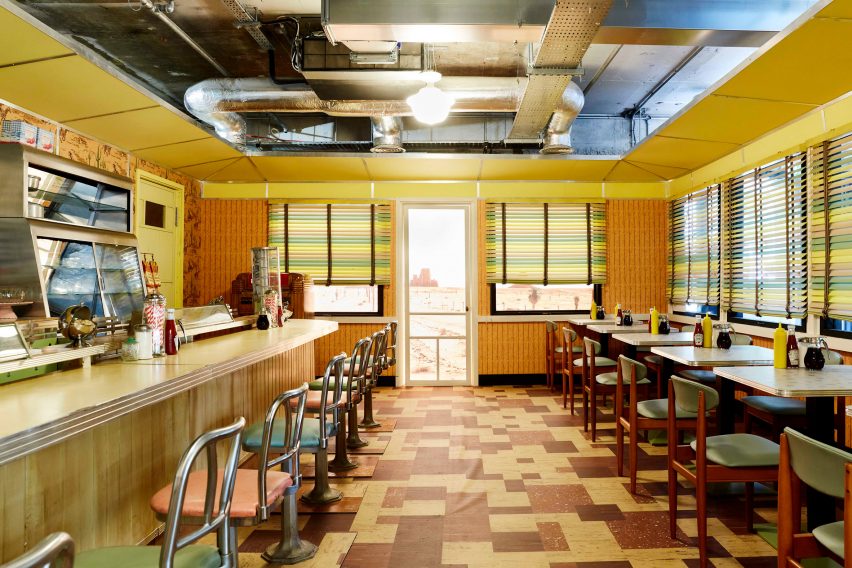
The exhibition ends with a recreation of a luncheonette featured in the movie, where visitors can order food and drink.
It has a 1950s-style decor, with stools lined up along the service bar, pastel-coloured blinds and the image of a desert landscape framed inside fake windows.
A 1950s-style cafe is at the end of the exhibition
The photography is courtesy of Universal Pictures and 180 Studios.
The Asteroid City exhibition is on display at 180 The Strand in London from 17 June to 8 July 2023. See Dezeen Events Guide for an up-to-date list of architecture and design events taking place around the world.
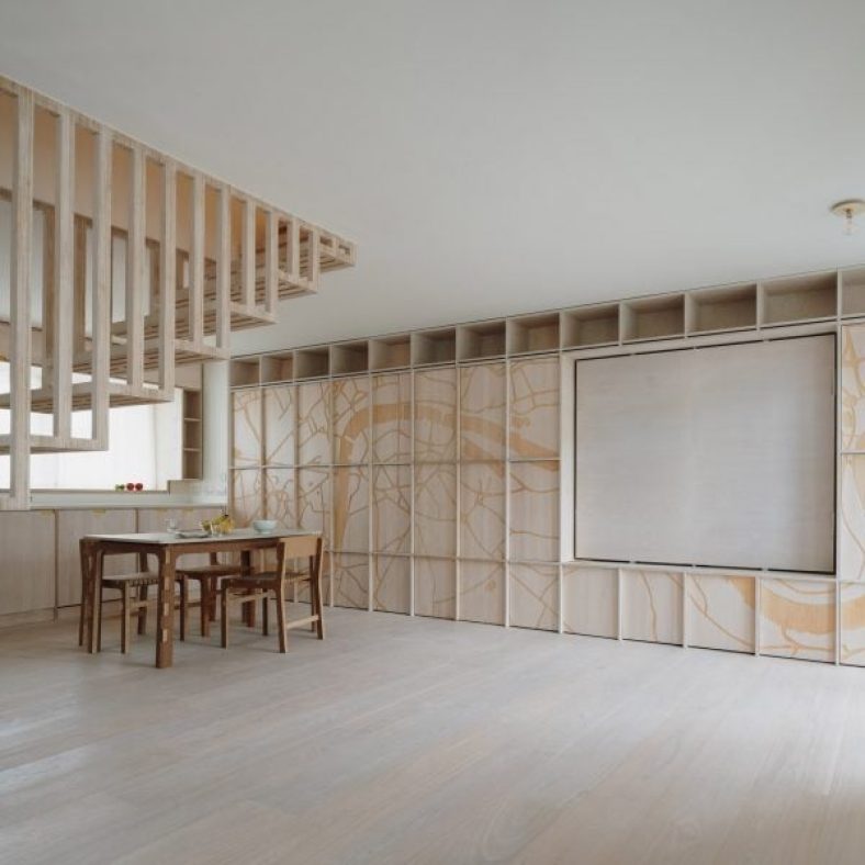
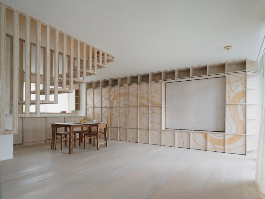
UK-studio Tsuruta Architects has combined artificial intelligence with CNC cutting in a revamp of a home in London’s Notting Hill.
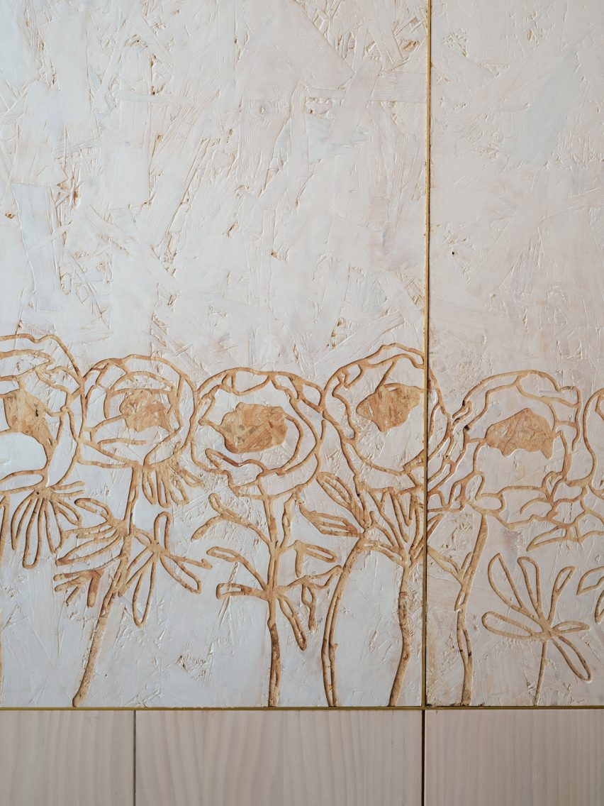
Dragon Flat features engraved wall panels and joinery incorporating AI-generated images, including a map of the River Thames and a graphic floral motif.
AI-generated engravings feature on both floors of the home
A CNC router – a computer-controlled cutting machine – allowed these designs to be directly transferred onto wooden boards, which have been used for surfaces within the interior.
Taro Tsuruta, founder of Tsuruta Architects, said that he decided to experiment with AI because there wasn’t room in the budget to collaborate with a graphic designer.
A map of the River Thames features in the living space
Using DALL-E 2, an AI program that transforms text instructions into high-quality images, he was able to create bespoke designs for the kitchen and bedroom space.
“I typed a series of prompts and ran a series of variations, then came up with an unexpected yet expected result,” he told Dezeen. “It was like sculpting a form with a keyboard.”
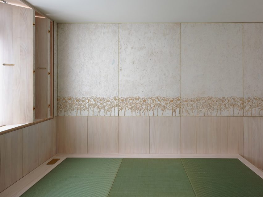
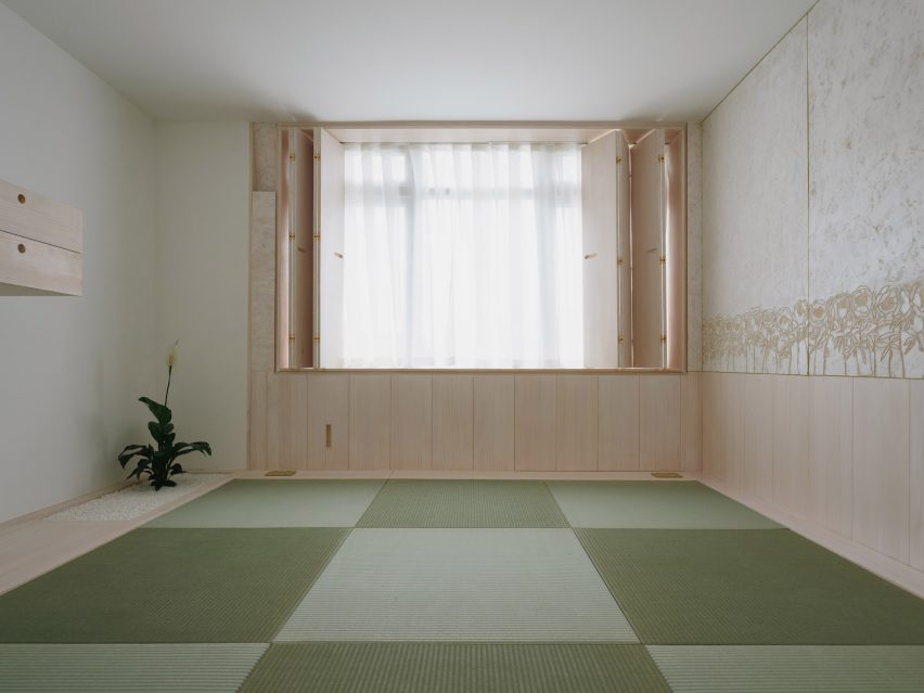
Upstairs, a tatami room features a row of engraved peonies
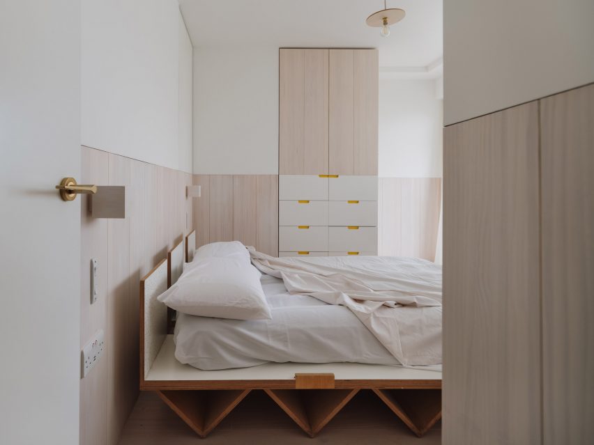
Tsuruta’s clients for Dragon Flat were a young Asian couple who moved to London five years ago. The property they bought was a two-level maisonette in a 1950s council block.
The renovation sees the home subtly reconfigured.
The lower level is opened up, allowing the kitchen to become part of the living space, while the upper level has been adapted to create more storage.
This revamped upper level includes a walk-in wardrobe and a tatami room – a typical space in traditional Japanese homes – as well as a main bedroom.
The designs are etched into OSB wall panels
The River Thames image features in the new living and dining room. Engraved plywood panels front a grid of cupboards, creating an entire wall of storage.
The floral pattern, designed to resemble “an army of peonies”, can be found in the tatami room.
Images of these flowers are etched into white-washed oriented strand board (OSB), which forms wall panels. This creates a colour contrast that allows the design to stand out.
Whitewashed surfaces allow the floral design to stand out
“We did quite a few sample tests, changing the needle size of the CNC router to get it right,” said Tsuruta.
The aim here, he explained, was to create a design that playfully references Arts and Crafts, a movement that embraced floral imagery but rejected the technological advances of its time.
“Arts and Craft was very labour-intensive,” said the architect. “Our process is the opposite, but we share a common goal of enriching the lives of occupants.”
The addition of a walk-in wardrobe frees up space in the bedroom
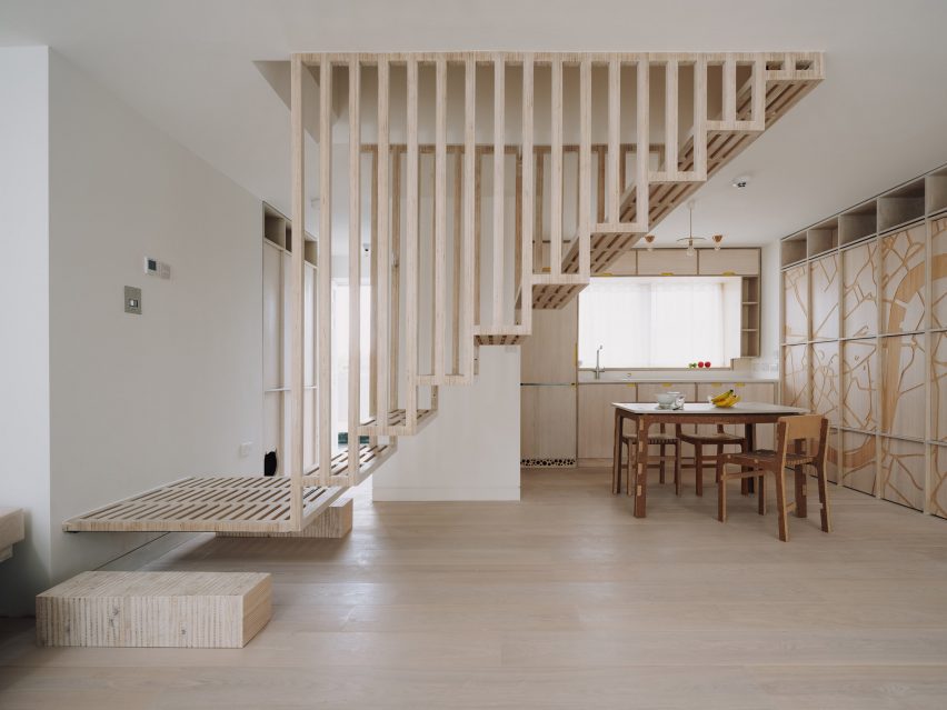
CNC cutting has played a pivotal role in many of Tsuruta’s projects. Examples include The Queen of Catford, a group of five flats filled with cat faces, and Marie’s Wardrobe, a home with a highly intricate custom staircase.
Dragon Flat is his first completed project to incorporate AI, a process he said provides infinite options but requires human input in order to achieve a successful result.
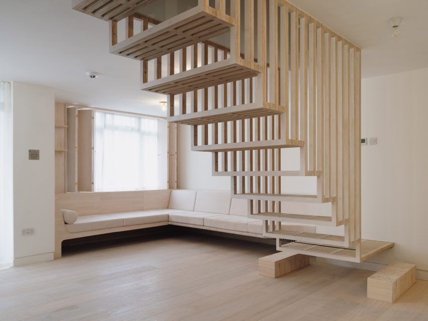
A floating timber staircase allows light to filter through
“This process is pretty much the same as with any tool,” he said. “At the end of the day, we were the ones to select and move on to the next variation or stop there.”
The interior also features other playful details, including a floating timber staircase. Built in the same position as the original stairwell, this perforated volume allows more light to filter between spaces.
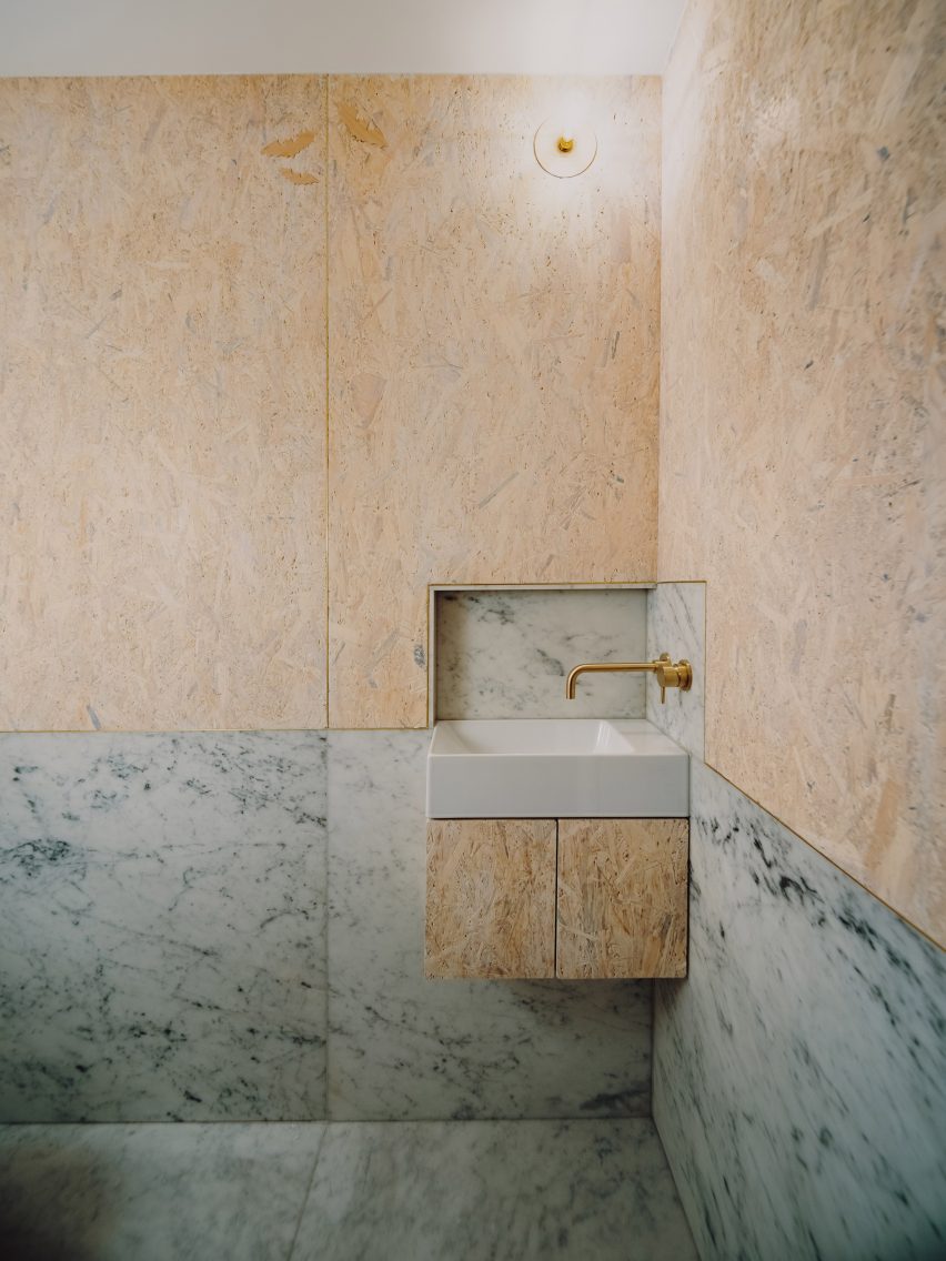
OSB and marble contrast in the bathroom
The bathroom combines marble with OSB, creating an intentional contrast between luxury and low-cost materials, and also includes some small motifs showing bats.
“The symbolic meaning of peonies, dragons and bats, together with the Thames River, is ambiguous,” added Tsuruta.
“We want people to keep thinking and talking about them, but overall they are believed to bring prosperity and a happy life.”
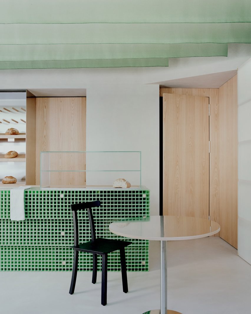
Architecture practice Studio Wok has created a matcha-green counter and Japanese-style fabric panels for bakery and wine bar Pan in Milan‘s Acquabella district.
The studio created the eatery, which is led by Japanese chefs Yoji Tokuyoshi and Alice Yamada, to have an interior that would represent a meeting between Japan and Milan.
“There are references to Japanese culture, non-literal and far from stereotypes,” Studio Wok said. “The intention was for a deeper understanding, working on the concept of quality, both in materials and in details.”
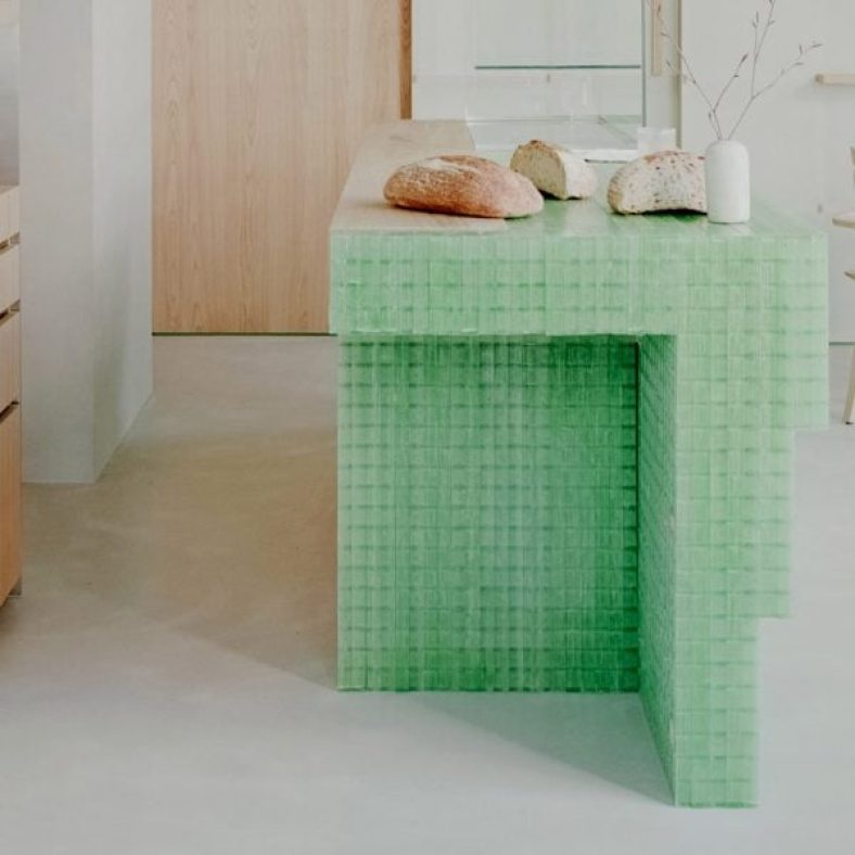
A fibreglass counter sits at the centre of the bakery
A central bread counter is the “protagonist piece” in Pan’s interior design.
The counter was constructed from panels of fibreglass grid and its eye-catching colour was informed by the vivid green of matcha, an ingredient widely used in Pan’s food, the studio said.
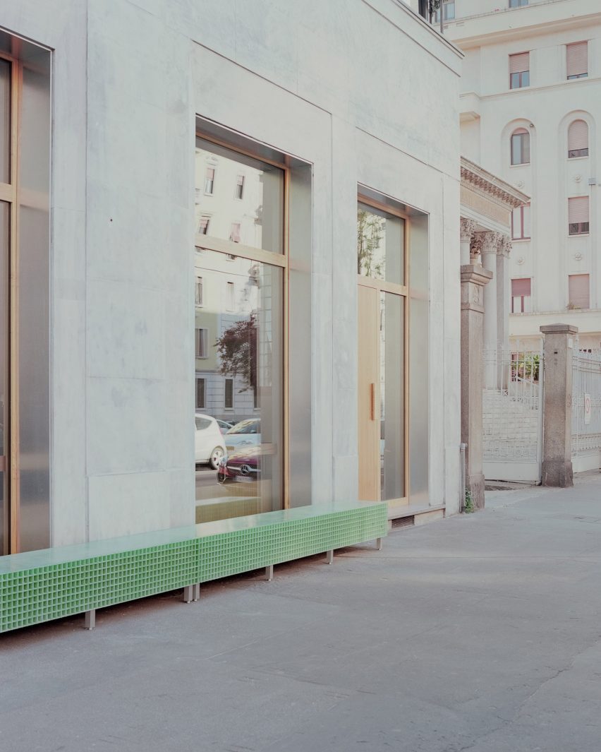
Fibreglass was also used to create an external bench, linking the bakery with the wider neighbourhood.
Fibreglass was also used for an external bench
“We did a lot of research looking for a ‘poor’ material that could be ennobled by being used in an innovative way,” Studio Wok told Dezeen.
“Fiberglass grating is a material used in industry but little used in interiors and it seemed perfect to us.”
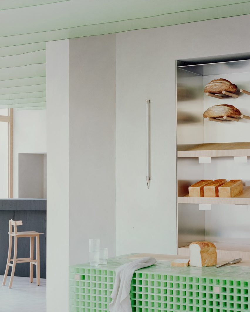
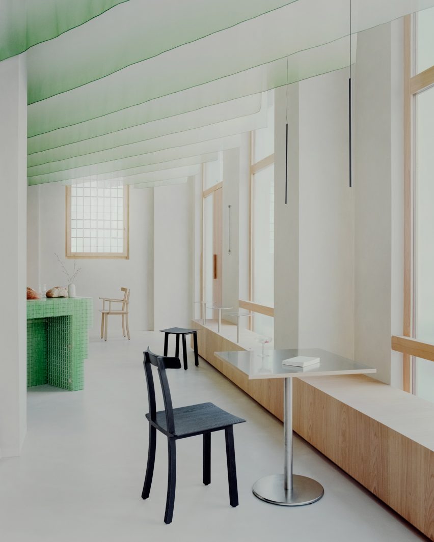
Fabric hangs from the ceiling
The green of the fibreglass is echoed in vertical fins of hanging fabric that define the ceiling, creating a dialogue between hard and soft elements within the space.
These suspended sheets of fabric are a contemporary update of the traditional Japanese design element of ‘noren’, meaning curtains or hanging divider panels.
Wooden seats have views of the street
“The ceiling sheets have the main function of creating a three-dimensional covering to make the environment more welcoming and also to work from an acoustic point of view,” the studio said.
“They create a suspended three-dimensional world, both continuous and ephemeral. Furthermore, they dialogue with natural light during the day and with artificial light in the evening.”
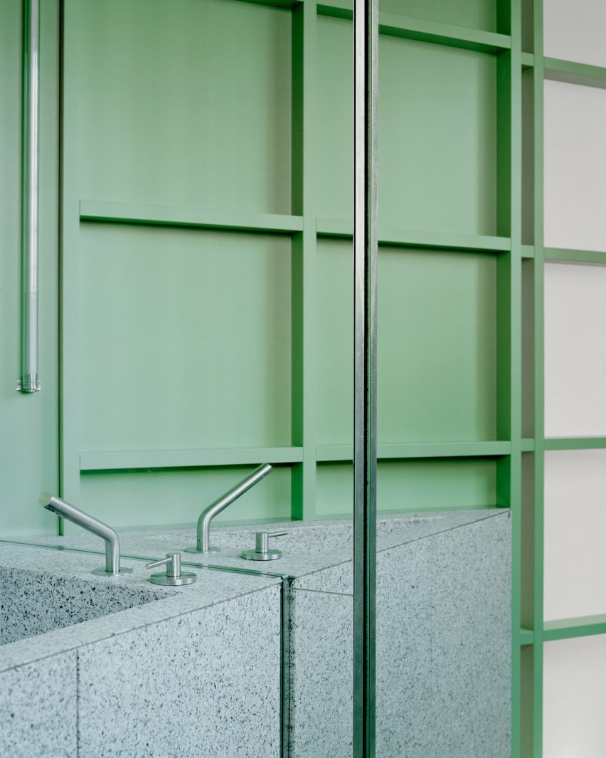
The bathroom has a decorative stone sink
In the bathroom, the green theme continues with a wall and sliding door featuring translucent panels of pressed cellulose, which have been fixed onto a wooden grid frame.
“We were looking for a translucent material to allow natural light to pass through the anteroom. It also reminded us of the rice paper walls, typical of Japan,” Studio Wok said.
The effect of these materials is to create “a green monochromatic box from which the monolithic element of the sink emerges,” Studio Wok said.
The sink was made of a grey-tinted natural stone called Moltrasio.
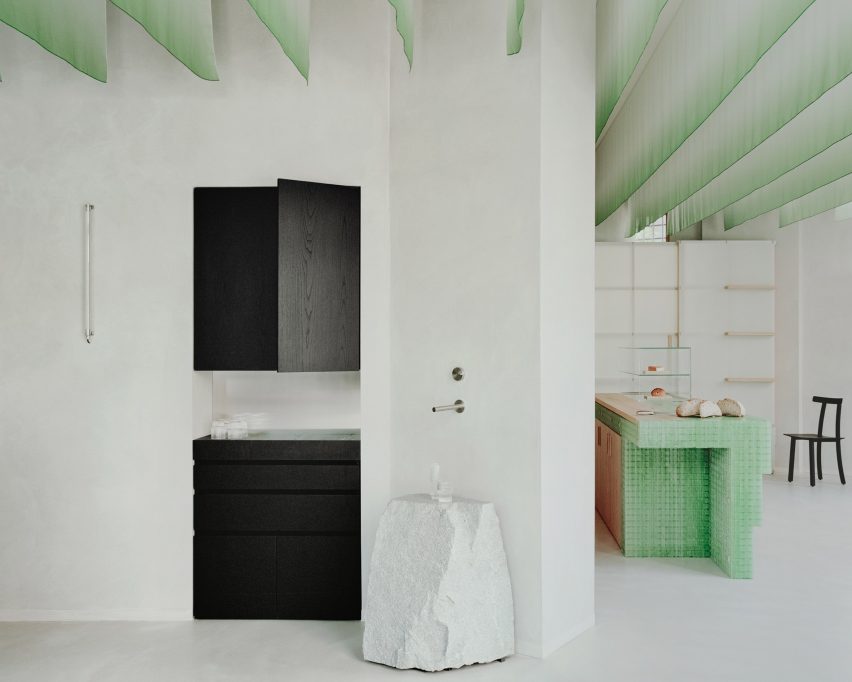
In the main space, light grey walls and floors in hand-trowelled cementitious resin amplify the sense of light, while chestnut was used in both its pale natural form and stained black across integrated and freestanding furniture.
Black-stained chestnut was used for the bar area
The bar area has a more serious, less playful atmosphere, informed by the black-stained chestnut wood of the counter and cabinetry.
Here, a rough-hewn natural stone boulder serves as a water counter, introducing a freeform, sculptural element to the space.
Studio Wok designed the bakery and wine bar with references to Japan
To anchor the space in the local neighbourhood, Studio Wok designed large windows with pale chestnut frames that open the bakery up towards the street.
Seating in the window areas “project the interiors of the venue outwards, creating a hybrid threshold space between the domestic and the urban,” the studio said.
“Our vision for the material palette at Pan was to seek a balance between elements with a contemporary and industrial flavour, with others that are more natural and timeless,” said Studio Wok.
“It’s a celebration of Japan and its dualism between innovation and wabi-sabi spirit.”
As the refreshing breeze of spring gives way to the warmth of summer, the home improvement season kicks into high gear. Those who have a substantial budget often pour significant funds into expansive kitchen remodeling projects. But what about those with a tighter budget who are still eager for a fresh, revitalizing change? No need to fret, because cabinet refacing presents a savvy and economical option for those looking for a significant transformation without the hefty price tag.
A one-room hotel kitted out with a miniature nightclub and twin dwellings with labyrinthine staircases informed by MC Escher are among the guesthouses featured in our latest lookbook.
Guesthouses are accommodations for travellers, including cabins, rental cottages and private rooms, sometimes located in close proximity to permanent structures such as homes or offices.
Despite their temporary nature, guesthouses can feature distinctive designs created to be remembered for longer than just during their occupants’ stay.
From a bird nest-style retreat in Namibia to a micro dwelling in South Korea, here are eight guesthouses with impactful interiors from across the globe.
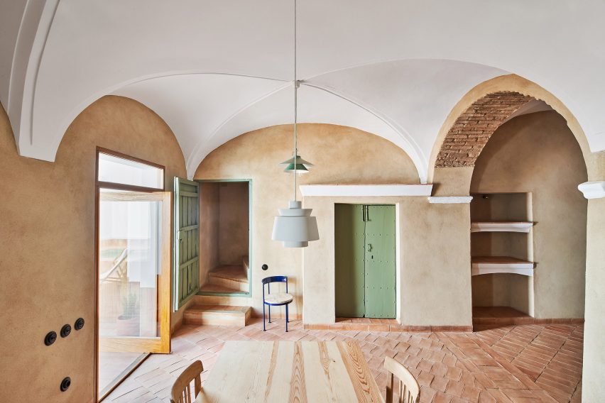
Spanish studio Lucas y Hernández-Gil sought to honour the original architecture of this eighteenth-century building, which was renovated to feature decorative doorways and original arched ceilings.
Nestled in a wine-growing town in Spain’s Extremadura region, the guesthouse takes visual cues from its site, with hues of deep red and pale green that nod to the town’s natural terrain and surrounding vineyards.
Prefabricated in New York, Den Cabin Kit is a flat-packed kit-of-parts for a steeply pitched cabin that is designed to be assembled in a few days.
Cabin-design company Den Outdoors created the structure to cater to a guesthouse, study or yoga studio. Slanted wooden walls and a single triangular window create a cosy atmosphere inside.
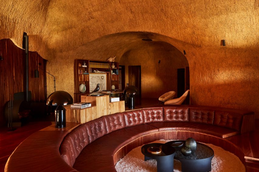
The Nest at Sossus is an off-grid guesthouse in Namibia with a thatched facade informed by the amorphous shape of bird nests.
Thatching also features on the interior, which South African designer Porky Hefer created with bulbous protrusions and built-in furniture to mimic the stacked components of a nest.
Pieces include a sunken Chesterfield-style sofa upholstered in oxblood-coloured leather.
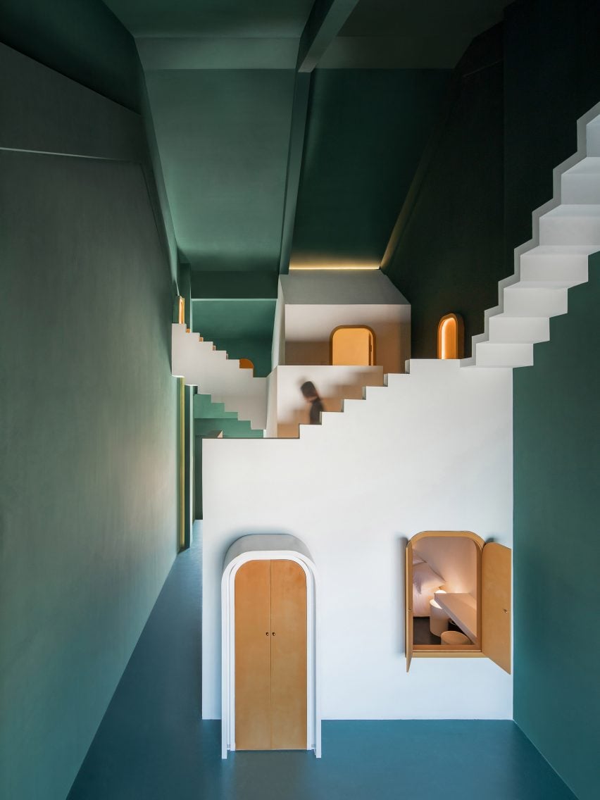
Shenzhen-based Studio 10 designed a pair of guest rooms in Guilin, China, which take cues from the optical illusions of the seminal Dutch graphic artist MC Escher.
Called Dream and Maze, the rooms feature colour-coded arched doorways and disorientating anti-gravitational staircases built within a seven-metre-high structure with a pitched roof.
“The challenge was in keeping the balance between the practical need of a hotel suite and the illusionary, spatial effect we wanted to achieve,” the studio told Dezeen.
Catalan studio Aixopluc filled a guest apartment above its offices with modular furniture that can be assembled using DIY techniques.
Named after an Arabic word describing a place for both guests and for storing goods, Alfondac features various exposed appliances and living areas amalgamated into one space.
“This iteration is an exploration of the potential benefits of having different activities and their smells – shit, lavender soap, pee, escudella [a type of Catalan stew], incense, linen sheets after sex, hyacinth flowers, baby’s poo and half-full glasses of Priorat wines – coexist rather than being segregated,” said Aixopluc.
Nuwa is a tiny guesthouse in northern Seoul that measures under 30 square metres. Local studio Z_Lab renovated a traditional Korean home, known as a hanok, to create the apartment out of a single room.
A porthole window inserted next to the bed provides views of the surrounding garden, while a sunken bath and walnut and stone accents define the rest of the space.
Hailed by its designers as containing Tokyo’s smallest disco, this one-room hotel in the city’s Kagurazaka neighbourhood features a miniature nightclub with a bright red interior, a curved bar and an illuminated dance floor.
Hotel brand Trunk collaborated with design studio Tripster to create the interiors within a traditional 70-year-old geisha house. Living spaces are characterised by muted palettes, including a tearoom with tatami mats arranged around a sunken fireplace.
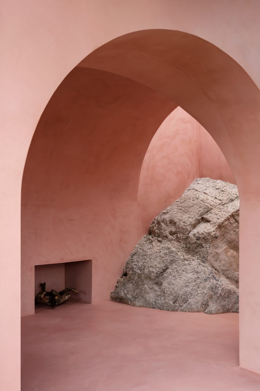
Architecture studio Mar Plus Ask designed a pair of guesthouses in the Mallorcan mountains to celebrate the craggy boulders that jut through their walls.
The Olive Houses are off-grid dwellings created for solo creatives as a silent refuge. Sloping cave-like walls were rendered exclusively in blush-pink stucco to complement the pale green shade found on the underside of an olive tree leaf.
“To us, the [boulders] became a piece of art – suddenly the house was more about sculpting its backdrop and being its lightbox,” explained the studio.
Kitchen design trends, like fashion trends, can quickly change. The yellow cabinets and wooden countertops popular in the 1970s are an outdated embarrassment compared to the sleek, textured cabinets and quartz countertops that are popular in contemporary kitchen design.
Although trends change with time, certain kitchen styles remain popular for years, but what makes them so timeless? We talked to kitchen remodeling experts and got their expert opinions. Let’s dive right in!
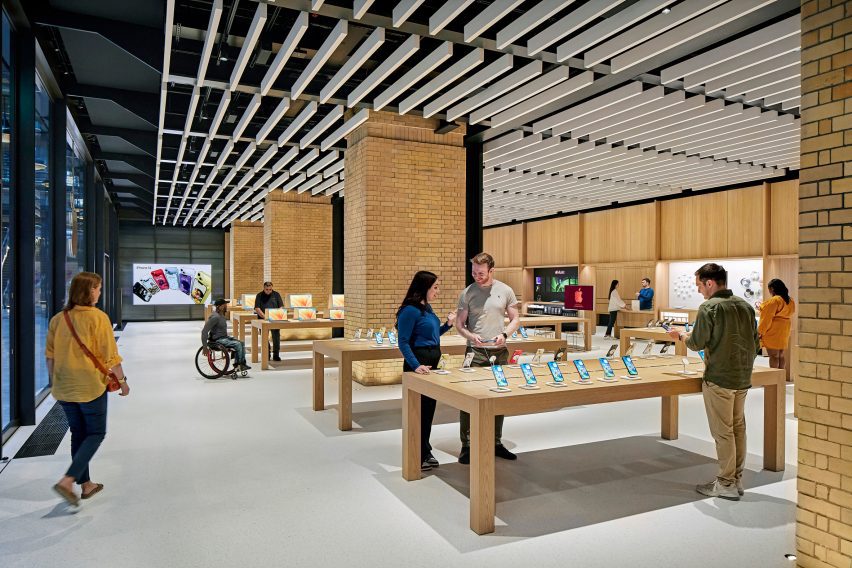
Technology company Apple has unveiled its latest Foster + Partners-designed store in the recently revamped Battersea Power Station in London, which features updated fixtures and furniture.
Set to open later today, Apple Battersea is the brand’s 40th UK store and represents an evolution in its retail design thinking with more of an emphasis placed on accessibility and sustainability.
“We developed this material palette and this fixture set that is really trying to align with like Apple’s goals,” said Bill Bergeron Mirsky, a global retail design lead at Apple.
“This material palette is new for us, it’s an evolution of the Apple Store,” he told Dezeen.
The shop is arranged around four original brick piers and has steel roof supports exposed on the ceiling. On top of this base, Foster + Partners overlaid a revamped fixture set that Mirsky said “will become familiar over time”.
Apple Battersea is the second store – after the recently reopened Tysons Corner store in the USA, which replaced Apple’s first ever store – to feature the redesigned fixtures.
It features an updated fixture set
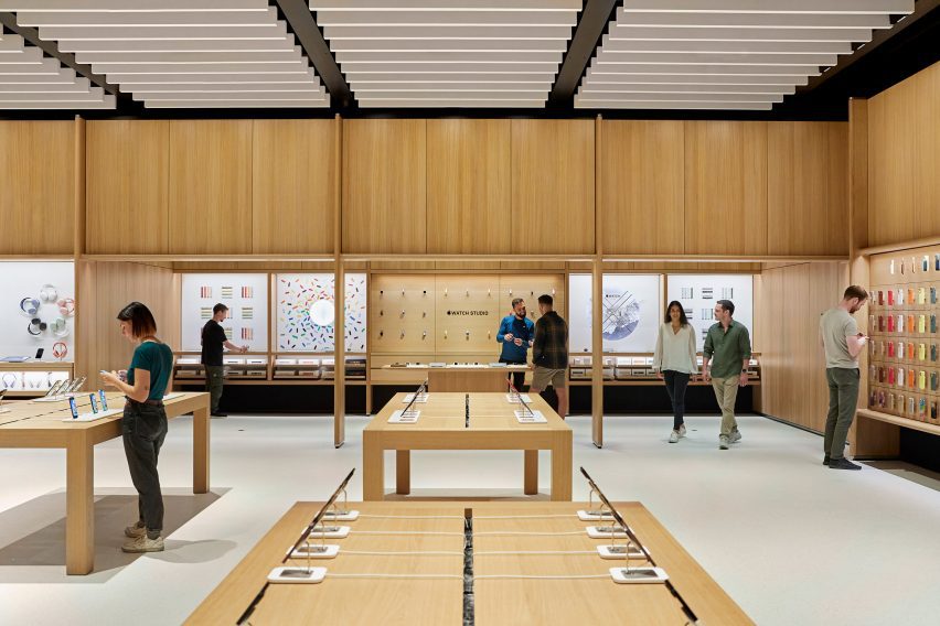
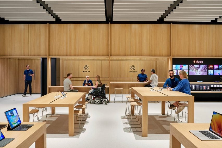
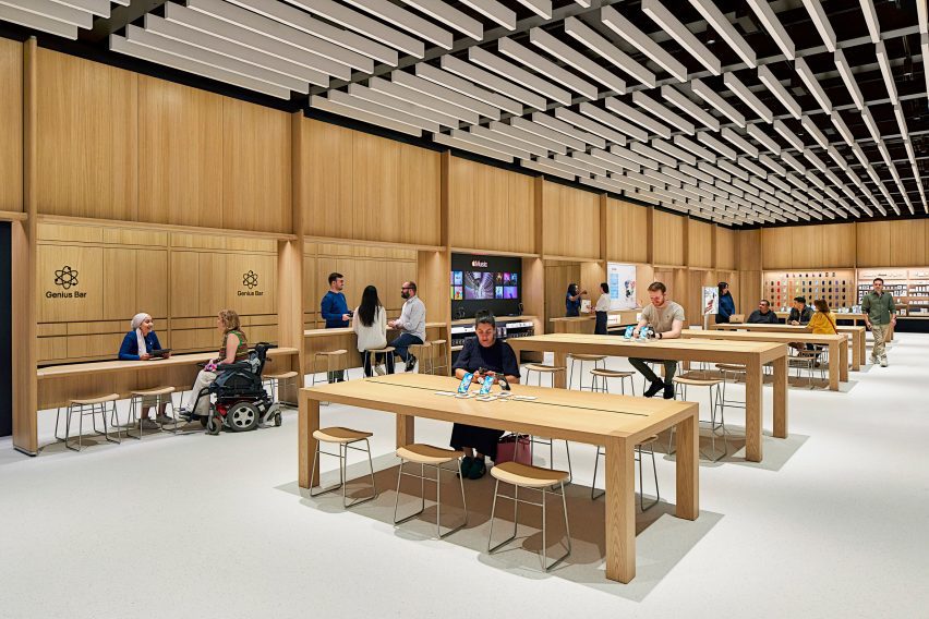
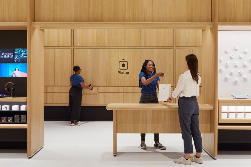
Around the edge of the store is an oak framework of shelving that was developed with Foster + Partners. The timber structure also defines a space dedicated to watches, a pick-up area and a redesigned Genius Bar.
The Genius Bar has a counter for stand-up service along with a lowered area where people can be served sitting down. Along with its standard Parsons tables, which are made from sustainably harvested European oak, the store also has several lowered tables.
The redesigned Genius Bar has a lower counter
“We’ve thought about mobility issues across the whole fixture set,” explained Mirsky. “We have our traditional Parsons table with our standard height, but you notice that the tables in the back are varied and our new genius bar as well.”
“We have a standing height because the team really prefers to stand and it lets them work with more people and then they can stand at the tables, but customers who want to sit or need to sit can actually use these slightly modified tables,” he continued.
As part of the focus on mobility, Apple also increased the amount of circulation around the edge of the store.
There is more space around the edge of the store
Along with the timber framework, Apple aimed to replace other more carbon-intensive elements in the store with biomaterials.
The floor, which was first used in the Brompton Road store, was made from aggregates bound together with a bio-polymer, while the acoustic baffles in the ceiling were made from biogenic material.
The acoustic baffles and bright floor form part of a focus on improving visual and acoustic clarity in the store, with a dark band placed around the base of the walls to provide visual differentiation with the flooring.
“Something I want to point out that is really part and parcel of the material palette, but also goes to our universal design, is the contrast in the store,” said Mirsky.
“We wanted to make sure we have this really enhanced kind of navigation,” he continued. “So the floor is brightened – it helps us with our low energy – but it also makes it so that you can clearly see the table and the walls are defined.”
The store has a dedicated pick-up corner
The fixture set, flooring and ceiling baffles were also used at the Tysons Corner store and Mirsky believes the base can create a feeling of familiarity for Apple’s customers.
“Each store is really dealt with as a unique circumstance Battersea has this incredible, incredible existing architectural fabric to work in,” he said.
“We use the same fixture set at Tysons Corner in a mall setting in America which doesn’t have this sort of grand grandiose architecture, but the same fixture set can generate an environment that’s very familiar and welcoming no matter where you are.”
The evolution of open floor plans has genuinely reshaped the character of the kitchen in our homes. Just fifty years ago, the typical kitchen was often a separate, isolated room. The prevailing thought was that the kitchen was purely a workspace, where any muss and fuss created there should remain concealed from visitors or casual callers.