Have you recently renovated your kitchen and need something to help you with residue left after cabinet refacing, newly installed countertops, and upgraded flooring? Or perhaps you just want to arm yourself with eco-friendly cleaning products that will cut down on dirt, grease and grime? Odds are you need to look no further than your kitchen pantry, because white vinegar is practically a miracle cleanser. When mixed with water – and sometimes salt or baking soda – vinegar cleans countertops, sinks and even mirrors for a fraction of the price of commercial cleansers. (more…)
The Zaha Hadid Foundation has opened an exhibition about Zaha Hadid’s Moonsoon restaurant in Sapporo, Japan. Here, exhibitions officer and curator Johan Deurell selects five highlights from the show.
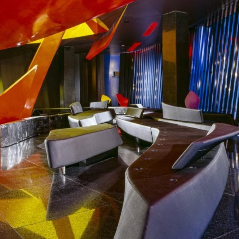
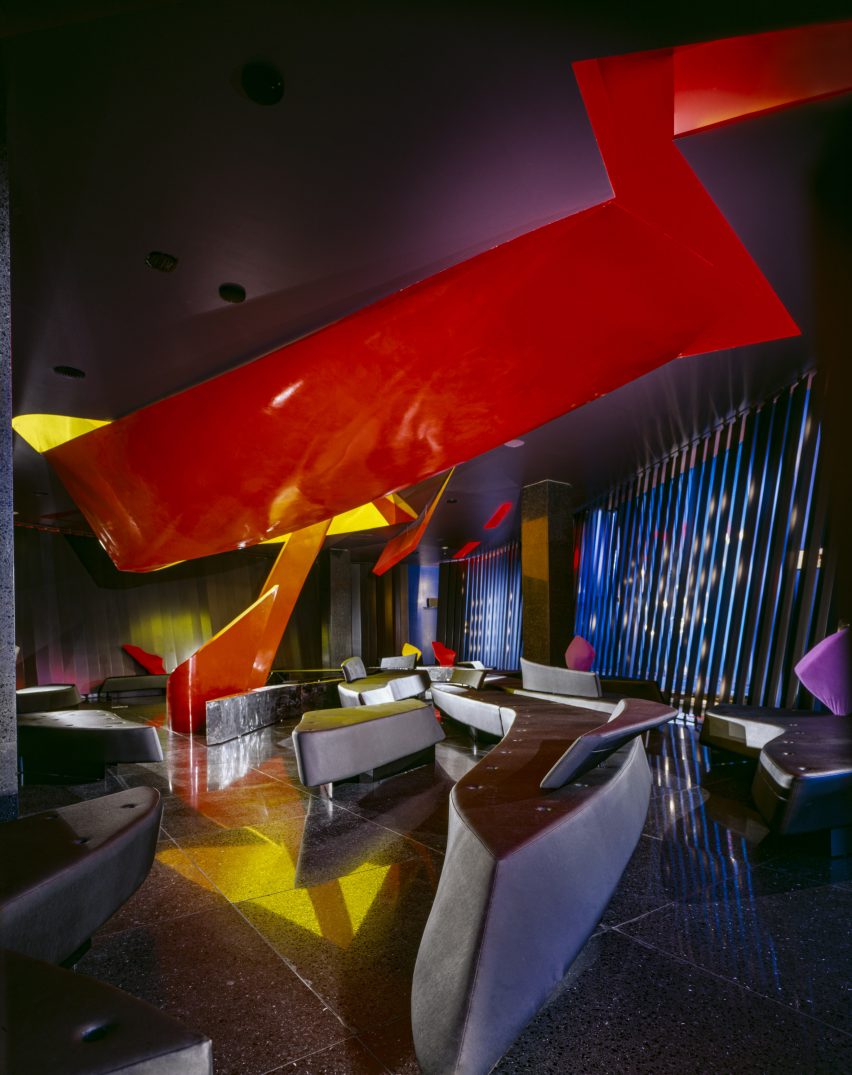
Zaha’s Moonsoon: An Interior in Japan is a case study of architect Hadid‘s first built project outside of the UK – the Moonsoon Bar and Restaurant in Sapporo, Japan, which was constructed in 1989.
The exhibition offers a journey from the conception of the venue – conveyed through a series of archival models, presentation documents and sketches – through to its built form, presented through images and one-to-one recommissioned furniture from the bar’s interior.
“Our latest exhibition showcases the creative processes behind one of Zaha Hadid’s earliest and less well-known projects,” said Zaha Hadid Foundation director Paul Greenhalgh. “Moonsoon was created at the time of the incredible explosion of the Japanese economy, and the design boom that accompanied it.”
“Japan provided opportunities for emerging architects to work on experimental projects. For the foundation, it is a chance for us to dive deep into the archives and highlight works rarely seen before.”
Monsoon’s design referenced some of the early 20th-century avant-grade movements that emerged out of Russia, such as the works of Russian abstract artist Kazimir Malevich.
Angular, twisting and geometric shapes were translated into functional architectural volumes and layers. Additional design references include the works of sculptor Alexander Calder, French liquor commercials from the 1950s and imagery of orange peel and pasta.
Zaha’s Moonsoon: An Interior in Japan takes place at the Zaha Hadid Foundation headquarters in Clerkenwell, London, which functioned as Hadid’s headquarters from 1985 until her death in 2016.
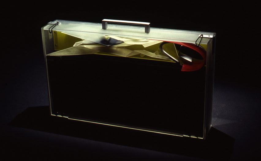
Presentation case, acrylic and aluminium by Zaha Hadid Architects, 1989-90
“The idea of our exhibition came about with the discovery of a Perspex briefcase in the archive. This briefcase was made by Daniel Chadwick as a container for the Moonsoon design concept.
“It carried elements of model as well as 14 paintings, six perspective drawings and 13 collages shown in this exhibition. The case would be taken to the clients as a form of presentation strategy, where the works on paper would be laid out and the model assembled.”
Presentation model, acrylic by Zaha Hadid Architects, 1989-90
“This model, made by Daniel Chadwick, was created to illustrate a concept, rather than as a replica of the restaurant’s final form. Here an ‘orange peel’ shape swirls through the two floors, and the colourful shards represent the furniture and interior elements. At the time it was made, the interior and furniture designs had yet to be finalised.
“Zaha Hadid Architects embraced the transparency of acrylic to make the relationship between interior and spatial elements in the model easier to view. In the future, digital models would provide the transparent layering effects that Hadid sought to achieve through the early use of acrylic.”
Interior concepts, acrylic paint on black cartridge paper by Zaha Hadid Architects, 1989-90
“This painting belongs to a suite of 14 paintings originally stored in the Perspex briefcase. Moonsoon’s concept was partially inspired by fire (for the first-floor bar) and ice (for the ground-floor restaurant), which is illustrated through the reds and blues in this painting. A swirling ‘orange peel’ shape represents the central furnace penetrating through the two floors, whereas splintered ‘ice shards’ symbolise tables.
“Zaha Hadid Architects used paintings to explore concepts that could not be shown through conventional perspective drawings. Various team members contributed to the paintings. The works were derived from sketches, which had been transferred to tracing paper and then onto cartridge paper, and subsequently coloured in, often by Hadid herself. Their warped shapes and layering anticipated the possibilities later offered by CAD software.”
Zaha’s Moonsoon, by Marwan Kaabour, 2023
“Not everything in the show came from that briefcase. There were boxes upon boxes of archival material too. During the research phase, colleagues at Zaha Hadid Architects told me: ‘go find the little doodle’. That turned out to be a sheet of Arabic letterforms spelling out Zaha and Moonsoon, and the recurring swirly shape, which you see in the model and paintings.
“With some help from Marwan Kaabour, who designed the graphic identity for the exhibition, I learnt that the swirl is a stylised version of the letter H in Zaha. Marwan has done some amazing work for Phaidon and V&A before and runs the Instagram account Takweer on queer narratives in the SWANA region. I asked him to make a video based upon the archival material we had found.
“This snippet is taken from that video. It charts the development of Moonsoon’s ‘orange peel’ structure, from the brief to its final built form. Beginning with sketches of the words مونسون [Moonsoon] and زها [Zaha] based on Arabic letterforms, through references to orange peel, pasta, and the works of Alexander Calder, it concludes with their eventual translation into the technical drawings informing the construction, as well as images of the construction and built.”
Photo by Paul Warchol
Sofa and tray table by Zaha Hadid Architects, 1989-90 (remade in 2014)
“Finally, the exhibition includes a boomerang-shaped sofa from the bar. The furniture for Moonsoon employed intersecting curves and diagonal planes to create an interior landscape. Designed by Michael Wolfson, the differently sized sofas have interchangeable plug-in backrests and tray tables, which came in different colours and finishes.
“Waiters could set the tables on their stands when delivering the drinks to guests. I am not sure how well this waiting method worked in practice, but it is interesting to think about this furniture as part of a design historical tradition of flexible seating landscapes. We know that Zaha was a fan of Verner Panton’s work, for example.”
Zaha’s Moonsoon: An Interior in Japan is on show at the Zaha Hadid Foundation in London from 20 April until 22 July 2023. See Dezeen Events Guide for an up-to-date list of architecture and design events taking place around the world.
It’s estimated that most Americans spend up to twelve hours washing, folding and putting away their laundry each week. You may be spending more time in front of the washing machine than you originally thought, and if your laundry room isn’t properly organized, it may be taking up a lot of your time.
Nobody wants to cook, clean and eat in an old kitchen, but the old-world style is a coveted one all around the world. New style trends have taught us that combining modern technology with vintage or rustic design can be both beautiful and functional. Reclaiming old pieces of furniture, distressing new pieces and adding vintage touches that remind us of simpler times are very popular trends right now. But go too far into the rustic or craftsman style and you risk ending up with a space that looks like it belongs in the early 1900s.
Let us teach you the three most important elements of craftsman-kitchen style, so you can incorporate it into your home. If you’re not sure where to start, make sure you contact professional kitchen remodeling contractors and you’ll have your rustic dream kitchen ready in no time.
Shanghai-based interior studio Linehouse used natural materials and a muted colour palette to give the Ying’nFlo hotel in Wan Chai, Hong Kong, the feel of an inviting home.
The hotel occupies the podium of a 24-story tower on a hilly street in Hong Kong. Its ground floor holds a series of communal spaces that Linehouse designed to provide “home comfort” for guests.
The ground floor comprises a series of rooms referencing living rooms
The Collectors Room, which greets guests at the entrance of the hotel, has a neutral palette of hand-rendered walls, timber paneling, and linen cabinetry that display curated objects and artworks. A communal oak table serves as a counter where guests can interact.
This room also connects to an outdoor terrace through sliding glazed doors. Built-in bench seating and an olive tree sit at the centre of the terrace and invite guests to relax and socialise.
A communal table and outdoor bench invite guests to socialise
A gridded timber screen leads further into the space through to the lift lobby and the Arcade room, where guests can gather to relax and play.
Soft-rendered walls, timber shutters and an eclectic mix of furniture create a sense of intimacy, while floor tiles in various geometrical motifs add a sense of playfulness.
The Music Room features ceramic tiles
Adjacent to the Arcade is the Music Room, the social hub of the hotel. Here, ceramic tiles, a bespoke oak shelving system, a custom sofa and curated art and lifestyle objects were added to evoke a sense of a residential living room.
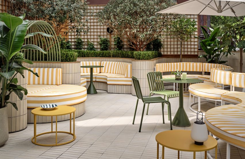
The Music Room opens up to the Garden Terrace, where undulating greenery sits behind circular seating in yellow-striped fabric, a colourful contrast to the overall neutral colour palette of the Ying’nFlo hotel.
Yellow-striped fabric seating on the terrace adds playfulness
“The spaces are designed to have a warm, welcoming and familiar feel,” Linehouse said.
“Against this backdrop of curated simplicity is an edge of youthful attitude and local context, with vibrant elements giving the hotel its own unique flavour.”
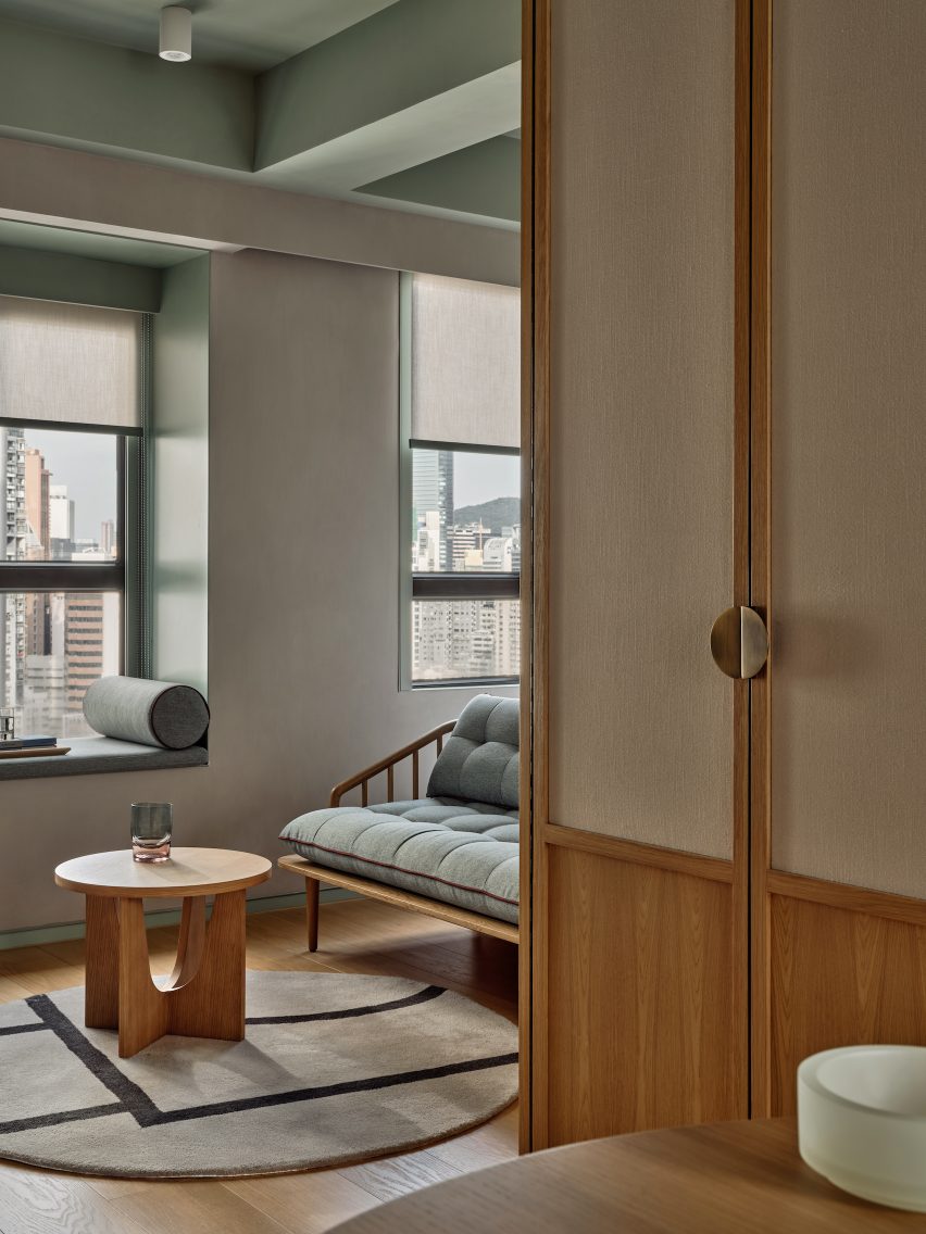
The guest rooms of the Ying’nFlo hotel are located on the upper floor and feature ceilings painted in a muted green hue, which the same green tone used to frame window seating nooks and for the hand-glazed tiles in the bathroom and kitchen.
A clean palette of plaster, wood, white-washed oak and canvas add texture to the rooms. Seating nooks and lounge furniture serve multiple functions as spaces where guests can work, relax or dine.
Muted green and selection of wood furniture create a warm feeling for the guest rooms
Linehouse was founded by Alex Mok and Briar Hickling in 2013 and the duo went on to win emerging interior designer of the year at the 2019 Dezeen Awards.
Design principle: Briar Hickling Design team: Ricki-Lee Van Het Wout, Lara Daoud, Justin Cheung
Dezeen is on WeChat!
Click here to read the Chinese version of this article on Dezeen’s official WeChat account, where we publish daily architecture and design news and projects in Simplified Chinese.
Whether they’re large or small, vital for cooking meals, or just for a fun experience with friends, kitchen appliances and accessories make it easier to complete our daily tasks. But not all kitchen appliances are made equal, so before you splurge on that new soda machine that turns water into gold, let us help you decide what’s in, what’s out and what’s actually worth the moneyin your next kitchen remodel.
What are trending kitchen appliances?
In recent years, we have seen a significant shift in the culinary landscape, with innovative gadgets and appliances making their way into our kitchens. These modern marvels not only simplify our lives but also help us create delectable dishes with ease. We decided to simplify things for you and discuss home appliance trends that are capable of revolutionizing our culinary experiences.
Cream kitchen cabinets offer a variety of qualities that make them a popular choice for both designers and homeowners alike. Cream colored kitchen cabinets are bright like their popular relative, white cabinets, but much less stark.
Cream cabinets are warm and inviting and add subtle depth and character to any room. Cream also pairs beautifully with an array of natural materials like wood, stone, and brick to produce a sophisticated yet simple style.
Cream is a neutral that is similar to white but softer and warmer and is among the wide variety of shades known as off-white. Cream leans toward the yellow side of off-white, similar to the color of dairy cream.
Cream tones range in how much yellow is present in the mix. In some cream paint combinations, yellow has a strong presence. In others, the yellow is subdued by the addition of cooling colors like gray or blue.
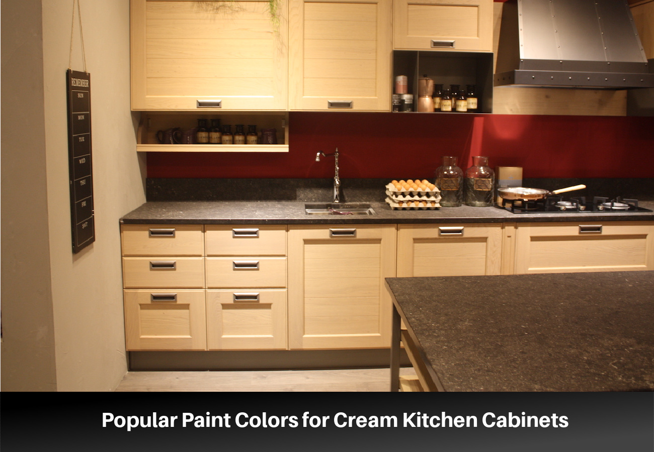
Popular Paint Colors for Cream Kitchen Cabinets
The trick when choosing the right cream is to consider the undertones of the color, the surrounding colors, the lighting sources in the room and the way these impact the color, and your personal preferences.
Creamy (7012) from Sherwin Williams
Creamy from Sherwin Williams is a popular cream for cabinetry of all kinds. It is a bright off-white with pale yellow undertones. It works best with warm tones, but its mild undertones can also pair well with cool colors.
Winterborne White (No. 239) from Farrow & Ball
Winterborne White is the ideal cream color for someone looking for a shade that is just a step away from white. This color is off-white with just a hint of yellow to warm it. This color pairs well with warm hues but looks equally gorgeous with gray or black.
White Down (CC-50) from Benjamin Moore
White Down is a cream with just a hint of gray and beige. These undertones create a color that pairs well with cooler shades.
Alabaster (7008) from Sherwin Williams
Alabaster is a warm off-white/light cream that is gorgeous on kitchen cabinets. It is light enough that it will look white in a dark-colored kitchen, but it looks cream compared with white. The undertones of this color are warm, but it is well-balanced enough that it works with a variety of color tones.
Pointing (No. 2003) from Farrow & Ball
Pointing takes its name from the lime pointing between traditional brickwork. True to its name, it has a delicate red undertone, which means that it works best with warm colors. This color takes on more body next to white but looks pale compared to stronger colors.
Natural Cream (OC-14) from Benjamin Moore
Natural Cream is a light and neutral cream. It is a balanced color with gray undertones. This color is so well balanced that though it has cool undertones, it works well with both cool and warm color schemes.
Shadow White (No. 282) from Farrow & Ball
Shadow White is off-white with just a hint of gray that looks like a white that is in a shady spot. This is a versatile color that takes on a stronger presence in darker rooms. This color works best with other colors that have a cool undertone.
Navajo White (6126) from Sherwin Williams
Navajo White from Sherwin Williams is a definite cream color with strong yellow undertones. Yet, it is light enough that it functions as an off-white rather than a yellow. Don’t confuse the Sherwin Williams’ Navajo White with the Benjamin Moore hue of the same name.
Tips for Choosing a Color for Cream Colored Cabinets
Painting your kitchen cabinets is a huge undertaking. Consider these six tips as you decide on the best color for your kitchen cabinets.
Coordinate with other elements in the room – Before you choose a cream color for your cabinets, you need to consider all the other color elements in the room if you are not planning on changing them. Take into account the wall color, the appliances, the hardware finish, and other decorative materials such as countertops, backsplash, and lighting. For general purposes, if the colors of your materials lean warm, you should choose a cream color with pink or red undertones. For cool-colored accents, choose a cream color with gray, blue, or green undertones.
Consider the lighting – Lights will dramatically change the perceived color of a space. A room with more natural light will make the color appear brighter and less saturated than in a dark room. Also, the color of your light bulbs will give your room a warmer or a cooler cast that will affect the way the cream color appears.
Choose your kitchen materials before you select the cabinet color – This tip is for homeowners who are designing a kitchen from scratch. There are many gorgeous variations of cream that will work for your kitchen cabinets, but not as many countertop materials, floor colors, or backsplash options to consider. Before you choose a cream paint color for your cabinets, choose these kitchen accents. Once you have selected options for your countertops, backsplash, and floor, you can choose an appropriate cream paint color.
Consider the depth of color – Cream paint colors range in the amount of color and depth they have. Some creams have just a hint of color while in others, the color is distinct. Choose the depth of color carefully and test a sample in your kitchen. Colors with yellow undertones will appear more yellow in dark rooms and under warm light. Rooms with large windows may wash out the color of pale creams and not provide enough body to give you the distinct cream look that you want.
Think about your personal style – Your personal preferences should play a role in the cream color you choose. Cream paints with more intense yellow shading will work better in more traditional or classic room styles. Subtle cream colors work better with contemporary styles.
Choose complementing colors – Cream works with a variety of other color tones but works best with natural colors. Consider pairing cream with other neutrals like black, brown, gray, and white. Cream also looks stunning with distinct colors like a wide variety of blues and green, blush pink, burnt sienna, and metallic tones.
Lookbook of Cream Kitchen Cabinet Ideas
A kitchen with cream cabinets works well in a variety of styles and contexts. We have gathered some kitchens that have cream colored cabinets so that you can see all the ways they can complement a kitchen space.
Cream cabinets are as effective in a modern kitchen as they are in kitchens with a traditional style. You can use a simple cabinet style like a Shaker style for a modern classic look or a flat panel cabinet style for something more contemporary. Either way, cream gives a modern kitchen a welcoming but bright appearance and provides a slight but noticeable contrast with modern white walls.
Cream cabinets with black accents give your kitchen a look that is contemporary and luxurious. Consider adding dark accents to a kitchen with cream cabinets including dark countertops, flooring, or black hardware. This creates a style that is dramatic yet simple.
Cream cabinets have a soft look that pairs well with a variety of materials and other colors. Consider pairing cream-painted cabinet units with sections of cabinets painted in complementing colors like deep green, blue, gray, and black. Add in wood elements like beam ceilings and countertops to give your kitchen depth and texture.
Cream, like other neutrals, works well with a variety of metal finishes. Cool creams work well with silver and chrome finishes, while warmer-toned creams look stunning with gold and brushed brass. Brass or gold hardware can bring out the glowing undertones of cream and give it a lush style.
Creating a light neutral kitchen with depth and texture requires planning. Layering white with cream-colored tones keeps the kitchen from appearing too cold and sterile. Mix in other light neutrals like taupe, beige, tan, and almond to create even more contrast and interest.
French interior designer Rodolphe Parente has completed a contemporary overhaul of a 19th-century Parisian apartment, reflecting both the building’s heritage and the “radical” art collection of its owner.
Originally built during Haussmann’s major reconstruction of Paris, the 150-square-metre flat is located in the Canal Saint-Martin neighbourhood in northeastern Paris.
Rodolphe Parente has renovated a Haussmann-era apartment in Paris
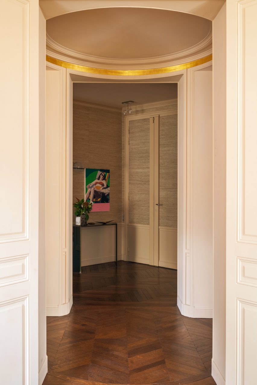
As part of the renovation, Parente sought to celebrate the apartment’s extensive period details. In the entrance hall, a band of gold leaf now highlights the geometry of the circular ceiling and missing sections of the mouldings were painstakingly reinstated.
“The main idea was to preserve and at some points restore the classic Haussmannian codes of a Parisian apartment,” Parente told Dezeen. “It was important for me to keep the Parisian vibration as well as the radical tone of my client’s art taste.”
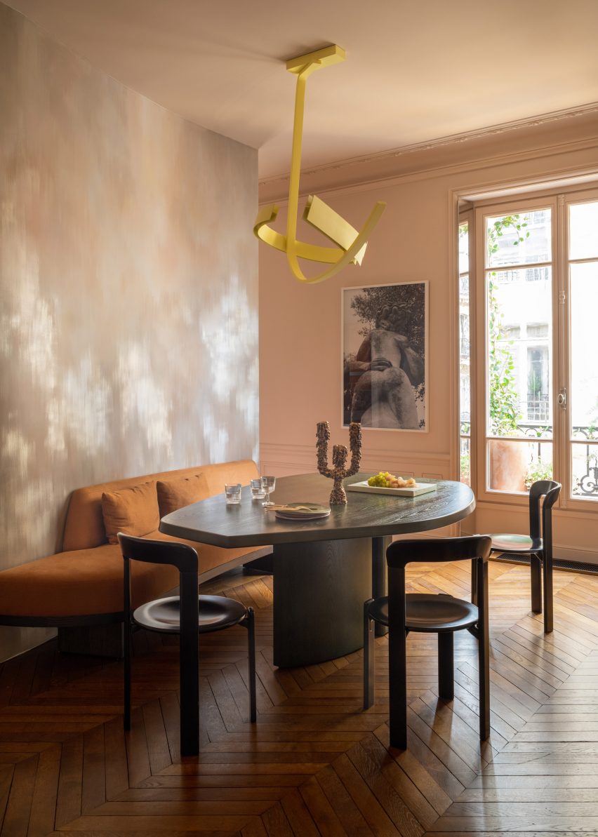
Redfield & Dattner created an abstract fresco behind the dining table
Parente began by opening up the apartment to improve the sense of flow, exposing long sealed-off doorways and connecting the dining room with the kitchen.
Taking cues from the craftsmanship inherent in the apartment, Parente drafted in several contemporary craftspeople including custom painting studio Redfield & Dattner, which created an abstract fresco on the new wall behind the dining table.
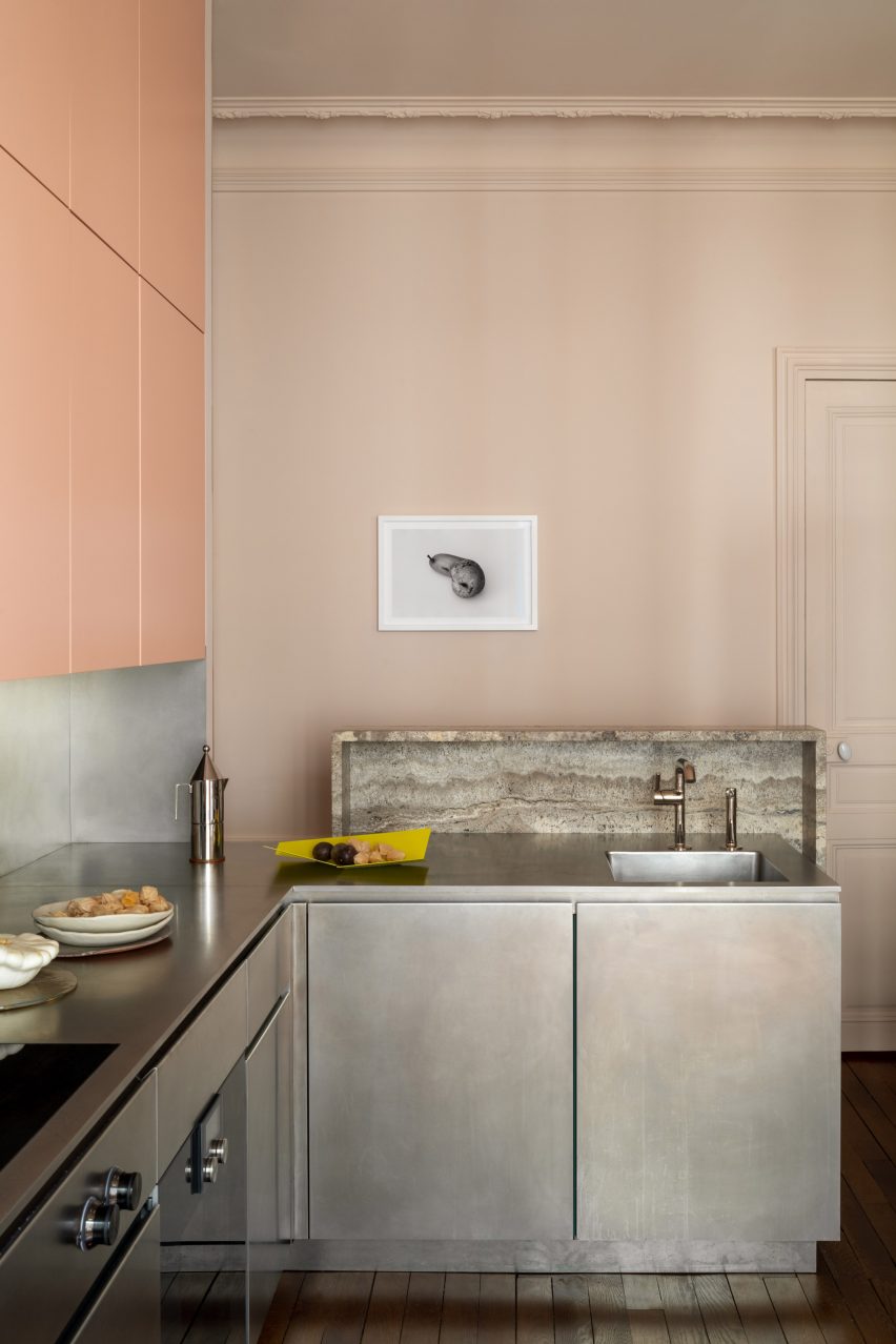
The kitchen balances cabinet finishes of stainless steel and pastel pink
“I wanted to bring the hand of craftsmanship into this project,” said Parente.
“The people I have worked with on this apartment bring something to the creativity in general.”
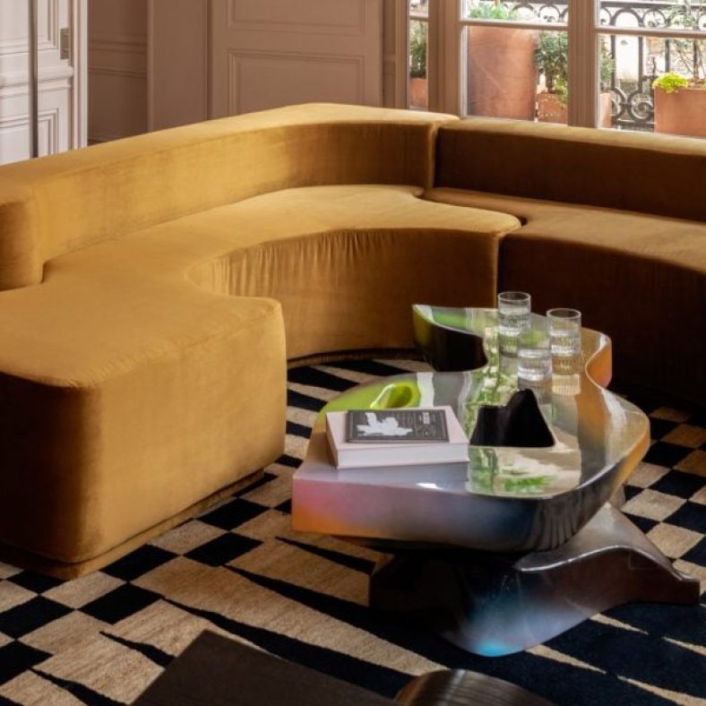
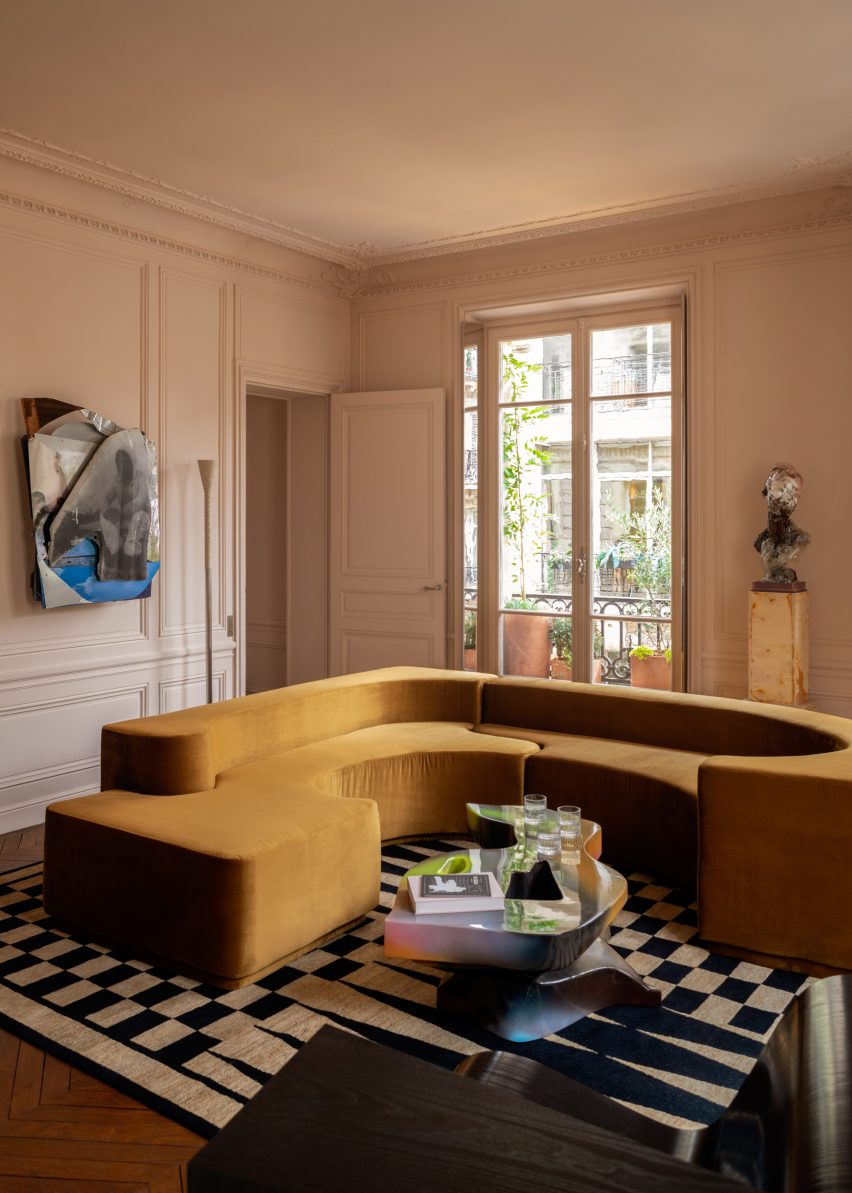
A sculptural vintage sofa centres the living room
Throughout the space, a palette of warm neutrals was used to create a sense of immersion.
“I chose neutral tones to subtly enhance the classical heritage of the apartment and keep an enveloping atmosphere,” the interior designer explained.
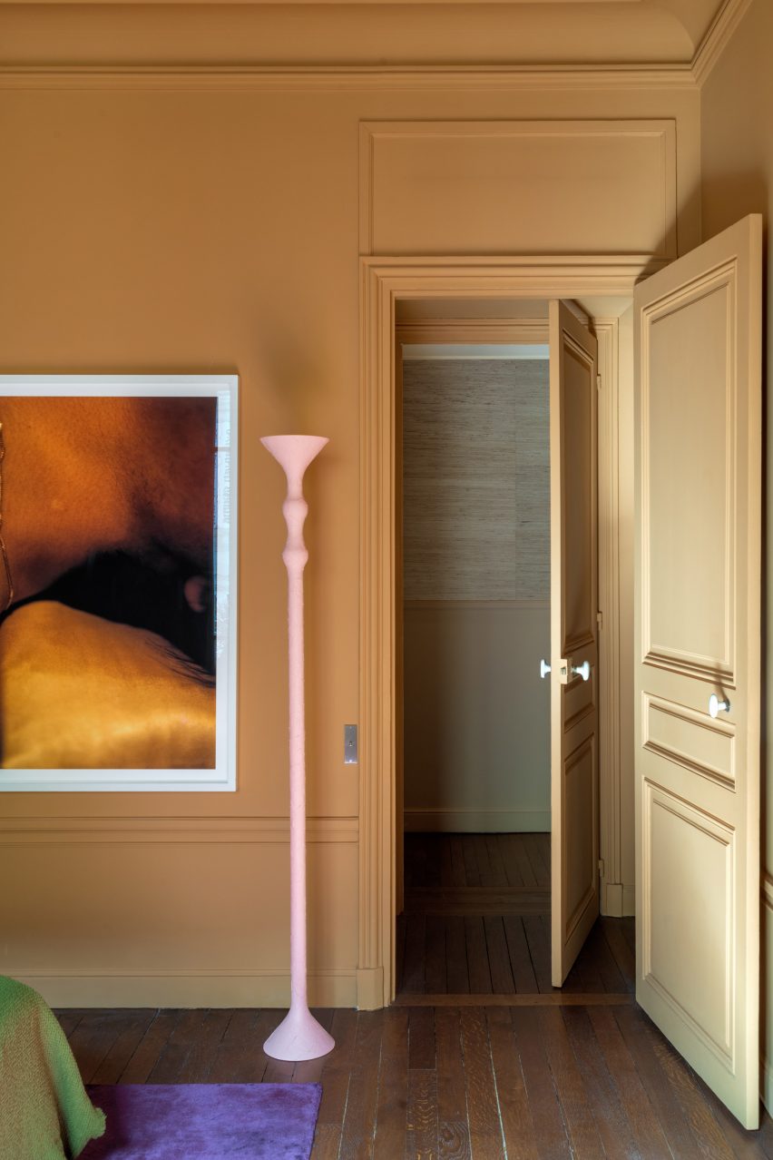
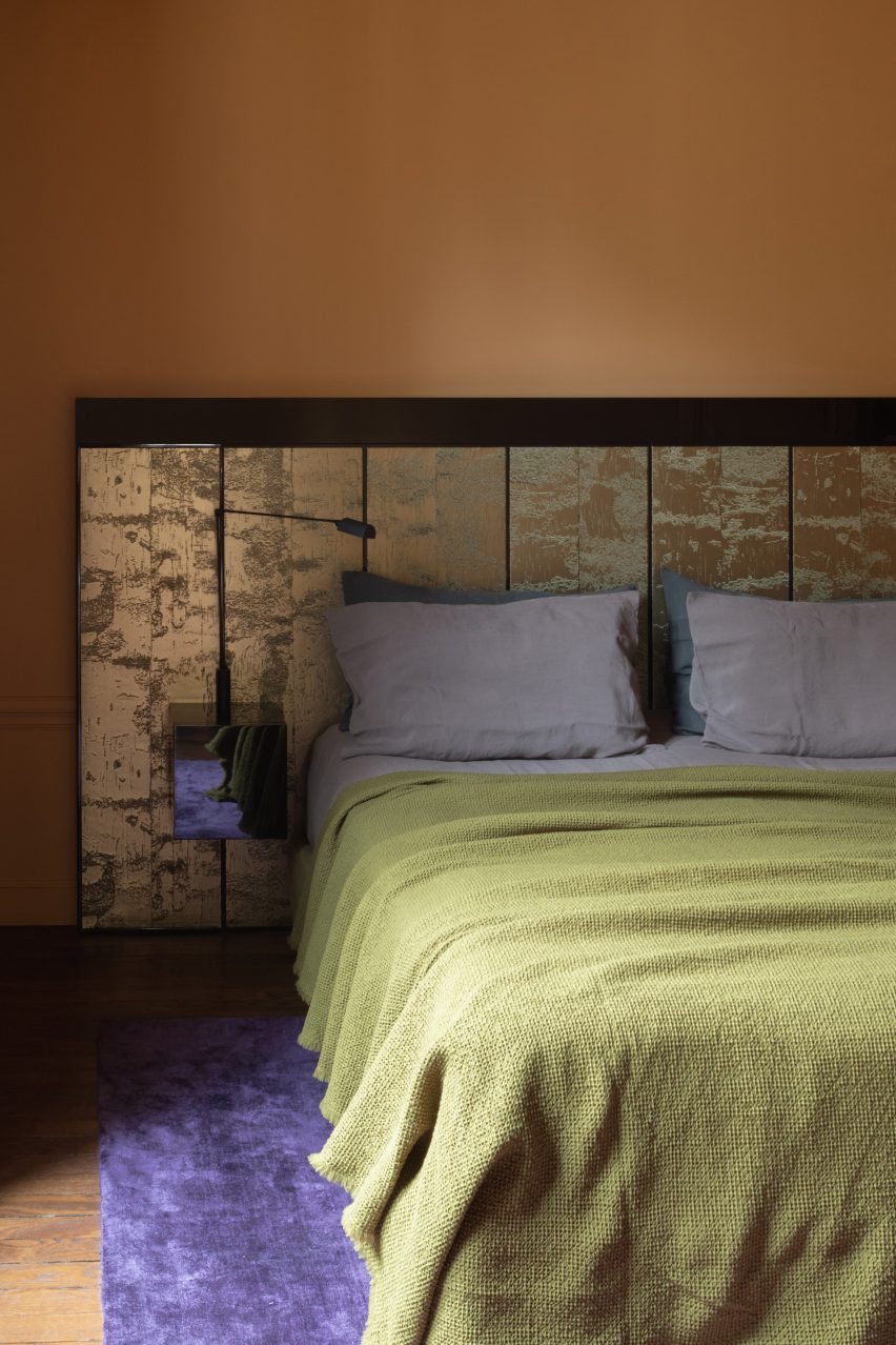
Against this cohesive backdrop, surprisingly colourful elements leap out including the lacquered yellow light above the dining table – Parente’s own design – and the vivid purple rug used against caramel-coloured walls in the main bedroom.
The kitchen balances cabinet finishes of stainless steel and pastel pink with a frame-like marble splashback, created by French artist Alice Guittard for Double V Gallery.
“The kitchen is a deconstructed block sitting in the Haussmanian environment,” Parente said. “It is connected to the historical elements through its composition.”
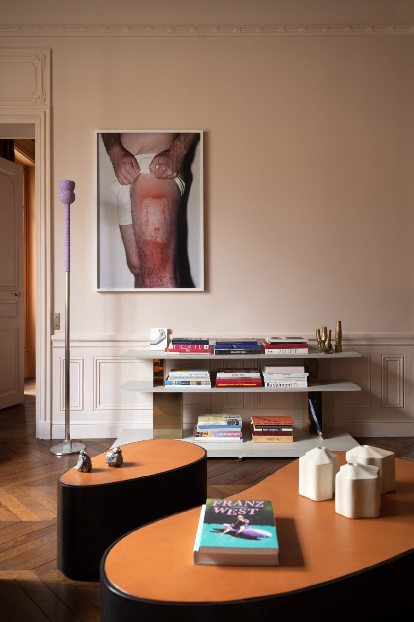
Period wall panelling remains in the reading room
In the living room, a sculptural vintage sofa is sited in the centre of the space, anchored by a graphic rug and positioned to disrupt the angles of the room.
Parente played with contrast via the material and colour palettes throughout the apartment. In the reading room, period wall panelling highlights the modernity of the sofa and chair with their highly lacquered side panels.
Parente designed a custom chair and sofa for the space
“For this room, we have designed custom-made furniture with contemporary and radical shapes bringing a form of reflection to the space,” the designer said.
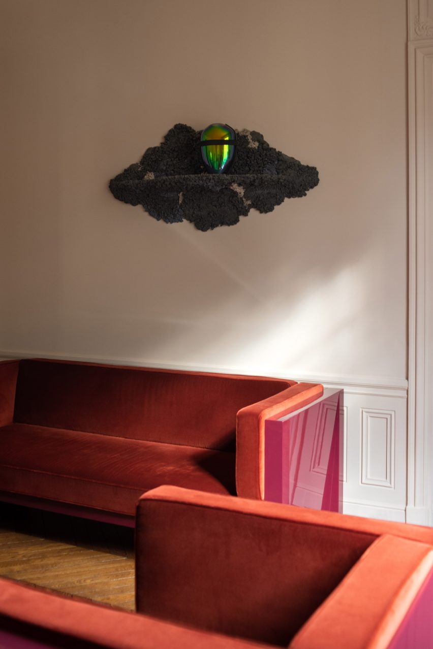
The idea of juxtaposition continues with the art displayed in the apartment, with the client’s often provocative pieces completing the aesthetic in each room.
Colours clash in the main bedroom
“The client showed total faith in this balance between modernism and legacy for the interior design. He also wanted to keep this dialogue for the decoration and focused on staying eclectic in his choice of furniture and art,” said Parente.
“The client has a radical point of view regarding art and design. It was a real pleasure to create a dialogue between the existing pieces and the interior design.”
A vivid purple rug contrasts with caramel-coloured walls
A spa with a spherical swimming pool and holiday homes with sloping plaster walls feature in our latest lookbook, which showcases eight cavernous Greek interiors.
Cave-like interior designs are becoming increasingly popular, as seen in the Gilder Center by Studio Gang – a recently completed museum extension in New York with a large grotto-like atrium.
In Greece, which is known for its caves, there is a wide variety of cave-like architecture either built from existing geological structures or designed to mimic these natural dugouts. Thick, curved walls are often chosen to protect interior spaces from the country’s Mediterranean climate.
As the weather becomes warmer in the northern hemisphere, here are eight cave-like interiors from Greece that are defined by their curved shapes.
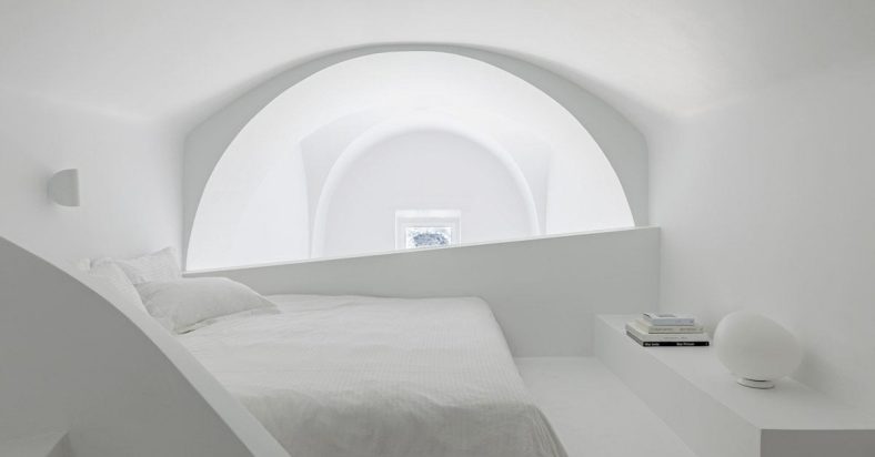
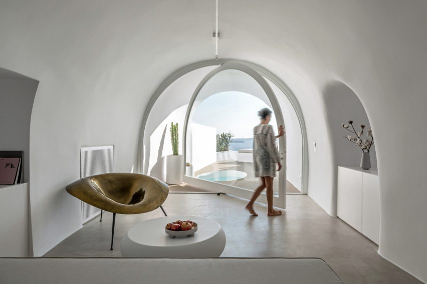
Local studio Kapsimalis Architects converted two underground caves at an old property in Santorini into summer houses with bright white facades.
Inside, the homes are characterised by smoothed-out interiors finished with earthy-hued plaster, while arched doorways and niches nod to the property’s history.
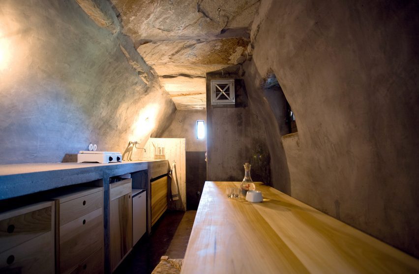
Designer Greg Haji Joannides renovated the interior of an earthquake-damaged house on the island of Nisyros using historic photographs as a guide.
On the ground floor, wide brick archways create an open-plan layout that allows the space to double as an exhibition site for artists in residence.
“The inspiration behind this design was to keep as much as possible of the original way the Nisyrians would build houses,” Joannides told Dezeen. “They would use the ground floor as a storage or working space.”
Wooden Cave is a timber-clad suite that forms part of Hyades Mountain Resort – a hotel in the mountainous village of Trikala Korinthias.
Tenon Architecture split the suite into two sections that intend to mirror the appearance and experience of entering a cave. The front half features ashy black tiles arranged in a linear formation, while the rear half is made from almost 1,000 pieces of curved hand-cut spruce.
“This division intends to create a clear distinction between the hard, ‘protective’ shell and the curved, ‘inviting’ interior, reminiscent of the form of a cave,” explained the architecture studio.
Kapsimalis Architects converted a cluster of former homes, barns and cellars in Santorini into the Saint Hotel – the volumes of which are arranged in a stepped formation down a sea-facing cliffside.
Inside, smooth cavernous walls were finished in white plaster that creates a subtle backdrop for minimal fittings and amorphous furniture.
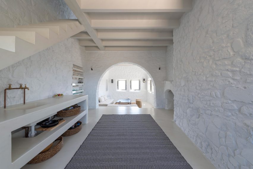
Retreat in Tinos Island is a 100-year-old stable that was transformed into a cosy holiday home for two by architect Ioannis Exarchou.
Exarchou set large stones and thick tree branches into the dwelling’s ceiling, clad the walls in smooth white plaster and covered the floors in coloured concrete.
“My main objective was to retain and preserve the cavernous unique feeling of the space,” the architect told Dezeen.
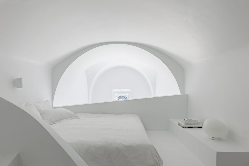
The cave-like subterranean spaces and vaulted rooms within this Santorini holiday home were renovated by Kapsimalis Architects to retain the building’s existing architecture.
The studio worked to simplify the complex interior layout, which features a labyrinthine arrangement of spaces that are brightened by all-white plaster walls.
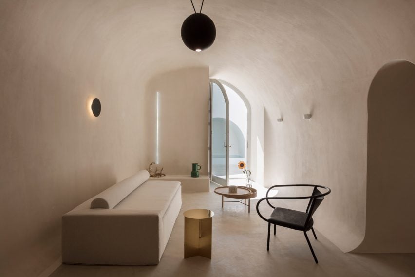
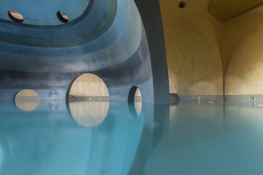
Carved into the base of a mountain in Mystras, Euphoria Spa is made up of differently scaled elliptical spaces that are connected by a web of catacomb-style passages.
One of these areas contains an indoor spherical pool that is characterised by a dark central structure that can be accessed via curved archways.
“Floating in the centre of this dark orb there is a sense of being suspended in the void of a platonic volume, but also a sense of womb-like calmness,” said DecaArchitecture.
Arched niches and grey cement plaster floors create neutral living spaces within these four holiday apartments, which were built near Santorini’s highest point.
The complex’s terraces and retaining walls were formed from rocks excavated from the site to create a continuity between the architecture and the surrounding mountains.
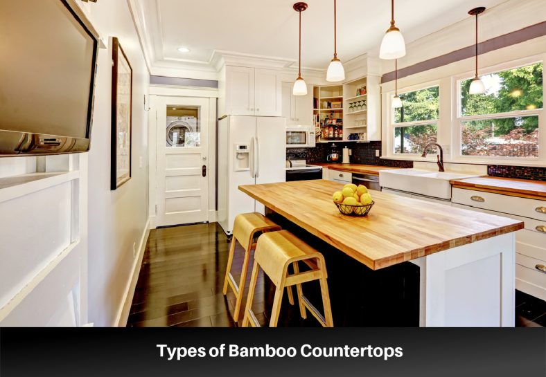
Bamboo countertops are increasingly popular with homeowners as an alternative to traditional materials because of their durability, sustainability, and warmth. Countertops made from treelike grass bamboo offer a similar look and texture to wood countertops but are harder and longer lasting.
Unlike marble and granite countertops, bamboo offers stunning beauty at a fraction of the cost. Bamboo is also a fast-growing material, so you can feel good about using this renewable resource as part of your eco-friendly kitchen design.
Types of Bamboo Countertops
There are four main types of bamboo countertops that present different surface appearances: vertical grain, end grain, flat grain, and strand woven.
Vertical Grain – Vertical grain bamboo countertops are the most common style for bamboo countertops. Manufacturers create this style when they join together strips of bamboo to create a vertical pattern. You can recognize this style because of the striped pattern and the vertical orientation of the lines.
End Grain – End grain bamboo countertops are also known as parquet butcher block and can feature the same pattern. Manufacturers make these countertops by gluing short blocks of bamboo together in distinct patterns. Because of the tight grain and pattern of this type of countertop, it is the best bamboo surface for resisting scratches.
Flat Grain – Flat grain countertops are also called face grain because they are created by opening the bamboo and joining the pieces face-up.
Strand Woven – Strand woven countertops do not have the stark lines that grain countertops do. Instead, manufacturers create these countertops by weaving strands together with adhesive and then pressing them under high pressure. Strand woven bamboo countertops have an appearance that is more similar to solid wood.
Construction of Bamboo Countertops
All bamboo countertops require adhesive and pressure to bind the pieces together as there is no piece of bamboo large enough to create a truly solid surface. That said, there are solid bamboo countertops and plywood bamboo countertops and they differ in the raw materials used to create the end product. Both of these construction methods produce countertops that are durable, hard, and suitable for kitchen use.
Solid Bamboo Countertops – Solid bamboo countertops come in different thicknesses and internal structures. Manufacturers create them by gluing solid bamboo pieces together in various patterns.
Plywood Bamboo Countertops – Fabricators make plywood bamboo countertops by gluing sheets of bamboo together under high pressure. After fabricators create the boards or panels, they can cut them apart to display different grain patterns.
Cost of Bamboo Countertops
Bamboo countertops cost between $25-$100 per square foot for just the materials. For a 50-square-foot section, expect to pay between $2,000-$3,000 on average for the countertops. Labor costs tend to run between $5-$15 per square foot. The price will be more or less depending on the type of bamboo used in creating the countertop as well as the quality and durability of the adhesives.
The most expensive type of bamboo countertops is created from Moso bamboo, which is well known for its strength and durability. Adhesives that don’t use formaldehyde and are environmentally friendly increase the price but are better for creating a healthy kitchen environment. You can save money on your bamboo countertops by comparing prices between manufacturers, waiting for sales, purchasing a less expensive style and finish known as builder’s grade, and installing the bamboo countertops yourself.
Everyday Care for Bamboo Countertops
The everyday care of bamboo countertops is straightforward and simple but should be maintained if you want to preserve the quality of your bamboo countertops.
Clean Spills Promptly – Like wood countertops, bamboo can stain if left exposed to standing water. Clean up liquid spills as they occur.
Avoid Abrasive Products – Use a soft cloth or sponge and warm water or mild soap to clean the surface as needed. Do not use abrasive cleaners or pads, as these can scratch the surface.
Use Cutting Boards – Rather than cut directly on the surface of your bamboo countertops, use cutting boards to prepare food. This will prevent scratches and dents from marring the surface.
Use Trivets and Hot Pads – Bamboo countertops cannot withstand heat and can burn if exposed to hot surfaces. Use trivets for hot pans and pots to avoid marking the surface.
Long-Term Maintenance for Bamboo Countertops
You should expect some long-term care of bamboo countertops to keep them looking gorgeous.
Avoid Damage – Practice proactive maintenance of your countertops and avoid actions that will create damage. Use cutting boards for food prep. Do not leave any standing water or other liquid on the countertop, which creates stains. Do not use abrasive cleaners or scouring pads, which destroy the finish on the countertops. Also, do not place hot pots and pans directly on the surface of the bamboo without a trivet or hot plate. Doing this can create burn marks that need to be removed with sanding.
Oil the Surface Regularly – It is vital that you apply a coat of oil to your bamboo countertops every couple of months in order to avoid a dry and brittle surface. Use a food-safe oil like linseed, tung, or mineral oil. Apply the oil with a soft cloth. Allow the oil to penetrate the surface before wiping off the excess with a clean cloth.
Consider a Sealer – Some people use linseed, tung, or mineral oil to seal the surface of their bamboo countertops. Others prefer a more long-lasting option like polyurethane or varnish. A long-term sealant is not a necessary step and should be considered in light of family allergens and food exposure preferences.
Sand Out Scratches – When scratches or dents occur, you need to sand them out with fine-grit sandpaper. Use sandpaper that has a grit of 120-180. Carefully sand in the direction of the grain until you have removed the mark and the surface is smooth again. Use a higher grain to finish if you want the surface smoother.
Address Damage Quickly – Always address any problems with your countertops quickly as leaving them can create larger problems as time passes.
Pros and Cons of Bamboo Countertops
Bamboo countertops have distinct qualities that create unique positives and negatives that you should consider before an initial investment.
Pros:
Eco-Friendly – Bamboo is a renewable resource because it is a fast-growing resource that can be harvested without harming the environment. The bamboo plant requires very little water to grow and can thrive without pesticides and fertilizers making it a more eco-friendly countertop than other wood options.
Affordability – Bamboo countertops are less expensive than natural stone countertops like granite and marble. Compared to wood countertops, they are similar to many mid-range choices but less than high-priced woods like teak and exotic woods like zebrawood.
Easy Care – Bamboo countertops are easy to clean and maintain, as you can wipe them down with a soft cloth and water. They naturally resist the growth of bacteria and mold.
Appearance – Bamboo has the same warmth and textured look as wood countertops. You can vary the look of bamboo countertops according to the style of the surface.
Durability – Bamboo is a hard and durable material. It has an excellent strength-to-weight ratio making bamboo kitchen countertops an ideal surface for countertops.
Cons:
Prone to Scratches – Even though bamboo is durable, it is prone to scratches from knives, pots, and pans. It is important to note that you can easily sand out the scratches when needed.
Regular Maintenance – The maintenance of bamboo is easy but it does need to be constantly maintained in order for the countertops to look their best. This includes regular cleaning and oiling of the surface.
Water Resistance – Bamboo countertops are not water resistant. You must clean up spills from water and other liquids quickly and not allow them to sit as they can cause staining.
Heat Resistance – Bamboo kitchen countertops cannot withstand heat and can burn if exposed to scalding surfaces.
Limited Color and Designs – Bamboo is available in just one color, though in a variety of configurations. It is possible to change the color of the bamboo countertop with either stain or dark oils, but one must apply the stain carefully as bamboo takes stain differently than many softwoods.