In total, 16 international designers and artists created pieces that respond to the interiors of the building.
The exhibition introduces new art pieces and objects into the house and garden
Some responded by sourcing materials from the property itself, while others focussed on themes and ideas taken from decorations within the interiors.
“The designers of the exhibition have responded to Chatsworth in all sorts of fascinating ways,” said co-curator of the exhibition Glenn Adamson.
“Throughout you really see this kind of conversation between the present and the past.”
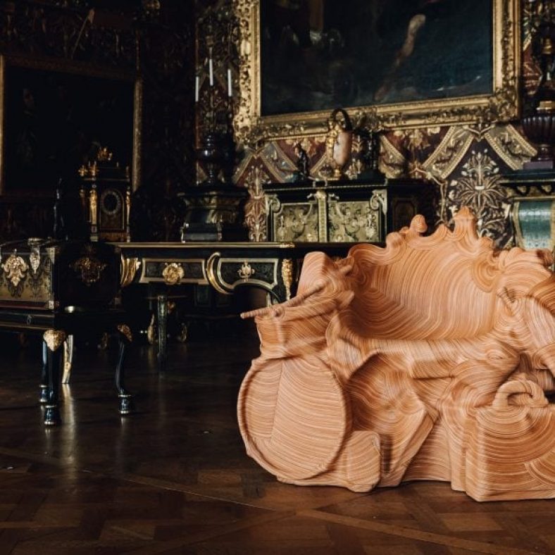
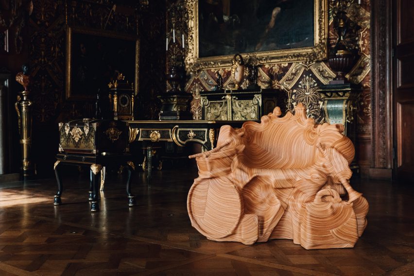
Jay Sae Jung Oh designed a throne using musical instruments
The exhibition continues Chatsworth House’s 500-year-long history of working with leading artists and designers and collecting an extensive collection of art and objects.
“An artist’s new work can create a new way of looking at these spaces,” said Chatsworth House Trust director Jane Marriott.
“It can capture their imaginations and hopefully inspire them to explore Chatsworth in a different light.”
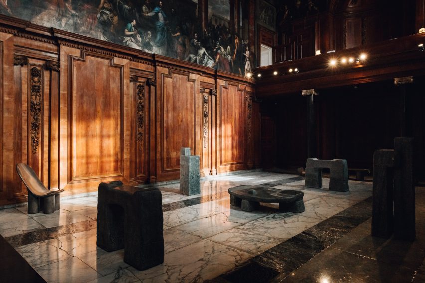
Toogood’s monolithic furniture creates a pensive space within the exhibition
British designer Toogood took over Chatsworth’s chapel and adjoining Oak Room. As a nod to the historical use of the space as a place of worship and gathering, she created an installation of monolithic furniture made from bronze and stone.
The sculptural forms were designed to evoke ecclesiastical structures and to reflect the local landscape.
“These objects give a sense of meditative calm, a sense of massiveness or monumentality that feels appropriate to the space,” Adamson said.
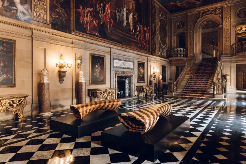
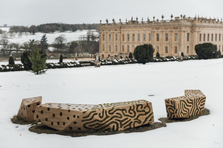
Dutch designer Joris Laarman designed a series of benches for the exhibition
Two stone benches by Dutch designer Joris Laarman made from locally sourced gritstone , which was the material used to build the house itself, were placed in Chatsworth House’s gardens.
The surfaces of the benches were carved with undulating patterns in which moss and lichen have been planted and will continue to grow over time.
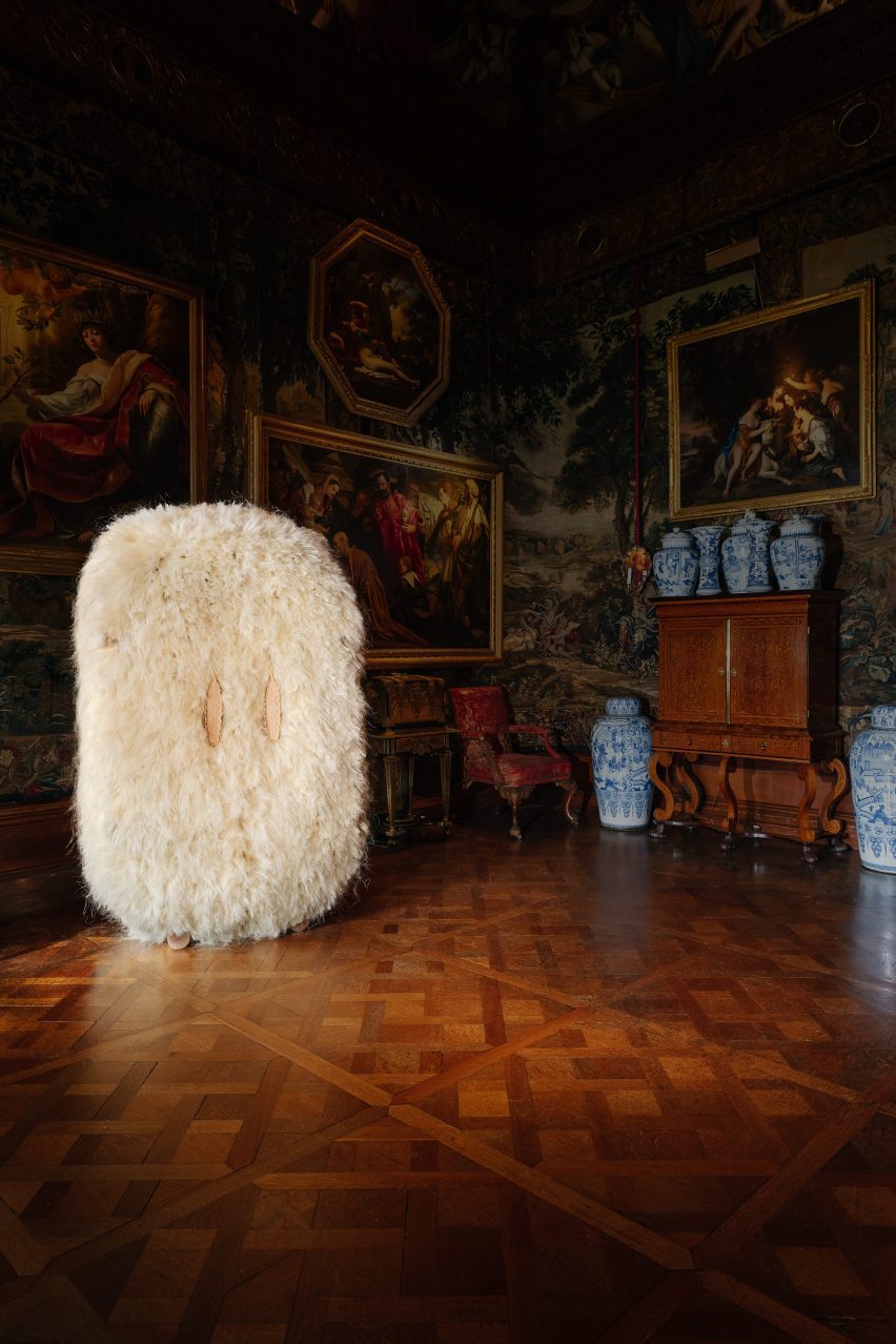
Other objects in the exhibition include a throne-like seat wrapped in leather made from musical instruments by Jay Sae Jung Oh, a fibrous cabinet designed by Fernando Laposse, and sinuous steam-wood sculptures by Irish furniture maker Joseph Walsh.
Laposse’s fluffy cabinet is made from agave plant fibres
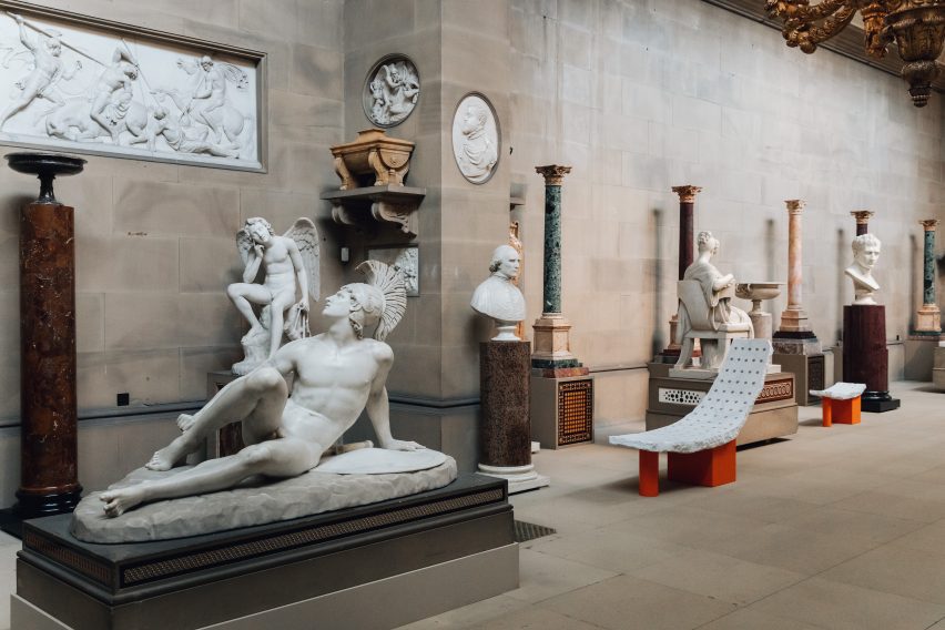
Another section of the exhibition, which occupy Chatsworth’s Sculpture Gallery built in the early 19th century, features pieces by British designer Samuel Ross.
Ross’s pieces were designed to echo the surrounding sculptures, mimicking their form to invite viewers to imagine the body that would recline on them. The designer has used a material palette of stone and marble to further reflect the sculptures within the gallery.
Chatsworth’s collection contains art and design pieces spanning 4,000 years
“It’s a kind of collision of past and present, of the artisanal with the technological, the classical with the industrial,” Adamson said.
“It’s a great example of how the show in general tries to talk across generations, across centuries.”
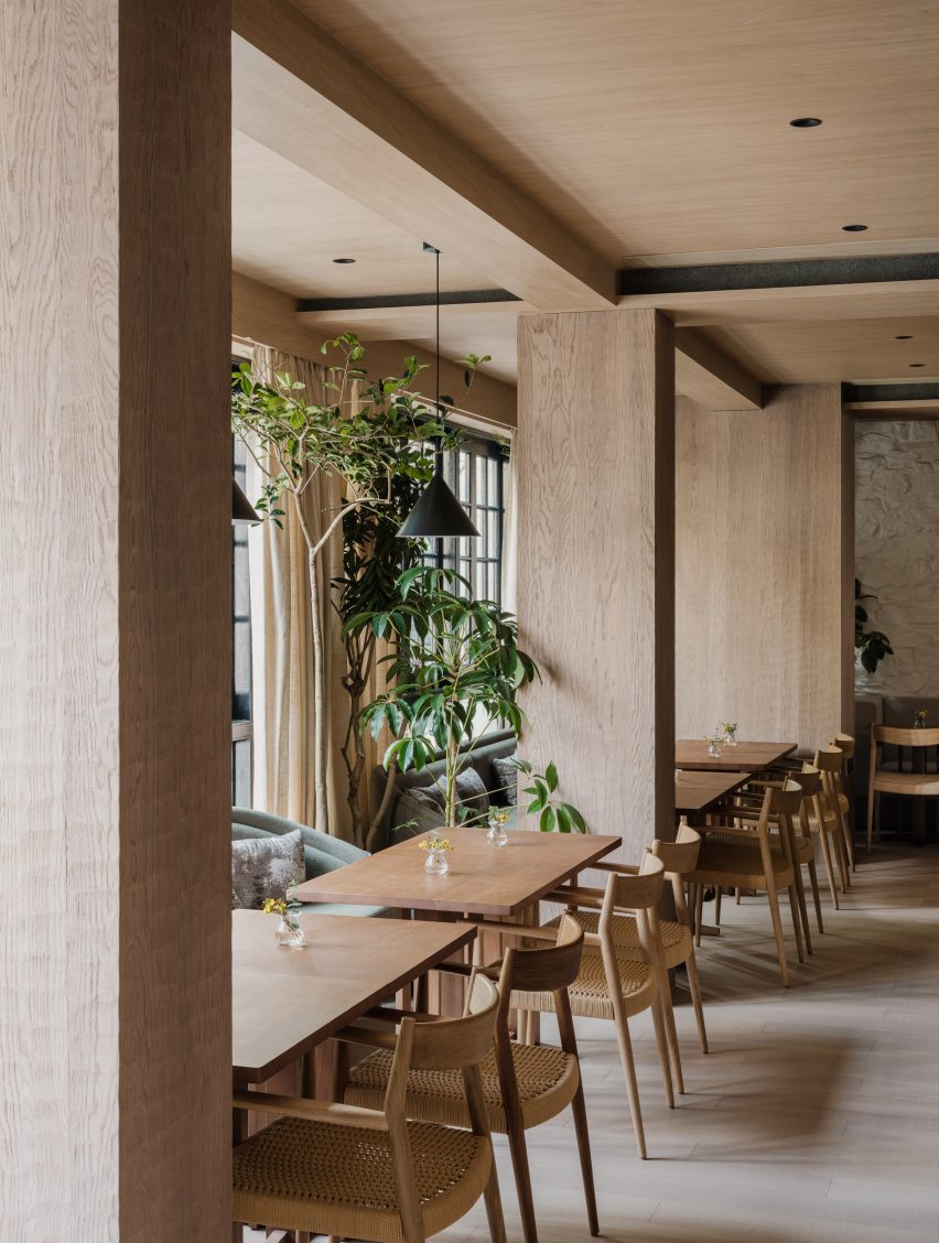
Design studio Linehouse has used natural, tactile materials for the interiors of the Coast restaurant in Shanghai for China’s casual dining brand Gaga.
The restaurant is set inside a traditional mid-century Shikumen house – a blend of Western and Chinese architecture – with a renovated interior informed by its Mediterranean menu.
“We aimed to create a deep connection with coastal elements and Mediterranean soul,” said Linehouse co-founder Alex Mok.
Linehouse has completed the Coast restaurant in Shanghai
According to the studio, the restaurant’s aesthetic is one of “refined rusticity” – a contemporary reframing of rough-hewn vernacular styles, that creates a laid-back and tranquil atmosphere.
Throughout the scheme, Linehouse was informed by the idea of coastal terrain, including earthy and fired elements.
Linehouse chose a natural material palette, which in turn informed the colour scheme that flows throughout the interior of the three-storey restaurant.
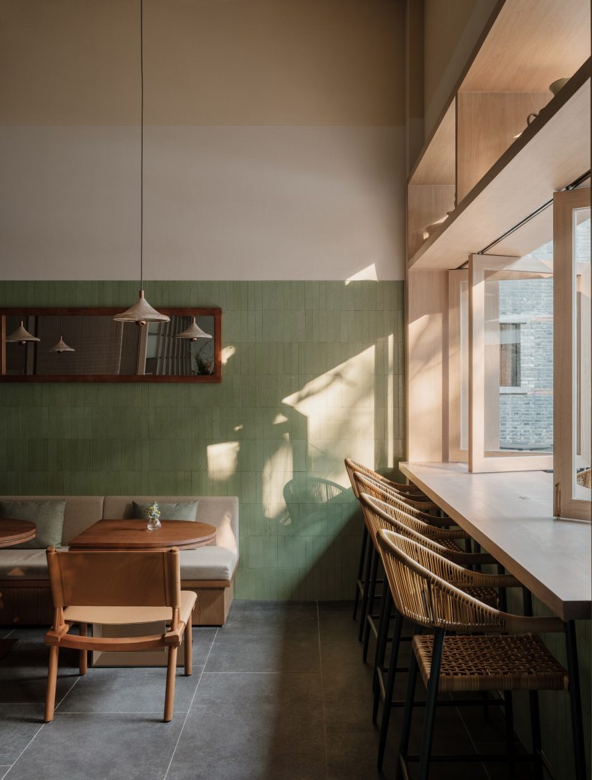
Green-glazed lava stone surrounds the ground-floor cafe and bar
The aim was to take the visitor on a “vertical journey” by giving each of the three floors its own unique identity.
“The colours and materials shift on each floor, telling a different part of the story,” Mok said.
The bar is finished in the same tiles
On the ground floor, where a daytime cafe transitions into an evening bar, green and earthy tones link to the leafy garden beyond. Walls are wrapped in a green-glazed lava stone, with a deliberately hand-made patina, “representing the earth element”.
Custom furniture pieces designed by Linehouse were used throughout the restaurant, while lighting was chosen for its intriguing, sculptural forms from designers including Santa & Cole and Studio KAE.
Natural timbers were used for the centrepiece bar counter, while the timber-framed windows open up to the silver-grey of the olive trees outside.
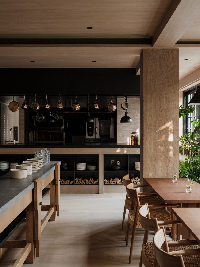
An open-hearth grill features on the first floor
Above this on the first floor is an intimate dining space lined with white-washed stone and timber panelling. Layered oak panels hung horizontally from the ceiling create intimate dining nooks, with taupe-toned banquette sofas and oak dining tables.
The focal point of this room is the parrilla – an open-hearth grill – and a chef’s table.
“The concept of the open parrilla grill captures the quintessence of Mediterranean cuisine,” Mok told Dezeen.
On this level, fire-informed red and brown tones punctuate the space including the tiles that line the kitchen, which were repurposed from used coffee grounds.
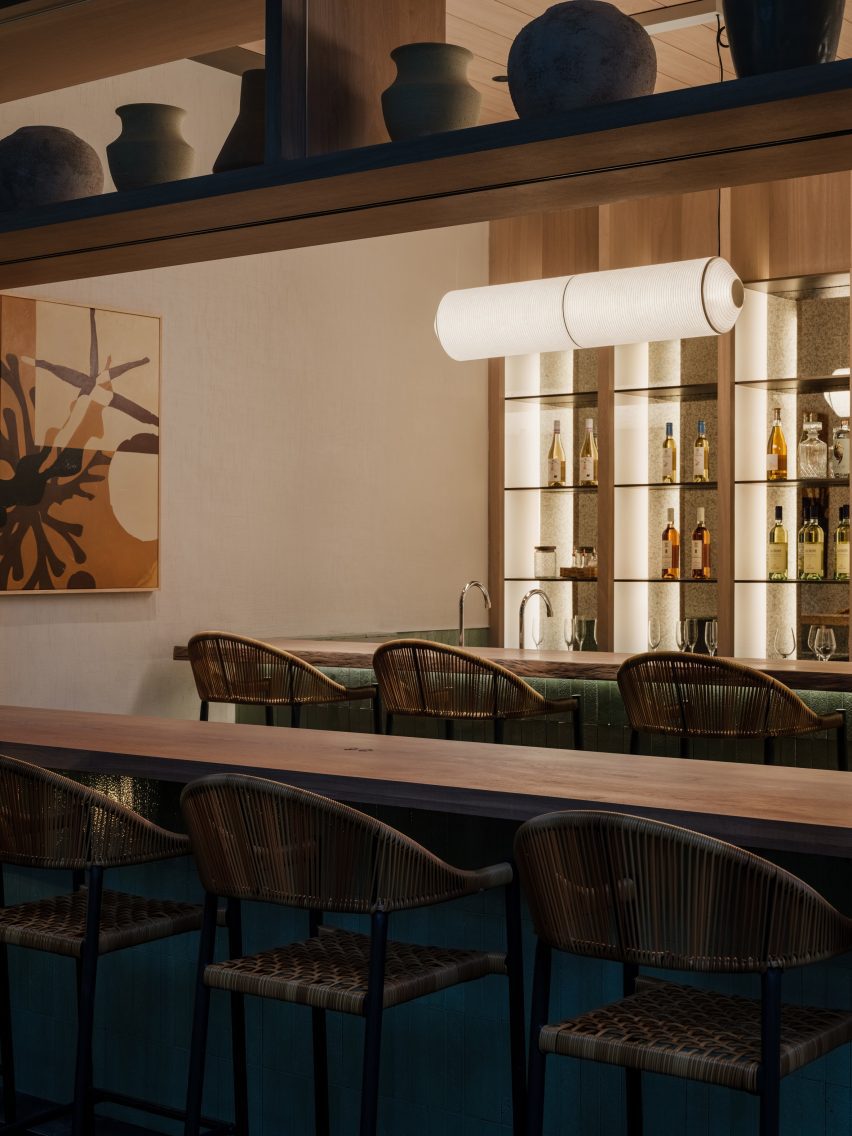
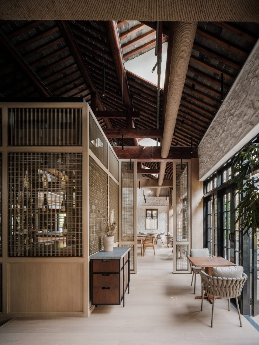
Finally, on the top floor under the exposed timber beams of the pitched roof, Linehouse created a string-wrapped wine room and a lofty private dining space.
Panels of string line the staircase structure
The walls were again clad in white-washed stone. But here, it is contrasted with the intense black of yakisugi, or fire-preserved wood, which serves as a backdrop to a chef’s table.
The space also features a generously-sized balcony, providing views out across this bustling neighbourhood.
Linehouse created a string-wrapped wine room on the top floor
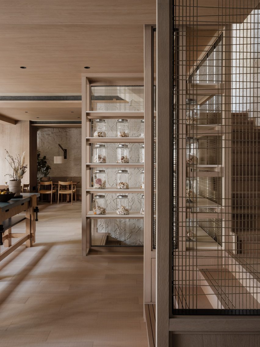
The spaces are linked by a staircase that weaves up through the centre of the building. Its chalky-white outer walls are patterned with a sculptural relief of sea creature exoskeletons, echoed by collections of shells displayed in glass jars nearby.
Panels of string, woven into simple grids, line the staircase structure, allowing natural light to flow into the heart of the building.
“We chose materials that tell the story of the coastal journey, while the exoskeleton wall is a modern representation of the sea,” said Mok.
The top floor also houses a private dining room
Linehouse was founded by Mok and Briar Hickling in 2013 and the duo went on to win emerging interior designer of the year at the 2019 Dezeen Awards.
The photography is by Wen Studio, courtesy of Linehouse.
Dezeen is on WeChat!
Click here to read the Chinese version of this article on Dezeen’s official WeChat account, where we publish daily architecture and design news and projects in Simplified Chinese.
For our latest lookbook, we’ve collected eight bathrooms with decorative sunken baths that create a relaxing atmosphere.
Sunken baths are bathtubs that have been sunk into the bathroom floor, decks or patios. They can help to save space in the bathroom and to create a luxurious spa-like feeling.
In this lookbook, we’ve gathered inspirational sunken bathtubs in homes from South Korea to Ukraine, including a peaceful sunken bath on a wood patio and a bath clad in green tiles.
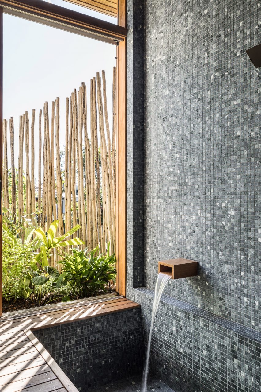
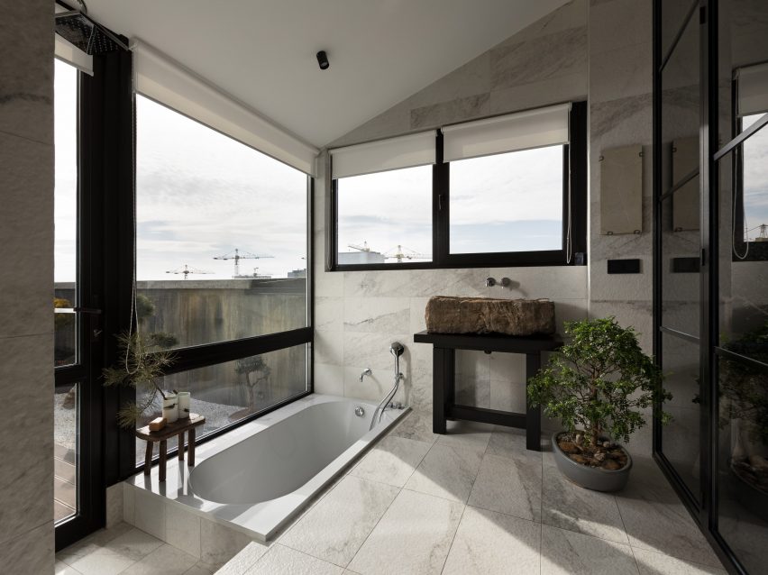
Architect Emily Sandstrom’s extension to a 1930s bungalow in Sydney includes a bathtub that was sunk below floor level.
Clad in small black and grey tiles, the bath was informed by Japanese bathing rituals and also has timber decking that covers the drainage points for an overhead shower. Glass sliding doors provide restful garden views.
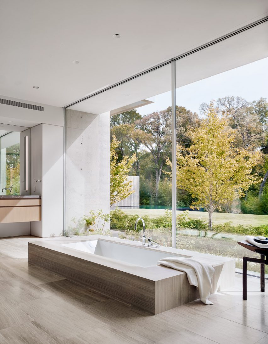
The Preston Hollow was designed to reference brutalist architecture and its clean concrete lines are visible in the interior, too, including in the minimalist bathroom.
Here, a sunken bathtub blends into the wood floor. Marble details and a sculptural chair add decorative, organic touches to the spartan space.
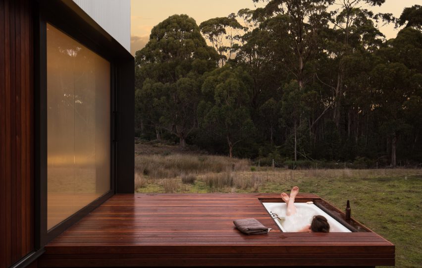
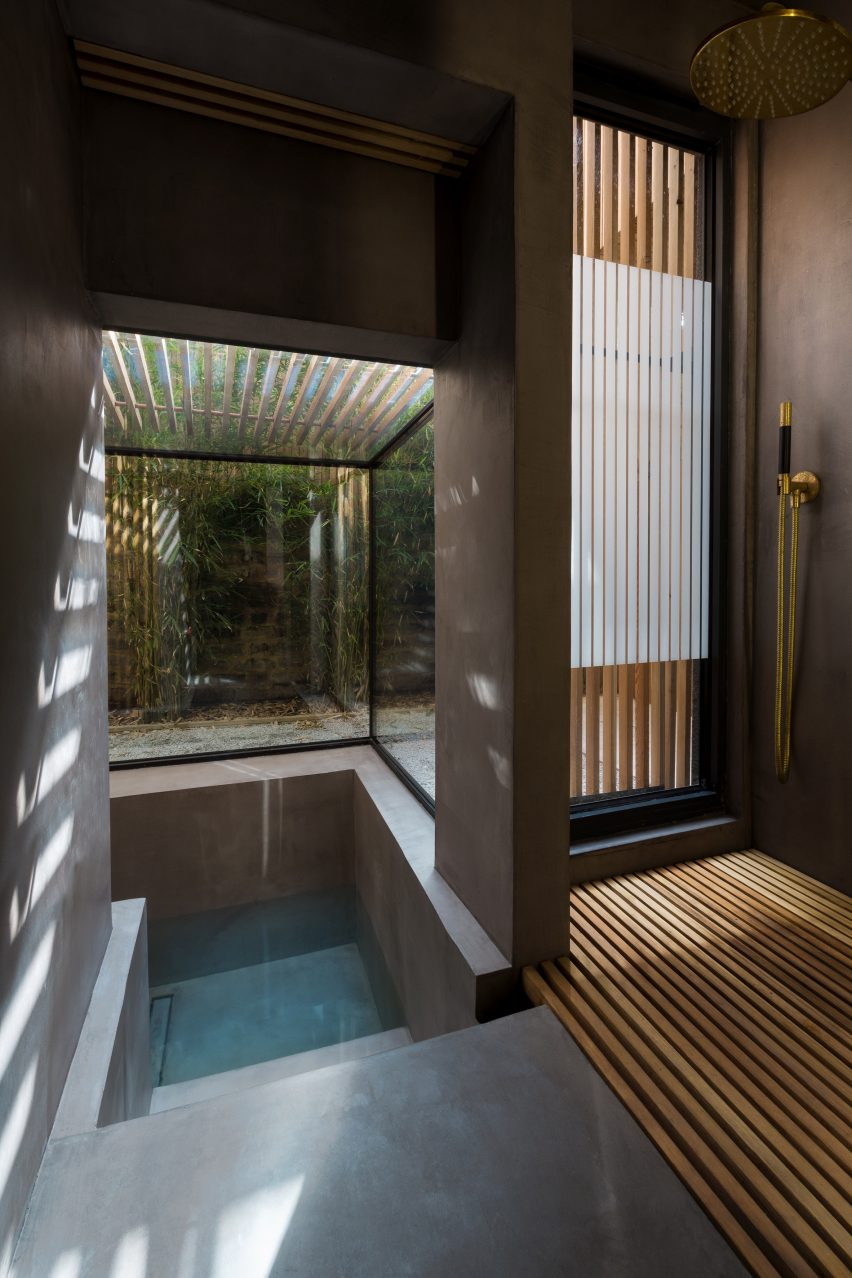
This wood-lined off-grid cabin in Tasmania comes with two decks to let the owner enjoy both the sunset and the sunrise. The western deck, which provides views of the sunset, has a cosy, sunken outdoor bathtub.
The tub can be hidden under removable decking panels when it is not in use.
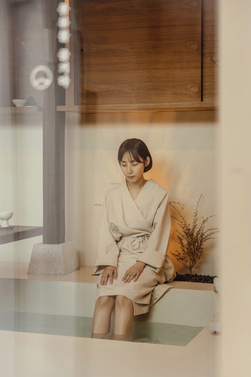
This tiny guesthouse (above and main image) in Seoul, South Korea, is located in a small alley in the city’s Seochon neighbourhood. Inside, the serene living spaces are finished in neutral colours.
The living space features a long walnut table with a rough stone base. Next to it sits a sunken bath in which guests can wash their feet.
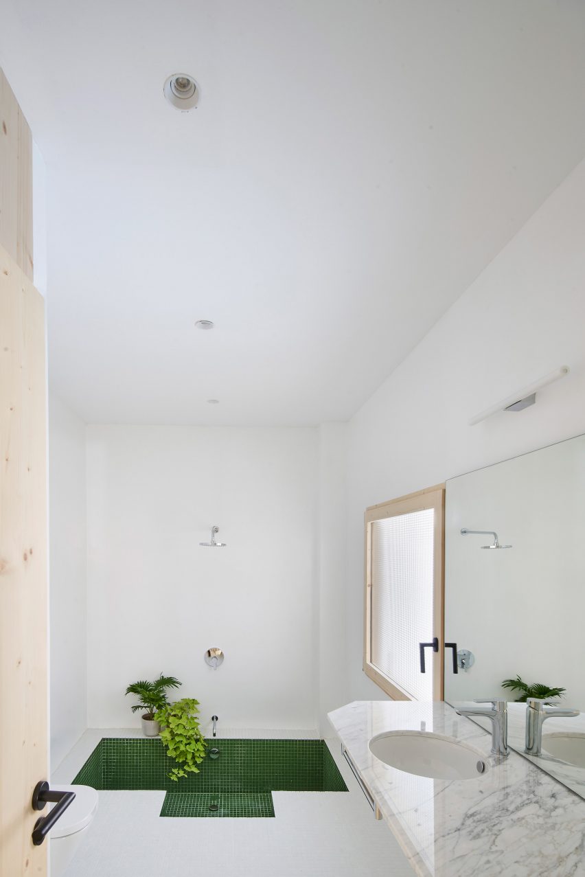
In the all-white bathroom of this Spanish apartment, the floor has been raised in order to accommodate a sunken bath that was lined with green tiles also used elsewhere in the project.
A white marble sink and a couple of green plants add decorative details.
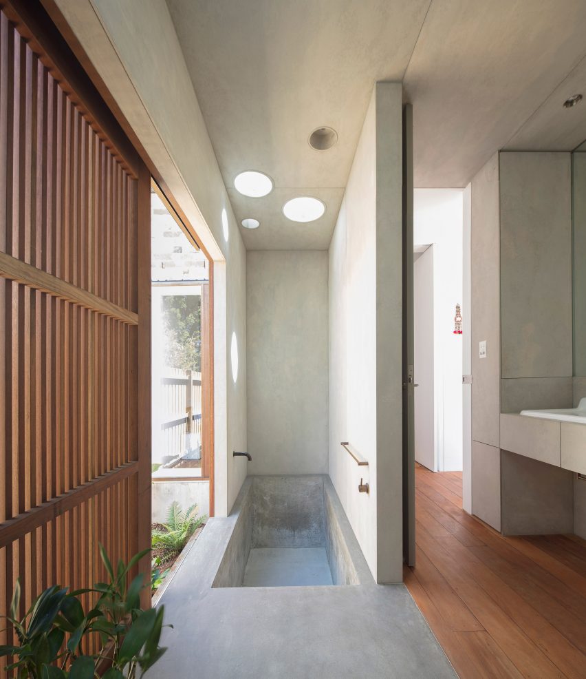
Japanese influences were blended with Ukrainian design in this family flat in Kyiv, Ukraine.
A bathroom with a sunken bath and garden views is divided from the main bedroom by a gridded Crittall-style glass wall. A small bonsai tree on the floor and a stone sink create a natural feel in the bathroom.
Bold colours and prints can enhance interiors in the same way as architectural details, argues Rebekka Bay of lifestyle brand Marimekko in this interview.
Bay was appointed creative director of the Finnish design firm in 2020 having previously held top roles at fashion brands including Everlane, Cos and Uniqlo.
Bay talked to Dezeen about how printed textiles can add spatial design to interiors. Photo courtesy of Marimekko
More than just decorative pieces, Bay believes Marimekko’s patterned surfaces can be used as features to define and create interior spaces.
“Often printed textiles are confused with this idea of just being like a drape or a tablecloth, but really when we develop printed textiles at Marimekko we see them as architectural elements, something that can also add spatial design or architectural elements to your home,” she told Dezeen.
“They are not just an accessory, but actually something that can create a space.”
Marimekko collaborated with IKEA on a homeware collection informed by wellbeing
In the wake of coronavirus lockdowns, the ability of colourful prints to improve wellbeing and happiness in the home has become increasingly valuable, Bay added.
“The role of the home is increasingly important because we have all been forced to relate to what our home environment is and how it supports our wellbeing,” she said.
“There is a renewed understanding of the importance of creating a home environment that will allow you to both rest and re-energise.”
“Being surrounded by bold beauty is something that evokes happiness or optimism,” Bay continued.
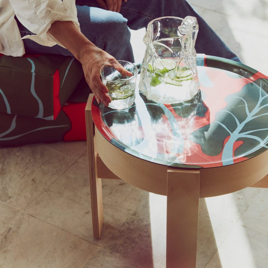
References to Marimekko’s and IKEA’s Nordic heritage are seen throughout their collaboration
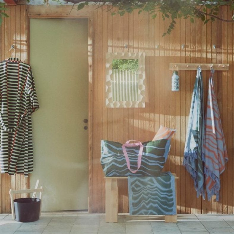
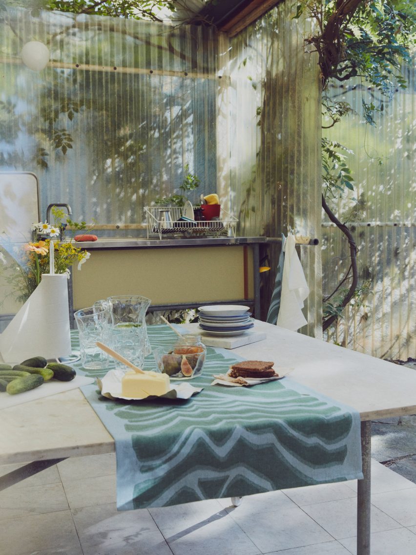
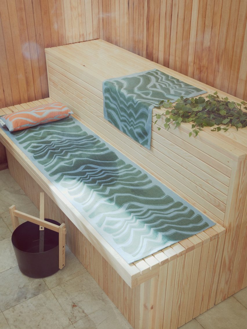
Picking up on this trend, Marimekko recently collaborated with Swedish furniture retailer IKEA to create a homeware collection named Bastua, which includes furniture, glassware and textiles informed by nature and the self-care rituals of the Nordic sauna.
Drawing on the brands’ Nordic heritage, the Bastua collection features practical home objects made from wood and glass.
Bay said the collaboration aimed to focus on circularity and longevity.
“What we share both at Marimekko and IKEA is that in the design process, we are concerned with how to design for circularity, how to design for longevity, how to design objects of timeless value and also multi-use objects,” she said.
“Our intent in this collaboration was to design objects that will have this timeless value, both in terms of the design but also in terms of material.”
“We have worked in very honest natural materials with glass and wood and other materials that improve over time and also focused on how the materials can be either recycled or upcycled.”
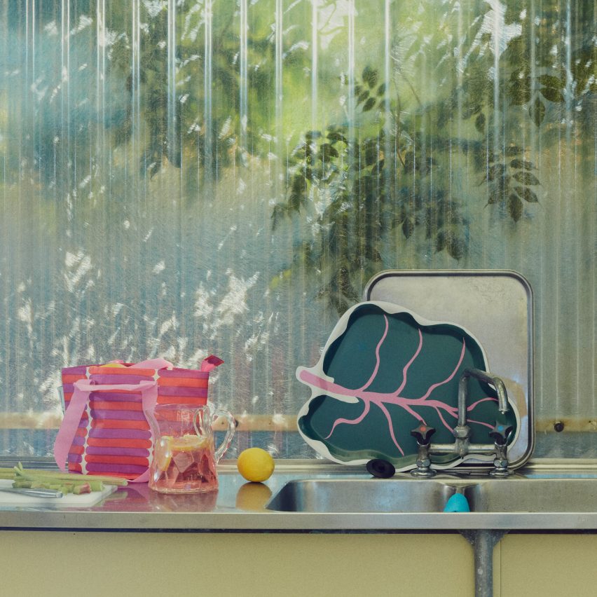
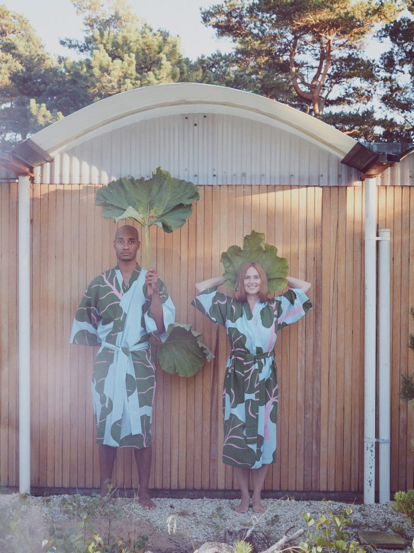
The rhubarb leaf is a repeated motif in the Bastua collection
Marimekko developed brand new prints for the Bastua collection, including a large rhubarb-leaf design that references the plants often found growing beside sauna buildings in Finland.
This print was applied to bath robes, seat cushions, shower curtains, trays and the iconic IKEA carrier bag.
“Functionalism and pragmatism joins this idea of celebrating everyday objects, which is very much a product of Marimekko’s mission – to bring joy to people’s everyday lives,” said Bay.
“I think for Nordic designers, we have strong design traditions in creating very beautiful but very functional, democratic design.”
Bay believes bold, colourful prints can add happiness to the home
In addition, she emphasised a desire to inject an element of humour into the designs.
“At times it’s very subtle and very serious, but I think what is unique to both Marimekko and IKEA is this intent also to bring a smile or a wink,” she continued.
“There’s something outside of the seriousness, wanting to develop truly high-quality, timeless design but also wanting to bring this little wink.”
Bay enjoys creating collections that “bring a smile or a wink”
Marimekko has accrued a large portfolio of prints over its seven decades of production and still reproduces archive designs.
The brand’s historic prints are used to inform new print designs that it hopes will resonate with modern consumers.
“I think there’s always this danger if you only look back that you end up being self-referential, or you end up being an archive or a museum piece,” said Bay.
“I would hate to create something of only museum value and not create a proposal for the future,” she added.
“There is this always looking back in order to look forward, always understanding what has resonated, what has broad relevance and then see if we can reposition or refocus that.”
Pinners have been attracted to Dezeen’s sauna board. The most popular saunas are inspired by their natural surroundings and have cosy and relaxing interiors.
This detached sauna, built on the property of a mountainside home in Whistler, British Columbia, was designed by Vancouver-based studio BattersbyHowat Architects.
Clad in standing seam metal, the small sauna mimics the design of the nearby holiday home.
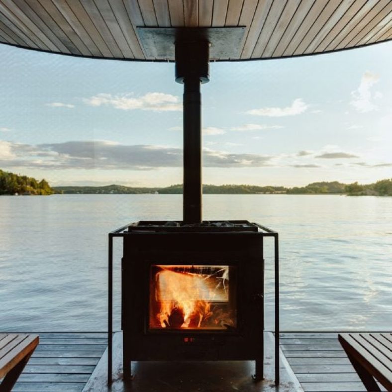
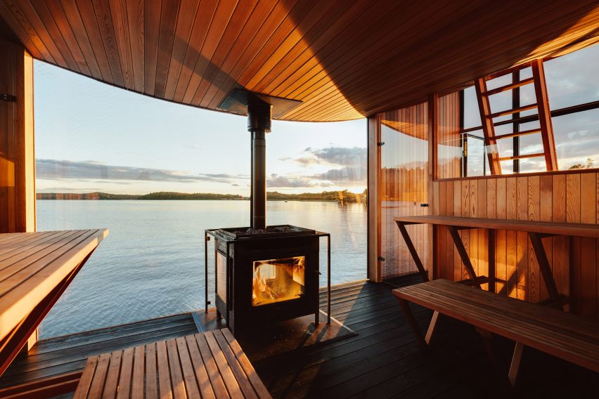
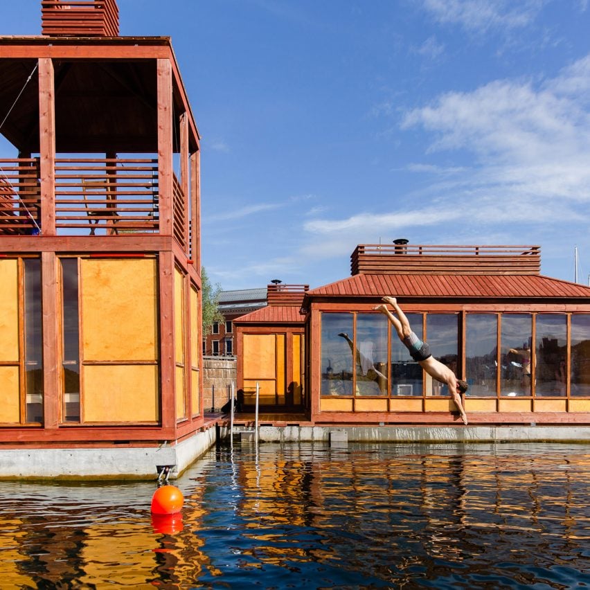
Pine planks clad the exterior of a floating sauna by Swedish studio Sandellsandberg, which they designed to blend in with the surrounding forests.
For the interior, the studio used red cedar and added a fireplace, meaning that the central space can be heated for overnight trips when not used as a sauna.
ACT! Studio and Borhaven Arkitekter designed a collection of floating red and orange buildings in Oslo harbour to be a playful and relaxing space sauna.
For the project, the studio covered the floors with red vinyl. Birch plywood was used for the walls, tiered seating and changing rooms.
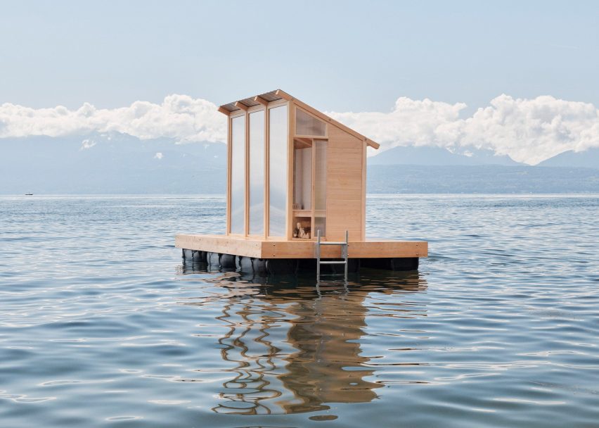
Graduate Trolle Rudebeck Haar designed another floating sauna in Switzerland to fit up to three people. It has a sloped roof, wooden stove, bench, translucent glass windows and an exterior deck.
Löyly sits on a floating pontoon deck which allows it to be placed on any water with low-wave motion.
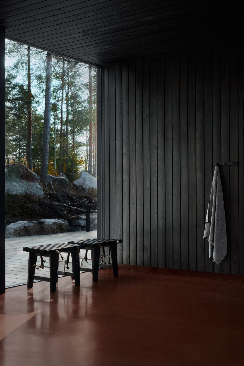
Simple and traditional materials such as black wood and red epoxy flooring were used by Studio Puisto to create a sombre and crisp atmosphere for this sauna at a lakeside wellness centre in the town of Ähtäri, Finland
Located in its own independent wooden cabin, the studio added a large window with the aim of connecting with the surrounding environment.
The surrounding natural environment inspired the design of the Arctic Sauna Pavilion by Tony Yli-Suvanto Architects in Lapland, Finland.
Inside, both bathing and relaxation take place in the same space, in accordance with an ancient arctic tradition. The walls of the building tilt outwards in the local custom to prevent the timber wall construction from getting wet.
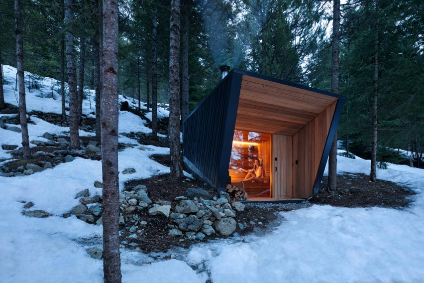
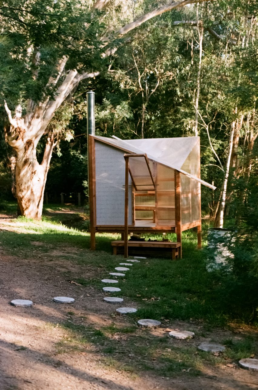
Studio Rain created a temporary sauna that is prefabricated and off-grid. Polycarbonate panels clads the walls and ceilings and it is heated by a wood-burning stove.
Made of reclaimed timber, it can be built, disassembled and reused without the need for any equipment.
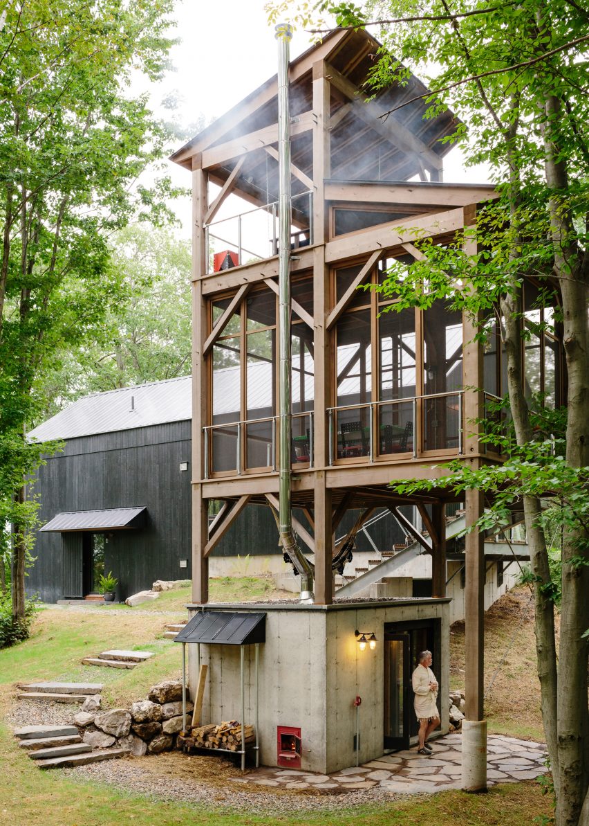
This spa was built in the garden of a renovated Victorian semi-detached home by Neil Dusheiko Architects. Inside the spa, the studio added a Japanese soaking tub, sauna, shower, gym and relaxation room with a fold-down bed.
With walls clad in Sapele timber and black slate flooring, the Dark Spa is intended to be “silent and mysterious”, the studio told Dezeen.
Pinterest is one of Dezeen’s fastest-growing social media networks with over 1.4 million followers and more than ten million monthly views. Follow our Pinterest to see the latest architecture, interiors and design projects – there are more than four hundred boards to browser and pin from.
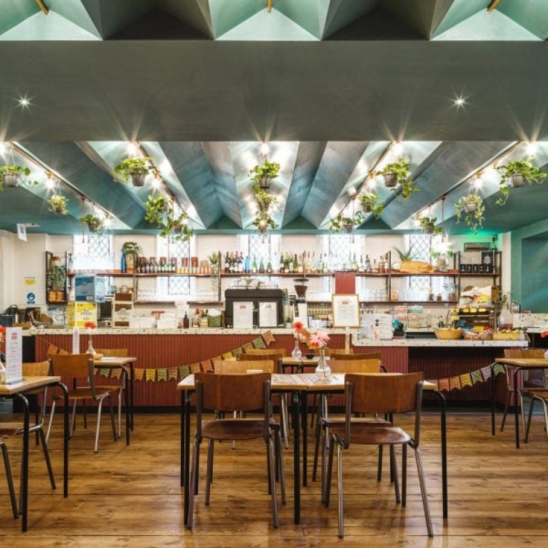
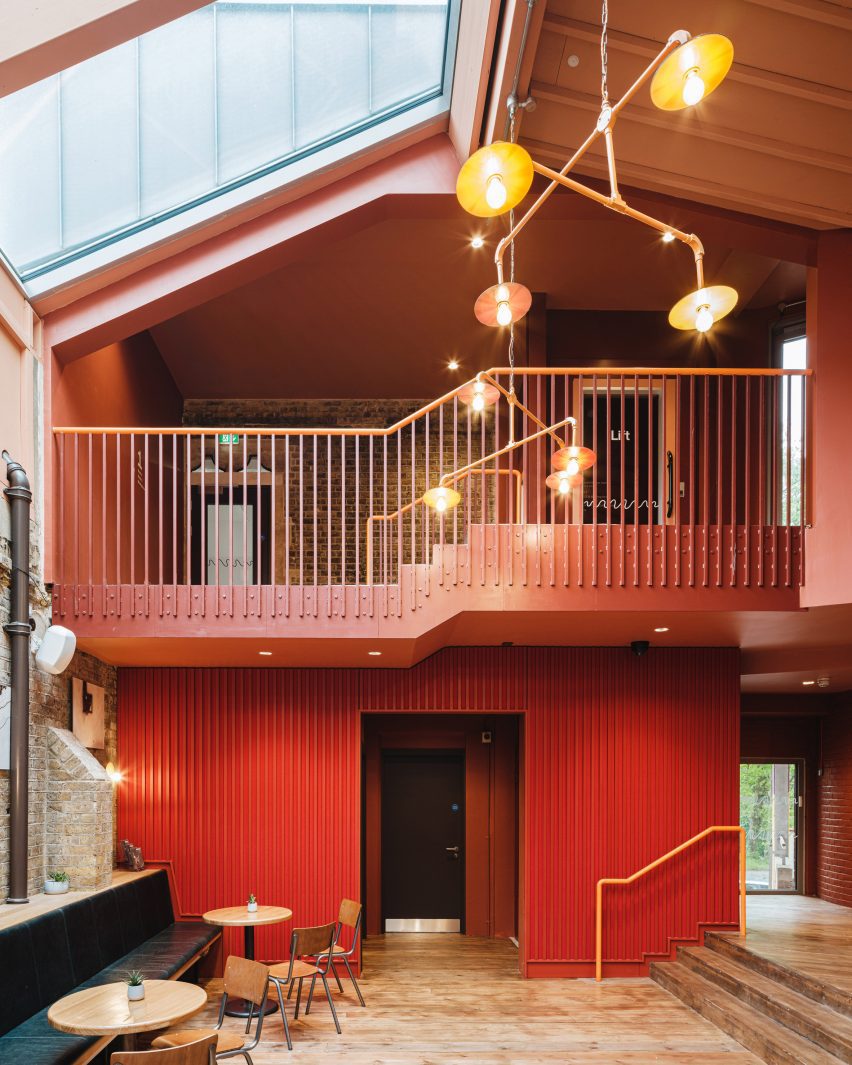
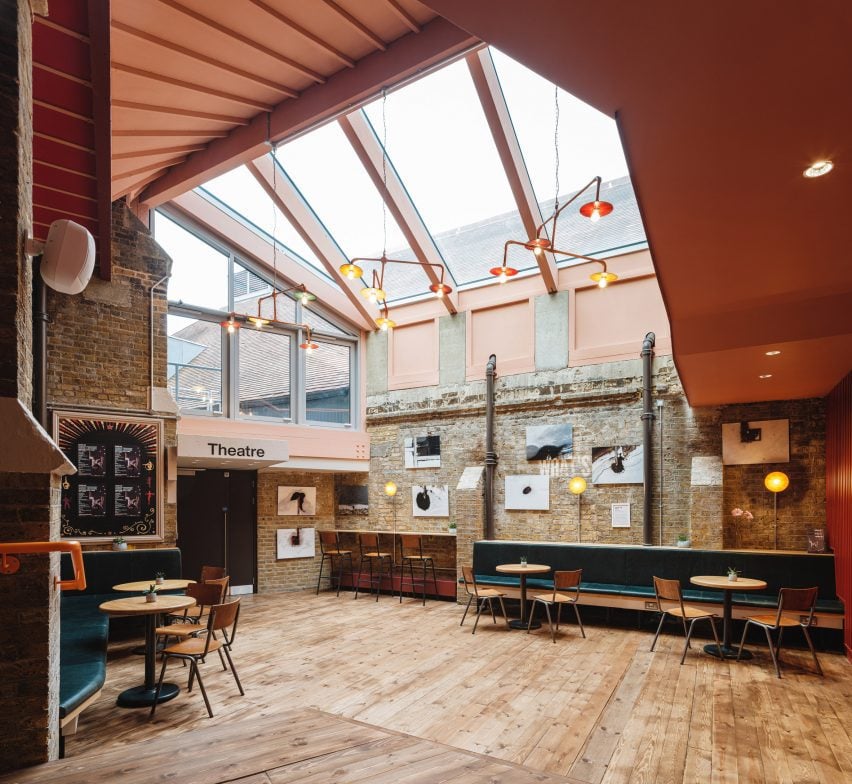
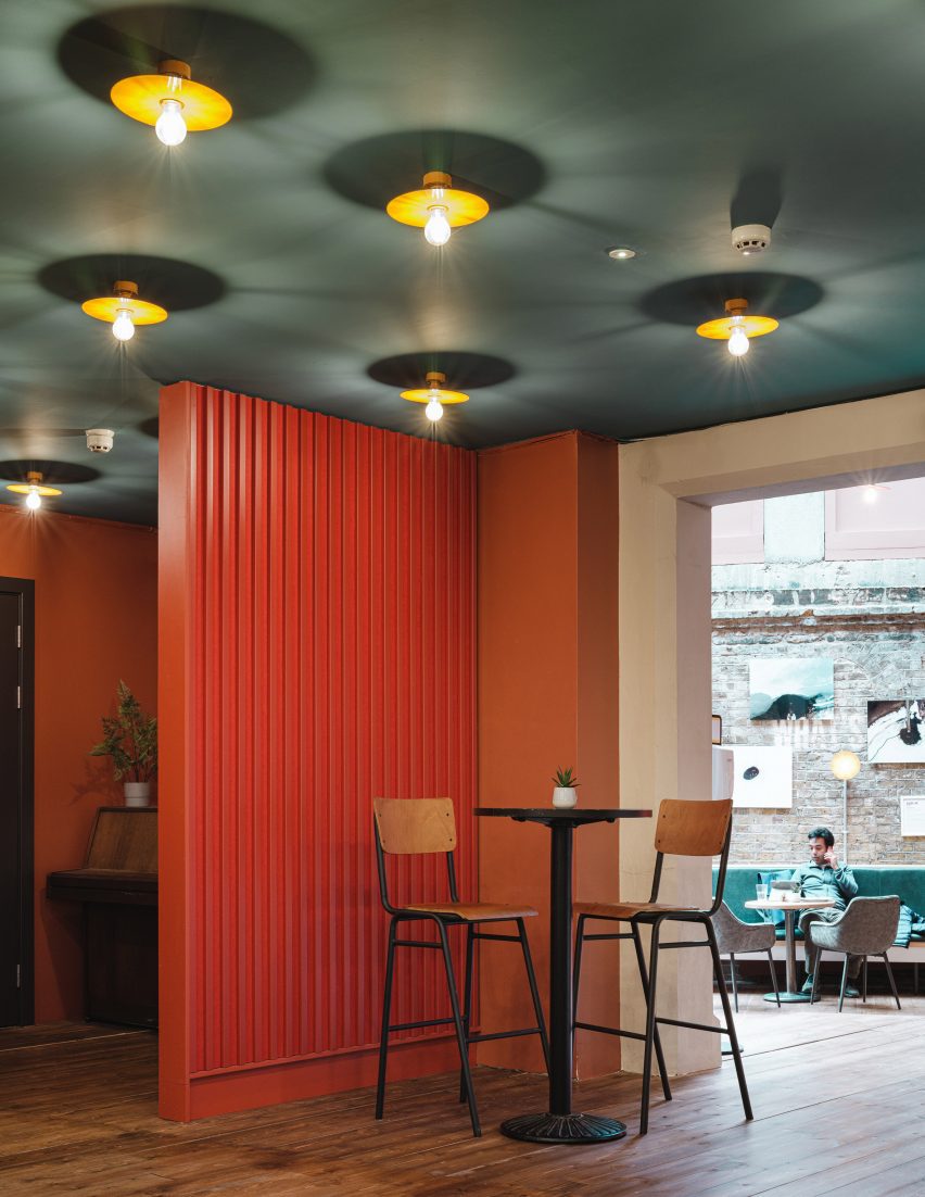
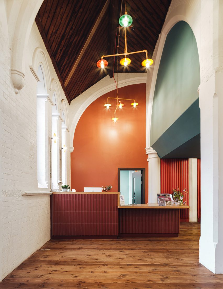
UK studio Citizens Design Bureau has given a colourful retrofit to Jacksons Lane, an arts and circus centre in an old church in London, with the aim of decluttering and simplifying its interior.
The studio aimed to improve the functionality of the grade II-listed building, which used to be a church but has been a community hub and “leading centre in contemporary circus arts” since the 1980s, Citizens Design Bureau said.
The Jacksons Lane building has a colourful interior
“The previous layout was a real jumble of spaces that didn’t work from a functional perspective,” the studio’s director Katy Marks told Dezeen.
“Our approach was to declutter the old church building, so that the original structure was more visible, giving a sense of the symmetrical cruciform of the original plan and using the drama of those spaces to full effect, improving acoustic separation, functionality as well as making the building fully accessible,” she added.
Spaces were rearranged to create a more functional interior
The venue in Highgate, London, had a dated interior with more than 20 different levels.
While reconfiguring its spaces to make them more functional, Citizens Design Bureau added a cafe and hireable studios in the former church’s double-height transept.
Red and teal colours brighten up the space
New details that make Jacksons Lane more functional include acoustic windows, as well as ramps and lifts that create easier access to the different spaces.
It also restored some parts of the church that had been hidden under more recent interventions. This included reinstating the main entrance of the building to the original church porch, which had been boarded up.
“You would often see people still climbing the steps up to the original, boarded-up door, trying to push it open,” Marks said.
“In a grade II-listed building, we had limited scope to make big changes to the exterior, so we felt that opening up the original and intuitively obvious entrance was the most impactful move we could make, to make the building much more legible and welcoming to everyone,” she added.
Citizens Design Bureau retrofitted the arts centre in Highgate
Inside the centre, Citizens Design Bureau introduced a warm colour palette of deep reds and oranges with teal accents, which complements the existing brick, stone and dark-wood details.
“The building has undergone many changes over decades of use, so the internal fabric in particular has a layered history,” Marks said.
“We have used colour to express those layers – white for the church structure, a teal blue for elements that were added in the 70s, and then volcanic oranges, reds and purples for completely new insertions with pops of other colours in the lighting, reflecting the playfulness of its current function as a creative space, specialising in circus arts.”
Whitewashed walls contrast dark-wood floors
The studio clad some of Jacksons Lane’s ceilings with a pale-green concertina form that improves acoustics.
Lamps with bright orange cables add another colourful touch to the space.
The former church is now used as an arts and circus hub
Jacksons Lane is used by a lot of people in the local area and Marks said the feedback so far has been “wonderful”.
“We hope that what we have done really expresses the ethos and character of Jacksons Lane with clarity and a bit of joy, raises a smile and is the kind of place that people really want to hang out in,” she said.
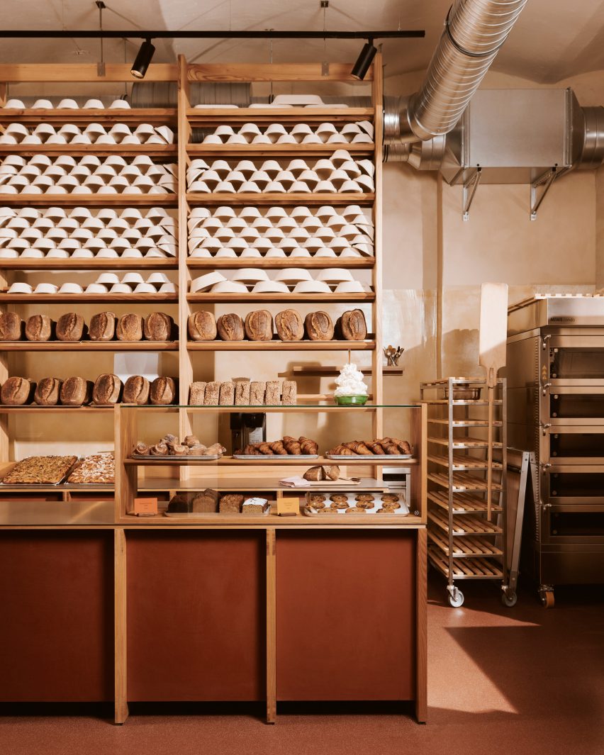
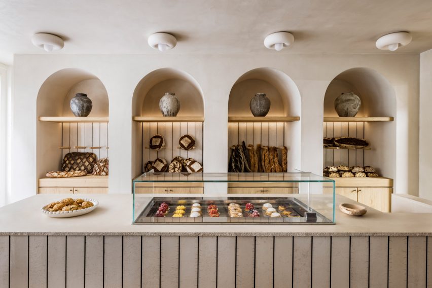
A steely space-themed patisserie displaying chunks of meteorite and a green monochrome pastry shop with squiggly furniture feature in this lookbook of unusual and unique bakery interior designs.
Architects and designers across the world have created bakeries and patisseries with striking interiors that provide a playful setting from which to collect baked goods to take home or enjoy while dining in with a tasty treat.
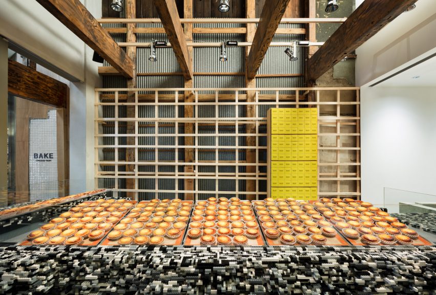
From a bakery with an open-plan kitchen that showcases the bread-making process to a cheese tart shop with a Lego display counter, here are eight offbeat bakeries and patisseries that have been featured on Dezeen.
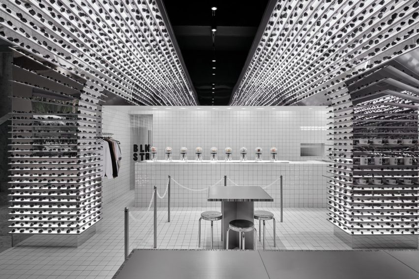
For Australian chain Black Star Pastry’s first Chinese outpost, design studio Linehouse created a space-themed interior filled with stainless-steel shelves displaying meteorites.
The shelving extends to the top of the walls and curves to form an arched ceiling. On the white-tiled counter, nine levitating cakes are displayed in glass containers.
Designers Lera Brumina and Artem Trigubchak finished this cafe and bakery in Ukraine with colourful walls and upholstery.
Originally a dental clinic, the designers transformed the interior by combining pink and rusty hues with blue and grey tones to “emphasise the warm colour of bread”.
The Casa Mela pastry shop in Madrid is made up of two rooms that Spanish studio Casa Antillón contrasted by completing one in white and the other in green.
Customers enter the shop via the all-white room, which features an angular stainless steel counter displaying the sweet treats on offer (pictured top).
In the green room, metal tables and chairs with wriggly edges provide dining furniture.
Located at the base of a mountain in Daejeon, South Korea, the Café Teri bakery and cafe is made up of two buildings with exterior walls that curve towards each other to form an “artificial valley”.
Designed by Nameless Architecture, the curving walls create a dramatic effect in the bakery interior and slope down to form stepping seating.
Danish architects Mathias Mentze and Alexander Vedel Ottenstein transformed a former brick factory in Berlin into the Sofi craft bakery with warm tones, wood finishes and red vinyl flooring.
At the centre of the space is an open-plan kitchen that the architects designed as a “production floor” allowing visitors to watch the bread-making process.
Interior architecture studio Emmanuelle Simon added arched shelving coves and rounded furniture to the Liberté bakery in Paris, aiming to create a unique space that encourages visitors to stay a little longer than usual while on their bakery trip.
The rounded shapes were complimented with warm sandy colours and Raku tiles – ceramic tiles that were created by the ancient Japanese firing technique – cover the central island and back walls of the alcoves.
The mobile, digital age has transformed the way we do business, and that’s beginning to transform home design. The home office, which used to exist only in larger or more affluent homes, is now a priority for many households, especially those in which someone works from home.
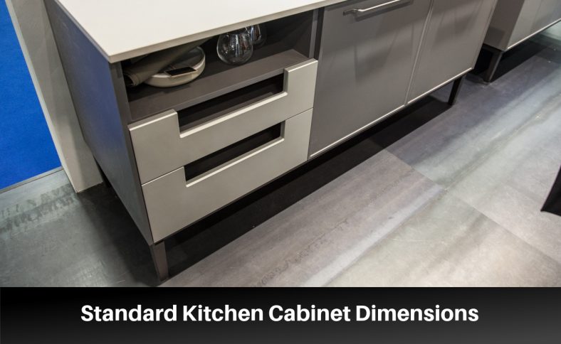
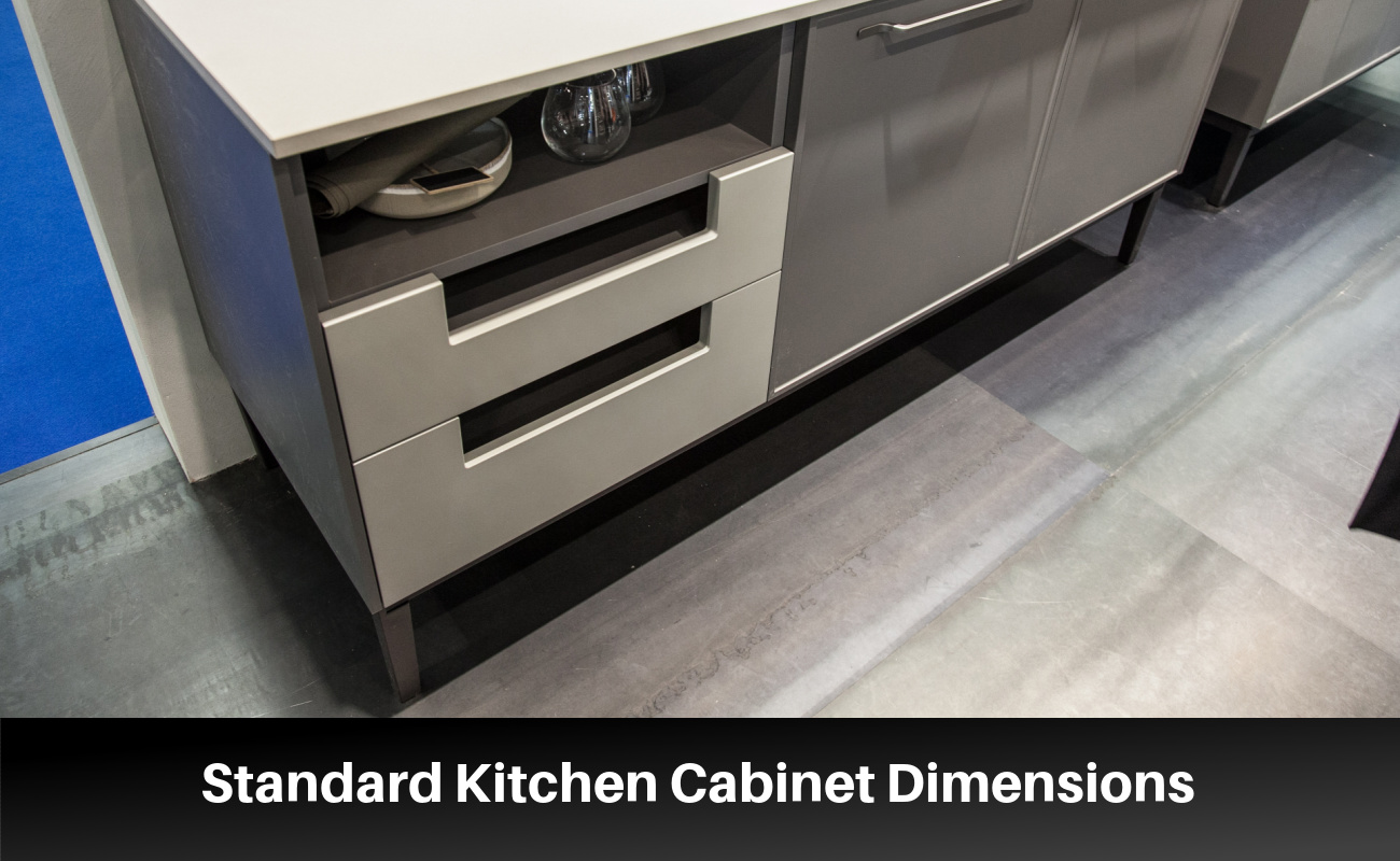
Kitchen cabinet dimensions are crucial when designing your cooking area. Getting the cabinet dimensions wrong may ruin the overall aesthetics.
Manufacturers use specific standard dimensions when designing ready-to-assemble cabinets. Base, tall, and wall cabinets have unique standard sizes.
Base Cabinet Dimensions
Correcting the base kitchen cabinet dimensions ensures efficient use of space. The height of your base cabinets impacts your comfort and convenience in the kitchen. Cabinets that are too low may cause back strain. Those that are too high can be challenging to reach.
Cabinets that are too narrow or too deep can make it challenging to install appliances. Working with standard base cabinet dimensions helps achieve a cohesive design.
Standard Size for Base Cabinets
Dimension
Measurement with countertop
Measurement without countertop
Depth
25 inches (63.5 cm)
24 inches (61 cm)
Width
12, 15, 18, 24, 30, 36, and 48 inches
Height
34.5 inches (87.6 cm)
30 inches (76.2 cm)
Toe kick height
4 inches (10.2 cm)
Drawer height
4, 7, 10 inches (10.2, 17.8, 25.4 cm)
Cabinet back depth
24 inches (61 cm)
Variations in Base Cabinet Height, Width, and Depth
There are a few variations worth considering when taking measurements for base cabinets.
Base Height
Height affects the accessibility and comfort in the kitchen. Manufacturers use a height of 34.5 inches as the standard dimension for base cabinets. Custom-made base cabinets with different heights also suit specific needs.
Homeowners with mobility issues, for instance, may consider custom base cabinets. The variation may range between 35 to 36 inches. Depending on the material, adding a countertop may increase a base cabinet’s height.
Custom fabrication is necessary to accommodate individual needs. Hence, countertops range from 32 inches to 38 inches.
Raising the height of standard cabinets using custom box frames is suitable for taller individuals. Kitchen interior designers cover the box frames using toe kicks and molding for better reach.
Base Width
A cabinet’s base width uses a wider variable ranging from 6-48 inches. Adjusting the width by up to 3 inches helps meet various space needs. Using 9, 12, 18, and 24-inch filler cabinets best accommodates pull-outs.
In contrast, 30-inch cabinets are common in single-basin sinks. Consider 33 to 266-inch cabinets when installing a double-basin sink.
Base Depth
The depth of kitchen base cabinets starts from the outer front edge to the wall. Stock base cabinets have a depth of 24 inches, excluding the countertop overhang.
Considering a countertop’s overlay and edge detailing, a base depth of 25-26 inches should suffice. Deeper base cabinets make it difficult to plug in appliances or access items in the back.
You may need base cabinets with 12, 15, and 18-inch depths to suit various circumstances. While manufacturers don’t stock them in bulk, they help design limited spaces and storage areas.
Upper Cabinet Dimensions
Upper cabinets provide storage space for dishes and kitchenware.
Standard Size for Upper Cabinets
The typical height for upper cabinets is 12, 36, and 42 inches. Consider the ceiling height and clearance space when choosing the upper cabinet’s size.
Upper Cabinet Dimensions
Standard Size
Variations
Height
12″, 36″, 42″
Ceiling height, clearance space
Width
12″, 30″
Complements kitchen size, appliances
Depth
12″, 16″
Storage capacity, accessibility
A 12-inch or 15-inch tall cabinet is ideal for accessorizing the space above a refrigerator.
Variation in Upper Cabinet Width and Depth
The variations in widths and depths cater to diverse homeowners’ needs. Some homeowners opt for deeper cabinets up to 16 inches since they provide more storage space.
Upper Width
Upper-width variations help complement the size of your kitchen and appliances. 12-inch upper cabinets, for instance, are best for smaller kitchens. Upper cabinets with a width of 30 inches are suitable for larger kitchens.
Upper Depth
Adjusting the depth affects the storage capacity of an upper cabinet. Shallower cabinets tend to limit storage space. In contrast, deeper cabinets may be challenging to access items in the back.
Cabinet Height
Choosing the right cabinet height enhances the aesthetics and functionality of your kitchen.
Standard Cabinet Height for Base and Upper Cabinets
The typical height for base cabinets is 36 inches. Upper cabinets are often 30 inches tall. The 6-inch difference allows for easy access to items in upper cabinets.
Variation in Cabinet Height
Homeowners with a lower stature may consider cabinets with a lower height. The ceiling height and kitchen layout are also worth considering when choosing the cabinet height.
Sink Cabinet Dimensions
The sink cabinet offers a convenient space for storing cleaning supplies and concealing waste pipes.
Standard Sink Cabinet Width
A sink cabinet standard width ranges from 30 to 42 inches. Choose a 30-inch width for a single-basin sink. While the standard width for double-basin sinks is 36 inches, variations exist.
For instance, double-basin sinks, such as offset sinks, need an average width of 33 inches. A wider sink cabinet produces more countertop and storage space. A narrower sink cabinet is best for smaller kitchens.
Standard Sink Cabinet Depth
The standard sink cabinet depth is 24 inches. The depth for sink cabinets accommodates various sink sizes. It’s deep enough to conceal waste pipes and allow for plumbing repairs. Depending on design specifications, some manufacturers produce cabinets with depths of 21 or 27 inches.
Tall Kitchen Cabinet Dimensions
A tall kitchen cabinet is also known as a pantry or utility cabinet. Tall kitchen cabinets help maximize narrow storage spaces.
Standard Size for Tall Kitchen Cabinets
The standard height for a tall kitchen cabinet is 84 or 96 inches. A 96-inch cabinet works best in a standard 8-foot room. It runs from the floor to the ceiling. An 84-inch tall cabinet creates a uniform pattern with surrounding wall cabinets.
Variations in Tall Kitchen Cabinet’s Depth and Width
Depending on the design and manufacturer, there are variations in depth and width.
Tall Kitchen Cabinet Dimensions
Standard Size
Height
84″, 96″
Depth
12″, 24″
Width
12″, 24″, 36″
Tall Cabinet Depth
The standard depth for tall kitchen cabinets is either 12 or 24 inches. A 12-inch depth is standard in pantry cabinets for storing canned foods. In contrast, kitchen pantries with pull-out drawers have a depth of 24 inches.
Tall Cabinet Width
The width variations for tall kitchen cabinets are 12, 24, and 36 inches. A 12-inch width accommodates roll-out storage drawers. Most kitchens are compatible with a 24-wide tall kitchen cabinet. Consider a 36-inch wide pantry cabinet for extra storage with pull-out drawers.
Corner Base Cabinet Dimensions
The main corner base cabinets are Lazy Susan and blind corner base cabinets. Both complement various kitchen designs and maximize storage space.
Standard Size for Lazy Susan Corner Base Cabinets
The lazy Susan corner cabinets make accessing items at the back of the cabinet easy. They often have two rotating trays with a diameter of 28 inches. The standard size for lazy Susan cabinets is 36 inches wide and 34.5 inches high.
Its cabinet doors measure 9 inches wide for 33-inch cabinets, with a 30-inch height. The bottom tray rests on a fixed shelf, making corner storage spaces much more accessible. Lazy Susan’s standard depth is 24 inches, excluding the countertop’s overhang.
Standard Size for Blind Corner Base Cabinets
Blind corner cabinets have a single door opening to a half-moon-shaped shelf. Others have pull-out mechanisms extending from the cabinet. Blind corner base cabinets have a height of 34.5 inches, with a toe kick measuring 4.5 inches.
Most doors for this cabinet type measure 15 inches wide by 24 inches high. They also include a top drawer measuring 15 inches wide by 6 inches high. The standard depth for blind corners base cabinets is 24 inches.
Kitchen Island Base Cabinet Sizes
Choosing the correct kitchen island cabinet dimensions ensures optimal functionality.
Height
The standard height for kitchen island base cabinets is 36 inches. Measure the height from the floor to the top of the countertop. The height offers a suitable workspace for preparing meals and dining.
Depth
Same as the base cabinet, the kitchen island cabinet’s standard depth is 24 inches. The depth provides enough space for storing kitchen essentials.
Width
The width varies depending on design preferences and the available space. The common widths for kitchen island base cabinets are 24, 30, 36, 48, and 60 inches.
Determining Height for Kitchen Islands With Bar Stools
Bar stools determine the kitchen island’s height. Kitchen islands with bar stools have a standard height of 42 inches. The height offers enough legroom and comfortable seating for kids and adults. 30-inch bar stools leave enough space between the seat and the countertop.
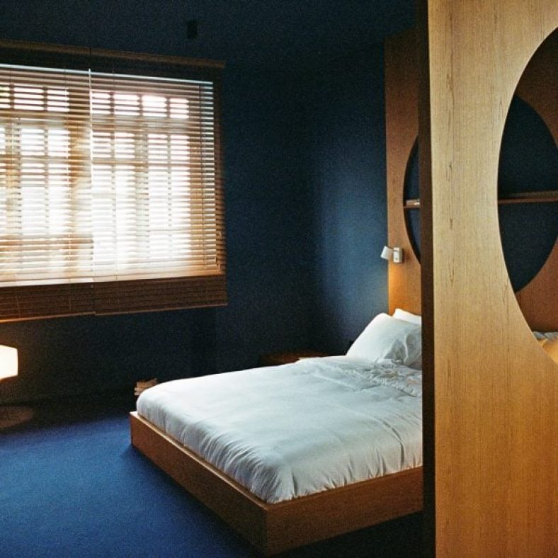
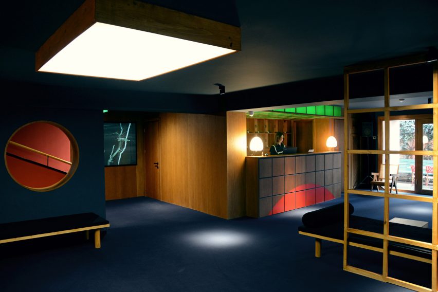
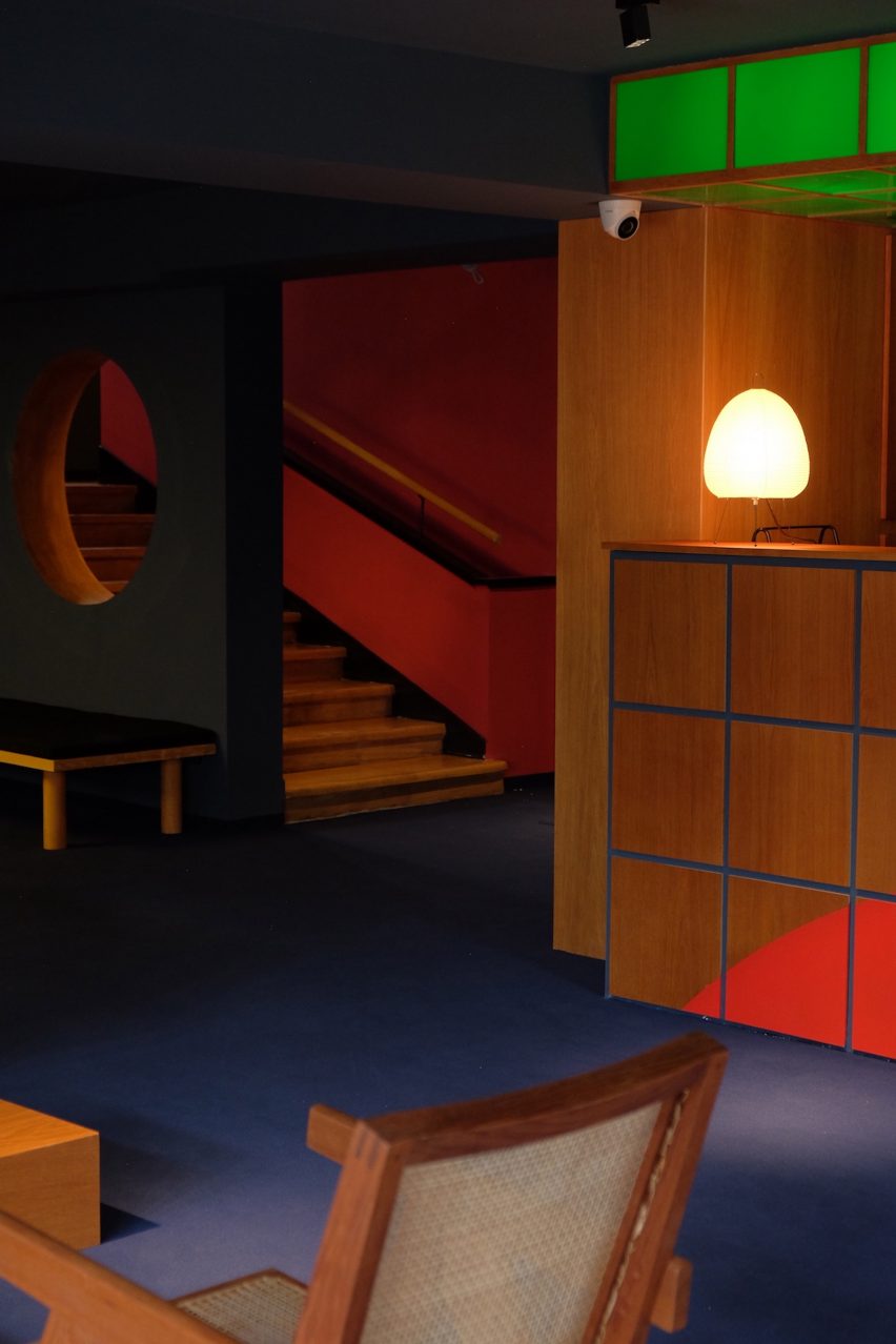
Georgian architect Sandro Takaishvili has converted an apartment building in Tbilisi into a hotel, with interiors informed by his love of cinema and movie projectors in all 16 rooms.
Taking over three storeys above a restaurant in the capital’s Vera neighbourhood, the Blueberry Nights hotel features a theatrical colour scheme, Japanese furnishings and moody lighting.
Blueberry Nights is a 16-room hotel in Tbilisi
“The design of the hotel is the culmination of my entire life’s consumption of film,” the hotel’s co-founder Sandro Takaishvili told Dezeen.
“My intention is to make people feel like they’re inside a movie, where everything feels slightly familiar but otherworldly at the same time,” said the architect, who previously worked as a set designer, filmmaker and photographer.
Its design references films by renowned film directors
The hotel was named after My Blueberry Nights – a film by Hong Kong director Wong Kar-Wai – and incorporates visual references to the work of other renowned directors including Stanley Kubrick.
The main lobby was designed to look and feel like a cosy cinema foyer, complete with dark blue carpeting, walnut wood furniture and seating upholstered in velvet. Guests can check in at a large reception desk fronted in plexiglass that was inspired by retro-futuristic films.
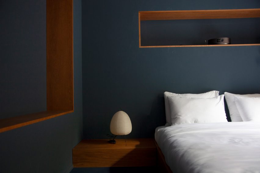
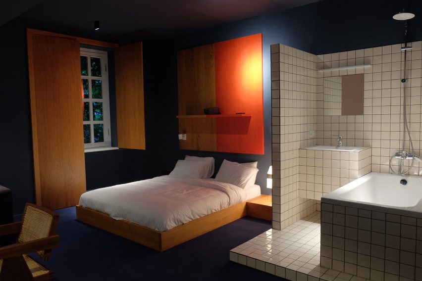
The guestrooms are sparsely decorated with lights from Japan
“From the moment guests step through the doors, a moody cinematic journey begins with dark blue carpets, downlights and a soft soundtrack of noir movie dialogues playing in the lobby,” Takaishvili said.
As part of the renovation, Takaishvili transformed the building’s attic into two extra guestrooms, for a total of 16 rooms.
The bedrooms were designed to evoke the visual style of David Lynch, with custom-made low-slung beds and walnut-veneer cabinets. Room dividers punctured by large circular openings were used to mark different zones within the rooms.
The warm wooden furniture is offset by splashes of red – in the form of vintage phones, artwork and window shutters made from medium-density fibreboard (MDF) – as well as the white tiles used in the tiny en-suite bathrooms.
Wooden furniture in the hotel rooms was locally produced
Other bedroom decor includes lamps with Noguchi-style paper shades, which Takaishvili imported from Japan, and teak-and-cane chairs by architect Pierre Jeanneret, which were sourced from London.
“The paper lights give off a soft luminescent effect that creates a cosy ambience,” the architect explained.
“Some of the simple geometric forms that I used definitely have a mid-century influence but I wasn’t trying to be trendy. I just wanted to achieve a cinematic effect without resorting to obvious movie gimmicks.”
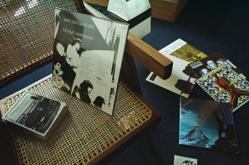
The architects added vinyl players and records in each room
One wall was left blank in each room so that guests can watch movies via a smart projector, while music can be played via a selection of vinyl records.