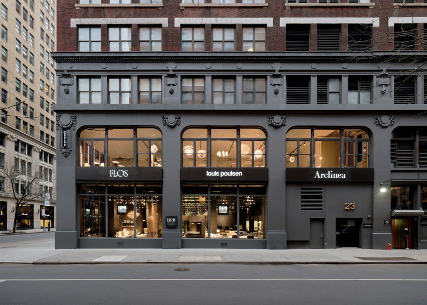
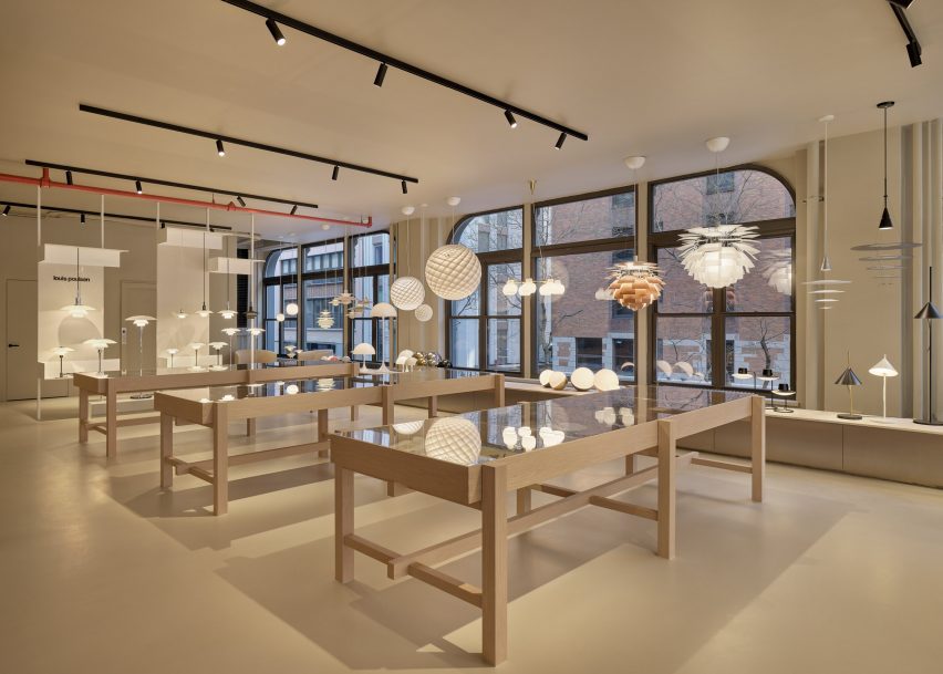
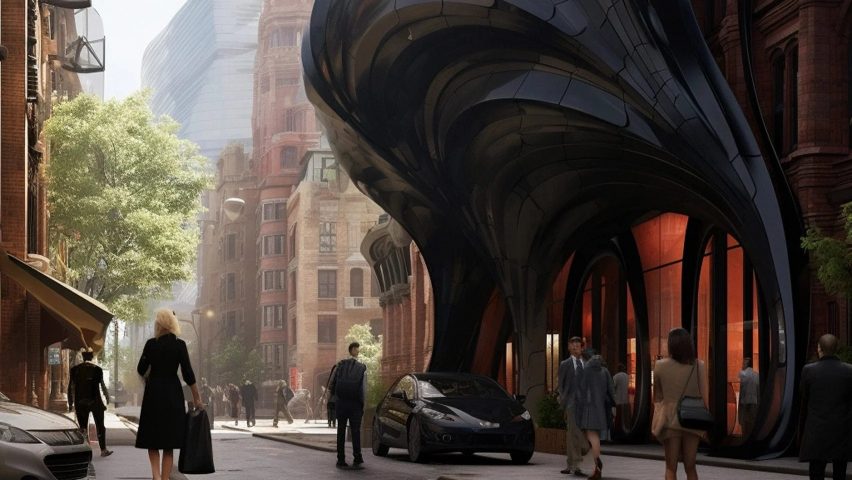
Local studio Lissoni Architecture has expanded the Design Holding flagship in New York City, creating an entirely new floor outfitted with light displays and curving metallic installations.
Lissoni Architecture has created an expansion for the Design Holding showroom in New York
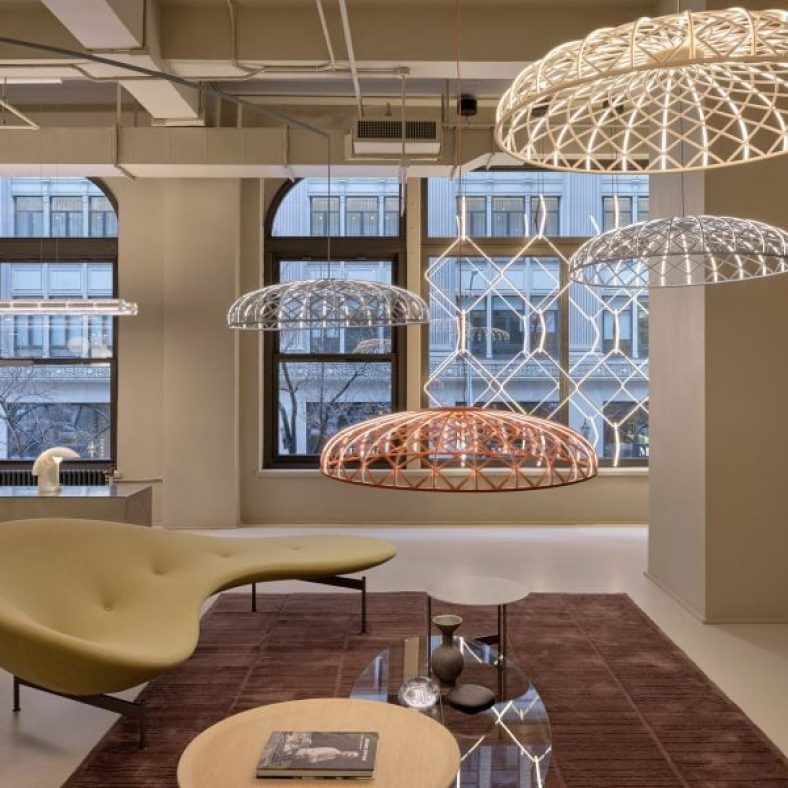
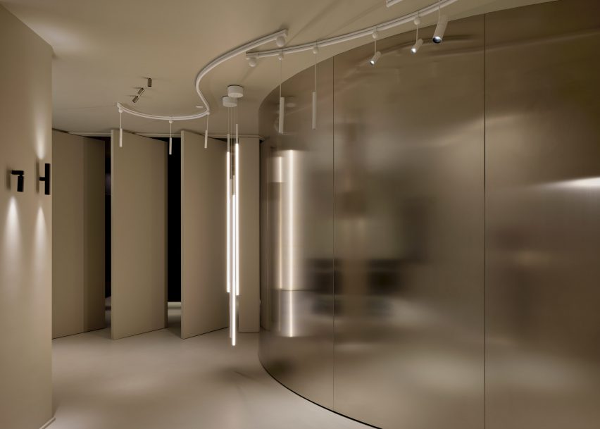
Lighting and design elements from the brands were distributed across the second-floor space, spread out amongst vertical stone-clad panels, transparent, metal showcases, and curving chrome benches and walls.
Each area of the floor was dedicated to a specific brand and the interior architecture was tailored to each brand’s identity, according to the studio.
The project encompasses a new second floor and an expansion and redesign of the first
“We wanted to share the melting pot attitude of New York City where everyone and everything can blend together holistically so we went to the essence of the iconic brands,” said Lissoni Architecture founder Piero Lissoni.
“[We highlighted] their DNA and proposed a common ground that could host and enhance the design codes of each identity.”
The studio created dedicated areas for brands including Flos and B&B Italia
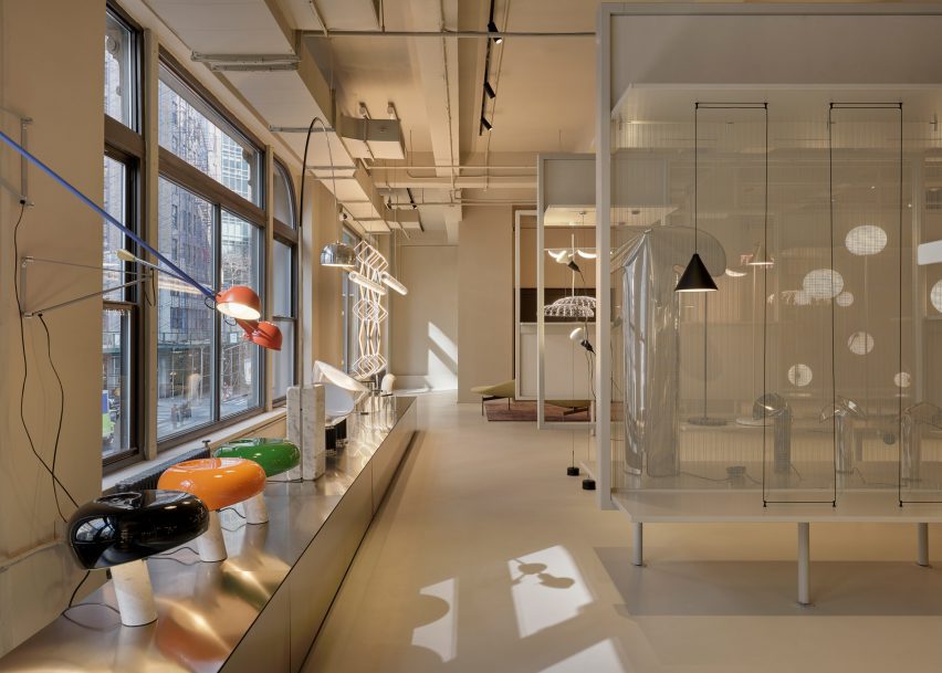
For lighting brand Flos, the studio created a series of display cases backed by a transparent mesh. A magnetized, geometric Bilboquet light by designer Philippe Malouin is on display, as well as the Almendra chandelier affixed with almond-shaped flakes by Patricia Urquiola.
A testing room for clients was also created for the brand, which consists of a curved, metal wall that meets a series of angled panels that act as an entrance for the room.
The various displays were informed by the “melting pot” attitude of New York City
Another corner of the floor was dedicated to the display of the Skynest chandelier by Marcel Wanders, which resembles an inverted basket interlaced with cords of light.
Displays for Flos and Louis Poulsen consist of inserted panels and curving planting beds that are populated with a number of lighting fixtures from both brands.
Metallic panels, warm wood, and dark cladding were used throughout the second-floor space
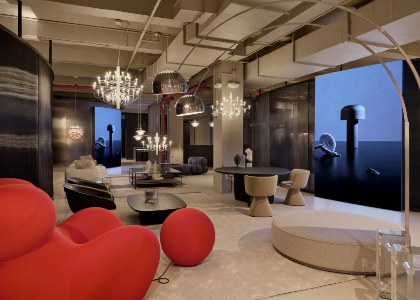
Dark, metal cladding used in the Flos displays contrasts the off-white and beiges used throughout the Louis Poulsen space, but both flank a B&B Italia lounge that sits at the centre of the floor, which features a bright-red chair from the Up series by Gaetano Pesce.
A B&B Italia wardrobe was also created for the showroom, which sits next to an Arclinea kitchen display.
A black ash finish was used to clad a large cabinet unit, which sits behind a Thea island topped with a quartz waterfall countertop.
Lighting by Louis Poulsen, including the Patera Oval pendant by designer Øivind Slaatt, was tucked into the furthest corner of the space, with pieces distributed amongst wooden tables and a low-lying display unit.
A separate entrance leads to a Maxalto space on the first floor
On the first floor, a new space dedicated to Maxalto is accessible through a separate entrance, with pieces such as the brand’s Arbiter sofa system positioned against walls clad in black.
Piero Lissoni announced the founding of the US branch of his studio last year, saying that the US has become more “open-minded” in terms of architecture.
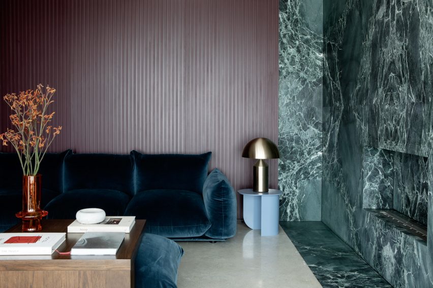
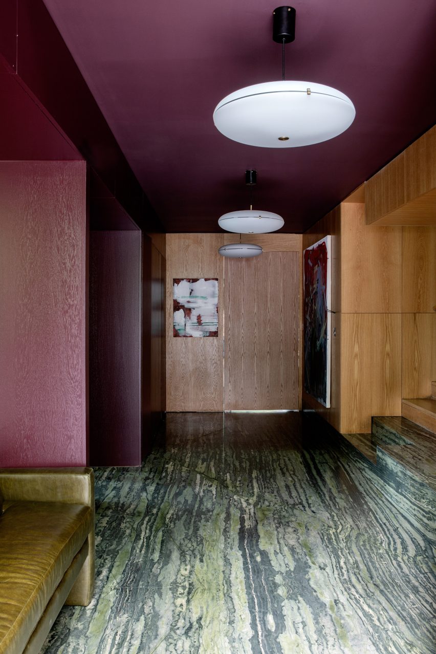
From a glitzy Parisian apartment to a converted garage in Buffalo, New York, our latest lookbook collects eight residential interiors where floor-to-ceiling curtains inject a theatrical feel.
Curtains aren’t just for covering windows. A set of statement drapes can be an easy way to significantly change the mood of a room, particularly in apartment renovations.
The selection below features curtains in stage-like living rooms, rough-edged bedrooms and cosy working nooks.
This is the latest in our lookbooks series, which provides visual inspiration from Dezeen’s archive. For more inspiration, see previous lookbooks featuring interiors with statement carpets, furry walls and colourful bedrooms.
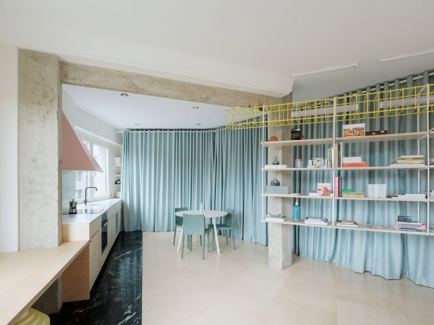
Duck-egg blue curtains help to create a flexible open-plan layout at this apartment in Bilbao that was overhauled by architecture studio Azab, running the length of the living-dining-kitchen area to conceal storage space and a bathroom.
“The curtains have theatrical and playful connotations and invites the inhabitant to perform with it, to change the space and to play with the mysteries, contradictions and paradoxes that privacy offers us beyond morality,” said the studio.
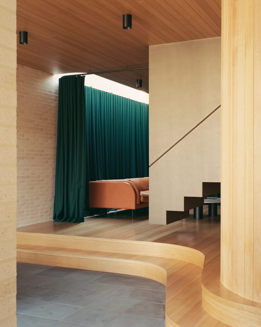
In this extension to an Edwardian family home in Melbourne, architecture practice Studio Bright raised the sitting room on a curved plinth, giving it a stage-like quality.
Enhancing the effect is a heavy green curtain hung from the ceiling, which can be drawn across to turn the space into an impromptu theatre for the children to play in.
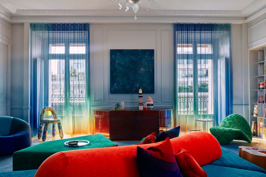
Fashion designer Roksanda Ilincic brought her proclivity for bold colours and shapes to this London penthouse inside a former Victorian gas holder.
Pale pink Kvadrat curtains over the full-height windows cast a rose-tinted hue over the rooms, where the colour palette is kept mostly neutral apart from some pops of bright yellow.
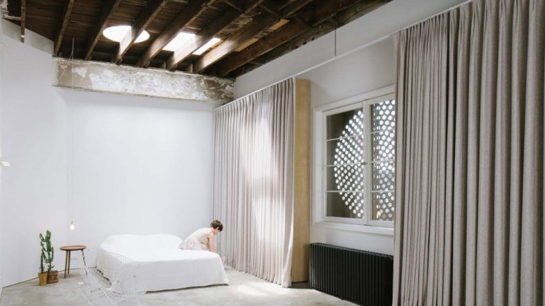
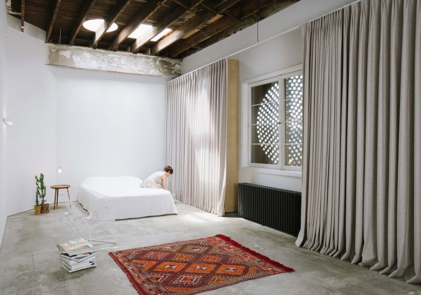
Peeling paintwork, uneven concrete floors and distressed wooden beams lend a distinctly rough-and-ready feel to this home-slash-workspace in Buffalo created out of a garage conversion by design studio Davidson Rafailidis.
For the most part, the space is minimally furnished, apart from a set of high and wide drapes that introduce a luxurious twist.
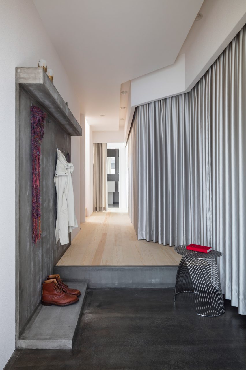
Upon entering Landscape House in central Japan, designed by Japanese studio FORM/Kouichi Kimura Architects, one is greeted by a lengthy corridor lined entirely on one side by a full-length silver curtain.
The fabric echoes a raw concrete feature wall on the opposite side of the corridor, as well as referencing the extensive use of metal throughout the building.
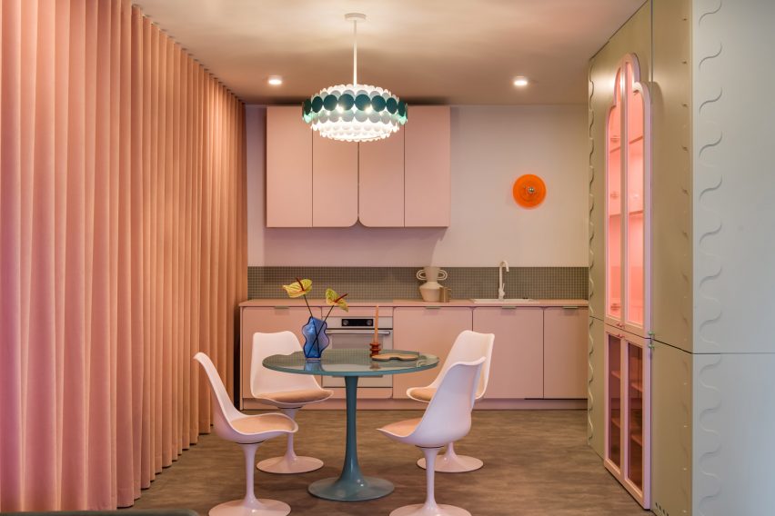
Furora Studio wanted the design of this holiday apartment in Kraków to be slightly more outrageous than the standard residential interior.
A velvety, salmon-pink curtain dresses an entire wall in the open-plan kitchen and living room, adding to a plethora of sugary colours and rounded edges.
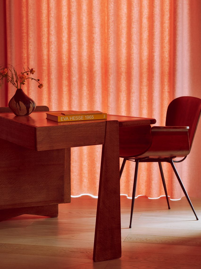
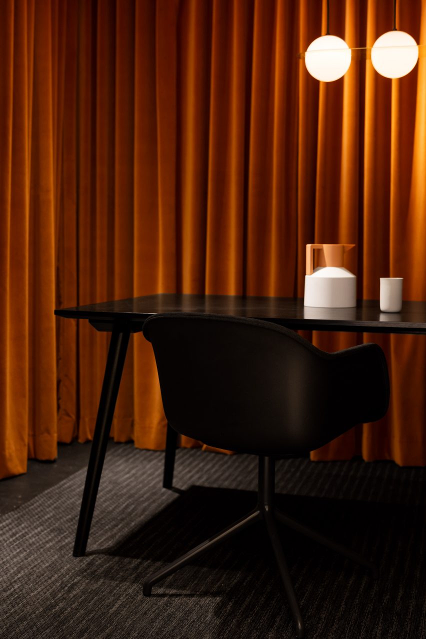
Most of the spaces inside Maison-Boutique Coloniale in Montreal – renovated by designers Michael Godmer and Mathieu Turgeon as their own residence and studio – are pared-back and neutral.
But in an office space on the basement level, plush orange curtains line the walls, combined with dim pendant lighting and a black table arrangement by Muuto and &tradition for an intimate effect.
This is the latest in our lookbooks series, which provides visual inspiration from Dezeen’s archive. For more inspiration, see previous lookbooks featuring interiors with statement carpets, furry walls and colourful bedrooms.
Sink drains and strainers are made with small holes to let water flow through and keep large items out of the plumbing system. Many different things poured down sink drains clog pipes, damage sewer systems, and pollute the environment.
It is much easier and quicker to remove the kitchen sink strainer and wash leftovers down the drain. For a while. Until the drain gets smelly or the pipes become clogged. Then it can become time-consuming and costly. Never wash these things down the drain.
Grease
Grease and oils–like cooking oil, butter, salad dressing, and fat–may be the worst thing to pour down a drain. They stick to pipes. Then other waste adheres to the grease–narrowing the drain. Eventually clogging the drain.
Bacon grease congeals. It can float on top of the water left in P-traps and form a hard plug. Adding more debris makes the plug harder to remove. Hot water may remove some of the grease by melting it and flushing it away, but grease never mixes with water. You may eventually require a plumber to completely replace the drain.
Eggs and Egg Shells
Crushed eggshells function like sand in concrete. They embed into grease and oils–holding the clog together and allowing it to grow. Eggshell membrane sticks to pipes or accumulates other waste like coffee grounds, dirt, and food remnants.
Liquid eggs and milk used as a batter rinsed down the drain with hot water can cook into lumps if not completely washed away.
Flour
Flour mixed with water clots and sticks to itself and the sides of pipes. Once attached and dried out, it is difficult to remove. Clotted flour narrows pipes and can eventually lead to clogged drains.
Coffee Grounds
Coffee grounds look like they should easily disappear down the drain because they are small separate particles. Instead, ground coffee clumps together and is one of the most common causes of drain problems.
Pasta, Rice, and Potatoes
Pasta and rice absorb water and expand. Not just in boiling water but in the cold water in a drain. They are sticky when wet and form clumps that glue themselves to pipes and cause clogs.
Potatoes are a starchy food. They form a sticky paste when ground in garbage disposals and will glue to the sides of pipes.
Hair
Hair is tough, tangles, and does not decompose well. Once in a drain, it catches and holds almost anything. Hair is the major cause of shower and tub clogs. Beard or hair clippings rinsed down sink drains cause clogs. The pipes are smaller than tub and shower drains so it takes less hair to cause problems.
Medications
Crushing and disposing of left-over pills or pouring liquid medication down the drain will not clog the pipes. Instead, they will pass into water treatment systems which cannot filter them out. Eventually, medications pollute groundwater, streams, rivers, and oceans. They can end up back in drinking water.
Chemicals, Cleaning Products, and Paint
Leftover paint, turpentine, paint thinner, etc. should never be poured down drains. Paint can dry onto the insides of pipes and clog drains. Do not put any paint down drains–house paint, picture paint, or hobby paint.
Many cleaning products contain chemicals harmful to the environment. Undiluted bleach is very corrosive and can damage pipes. Bleach and chemicals can react with each other and with food to create dangerous compounds. Some may be explosive or toxic.
Water treatment plants and septic systems are incapable of filtering out chemicals. They end up in groundwater, streams, and ecosystems. There is always a chance of chemicals re-entering the drinking water system.
Soil
Repotting plants or washing off freshly dug vegetables in the sink seems like an easy way to dispose of the dirt. Potting soil contains peat moss and fibrous material like root hairs and compost. These materials along with the soil can easily help build existing clogs or start one.
Food Scraps
Sink strainers should always be in place when cleaning the remains of a meal off plates into a sink. Large scraps washed down the drain can lead to clogs. Clogs containing rotting food produce foul odors coming from the drain.
Having a garbage disposal and using it with lots of water helps to get rid of scraps. Clean your garbage disposal regularly to eliminate odors and keep it operating properly.
Regardless of how careful you are, something will get into the drain–coffee, dirt, plate scrapings, etc. Lack of water is one of the biggest causes of drain blockages. People tend to let the tap run for a few seconds until the sink is clean–then turn it off.
The P-trap in the drain is always full of water to prevent sewer gas from getting into the house. Too little water will not completely replace the standing water and flush things down the sewer line. Things that float like grease, food scraps, flour, and starches will stick to the pipes above the water line. Once dried, they may not come loose and the clog just grows.
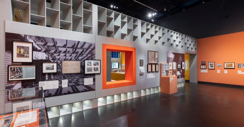
London’s Victoria and Albert Museum has launched its Tropical Modernism exhibition, which highlights the architectural movement’s evolution from colonial import to a “tool of nation building”.
According to the Victoria & Albert Museum (V&A), the exhibition aims to examine the complex context, power dynamics and post-colonial legacy of tropical modernism – an architectural style that developed in South Asia and West Africa in the late 1940s – while also centralising and celebrating its hidden figures.
London’s V&A museum has opened a major exhibition exploring tropical modernism
“Tropical modernism is experiencing something of a modish revival as an exotic and escapist style popular in verdant luxury hotels, bars and concrete jungle houses,” the exhibition’s lead curator Christopher Turner told Dezeen.
“But it has a problematic history and, through an examination of the context of British imperialism and the de-colonial struggle, the exhibition seeks to look at the history of tropical modernism before and after Independence, and show something of the politics behind the concrete,” he continued.
The exhibition traces the evolution of tropical modernism within a South Asian and West African context
For the in-house iteration of the exhibition, additional architectural models, drawings and archival imagery have been introduced to interrogate tropical modernism in India alongside the African perspective.
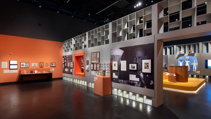
Exhibition materials line a series of rooms within the V&A’s Porter Gallery, divided by brightly coloured partitions and louvred walls referencing tropical modernist motifs.
Archival imagery, architectural drawings and physical models line the gallery rooms
The exhibition begins by tracing tropical modernism back to its early development by British architects Jane Drew and Maxwell Fry. Stationed together in Ghana from 1944, Drew and Fry adapted international modernism to the African climate, proposing functional over ornamental design.
Drew and Fry would also become part of the Department of Tropical Studies at the Architectural Association (AA), which exported British architects to the colonies from 1954 in a bid to neutralise calls for independence.
The exhibition aims to centralise local professionals who have gone widely unrecognised for their contributions to the movement
The exhibition continues by spotlighting local Ghanaian figures who worked with Fry and Drew, noting the power shifts that were taking place behind the scenes to reappropriate the architectural style for an emerging era of colonial freedom.
Influential political leaders Jawaharlal Nehru in India and Kwame Nkrumah in Ghana are the exhibition’s key personas, framing the evolution of tropical modernism from conception to regionalisation.
Gallery rooms are divided by brightly coloured partitions informed by tropical modernist motifs
“The heroes of our exhibition are Nehru and Nkrumah, the first prime ministers of India and Ghana,” Turner explained. “Tropical modernism, a colonial invention, survived the transition to Independence and was appropriated and adapted by Nehru and Nkrumah as a tool of nation building.”
“Nkrumah, who sometimes sketched designs for the buildings he wanted on napkins, created the first architecture school in sub-Saharan Africa to train a new generation of African architects, and this institution has partnered with us on a five-year research project into tropical modernism.”
According to the V&A’s research, tropical modernism shifted from its western Bauhaus roots towards a localised vernacular styles
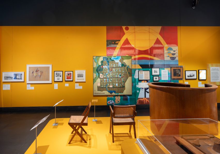
Through a host of physical models and artefacts, the city of Chandigarh becomes the exhibition’s narrative focal point for tropical modernism in India.
Under prime minister Jawaharlal Nehru, Chandigarh was the first large-scale modernist project, recruiting Drew and Fry along with French architect Le Corbusier to plan the ideal utopian urban centre.
As with Nkrumah – who saw how the Africanisation of architecture could become a symbol of progress and change – the exhibition also aims to highlight Nehru’s ambitions for a localised modernism drawing from the Indian vernacular, rather than the Western Bauhaus style.
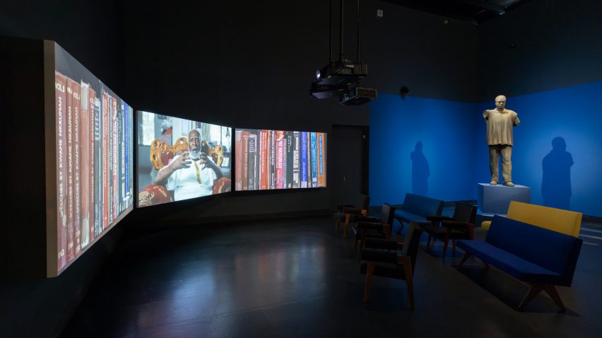
The display culminates in a video featuring 16 key tropical modernist structures, interspersed with interviews and footage explaining the social and political context behind each building’s realisation.
“We made a three-screen 28-minute film, shot in Ghana and featuring panoramic portraits of over a dozen buildings, cut with archive footage from the time and interviews with architects like John Owusu Addo and Henry Wellington, and Nkrumah’s daughter, the politician Samia Nkrumah,” said Turner.
The exhibition aims to address gaps in the museum’s African and South Asian studies
According to Turner, the exhibition begins to address gaps in the V&A’s collections and archives pertaining to architecture and design in the global south.
“Archives are themselves instruments of power, and West African and Indian architects are not as prominent in established archives, which many institutions have now realised and are working to address,” Turner explained.
“Tropical modernism was very much a co-creation with local architects who we have sought to name – all of whom should be much better known, but are excluded from established canons.”
The display will inhabit the V&A’s Porter Gallery until 22 September 2024
Bringing tropical modernism back into contemporary discourse was also important to the V&A as a timely investigation of low-tech and passive design strategies.
“Tropical modernism was a climate responsive architecture – it sought to work with rather than against climate,” Turner said.
“As we face an era of climate change, it is important that tropical modernism’s scientifically informed principles of passive cooling are reexamined and reinvented for our age,” he added.
“I hope that people will be interested to learn more about these moments of post-colonial excitement and opportunity, and the struggle by which these hard-earned freedoms were won.”
A 28-minute video captures footage of remaining tropical modernist structures at the end of the exhibition
The V&A museum in South Kensington houses permanent national collections alongside a series of temporary activations and exhibitions.
The photography is courtesy of the Victoria & Albert Museum.
Tropical Modernism: Architecture and Independence will run from 2 March to 22 September 2024 at the V&A Museum in London. For more events, exhibitions and talks in architecture and design visit the Dezeen Events Guide.
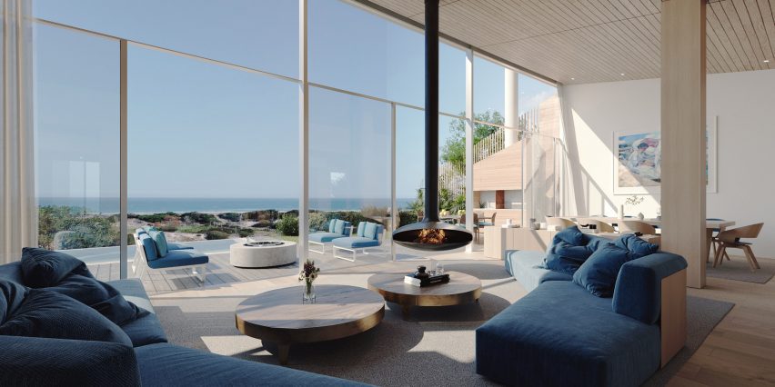
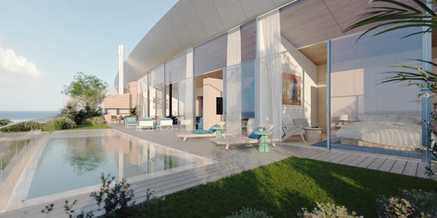
Architecture studio Rafael Viñoly Architects has unveiled designs for a terraced residential building in Uruguay, which is the last project designed by the studio’s founder.
Located outside of Montevideo on a beachfront site, the Médano El Pinar apartment complex will be comprised of approximately 120 luxury, multi-family residences of one to five bedrooms. It is the last project designed by architect Rafael Viñoly, who died last year.
Rafael Viñoly Architects has unveiled designs for a terraced residential complex in Uruguay
“The last project designed by renowned architect Rafael Viñoly, Médano El Pinar is an innovative, ultra-sustainable, luxury, multi-family residential development,” said the studio.
“The building’s long, low-slung, and sinewy shape integrates it with the organic landscape of its pristine setting to minimize its visual impact on the neighbourhood and make it completely invisible from the public beach.”
It is the last project designed by the late architect, according to the studio
Situated behind sand dunes, renderings show an undulating building with a terraced facade that mirrors the curves of its beachfront site.
Residences will be distributed along its 1,394-foot (425-metre) length and contain glazed facades that will open onto terraces.
The residences will contain glazed facades and private terraces
“Generously proportioned interiors open to large elevated private gardens with panoramic views, creating a sense of ‘conscious luxury’,” said the studio.
The building will be constructed from a locally sourced mass timber structure, according to the studio, with aims to be “the first nearly Zero-Energy Building”.
Other sustainable strategies integrated into its design will include the use of solar panels, rainwater capture, a green roof and cross ventilation.
Interior renderings show double-height living spaces with wood beams distributed throughout and capped by a wood-slated ceiling.
The building will be made of a mass timber structure
A wall of floor-to-ceiling windows and sliding glass doors open onto the accompanying terrace, which hosts a small pool or garden and additional seating areas.
A large pool sitting in front of the building is also pictured, with ground-level entrances to the building tucked along its length.
Uruguayan architect Viñoly, who died aged 78, designed numerous buildings around the world including 432 Park Avenue in New York and the Walkie Talkie in London.
Organizing a pantry can be a costly project. Visit any home influencer’s Instagram feed, and you’ll likely see expensive baskets, bins, and food storage containers neatly lining pantry shelves. If you want that streamlined look but are working with a modest budget, you don’t have to compromise — use similar but less expensive materials for an Instagram-worthy pantry.
Tips for Pantry Organization for Less
The goal of pantry organization is to make it easy to see what food you have on hand and keep it organized. There’s no need to spend hundreds of dollars on a pantry makeover. Instead, try some of these tips.
Utilize Inexpensive but Matching Food Storage Containers
Organizing a pantry requires a variety of containers. Large containers house bulky items like uncooked spaghetti, cereal, oats, and rice. Smaller containers can fit more niche items like chocolate chips for your favorite cookie recipe or a package of candy.
For continuity, it’s best to use the same type or brand of small container and the same type of large container since these items will sit next to each other on a shelf.
Out of Space? Create a Pantry Drawer to House Your Food
If you have no dedicated pantry but have deep drawers, create your own food storage system utilizing container sets, like TikToker The Kwendy Home. Mess around with the organization until you find the best way to arrange your containers. Be sure that the least used items are on the bottom and the food/snacks you reach for the most are on top.
Hit Up the Dollar Tree for Storage Bins
Expensive and cheap bins all serve the same purpose—to contain items. To stretch your money as far as possible, utilize bins from The Dollar Tree. Affordable and aesthetically pleasing baskets are also available at Amazon, Walmart, and Target.
Make Your Pantry Look Fresh with a New Coat of Paint
Dirty or scuffed-up paint jobs can ruin the look of a room, including the pantry. A quick coat of paint on the walls and shelves allows you to customize the look and spruce up the pantry in a big way without splurging.
Utilize Cardboard Boxes
Make your own bins by saving your cardboard boxes and wrapping them in pretty paper or fabric. You’ll get a custom look for pennies on the dollar. Plus, you can cut down boxes to be the exact size your pantry needs.
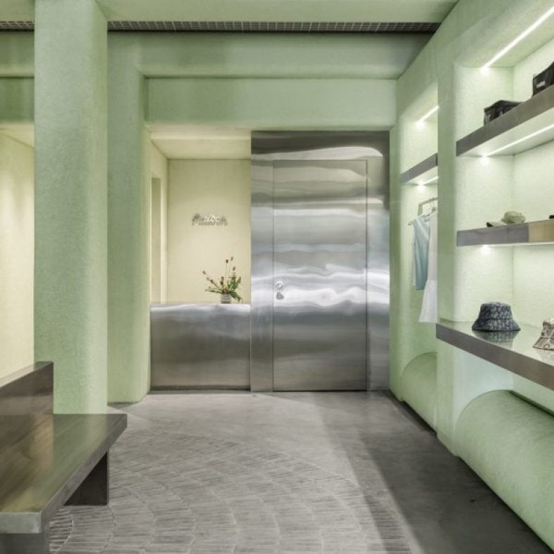
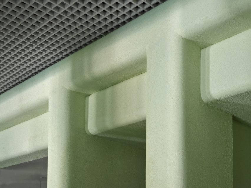
Los Angeles studio 22RE has used pale-green stucco informed by Miami‘s colours and golf courses for the interiors of a golf clothing boutique in the city.
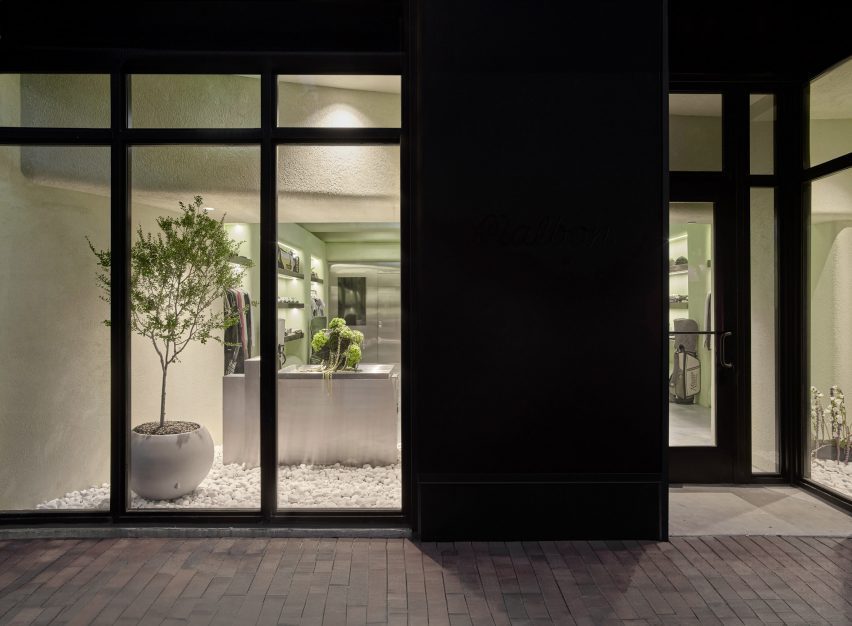
A few blocks from the ocean, the Malbon store in Coconut Grove serves a large customer base for the brand in South Florida – a popular golfing destination thanks to year-round warm weather.
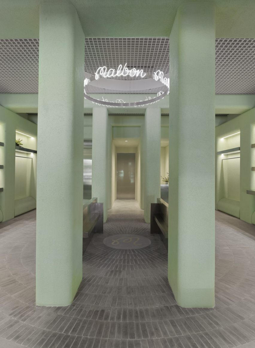
The Malbon Miami store revolves around a central area, from which handmade tiles emanate in a radial pattern across the floor
The verdant neighbourhood and Miami’s distinct architecture provided 22RE with a starting point to build upon, aiming to create a tranquil space amongst such vibrancy.
“We intended to create an oasis within the city, one that invoked stillness – a feeling that Malbon customers are accustomed to while they’re out on the green,” 22RE founding principal Dean Levin told Dezeen.
Pale green stucco covers the walls, columns and ceiling beams
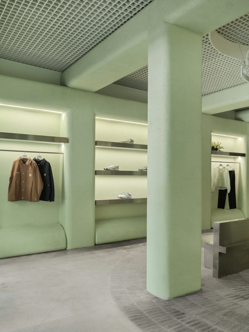
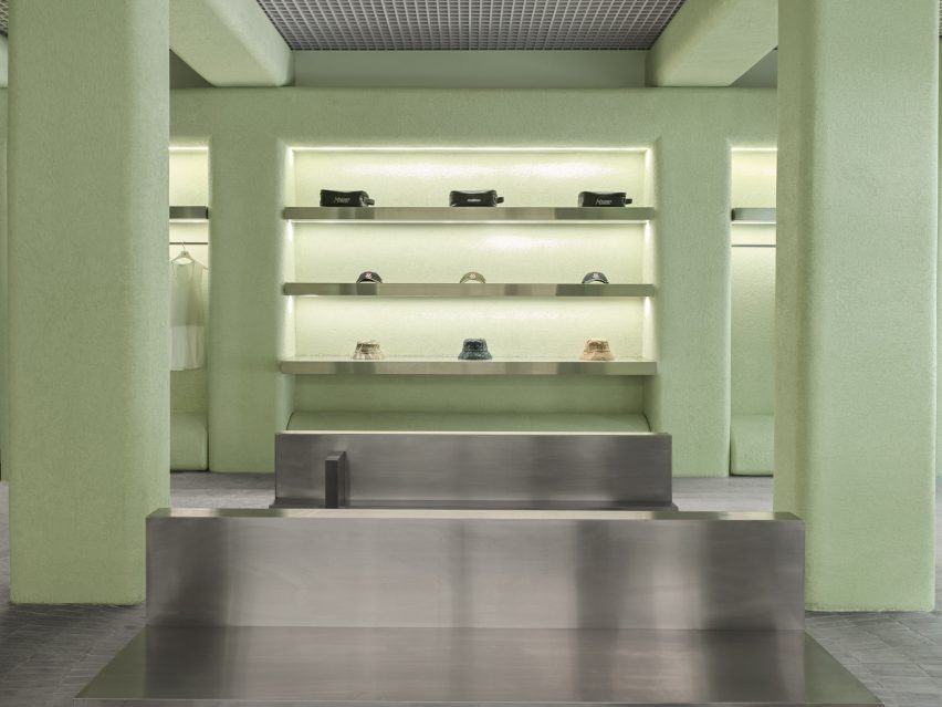
The store’s most striking feature is the pale green stucco that covers the majority of vertical surfaces and ceiling beams that form square archways overhead.
“The shade of green used throughout the space was inspired by the studio’s first visit to the location, and inspired by the vibrant hues associated with Miami as a city,” said Levin.
Merchandise is kept to the perimeter of the store, displayed on stainless steel rails and shelves
The placid hue is contrasted with stainless steel elements including the sales counter and a doorway to the stock room.
From the centre of the space, mid-grey handmade Mexican tiles are laid across the floor in a radial pattern, emanating from a circular plaque that displays the brand’s monogram.
Filleted stucco surfaces contrast the aluminium open-cell grid ceiling
A ring-shaped installation above, suspended from an aluminium open-cell grid ceiling, also bears the Malbon logo scribed repeatedly in white neon.
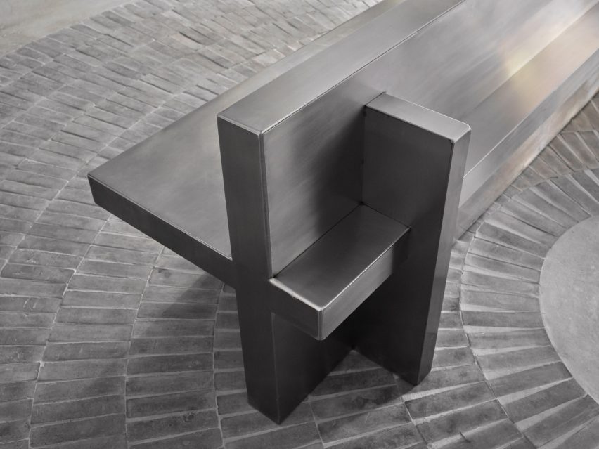
Four columns and a pair of stainless steel benches define this central area, which is intentionally devoid of merchandise to create a moment for pause and conversation between customers.
Clothing and accessories are kept to the perimeter, displayed in illuminated niches on stainless steel rails or shelves.
“In retail stores, there is a predominantly unchanging relationship between salesperson and customer,” Levin said. “We wanted to consider and account for the things we could – foot traffic, merchandising and general flow.”
A pair of stainless steel benches offer a place for pause and conversation in the middle of the boutique
Behind the street-facing windows, white stones cover the floors and plants so that the store “feels like a natural extension of the vegetation and foliage” in the surrounding area, said Levin.
“Through juxtaposing a variety of different materials both organic and industrial, the Malbon Miami storefront is an accurate reflection of the values we celebrate and preserve as an architecture and design firm,” he added.
The storefront contains greenery to create a natural extension of the verdant surroundings of Coconut Grove
Miami has grown significantly as a retail destination over the past decade, with a large concentration of new luxury stores in the city’s Design District.
Pots and pan storage is a struggle even in the tidiest of kitchens. Thrown in a cabinet or drawer, everything intermingles, making it hard to reach for exactly what you need.
Tiktoker Fatima.Kosar has implemented a simple strategy that makes varying sizes of cookware easy to grab and even presents a solution for keeping lids accessible. “Say goodbye to the chaos and get a pots and pan organizer,” she says. “It allows you to neatly store your cookware, making it both efficient and accessible.”
In her video, Fatima utilizes a pots and pan organizer to stack different sizes of cookware inside a kitchen cabinet. Depending on the cabinet size, this organizer can be placed vertically or horizontally. She adjusts the shelves to fit her current collection.
To keep lids accessible, Fatima adds an organizer on the top shelf. The organizer houses the lids that match her pots and pans, but since the slots are adjustable, they also work well for containing cookie sheets, slim pans, and bakeware.
Since organizers are freestanding, this is a good solution for renters and homeowners alike.
Pare Down the Collection for an Organized Kitchen
Aside from utilizing the right organizational tools, you can keep your kitchen cookware better organized by decluttering what you don’t need or use. Get rid of all pots and pans that have a flaking-off non-stick coating. Consider donating items you haven’t used in the past six months to a year.
Also, contemplate storing less used items away from everyday essentials. When your loved and needed bakeware is neatly organized in its own cabinet, keeping it organized doesn’t feel like a herculean feat.
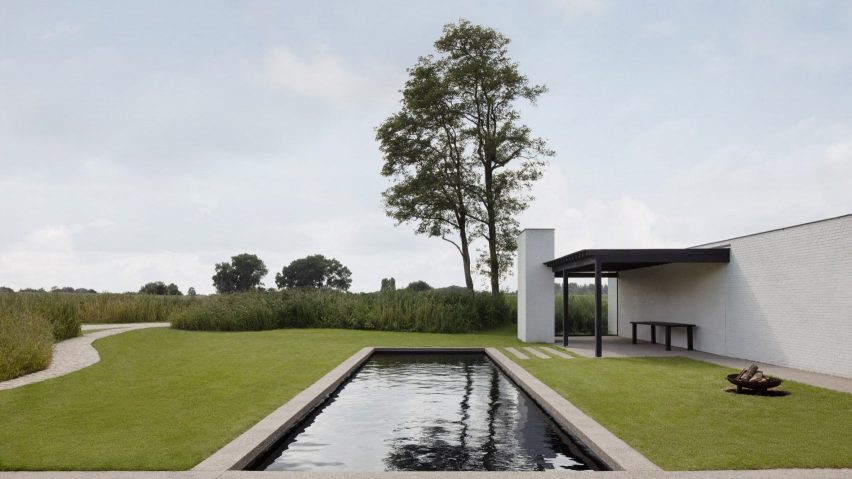
Geneva-based architect Stef Claes looked to mid-century and local architecture to create the low-lying home in Belgium. The residence, named House in the Fields, features white-painted walls and black accents.
Readers discussed the project, with one commending the architects for achieving “such a clean result” and another agreeing, claiming that they “could quite happily live there”.
You can also subscribe to our other newsletters; Dezeen Agenda is sent every Tuesday containing a selection of the most important news highlights from the week, Dezeen Daily is our daily bulletin that contains every story published in the preceding 24 hours and Dezeen In Depth is sent on the last Friday of every month and delves deeper into the major stories shaping architecture and design.
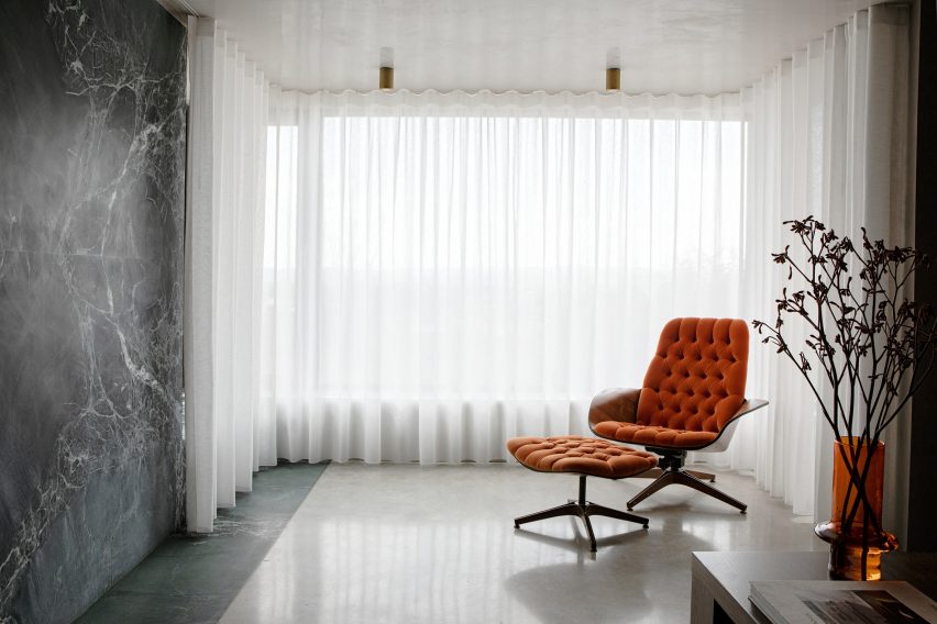
Dublin studio Kingston Lafferty Design has transformed the architecture and interiors of this family home in Cork, Ireland, which features 1970s-style shapes and colours informed by the work of designer Verner Panton.
Positioned on Lovers Walk hill overlooking the city of Cork, the townhouse – called Lovers Walk – was renovated by Kingston Lafferty Design.
Kingston Lafferty Design completed the renovation in Cork
The studio originally planned to just update the interiors, but decided that a more extensive architectural transformation was needed after discovering structural instabilities in the home.
Kingston Lafferty Design removed all of the floors, which lacked foundations and insulation in their concrete slab, and completely reconfigured the two-storey property’s layout.
Rooms on the ground floor were designed around an oak-lined hallway
“As the building was originally built in the 1970s, we wanted to return to its roots,” studio founder Róisín Lafferty told Dezeen.
“We thrived on inspiration from Verner Panton with his use of strong clashing colour, playful shapes and oversized elements,” she added.
One of these spaces is a “sensual” red kitchen
The ground floor was adapted to include an open-plan kitchen defined by a counter, island and splashback finished in veiny red quartzite.
Ruby-toned timber was used to create the geometric cabinets. When layered with the quartzite, “it sounds like a disaster, but it’s a delight,” said the designer.
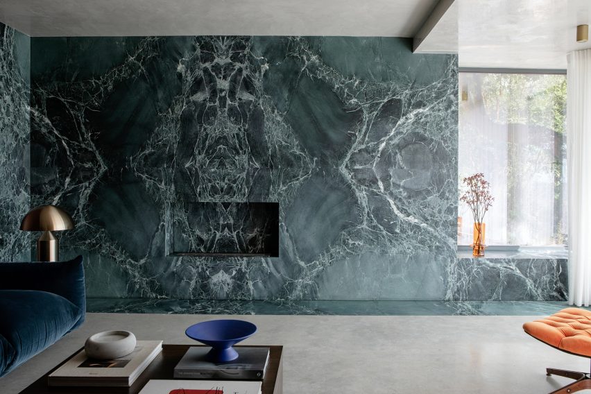
The living room follows a similar design to the kitchen
The space, described by the studio as a “sensual red-toned jewel kitchen”, is one of several rooms on the ground floor of Lovers Walk that were designed around the central, oak-lined hallway.
“We used the hallway as the core of the house, which grounded the space with pops of colour stemming from it. Each room leading from the core appears like a framed view or window of colour,” explained Lafferty.
It includes a green feature wall that takes cues from Mies van der Rohe’s iconic Barcelona Pavilion
The living room includes blue velvet sofas and a green feature wall clad in swirly book-matched marble, which was fitted with an alcove reserved for a subtle fireplace.
When creating the polished stone wall, the studio took cues from the seminal Barcelona Pavilion, completed in 1929 by modernist architect Mies van der Rohe.
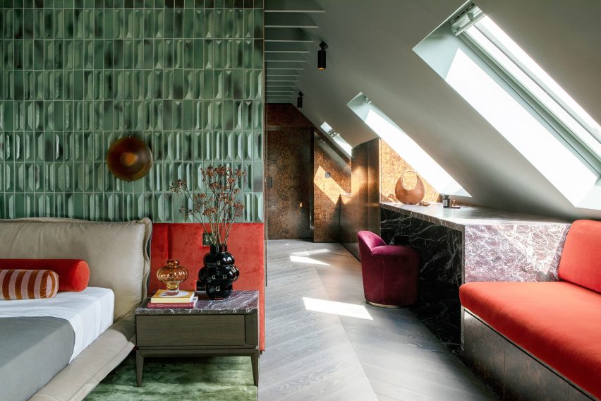
A floor-to-ceiling headboard takes centre stage in the main bedroom
“We used green as an overall thread throughout the house, inspired by the surrounding landscape,” added Lafferty.
“Although depending on the time of year, the colours tend to change and so we were able to add in other rich colours that anchor the green such as burgundies and bright oranges,” she added.
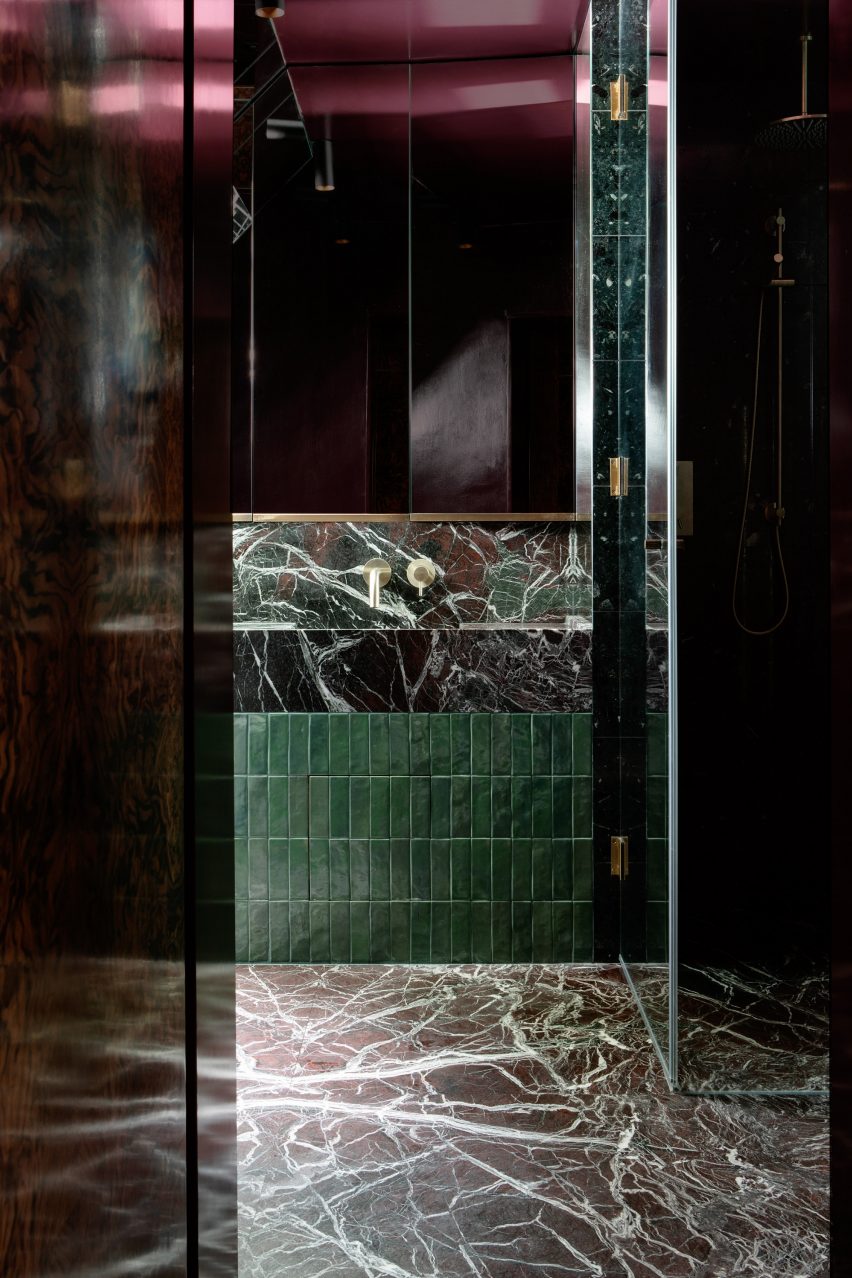
Stonework also defines the en-suite bathroom
“One would assume this mix of colours would clash, but we choose the tones and textures of each to ensure that all of them would blend harmoniously,” Lafferty said.
Upstairs, the main bedroom and en-suite bathroom were dressed in the same eclectic interiors as the communal spaces. A floor-to-ceiling headboard, finished in diamond-shaped green tiles originally designed by 20th-century architect Gio Ponti, frames the bed.
A playful bed was added to the bedroom created for the occupants’ child
Balloon-like coloured glass vases were positioned on two bedside tables, which were topped with the same slabs of Rosso Levanto marble as the geometric vanity desk.
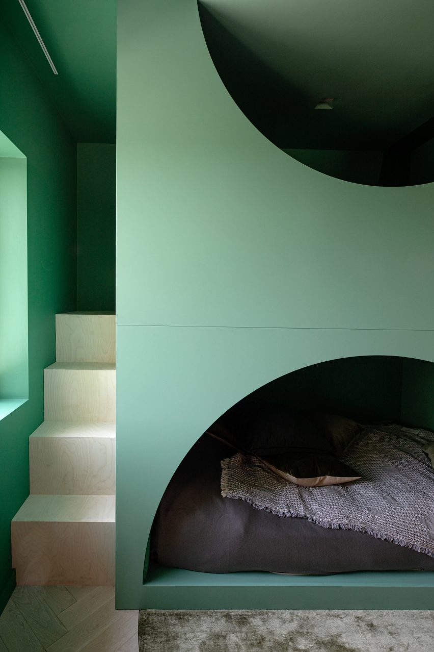
The bedroom designed for the occupants’ child features an alternative bed – a playful green structure with two stacked levels and half-moon openings that reveal a cosy sleeping area on the bottom level.
Other accents featured throughout the home include burl wood, terrazzo, plaster and brass. The repetition of 1970s-style thick pile carpets emphasises the dwelling’s textured material palette.
Lovers Walk is the studio’s “closest nod” to the work of Panton, explained Lafferty – “down to the selection of every tile, light fitting and exquisite piece of designer furniture”.
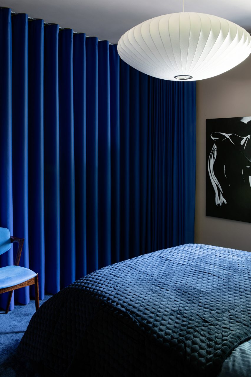
Deep blues characterise the guest bedroom
“Although there is such an array of materiality, it is balanced by repeated colour, shape and form,” she said.
“Every space in this house is an assault on the senses, in the best way possible.”
Lovers Walk was informed by the work of Verner Panton
Founded in 2010, Kingston Lafferty Design has completed projects ranging from a Dublin restaurant with oversized lollipop-like lamps and a co-working office in Belfast that includes a yoga studio.