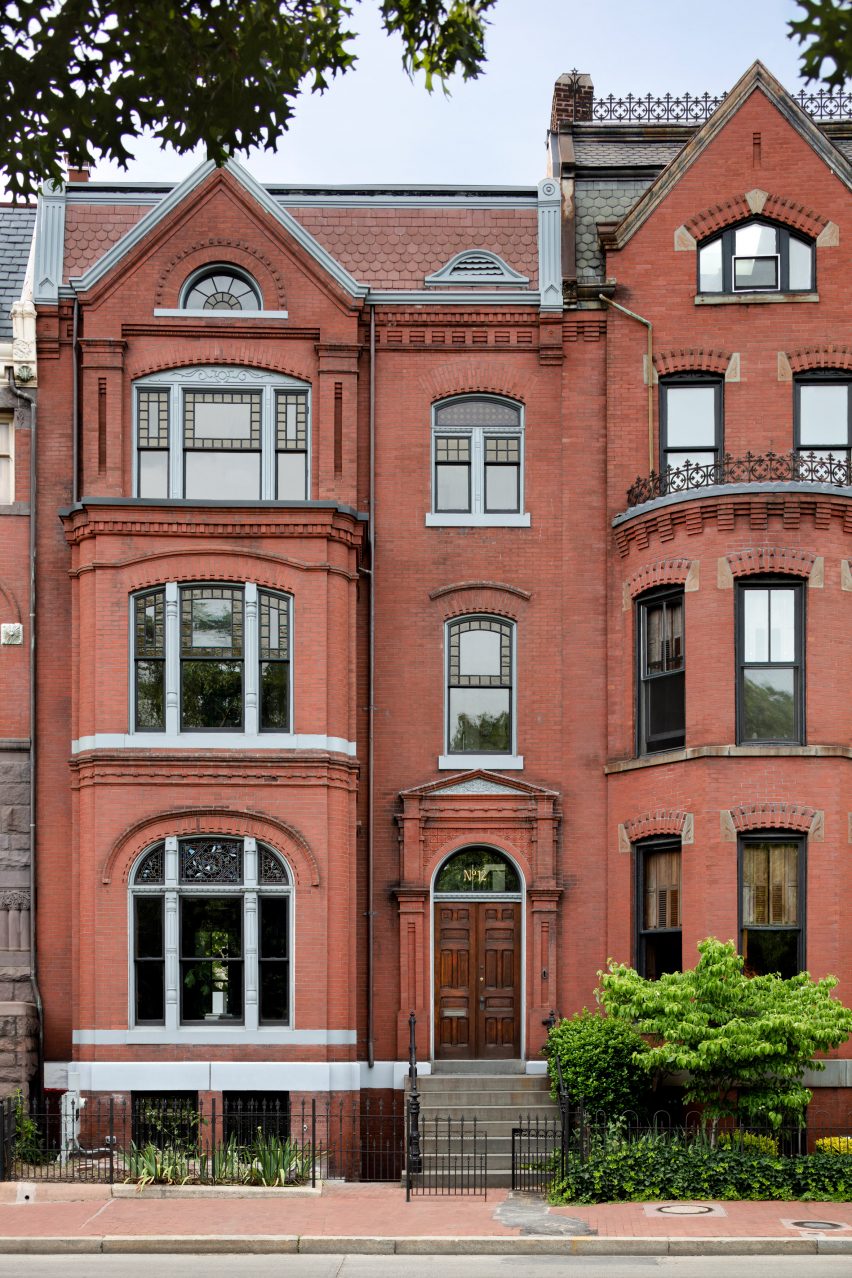
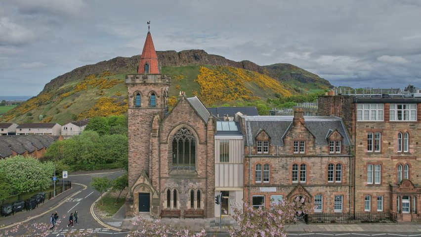
Colleen Healey Architecture has revamped a home on a radial lot facing Washington DC‘s Logan Circle, retaining historic details while updating the spaces for contemporary living.
The renovated eight-bedroom house fronts Logan Circle, one of the city’s grand rotaries that connects several major avenues, created as part of engineer Pierre L’Enfant’s original masterplan.
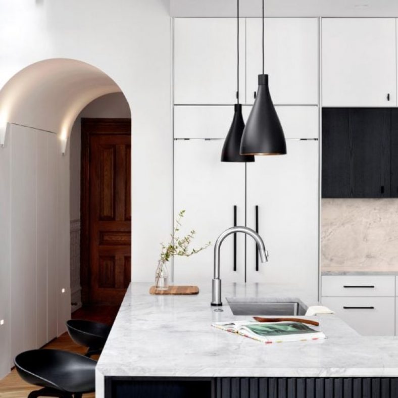
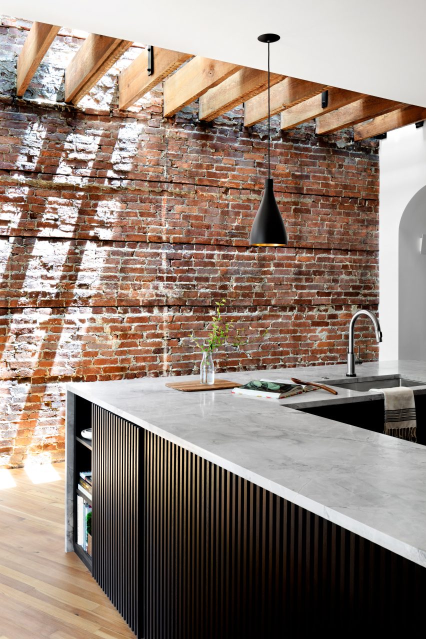
During the renovation, brick walls and floor joists were exposed to contrast a contemporary kitchen
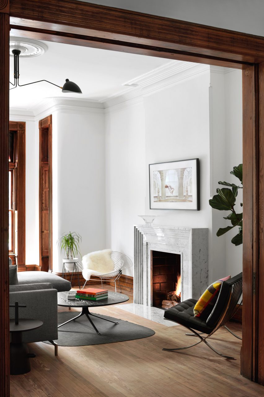
Due to its location, the lines of the building’s plan are subtly radial and therefore none of its walls are parallel to one another.
This proved a challenge for local architect Colleen Healey, who had no choice but to embrace this and incorporate the unusual parameters into the design.
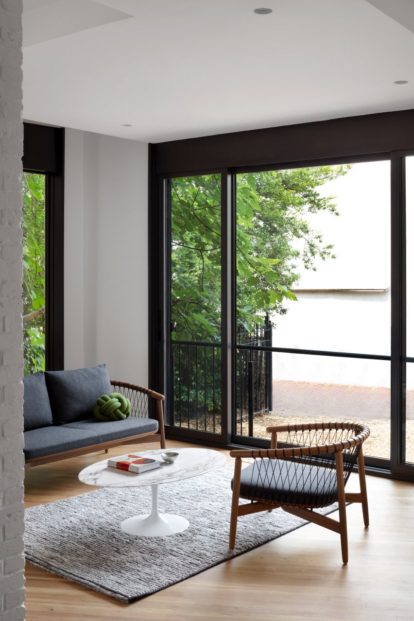
A garden room was created at the rear of the building, where sliding glass doors open onto a patio
“The effects of the radial lot not only informed design decisions, but provided inspiration for rounded references and other geometric subtleties,” said the studio.
Built in 1883, the home’s three-story front section once comprised an entry hall, living and dining room on the ground floor, an owner’s suite and two spare bedrooms on the first floor, and two further bedrooms on the second.
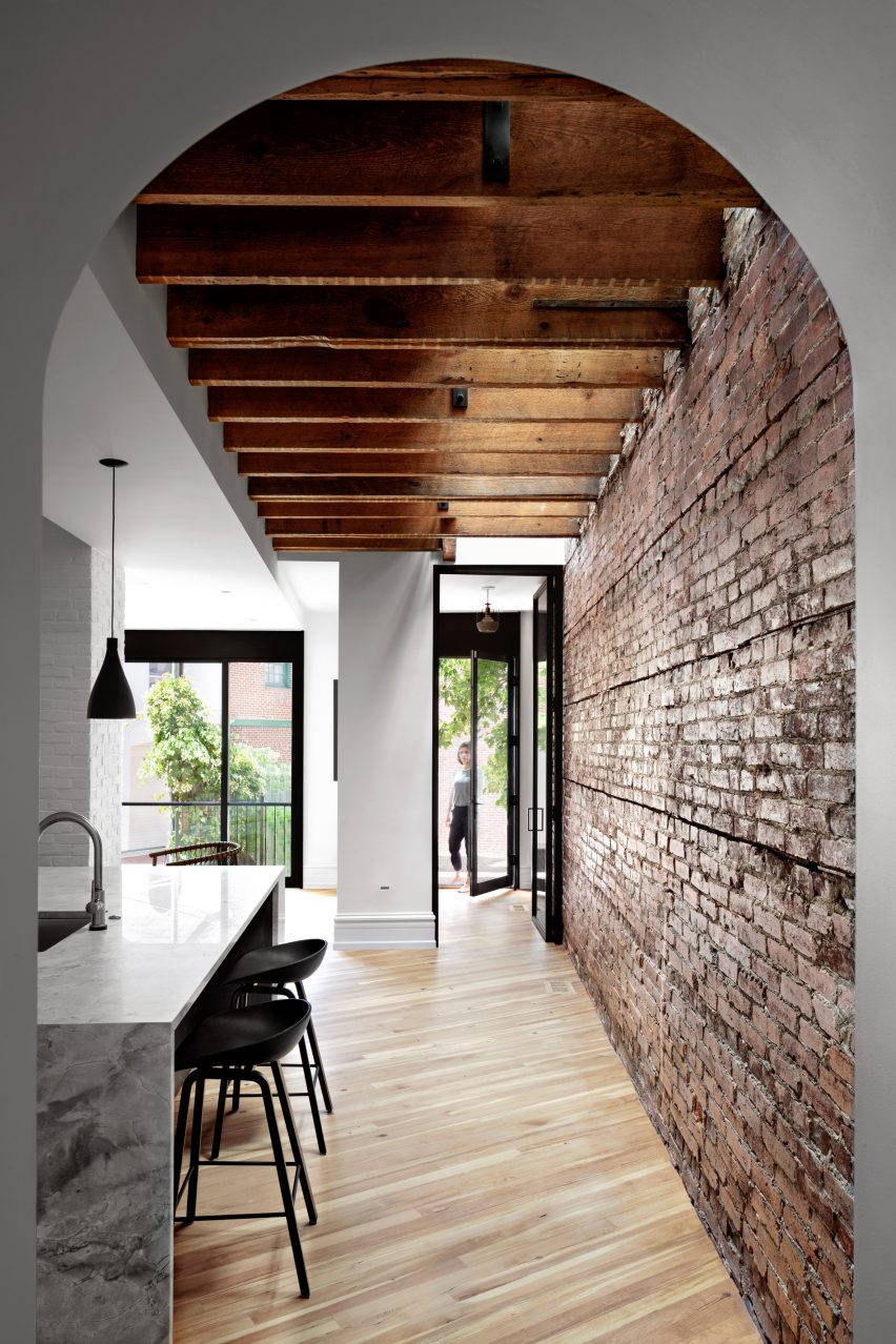
Since none of the walls are parallel, wooden flooring was laid diagonally
The rear section is set at half levels and features smaller rooms and lower ceiling heights.
“Much of the original elements and bones of the house were in great shape and our clients desired a mix of historic charm and modern upgrades,” said Healey.
Rooms at the front of the house, which have taller ceilings, retain many of their historic details
The back portion received the most attention during the renovation, remade as the “heart of the house” where a large kitchen features a U-shaped quartzite counter and a garden room faces the patio.
Skylights were created in the roof, allowing light to wash down original brick walls and through gaps between wooden floor joists exposed above the kitchen.
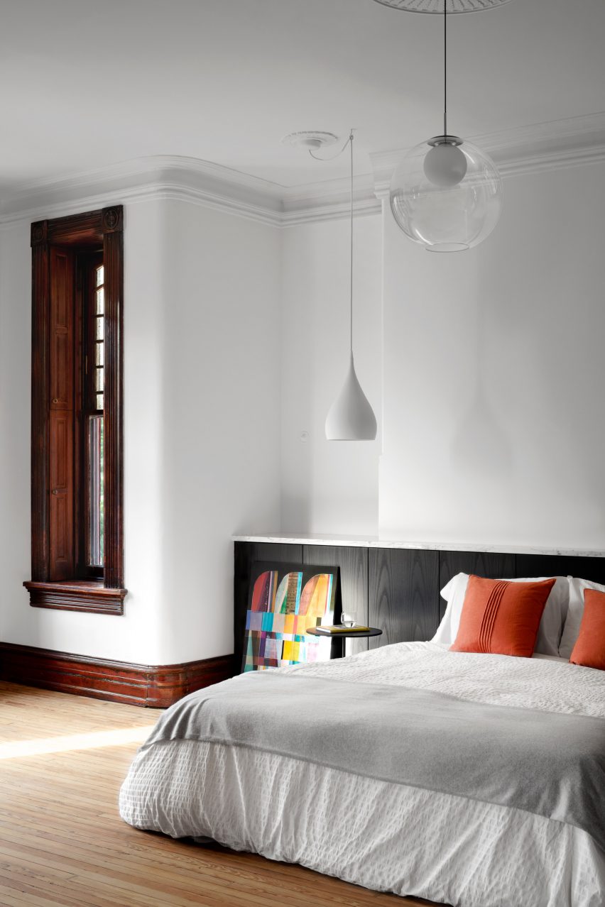
In the bedroom, a fireplace was sacrificed in favour of a headboard and art wall
Since the walls are positioned at angles, wood flooring was laid diagonally in this area.
An arched opening between the two sections of the house was extended to 10 feet, allowing a powder room and storage space to be added behind its plaster surfaces.
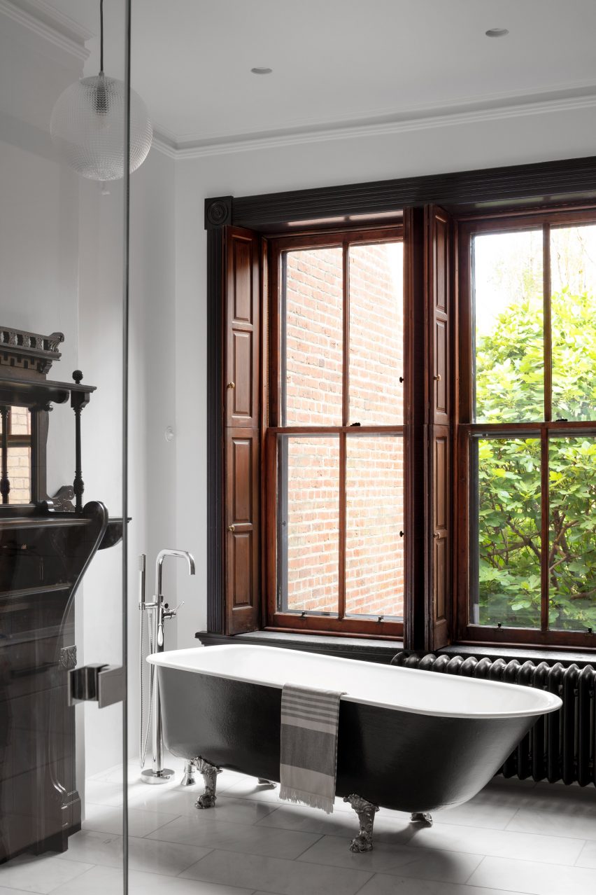
“A new finished lower level and existing bathrooms are upgraded with a mix of vintage and industrial charm, blending tastes of both clients and using elements original to the house whenever possible,” Healey said.
The upstairs bedrooms and bathrooms retained their dark wood window trims and shutters, baseboards and ornate fireplaces, but are refreshed with bright white walls and contemporary light fixtures.
The bathrooms also feature a mix of original details and new industrial-style fittings
However, in the primary suite, the fireplace was removed to make way for a widened headboard and art wall.
In the remaining rooms, items belonging to the clients are combined with mid-century furniture and minimal lighting to contrast the historic details.
The house was built in 1883 and faces onto Washington DC’s Logan Circle
“The result is a modern sensibility that unites the old and new spaces and creates a striking juxtaposition with the home’s architecture,” the team concluded.
The winners of the six studio categories were also announced, with all the winners receiving a Dezeen Awards trophy designed by Dutch studio Atelier NL.
Occupying a series of overlapping pavilions that step down towards Sydney Harbour, the gallery was designed to contrast the 19th-century neo-classical architecture of the existing art gallery.
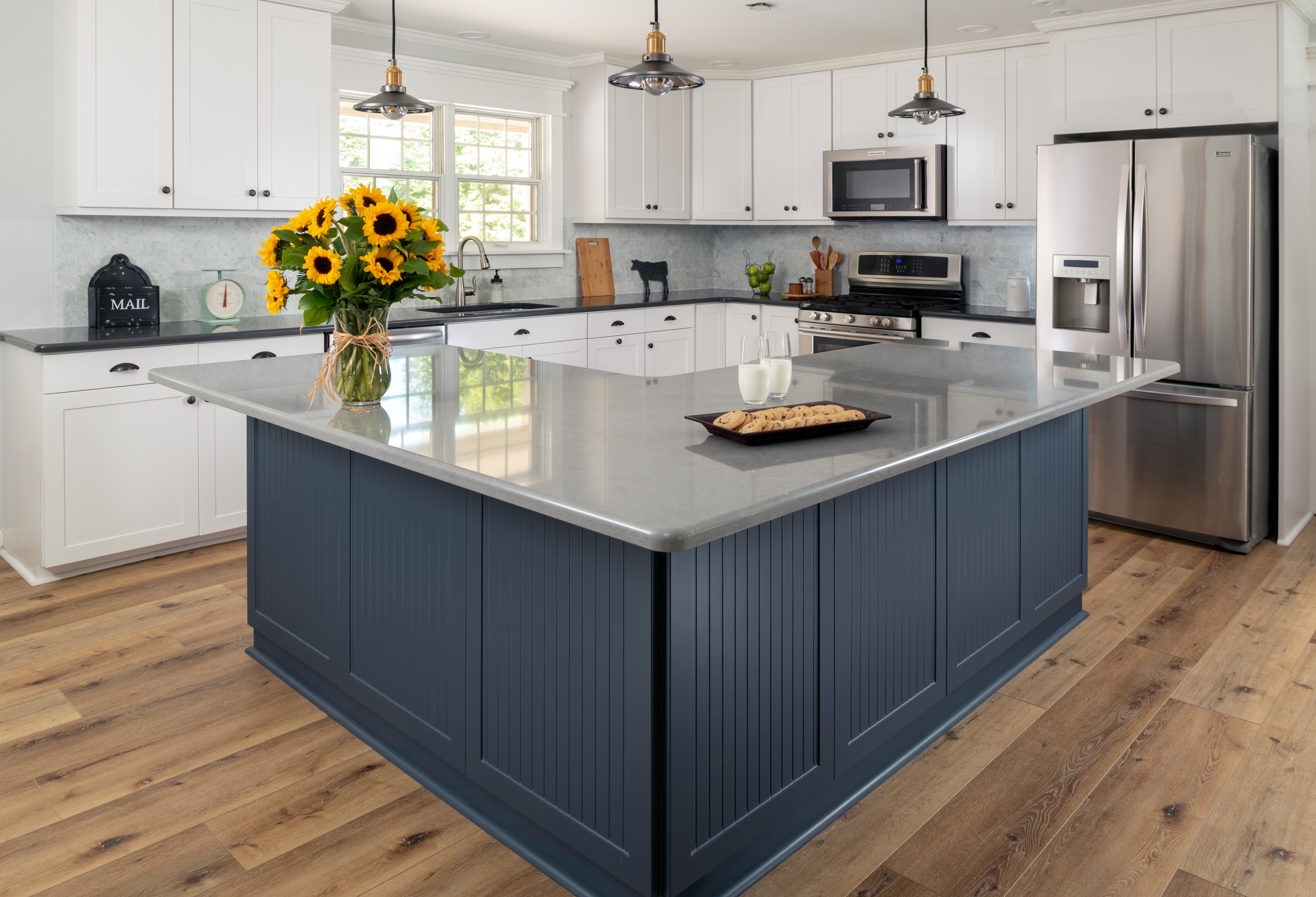
The kitchen is one of the most-used rooms in your home and a place where people tend to gather. It only makes sense to take both functionality and style into account when deciding between a kitchen island or a kitchen table.
Both options are welcome additions to the heart of the home.
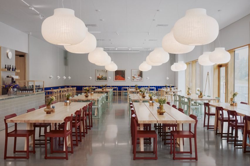
Avanto Architects and Joanna Laajisto have designed a logistics centre for retailer Finnish Design Shop that features warm timber, a foraged-food restaurant for staff and visitors, and views of the surrounding forest.
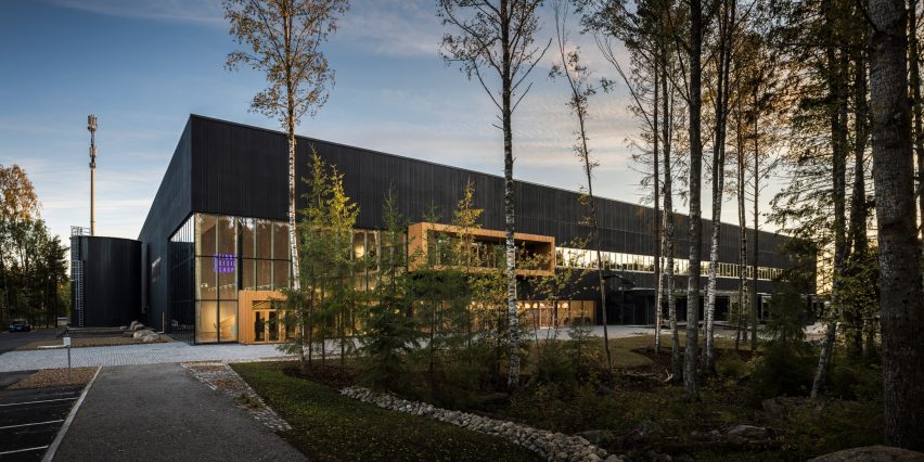
Located on the outskirts of Turku, west of Helsinki, the logistics centre is the hub for storage, management and dispatch of products from the Finnish Design Shop, which says it is the world’s largest online store for Nordic design.
The company needed a new logistics centre after a period of high growth, but founder and CEO Teemu Kiiski also aimed for it to be a meaningful place for employees and visitors.
The Finnish Design Shop logistics centre is located in the Pomponrahka nature reserve in Turku. Photo is by Kuvio
The Finnish Design Shop had first explored whether it could convert an existing building in the Turku area, but, finding nothing suitable, chose to build on a site in the Pomponrahka nature reserve, where the surrounding forest would provide a calming work environment and reflect the appreciation for wood in Nordic design.
To undertake construction there responsibly, the Finnish Design Shop says the builders saved as many trees as possible and landscaped the area with natural forest undergrowth and stones excavated from the site.
The entrance features glass curtain walls that connect the interior and exterior. Photo by Kuvio
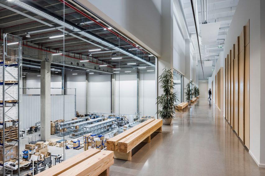
Avanto Architects designed the 12,000-square-metre building to blend into the forest as much as possible — a challenge given its massing, a product of the warehouse layout.
The layout was created beforehand by specialist consultants to maximise the efficiency of operations, which are carried out by robots in an automated system.
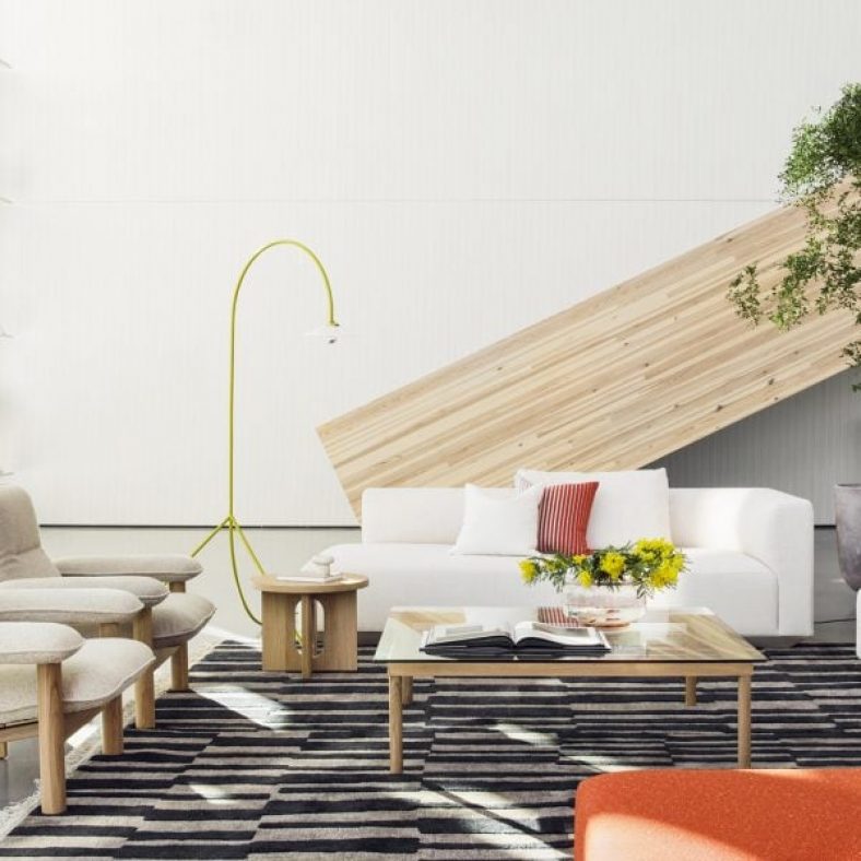
The centre includes a showroom. Photo by Mikko Ryhänen
The architects opted for a dark facade with a vertical relief pattern that becomes visible on approach and echoes the tree trunks in the surrounding woodlands.
“The pattern forms a more human scale to the large facade surfaces,” Avanto Architects co-founder Anu Puustinen told Dezeen. “We also used warm wooden accents in the main entrance vestibule, balcony and windows.”
There is also a restaurant that specialises in foraged food. Photo by Mikko Ryhänen
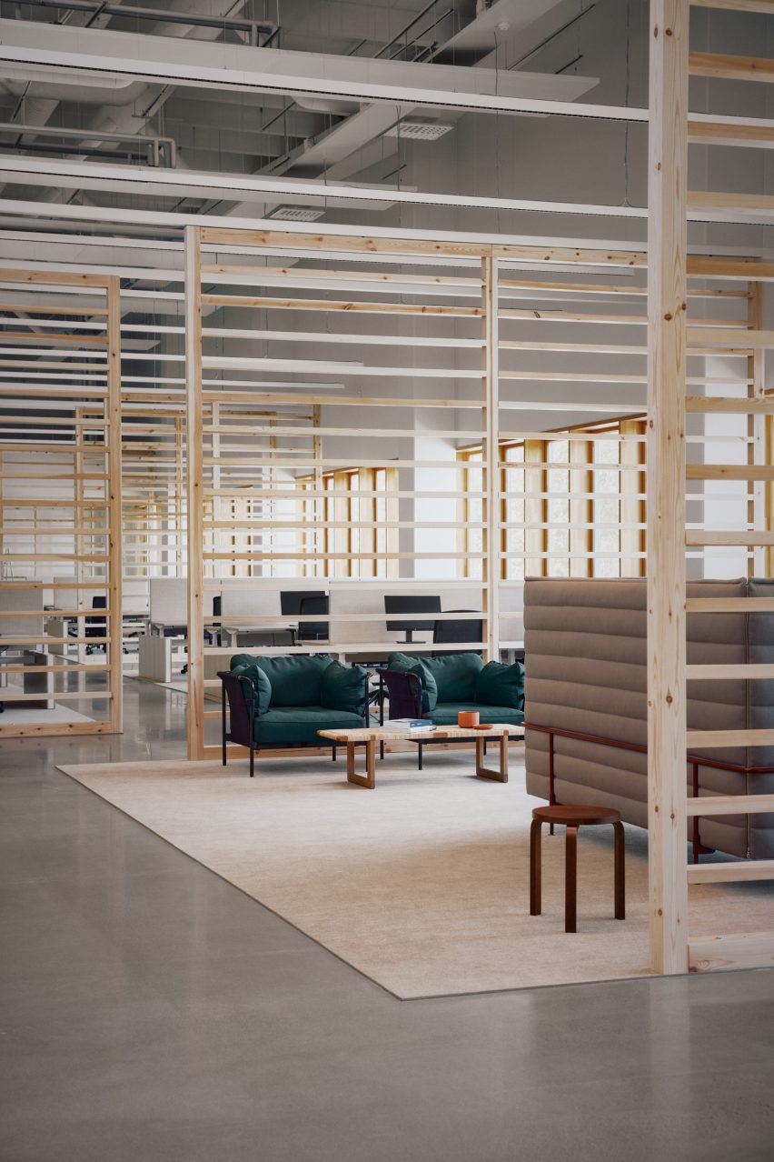
The architects gave the office spaces large windows so the employees could enjoy frequent views of the forest and lots of light, and included a balcony for access to the outdoors on the first floor.
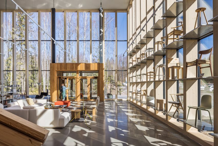
The entrance to the centre is through the showroom, which features glass curtain walls that showcase the use of the building and a long, straight staircase made from two massive glulam beams.
The first-floor offices have a view of the warehouse floor. Photo by Kuvio
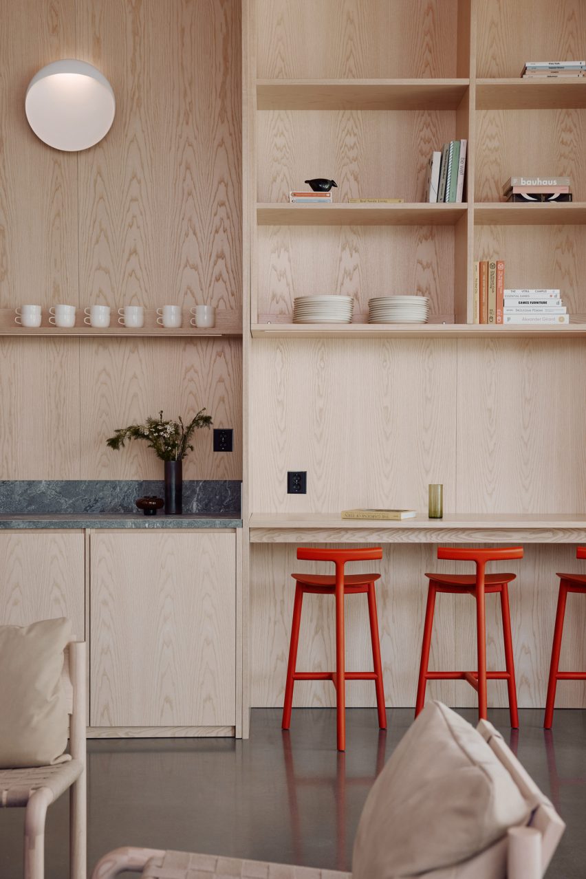
The interior was designed by Laajisto and her studio, who aimed to make the space feel well-proportioned and comfortable despite its size and to create a good acoustic environment by liberally applying sound-absorbing materials.
She kept the colour and material palette neutral and natural, with lots of solid pine and ash wood to continue the forest connection, but used furniture from the Finnish Design Shop in bright colours to punctuate the space.
“The aim was that every aspect in the interior should be done well and beautifully,” Laajisto told Dezeen. “Attention to detail was embraced in things that typically are overlooked, such as doors, plumbing fixtures and electrical hardware selections and applications, acoustic ceiling panels and ceramic tiles.”
The project is the first logistics building in Finland to be certified BREEAM Excellent, the second highest level.
Special attention has been paid to creating a good acoustic environment with sound-dampening materials. Photo by Mikko Ryhänen
Kiiski, who positions the company as the opposite of multinational e-commerce players such as Amazon, aimed for the new centre to be the most socially and environmentally sustainable online store.
“The values that life in the Nordic countries is based on include transparency, equality and respect for nature,” said Kiiski. “It would have been impossible to create this company and our new logistics centre without unwavering respect for these values.”
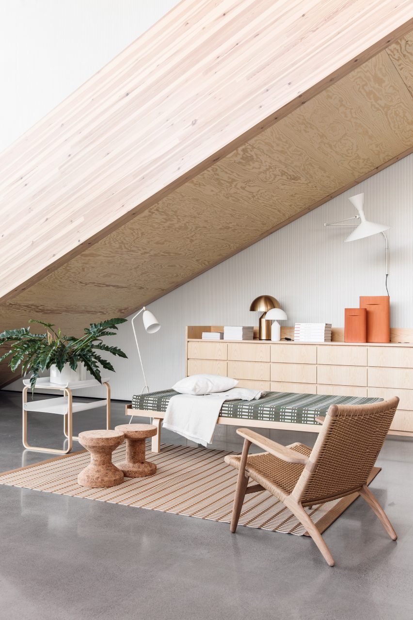
Wood is featured throughout the interior
He believes that global online shopping can be socially and environmentally sustainable when issues in supply chains, logistics and operations are addressed.
“Many studies show that online shopping can have a lower carbon footprint as compared to in-store shopping,” said Kiiski. “This is due to the more efficient logistics in e-commerce and the fact that in-store shopping usually involves private transport.”
“We want to push the whole industry towards a more sustainable future,” he continued.
The hub is meant to offer employees a healthy and humane working environment. Photo by Mikko Ryhänen
Past work by Avanto Architects includes the Löyly waterfront sauna in Helsinki, which has a multifaceted exterior that visitors can climb, and the Villa Lumi, a house with a sculptural white staircase.
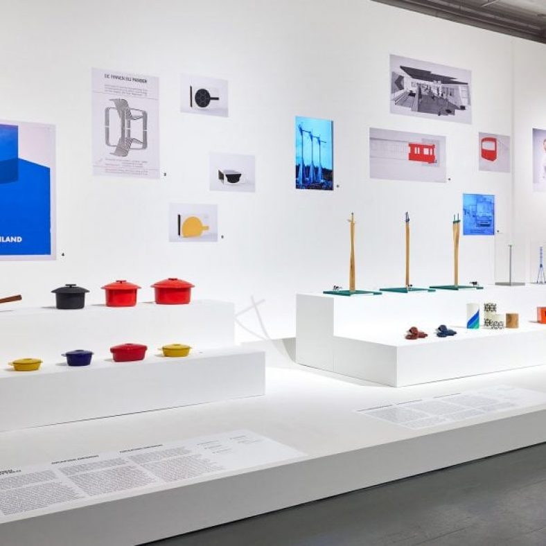
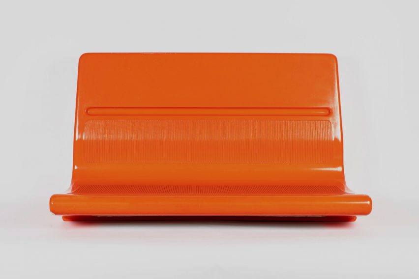
A vivid orange Helsinki subway seat and an iconic timber sauna stool are among the pieces in this exhibition of work by design duo and couple Antti and Vuokko Nurmesniemi.
Various works by the late interior architect Antti Nurmesniemi and textile designer Vuokko Nurmesniemi are presented in this eponymous exhibition at Helsinki Design Museum, which charts the pair’s work from the 1950s to the 2000s.
An orange Helsinki subway seat is included in the exhibition. Photo is by Mari Kallionpää
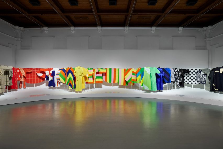
From kitchen crockery to colourful textiles, the Nurmesniemis created a broad range of designs together and individually over their solo and shared careers before Antti’s death in 2003.
“The exhibition is important because there has never been a joint retrospective exhibition about this central designer couple in Finnish design history,” curator Susanna Aaltonen told Dezeen.
Colourful garments by Vuokko also feature
Arranged across a gallery at Helsinki Design Museum, the show includes a striking orange subway seat that Antti created in 1982 in collaboration with industrial designer Börje Rajalin – a model that is still in use on Helsinki transportation today.
Visitors can also find an extensive cluster of garments featuring bright hues and geometric patterns, designed by Vuokko for her fashion label Vuokko Oy, which she founded in 1964.
Antti’s red Pehtoori coffee pot is well-known in Finland. Photo is by Mari Kallionpää
A red Pehtoori coffee pot from 1957 by Antti is also on display – described by Aaltonen as a product that is “often highlighted as Finland’s early industrial design item” – as well as elegant models of electricity pylons created with interior architect Jorma Valkama in 1997.
Also central to the exhibition are photographs of and furniture from Studio Home Nurmesniemi, the couple’s live-work home and atelier in Kulosaari, Helsinki, which was completed in 1975.
Lounge chairs by the couple are defined by black, white and red pinstripes
These pieces include signature wooden sauna stools and 1980s geometric lounge chairs designed by Antti and upholstered in Vuokko Oy pinstripe fabrics.
This furniture is displayed alongside archival imagery of the designers in their modernist house – a setting still used for Vyokko Oy photoshoots.
“All in all, the couple’s shared home and studio house is the finest example of the [their] lifestyle dedicated to design,” reflected Aaltonen.
“I hope that the exhibition will increase people’s understanding of Finnish cultural heritage and that people will also learn to cherish and preserve objects better, especially interiors.”
Artefacts on display vary from furniture to pylon scale models
Antti + Vuokko Nurmesniemi is on display at Helsinki Design Museum from 28 October 2022 to 9 March 2023.See Dezeen Events Guide for an up-to-date list of architecture and design events taking place around the world.
The photography is by Paavo Lehtonen unless otherwise stated.
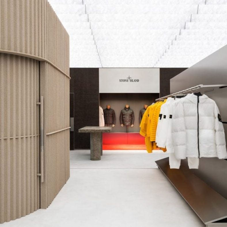
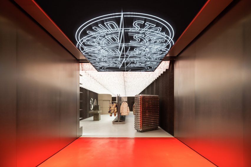
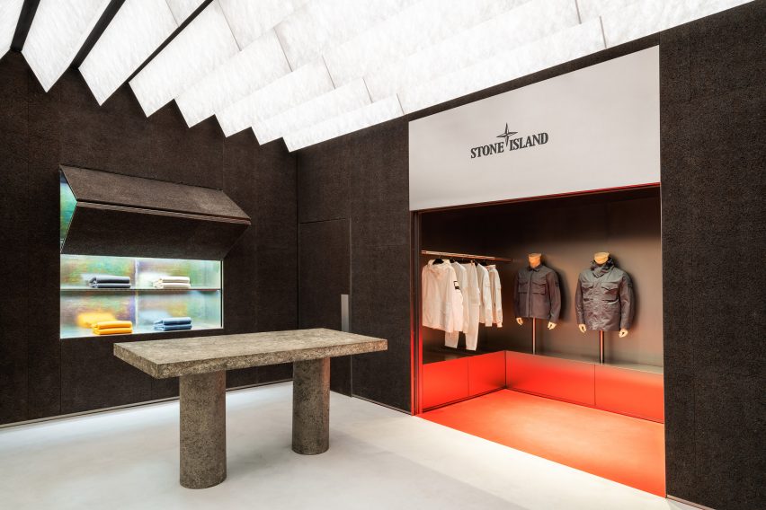
Fashion brand Stone Island has debuted a retail concept by Dutch studio AMO, which includes surfaces made from compressed shredded paper, burnt cork and sand-coated steel.
The research studio, affiliated with architecture firm OMA, created the store concept to celebrate Stone Island‘s 40th anniversary.
Stone Island’s Chicago store features a digital chandelier at its entrance
As well as an update to the look and feel of the interiors, AMO has designed the spaces to host a program of public presentations, salons, workshops and private events beyond store opening hours.
For the store’s architecture, the studio referenced the “innovative” approach taken by the Italian brand to transforming materials for its products, particularly outwear.
The interior was designed by AMO to reflect the brand’s experimental approach to materials
“Research and innovation are at the core of Stone Island,” said AMO director Samir Bantal, who worked with Natalie Konopelski, Giulio Margheri and Mateusz Kiercz on the project.
“The space, materiality, and program of the stores underpin the brand’s ethos, and reinforce a sense of belonging of its community of like-minded people,” he continued.
Walls are lined in cork that has been burnt, sandblasted and coated
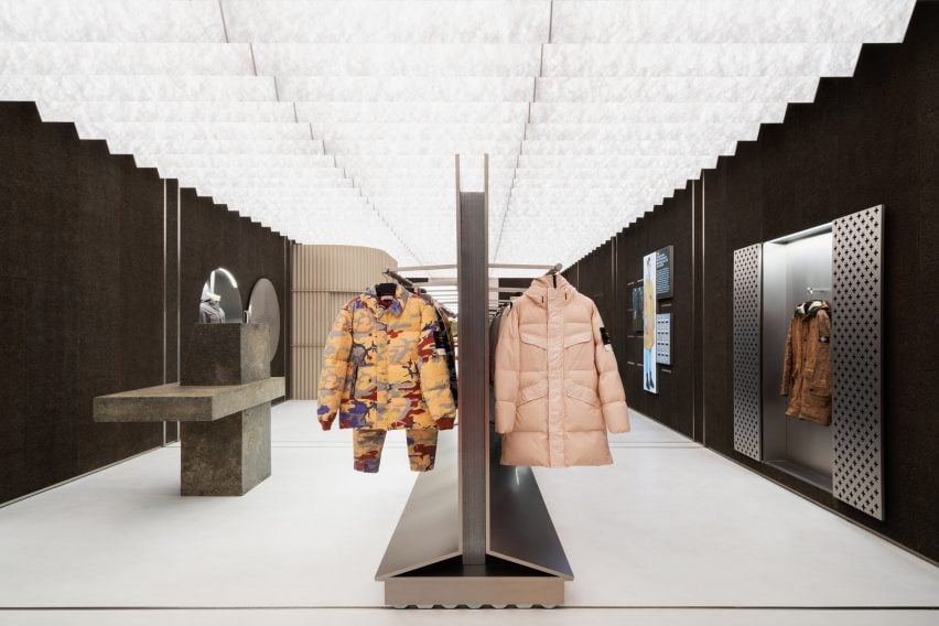
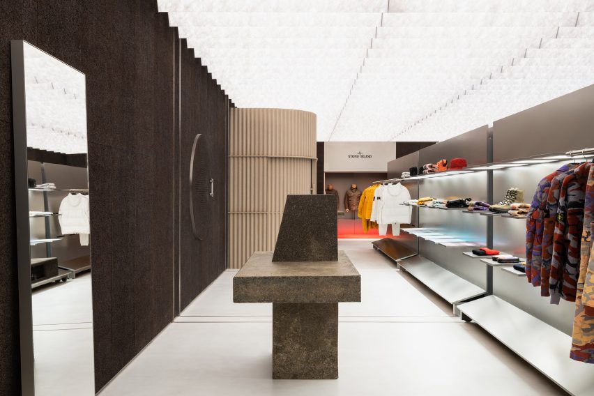
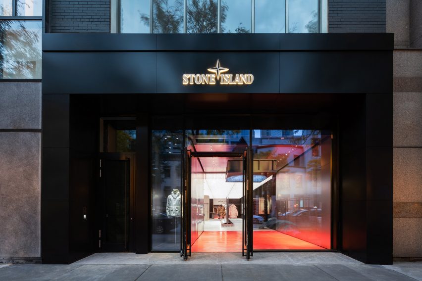
The inaugural store to be designed based on this direction is the 180-square-metre space in Chicago, Stone Island’s first in the city.
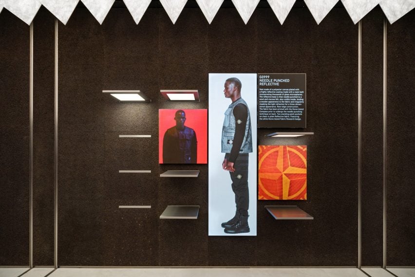
The space features altar-like niches for displaying archival pieces and prototypes to highlight Stone Island’s focus on technology and development.
A niche at the back of the store displays archival products and prototypes
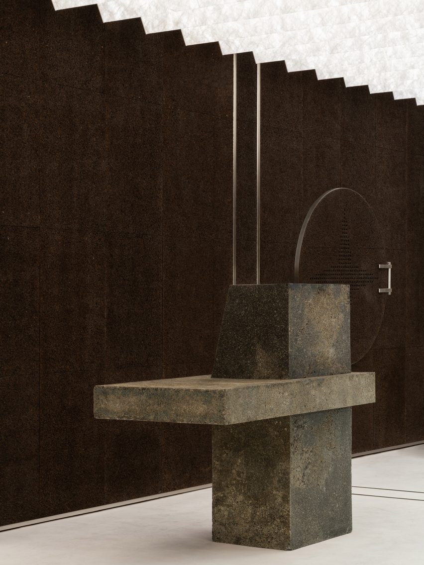
Surfaces throughout the store are intended to look like stone, though none are actually made from it. Instead, off-the-shelf materials have been treated in a variety of ways to replicate the same visual qualities.
Shredded paper and resin were compressed under high pressure to produce durable panels that mimic concrete, and used to create sculptural displays for products.
Sculptural display stands are formed from shredded paper and resin that’s compressed to look like concrete
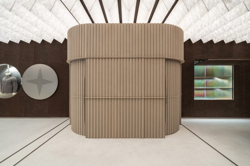
Cork – which is a staple in existing Stone Island stores – was burnt, sandblasted and coated to create a dark texture. Applied to the walls, the material helps to both absorb sound and control humidity, while the ceiling is covered with a sawtooth arrangement of translucent light boxes.
Corrugated steel panels were sand-coated to create a softer finish and used to form a curved partition around the fitting rooms.
The fitting rooms are surrounded by sand-coated corrugated steel
At the store’s entrance, which has a bright orange floor, a digital chandelier is suspended from the ceiling and broadcasts messages to shoppers.
Following the opening of the Chicago store in October 2022, plans are in place to roll out the concept at locations including Seoul, Munich and Stockholm.
“Stone Island and AMO share values of innovation, functionality, and passion,” said Stone Island creative director and president Carlo Rivetti.
“I am very happy to begin this important partnership, a new visual approach for our stores, to speak to our communities.”
Stone Island’s research is explained through displays
AMO was founded as the research arm of OMA, and has developed long-standing relationships with several fashion brands.
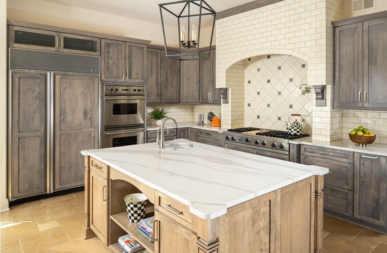
It’s easy to fall in love with the simplicity and practicality of a rustic New England kitchen. This seasoned style spans various nuances, including Shaker, colonial or farmhouse style in a palette using classic neutrals or nautical whites and blue, often paired with accents of earthy, natural materials and textures. So, if you’re thinking about a kitchen remodel that will give your cooking area timeless beauty and form, look no further.
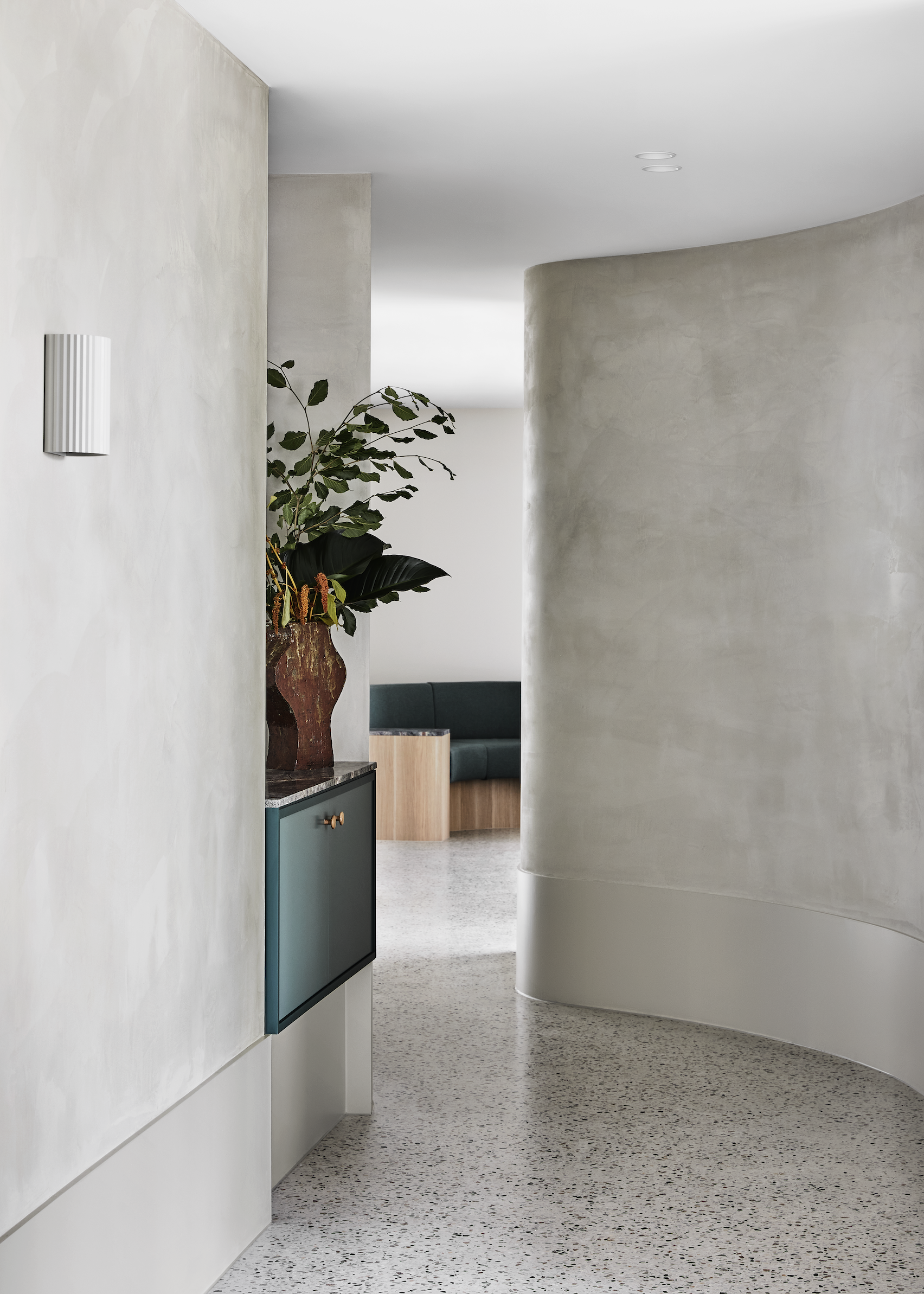
Melbourne-based Studio Tate has used raw and tactile materials to create “a soothing urban oasis” for the Relinque spa in Melbourne.
Located in north east Melbourne, the 800 square-metre space includes a day-spa, spinal clinic, pilates and yoga studios.
The interiors are informed by local parks and waterways
Local practice Studio Tate was informed by nearby parklands and waterways to create “a soothing urban oasis”.
“It was important to create a textural earthiness that evokes the senses, while striking a balance between sophistication and approachability,” explained Studio Tate senior associate Emily Addison.
A deep rust tone in the treatment rooms was selected to be gender neutral
The treatments rooms were located on either side of a central reception area, with the spa and yoga studio located on one side and the spinal clinic and pilates studio on the other.
Studio Tate used green marble, honed granite and hand-glazed Japanese tiles in the reception area, where visitors are encouraged to relax and browse the retail products before stepping into treatments.
Curved corridors encourage visitors to explore the space
The yoga studio was intentionally positioned close to the entrance facing the street, which allows plenty of natural light. A timber floor and ceiling were desigend to create a sense of warmth in the room.
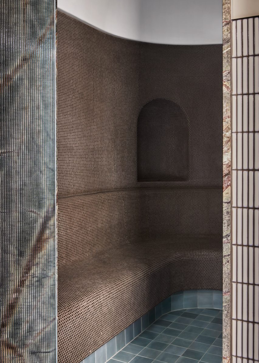
Moving further into the spa area, the tones get darker to provide privacy. Spaces were arranged in a circular configuration, which “encourages a continuous experience of the venue”.
The design aimed to have “textural earthines”
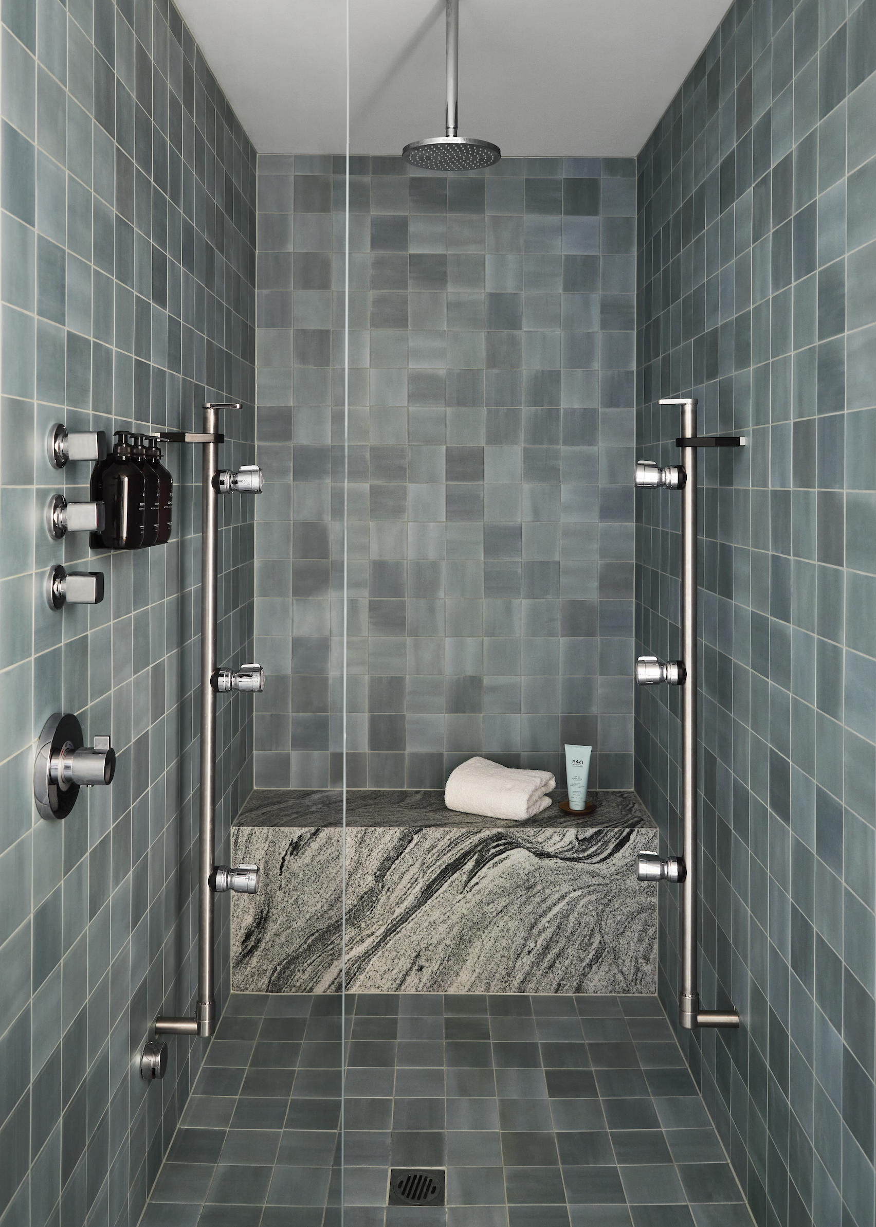
A curved corridor finished in polished plaster leads visitors to the spa area. Five individually-contained treatment rooms feature a deep rust tone, steam showers with sage green tiles and a granite shower bench.
Above the treatment bench, a backlit ceiling creates a halo around a circular acoustic fabric panel. The gently diffused light helps calm the mind throughout treatments.
The rounded steam room is lined with mosaic tiles, facing directly onto an ice room centred around an ice well covered in Japanese ceramic tiles.
“Luxurious accents are balanced with raw and tactile materials, ensuring the space feels welcoming to all,”added Addison.
Steam showers are lined with sage green tiles and a granite shower bench
A palette of greens, greys, burgundy and earth tones were used throughout the space in response to the nature-themed design narrative, according to Addison.
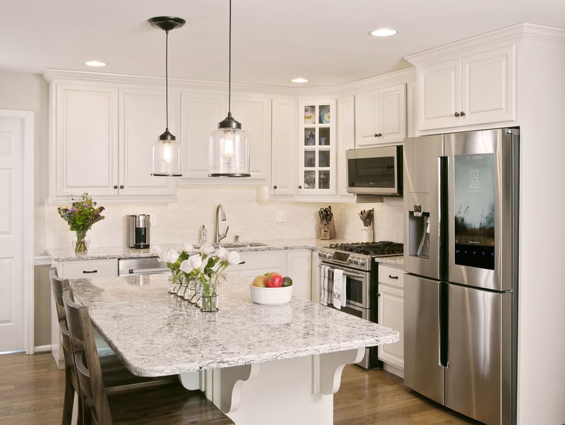
As you scroll through the kitchen images on Houzz and other décor websites, you can get lost. The countless countertop colors and styles become intoxicating. Sprinkle in countertop finishes, and you really have a conundrum. We can help narrow down the latter to 2 finishes that offer instant beauty and style. The Cambria Matte™ and Cambria High Gloss finishes will create a unique look that will define the space as traditional, earthy, glamorous or all-of-the-above.
There are 5 uber-popular Cambria Matte designs that mimic natural stone for a ‘marble’ effect, imparting an old-world charm that echoes centuries past and will last just as long. Mesmerized by the glitz and glam of a high gloss finish but not certain whether it’s right for your Lehigh County residence? No worries. In case you’re thinking about countertop installation, with these 10 Cambria quartz designs you’ll easily find what truly speaks to you.
A renovated dwelling in rural China and a converted stable in Ibiza feature in our latest lookbook, which collects 10 cottage interiors that promise rest and relaxation.
Cottages are small dwellings that are traditionally characterised by a sense of comfort and cosiness. However, interior designers are increasingly pushing the boundaries of how to dress the insides of these homes, as seen in these innovative examples.
As the weather cools down in the northern hemisphere, here are 10 calming interior spaces in cottages by architects and interior designers from across the globe.
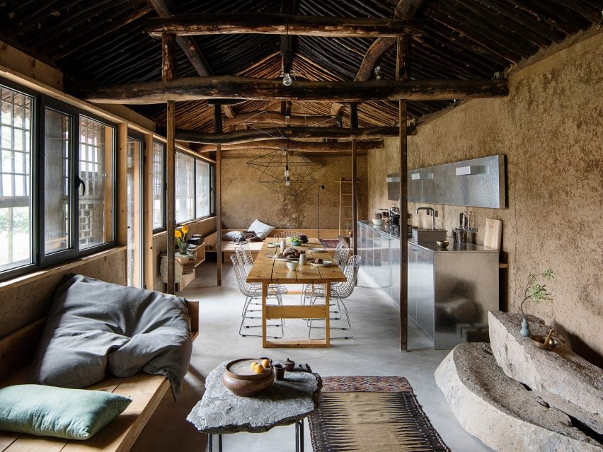
Located in Hai Zhen, a village just outside of Beijing, this previously neglected cottage was renovated by fashion designer Sun Min and architect Christian Taeubert.
A large, open-plan lounge area displays a mixture of rustic features such as the original roof and timber beams, which are presented alongside more contemporary elements including stainless steel and spindly, wireframe lighting.
Barwon Heads House is a renovated cottage by Melbourne-based studio Adam Kane Architects with a barn-style extension defined by an open-plan living area.
Shortlisted for the 2022 house interior of the year Dezeen Award, the cottage interior features a monochrome interior palette and statement geometric furniture, such as a pair of Kangaroo Lounge Chairs by designer Pierre Jeanneret.
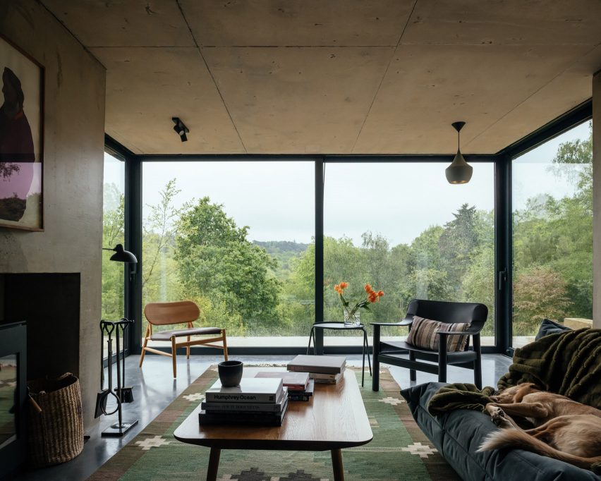
Architecture practice Invisible Studio added a double-pitched extension to this cottage that is located on the borders of Hampshire and Surrey in England.
Exposed concrete accents contrast with rectilinear sliding glass doors in the living space, which cantilevers over the sliding patio doors below with the support of a concrete chimney.
“All the materials are fair-faced so had to be perfectly made,” explained studio founder Piers Taylor. “Nothing is covered up and everything exposed.”
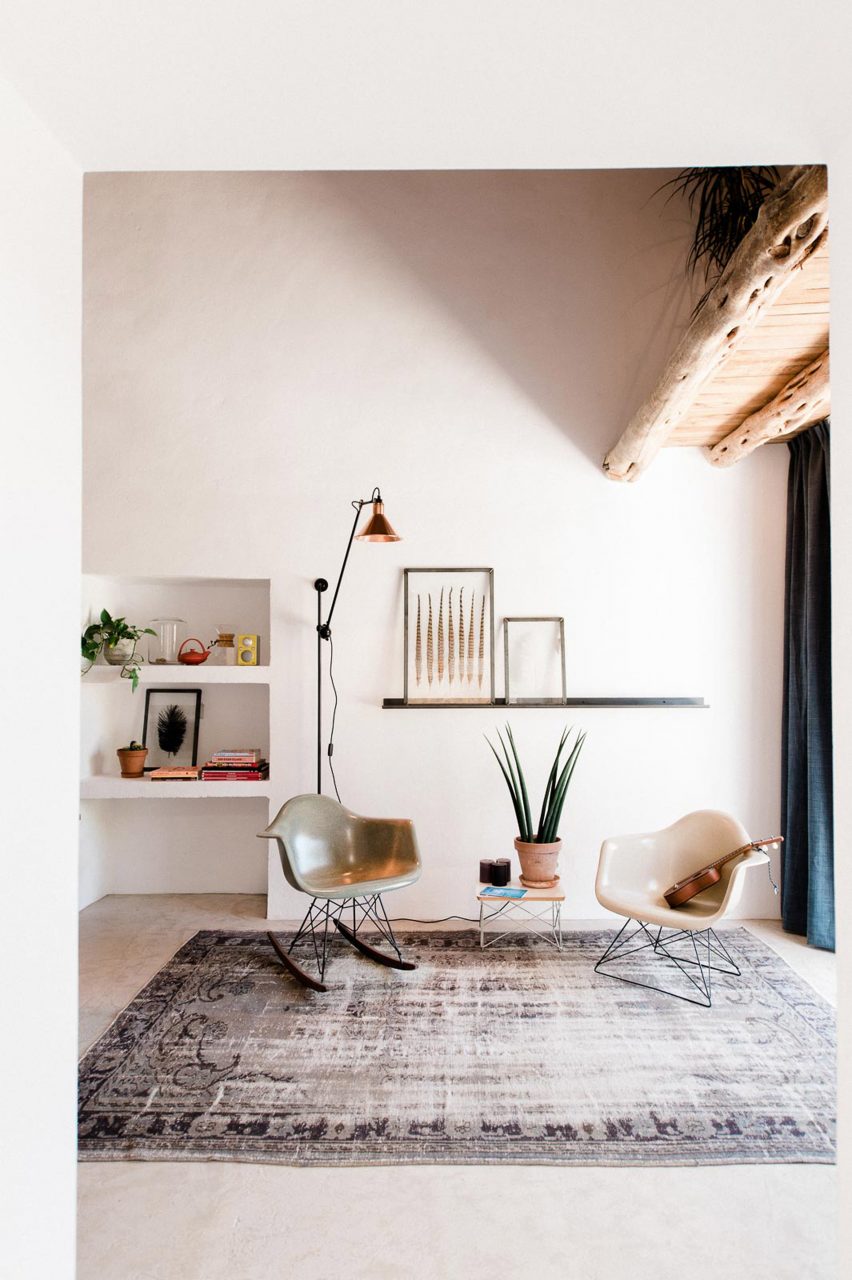
Casa Campo is a cottage in Ibiza that Standard Studio converted from a 200-year-old stable to an off-grid showroom and home for the owners of an interior design shop.
Original beams crafted from Ibiza’s native Sabina pine trees are paired with contemporary low-slung furniture in the double-height living space that is illuminated by bright white walls.
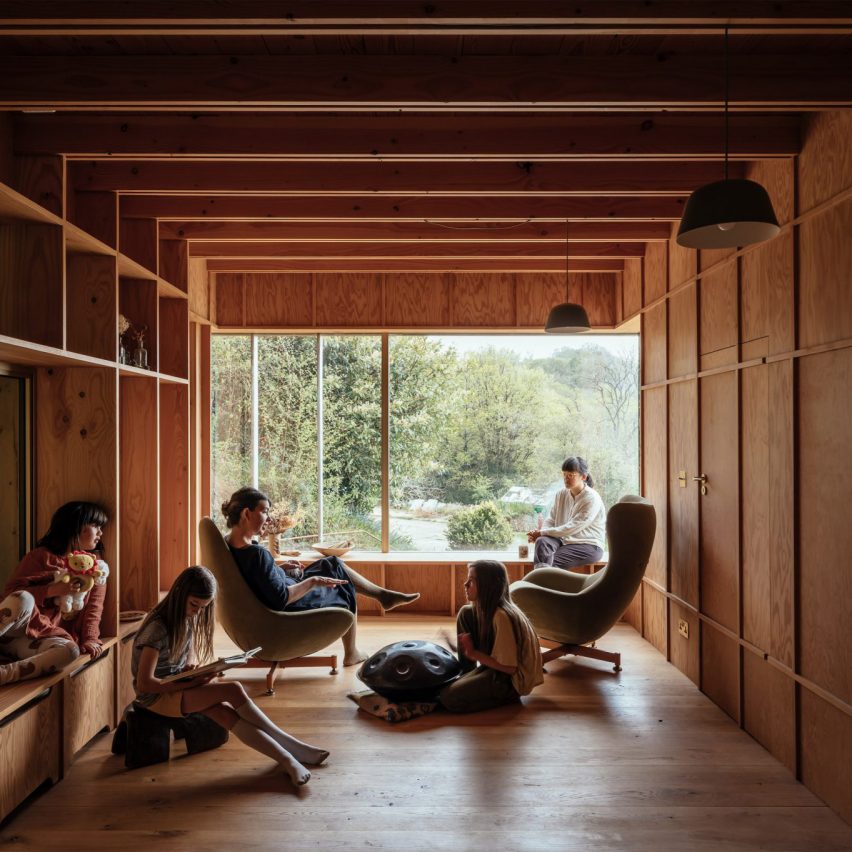
Architecture office Studio Weave designed a wooden extension to a stone cottage in Devon’s Blackdown Hills in the English countryside, which was created as a creative workspace for its owners and visiting artists.
Called Made of Sand, the extension’s interior is defined by built-in timber window seats and wall storage that is framed by large glass windows.
“The contrast between materials, old and new, in and out, are foregrounded to create a distinct sense of rest and relaxation in the new spaces,” said studio director Je Ahn.
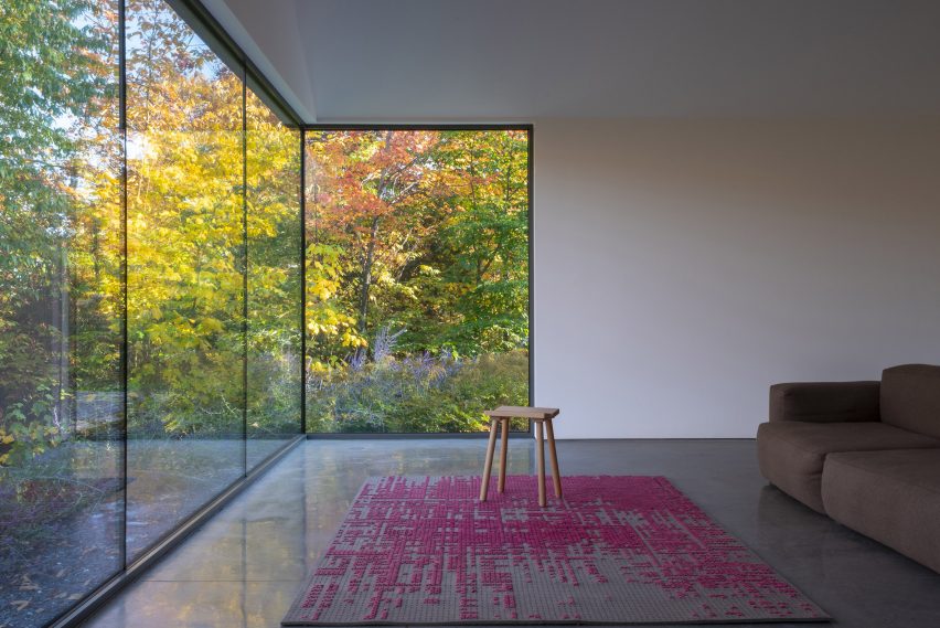
Two volumes connected by a walkway make up La Brèche, a ski cottage in Quebec by Montreal studio Naturehumaine that features facades informed by the area’s vernacular architecture.
Floor-to-ceiling corner windows illuminate the living space, which is characterised by a polished concrete floor and minimal accents of colour and texture.
Named after its location in Canada’s Muskoka region, this cottage interior features exposed finishes informed by the surrounding natural forests and the area’s geological details.
These include sandy-hued, Douglas fir exposed ceilings and large slabs of granite that make up various statement islands throughout the home, as well as a large fireplace in the living space.
“The granite is coarse-grained and hard,” noted Studio Paolo Ferrari. “It references the minerality of the site and imbues the interiors with a sense of ruggedness.”
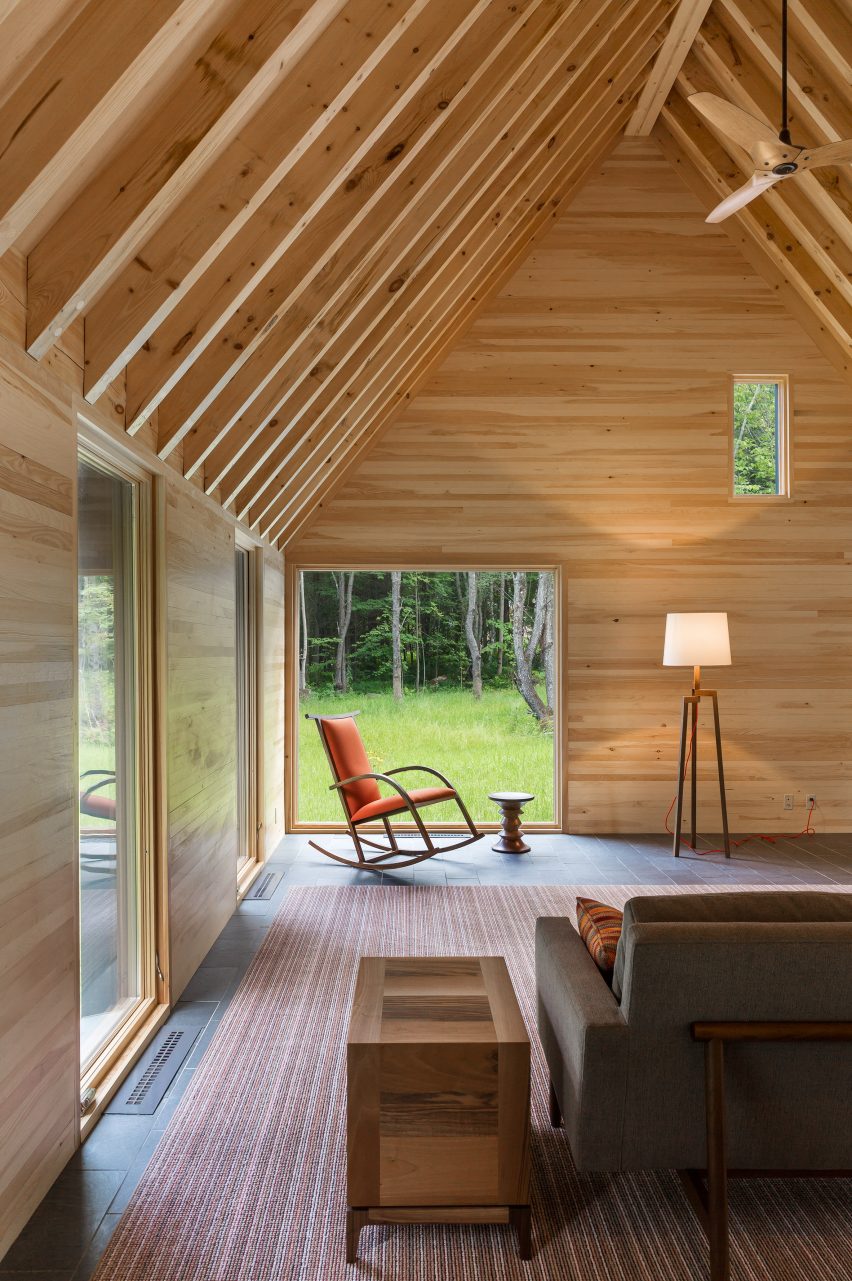
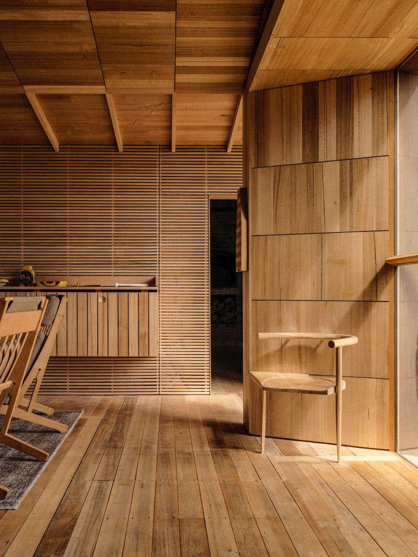
The Marlboro Music Cottages are a series of cabin-style dwellings by HGA Architects and Engineers (HGA) for musicians staying in New England over the summer during the Marlboro Music School and Festival, an annual event.
HGA took cues from the single-storey boxy dwellings with gabled roofs that populate Cape Cod for the cottages’ architecture. Cedar plank cladding and pitched roofs were used to embrace the homes’ natural setting.
Inside, the cottage interior features exposed timber ceilings, pine-sheathed walls and slate flooring, adding to this pared-back approach.
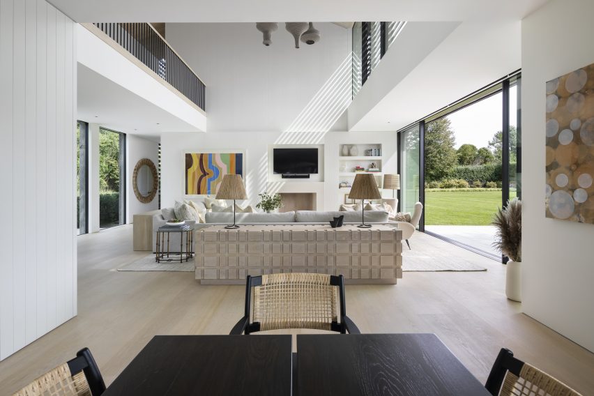
A double-height living space offers views of the surrounding Hamptons at this cottage by architecture studio Birdseye Design, which is wrapped in thin wooden slats that nod to local traditional buildings.
Eclectic geometric furniture makes up dining and living areas that anchor the west side of the property and open out onto an outdoor dining space.
“Operable glass walls open to a large stone terrace off the living room and the kitchen opens to a wood-slatted, pergola-covered porch,” said Birdseye.
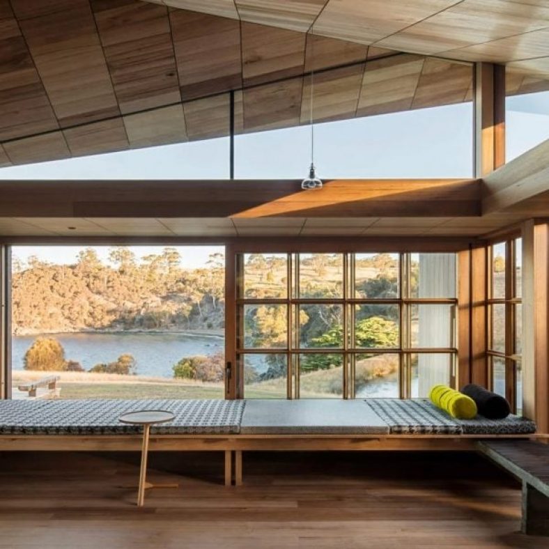
Australian studio John Wardle Architects has repaired this weatherboard cottage in Tasmania, which originally belonged to its architect, harbourmaster Captain Kelly, in the 1840s.
Furniture created from materials left over at the end of the project’s renovation feature in its updated design, while a focus on wooden interiors maintains a sense of the dwelling’s history.
“Over 175 years there had been many unsympathetic alterations to the small cottage,” said the studio. “Part of our work involved the removal of these non-original works, to respectfully return the cottage to its original form.”