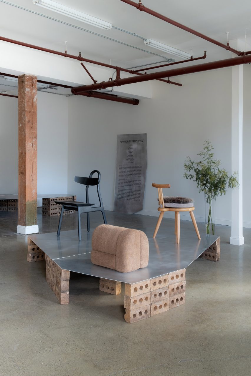
Stools from local designer Caleb Ferris and design firm Prowl Studio were among the works displayed at a San Francisco exhibition centred around contemporary Bay Area design.
The Works in Progress show displayed stools, chairs and other furniture from local designers to highlight the diversity in methods and backgrounds of an evolving Bay Area design scene.
The recent Works in Progress exhibition held in San Francisco highlighted Bay Area designers
“As the Bay Area creative scene evolves in real-time, there are boundless possibilities for how it might bloom,” said curators and designers Kate Greenberg, Kelley Perumbeti, and Sahra Jajarmikhayat in a statement.
“For now, we are here to acknowledge its depth and say: it’s a work in progress.”
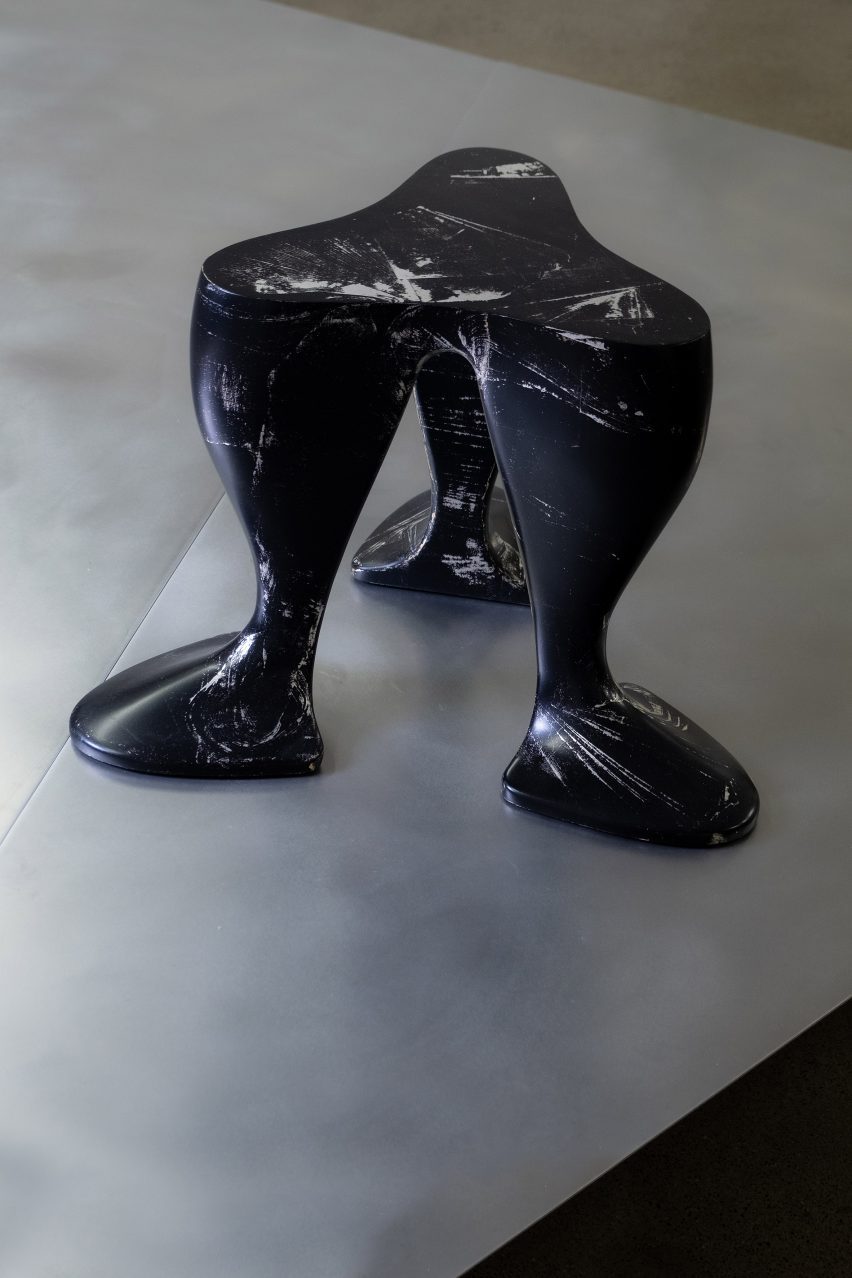
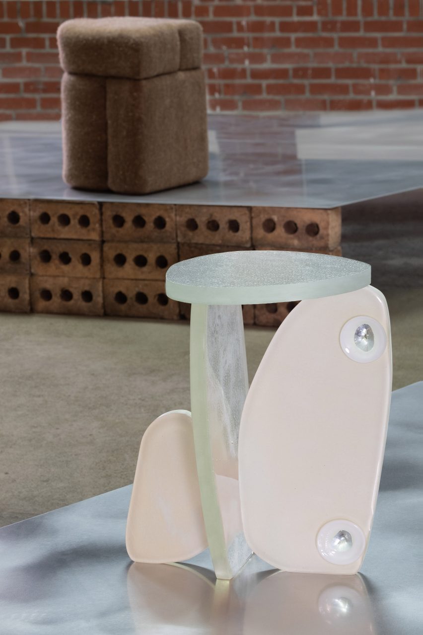
Caleb Ferris showed a duck-footed poplar stool
The team distributed the exhibition’s pieces across metallic platforms supported by foundations of bricks.
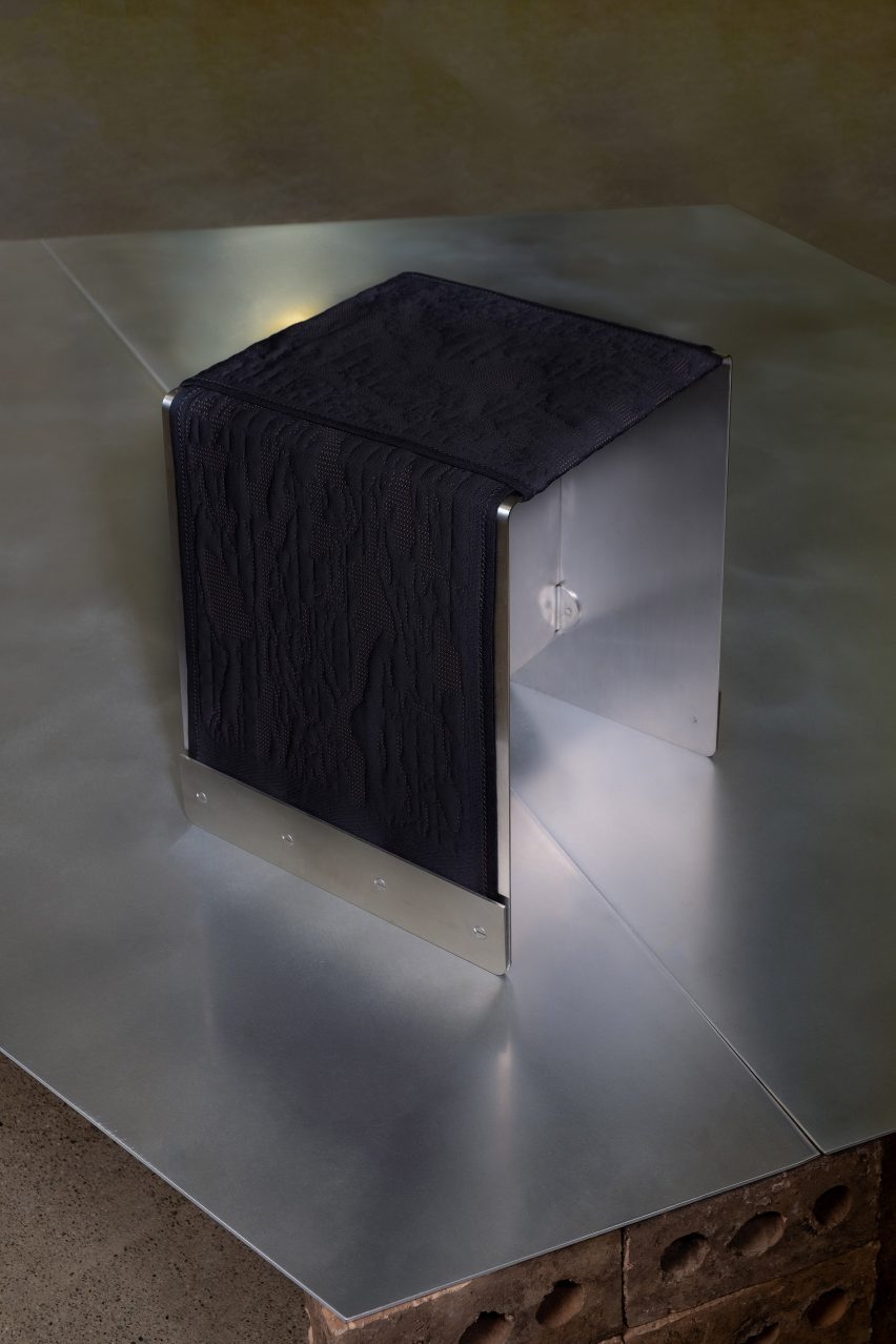
Pieces ranged from a curvacious, duck-footed poplar wood stool marked with paint and silver leaf by Caleb Ferris, to Prowl Studio’s cubic stainless steel stool wrapped in a 3D knit cover.
Prowl Studio wrapped a stainless steel stool in a 3D knit cover
“Across a range of materials, forms, and functions, the participants have found a groove in the original, the introspective, and the off-center,” said the team.
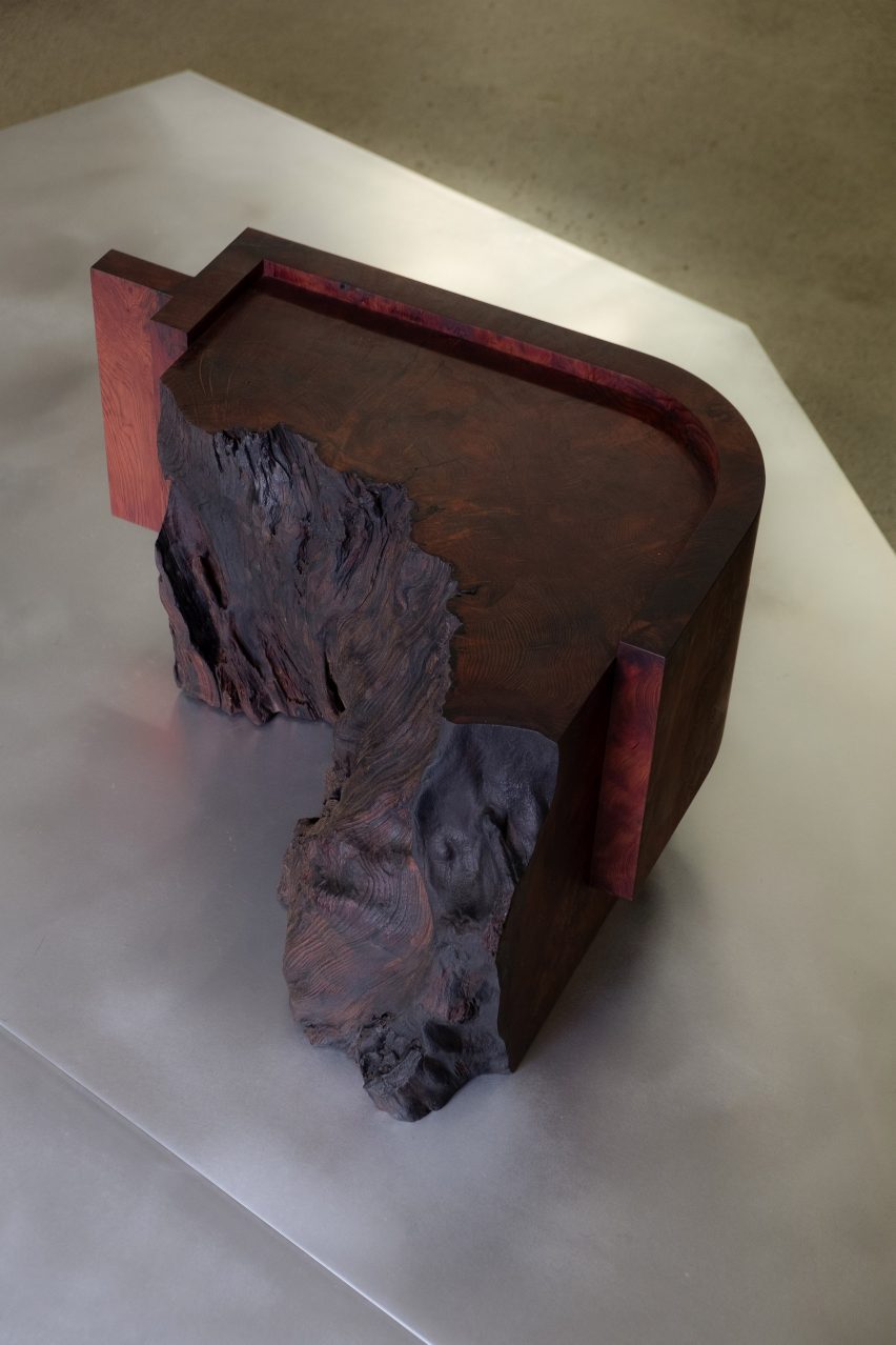
Designer Ido Yoshimoto displayed a sculptural side table made of old-growth redwood and finished in a dark red textured hue. The table consists of a geometric, curved corner that runs into a darkened raw edge.
Designer Ido Yoshimoto showed a sculptural old-growth redwood side table with a raw edge
Studio Ahead created a fuzzy Merino wool stool informed by northern California rock formations, which contrasted with the smooth surface of a glass stool by curators Jajarmikhayat and Greenberg.
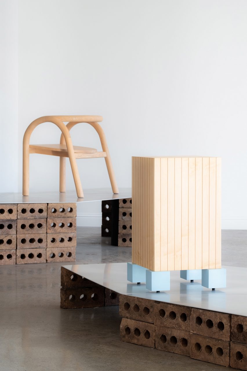
Other works included a baltic plywood side table with grooved sides and small, chunky sky blue legs by NJ Roseti and a white oak chair topped with a wild fleece and suede cushion by Rafi Ajl of studio Long Confidence.
Office of Tangible Space showed a flat-legged chair designed in collaboration with CNC design studio Thirdkind Studio, while Duncan Oja ofOja Design displayed a charred white oak stool with an organic, rough-sawn profile.
Fyrn Studio showed a charcoal-black hardwood stool with aluminium hardware created with replaceable parts and studio Medium Small and designer Yvonne Mouser both displayed chairs made of ash, one blackened and the other not, supported by bases of elegant, simple lines.
Studio Ahead and Kate Greenberg and Sahra Jajarmikhayat made stools with rock-like forms
“As simple as it sounds, the soul of this exhibition is in the representation of physical craft and the people behind it. It’s important to shine a light on this vibrant slice of the Bay Area that is not always as visible amidst a city focused on the digital realm,” said Perumbeti.
“There’s something really exciting brewing in this community that is just beginning to get teased out,” said Greenberg.
NJ Roseti created a baltic plywood side table supported by light blue cubic legs
Works in Progress was part of the wider San Francisco Art Week, which highlights art and design from the city and took place from 13-21 January.
Works in Progress took place at the American Industrial Center in San Francisco from 18 to 23 January 2023. See Dezeen Events Guide for more architecture and design events around the world.
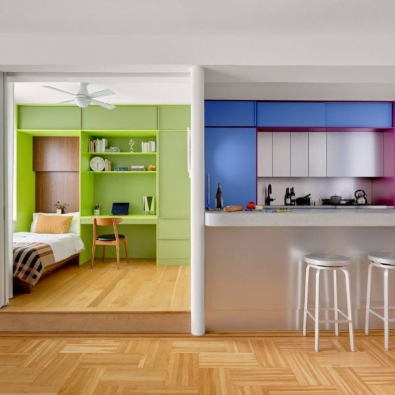
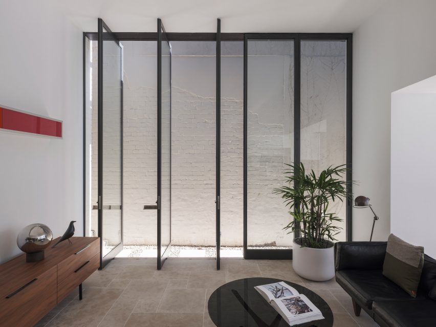
Bright hues define the different interventions that New York architecture studio Ideas of Order has made in this apartment at the northern tip of Manhattan.
The 1,000-square-foot primary residence in Hudson Heights was partially renovated for a couple, who had been living in the space for several years before deciding to invest in making it better suited to their needs, rather than buying another apartment.
One side of this Manhattan apartment was overhauled by Ideas of Order to make it function better for its owners
“Their sons had been sharing a room, but were beginning to need their own spaces,” Ideas of Order told Dezeen.
“They also wanted a space that could be designed for flexibility for when their children left for college.”
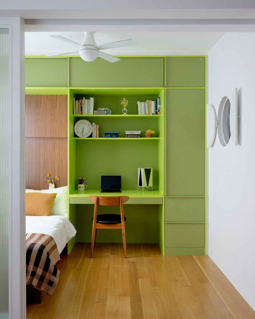
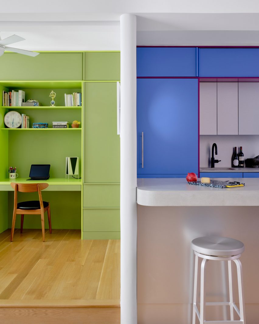
In the newly created bedroom, a lime green built-in houses a bed, a desk and storage
The kitchen also needed updating, to make it more suitable for entertaining, and more efficient storage space was required in the entryway.
So the architects reworked one side of the open living area, adding a bedroom on one side of the kitchen and refreshing the other areas.
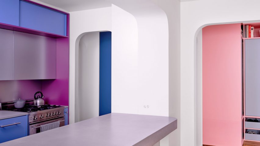
A new wall divides the bedroom from the kitchen
The husband is French, and the couple spent several years living together in France.
During this period, they both became enamoured by the midcentury architecture and design in the country and wanted to apply this style to their own home.
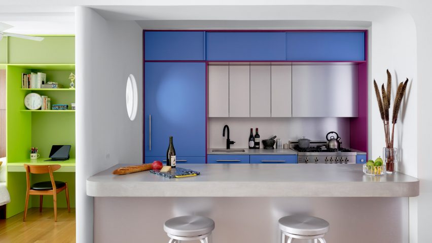
Raspberry and periwinkle cabinets surround the cooking area, which also features aluminium panels
“Inspired by their stories and the history of how colour was used by French midcentury designers like Charlotte Perriand, we suggested a series of polychrome millwork pieces inspired by Perriand’s design language, but updated for a contemporary home,” said Ideas of Order.
The different areas of the home were therefore given their own identities by applying bright hues.
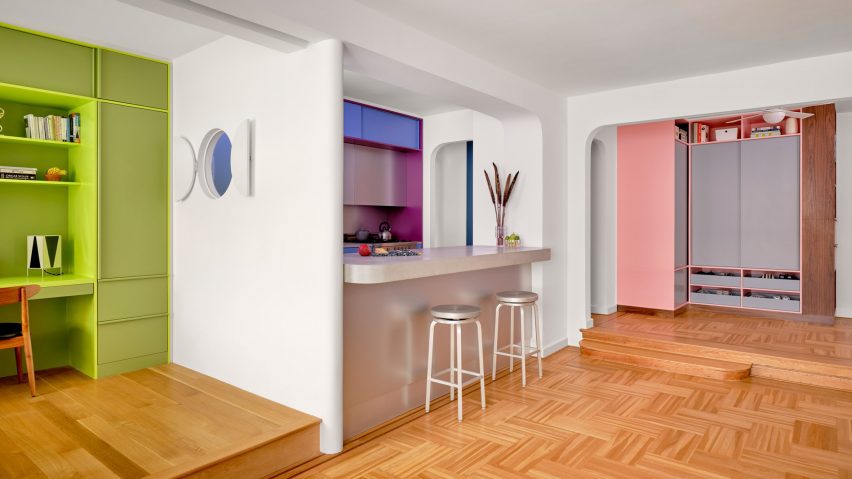
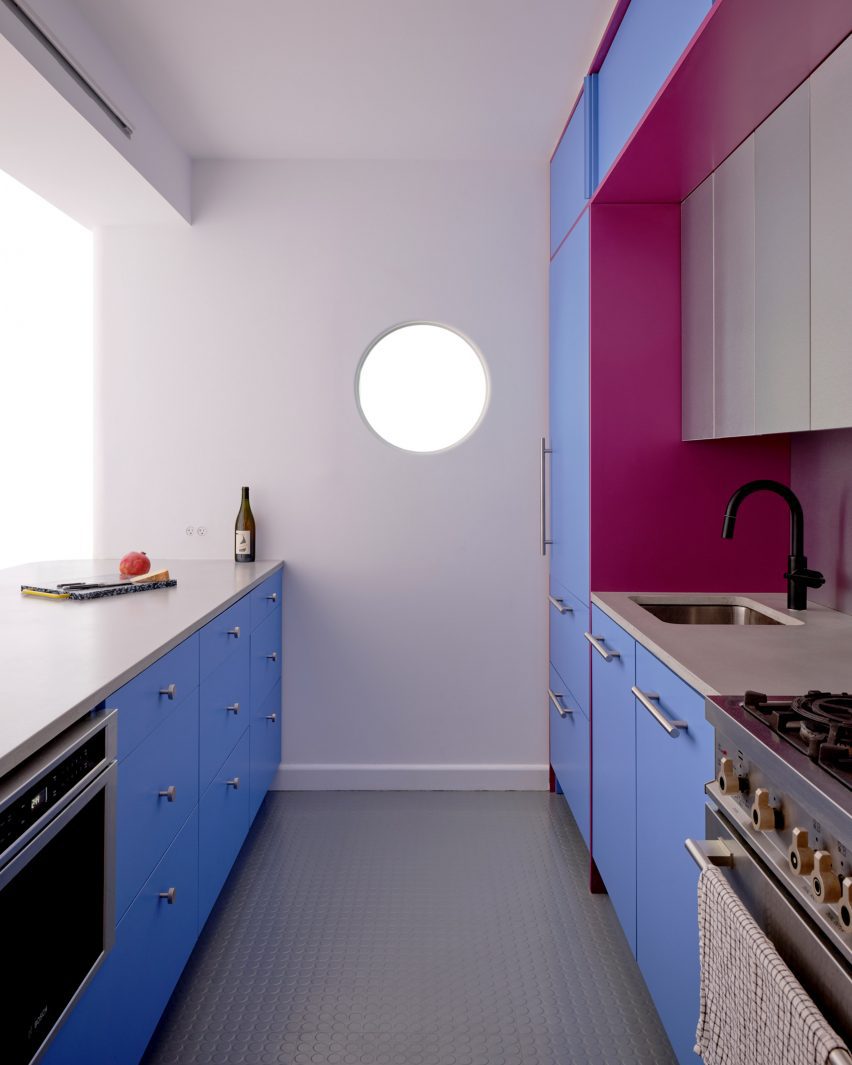
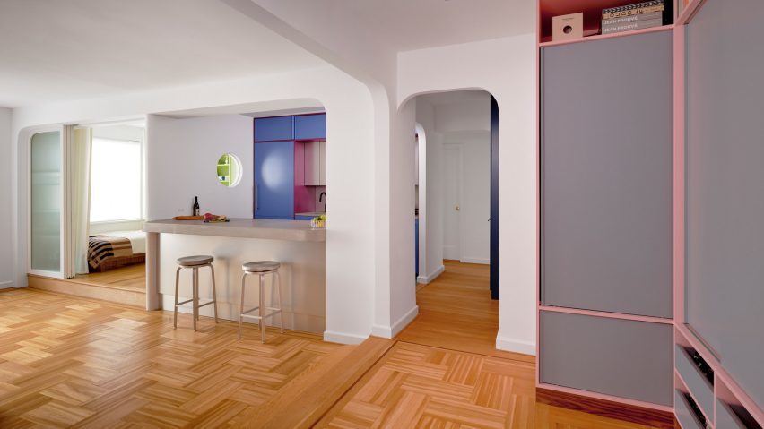
A porthole looks through from the bedroom into the kitchen, which has rubber flooring
Lime green is used in the bedroom across a full wall of built-ins that incorporate a single bed, a workstation and plenty of storage.
Sliding doors with fritted glass panels pull across to enclose the slightly raised room, while a porthole window with double shutters looks through the new wall that separates the kitchen.
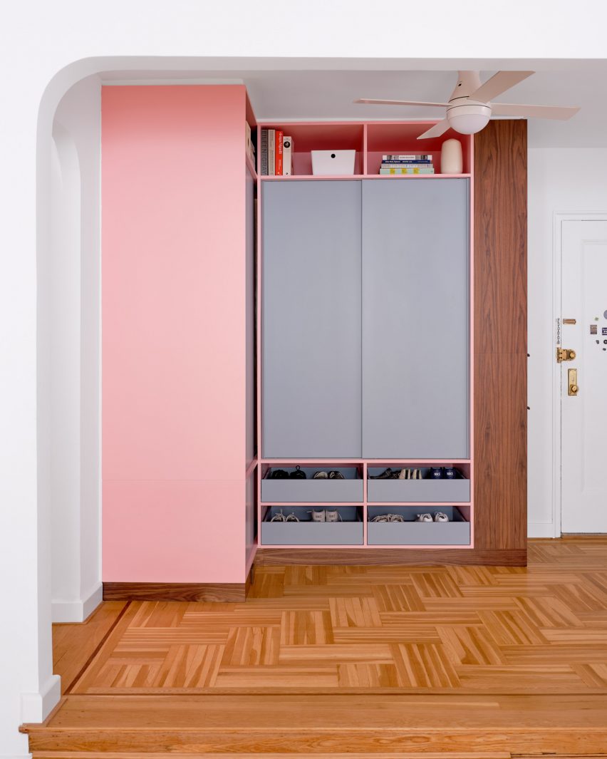
Storage in the entryway was made more efficient by new pink and grey built-ins
This adjacent space is denoted by raspberry and periwinkle millwork, which surrounds a small preparation area with an aluminium backsplash and matching panels above.
The same metal also fronts the bar counter between an arched opening to the living area, which is topped with concrete.
Archways between spaces throughout the apartment have curved corners
Rubber flooring in the kitchen offers a practical alternative to the wood used through the rest of the apartment.
Finally, in the entryway – which is again raised slightly higher than the living area – an L-shaped cabinet system was constructed in a corner beside the door.
Pale pink is applied to the frames, while the doors and drawer fronts are finished in light grey and walnut is used for the trim. Choosing the right hues was a challenge that took many iterations to find the right balance, according to the architects.
“It was important that each pair of colours in the millwork work together, but that the colours also harmonise when viewed as a whole,” they said. “We wanted the colours to be bright, but not overpowering. And we wanted the colour pairings to feel timeless and not too trendy.”
The architects went through many iterations to find the right balance of colours
Another challenge was the budget, which was modest by New York City standards and required some conscientious spending – particularly on small details that would make a big impact.
“We love the custom pulls for the millwork, the shutters for the circular window, and the rounded end to the partition between bedroom and kitchen, which reflects the rounded openings throughout the apartment,” the architects said.
The couple had been living in the space for several years before deciding to invest in making it better suited to their needs
Ideas of Order was founded by Jacob Esocoff and Henry Ng, who are both Fosters + Partners and WORKac alumni.
Their renovation is one of the most colourful interiors we’ve featured in New York City of late, compared to a neutral show apartment inside the One Wall Street skyscraper and a loft in Dumbo with a subdued palette.
Zellige tiles, which originate from Morocco’s ancient mosaic tradition, are one of the most popular kitchen and bathroom tile trends today. Beyond their trendy appeal, zellige tiles have a distinct beauty and handcrafted appearance, making them a long-lasting home trend. These handmade tiles are renowned for their vibrant colors, geometric patterns, and meticulous craftsmanship. Aside from their beauty, zellige tiles have a long history and tradition that contribute to their unique appeal. This exploration will equip you with the knowledge you need to decide if you are ready to get in on this exclusive tile trend.
Zellige tiles are a traditional type of Moroccan tile. The term zellige is derived from an Arabic word meaning “little polished stone.” These tiles served as the foundation for the intricate mosaic patterns found in Moroccan architecture and design, both historic and modern.
Authentic zellige tiles are ceramic tiles made from a special clay. Each tile is made by hand using a unique cutting, shaping, and polishing technique. This handcrafted process results in slight imperfections in each tile, which contribute to their unique charm. Zellige tiles have a glazed surface, which produces luminous colors and adds depth and character.
Zellige Tile Style Guide
Tile trends change over time, but the zellige tile trend appears to be particularly durable due to its elegant style, handmade aesthetic, and versatility. See how some homeowners and designers have embraced the trend.
Colorful zellige tile provides a striking contrast in a neutral colored space, making the design more balanced, vibrant, and dynamic. This soft green zellige tile provides an instant focal point in this all white kitchen and is the ideal backdrop for the vent hood and bright brass wall sconces.
Because of their slightly variable color and luminosity, zellige tiles are excellent for creating a tone-on-tone look. Designer Elle du Monde used black zellige tile as a backsplash for this black cabinet home bar. The black tiles give the bar enough glowing depth to keep the design interesting and unexpected.
These blush pink zellige tiles elevate the style of this simple white kitchen. Laying them vertically gives the kitchen a more modern look, but it also visually expands the space.
Ombre Bathroom Wall
Rather than try to work around the color differences in zellige tiles, this designer embraced the ombre look by using zellige tiles in three different color variations. This gives the bathroom a contemporary look but also pays homage to the mosaic history of zellige tile.
Zellige tiles feature an iridescent quality that makes them appear to glow in soft light. This makes them especially effective, even in neutral colored spaces, at creating dynamism and interest.
Zellige tiles are available in a variety of shapes. The most popular are square tiles, which come in a variety of sizes, but you can also find rectangle, fish scale, cross, star, hexagon, and trapezoid shapes.
This designer used blue zellige tiles to cover the entire bathroom from floor to ceiling. This may result in monotony with some tile types, but the variability and imperfections of zellige tiles provide inherent interest.
Considerations Before Using Zellige Tiles
We all agree that zellige tiles are striking, but due to their distinctive style and nature, they will not work in every application or space. Here are some ideas to consider before implementing them in your home.
Inherent Imperfections
Authentic zellige tiles are still handmade in Morocco. This means that no two tiles are exactly alike in size, depth, or color. Therefore, if you want a tile wall with flawless uniformity, zellige tiles are not for you. Instead, zellige tiles produce a tile wall or floor where corners do not exactly meet and there are slight color changes across the tiles.
People who use zellige tile should embrace its imperfections. One important tip from tile manufacturers is to mix the tiles from all the boxes you get for your project. This will spread out the slight color and shape differences in the boxes.
Maintenance
Glazed zellige tiles require just a regular cleaning with mild soap or stone cleaner and water in order to keep them looking beautiful for years. Wipe up all spills quickly, and keep the tile free from abrasives that might scratch or mar the surface of the tiles. Slight imperfections in the tiles cause certain corners to stick out, so be aware of this while you clean. Never use harsh chemicals or abrasives because these will damage the glaze. Glazed zellige tiles do not need to be resealed; however, unglazed zellige tiles require regular application of a sealer.
Adhesive and Grout
Many designers and tile professionals recommend that zellige tiles be installed with no grout line visible. Zellige tiles are installed on a substrate covered in a thin-set adhesive. Because of their irregular shape, some contractors opt to use wedge-shaped spacers to get the tiles as evenly spaced as needed through the laying process. Allow the thin-set to cure and apply an unsanded grout with a tile float at a 45-degree angle. Allow to sit for 10-20 minutes, and then clean and wipe down according to the manufacturer’s instructions. Be sure to clean and buff the tiles completely to avoid grout haze on the tiles.
Where to Use Them
Zellige tiles appear delicate, but they are surprisingly durable. They are heat and moisture resistant and can withstand wear and tear. Zellige tile manufacturers insist that these tiles can be used anywhere, including walls, floors, fireplaces, and outdoors. This is true with a few caveats. Although zellige tiles are durable, some have slightly raised edges that can cause problems on certain floors.
The raised edges of zellige tiles are prone to scratches and other damage, so they are best used in low-traffic areas. Some people also claim that the glazing on zellige tiles makes them slippery. Use small-scale zellige tiles on floors so that the grout lines can provide additional traction.
Finding Zellige Tile
It is easy to find authentic zellige tiles, but it is vital that you know what you should look for. Choose a reputable supplier with a proven track record for distributing zellige tiles. Some popular distributors include Cle Tile, Riad Tile, Zia Tile, and Badia Design. Some suppliers may provide you with documentation or a certificate that verifies the traditional and handmade origin of their tiles. Look for the hallmarks of authenticity, including a handmade look, glossy and “cracked” surface glazing, a variation of colors, and being made using traditional methods in Morocco.
Timeless or Trendy?
Zellige tiles are currently one of the most popular tile trends in kitchen and bath design. While trend directions are always difficult to predict, zellige tile has characteristics that argue for its timeless appeal. Zellige tiles have been around for hundreds, if not a thousand, years. The fact that we are still using them today is proof of their timelessness. These tiles are handcrafted from natural materials. Their authenticity distinguishes them as a classic and elegant choice. So, while we can not predict whether zellige tiles will be used in all of the latest kitchen and bathroom designs in ten years, we can say that they will always be beautiful and will not be disappearing from kitchens and bathrooms any time soon.
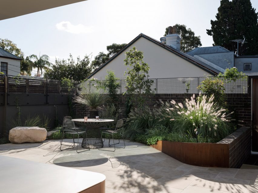
A private roof terrace enclosed by greenery features in Hidden Garden House, a Sydney home reconfigured by Australian studio Sam Crawford Architects.
Situated within a conservation zone, the home has been updated by Sam Crawford Architects to brighten its dark interior and transform it into an urban “sanctuary”.
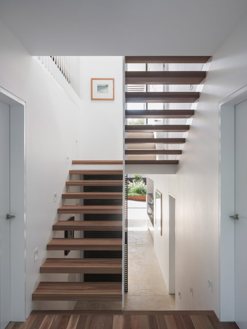
An open-tread staircase has been added to the hallway
Alterations to the 198-square-metre home’s interior are first seen in its entrance, where a stair with open treads and a white-steel balustrade replaces a solid timber structure that previously restricted light from a skylight above.
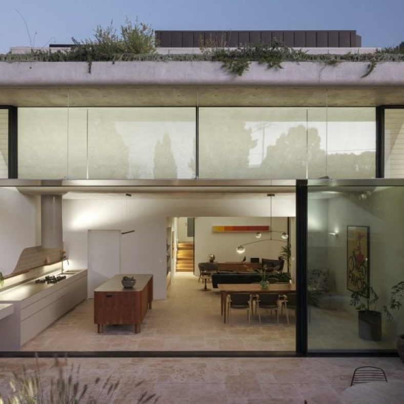
Down from the entry hall is a spacious ground-floor kitchen and dining area, which is illuminated by 4.5-metre-high glass openings that lead out to a landscaped patio. The patio is paved with limestone tiles that extend out from the interior.
A curved concrete roof features in the kitchen
“By extending the ground floor finishes through the full-width doors into the rear yard, the garden and high-level green trellises at the rear of the site form the fourth wall to the rear wing,” studio director Sam Crawford told Dezeen.
“They create a sense of enclosure that draws the occupant’s eye up to the expanse of the sky rather than surrounding suburbia.”
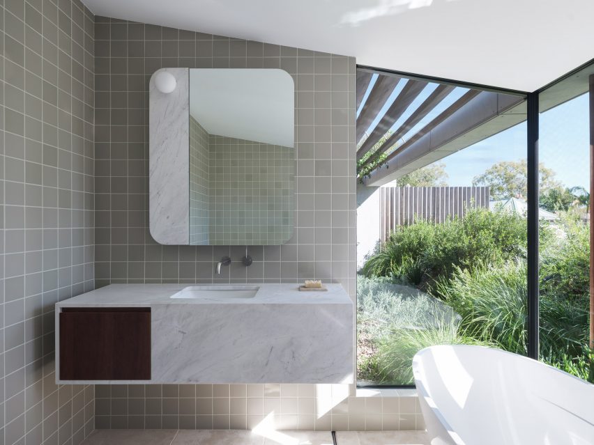
Angled timber screens and greenery ensure privacy for the bathroom
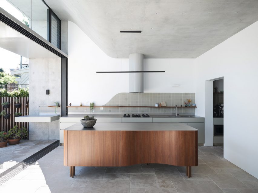
A concrete ceiling in Hidden Garden House’s kitchen curves upwards to help draw in the winter sun and provide summer shading, while operable clerestory windows allow natural ventilation.
Above, this curved ceiling forms a sloped roof terrace filled with plants, which is situated off the main bedroom on the upper floor.
An ensuite bathroom, also lined with limestone floor tiles, has expansive openings offering a scenic yet private bathing experience enabled by angled timber screens and the terrace’s greenery.
“The rolling green roof serves as a visual barrier to the surrounding suburb, whilst allowing the occupants to occupy their private garden oasis,” added Crawford.
White walls and wooden furniture feature throughout the interior
Hidden Garden House’s consistent material palette of bright white walls and wooden furniture ties its living spaces together, while decorative square tiles line both the kitchen and bathrooms.
Curved details, such as the patio’s shape and the kitchen island and splashback, also feature throughout.
The home aims to be an urban “sanctuary”
Other alterations that were made to improve Hidden Garden House’s layout include the relocation of entrances to the ground floor laundry room and bathroom.
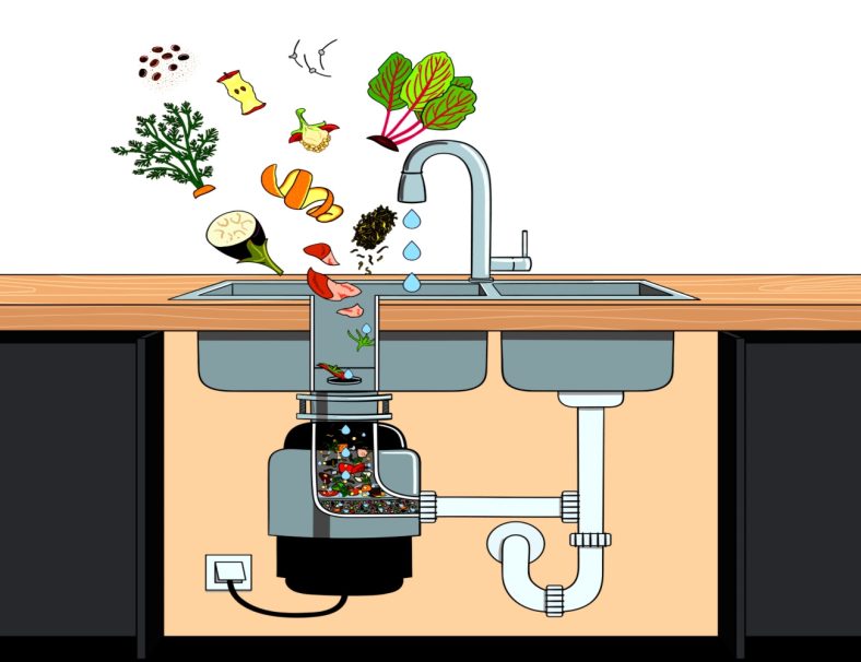
Garbage disposals are handy tools, allowing users to pulverize leftover food and send it through the drains, where it eventually lands in the sewer or septic tank. But as nifty as it is to rinse stuck-on food down the drain, garbage disposals can’t handle everything we throw at them.
We recently spoke to five experienced plumbers from across the country to get the low down on what’s safe and what’s not safe to put in a garbage disposal. All plumbers replied with similar answers, so if you’re sticking one of these five things down your disposal, stop immediately.
1. Eggshells
Contrary to popular belief, eggshells don’t sharpen garbage disposal blades. “Eggshells, often believed to be disposal-friendly, can surprise you by forming granules that stick to grease, compounding the clog issue,” says Al Fagundes, Master Plumber at A. Fagundes Plumbing and Heating.
Unless you’re interested in a slow buildup of eggshells that eventually cause a clog, start tossing those empty shells in the garbage or compost bin.
2. Starchy Foods
While most people know that flushing grease down the drain is a big no-no, not all realize the damage that starchy foods can do. According to Roy Barnes of Service Force Plumbing, the day after Thanksgiving is one of the busiest days for plumbers due to people clogging their drains with potato peels and starchy leftovers.
“Your garbage disposal will do a great job of grinding starches up into a sticky paste – the finer it grinds, the stickier the mess,” he says. To play it safe and prevent clogs, don’t put potatoes, potato peels, or pasta down your disposal.
3. Grease, Oil, or Animal Fats
All types of grease, including oil and animal fats (like bacon lard), can clog drains. Never place these in the garbage disposal or dump them down the drain. “Pouring grease down the drain may seem like a good idea when it’s a liquid, but as it cools, it will harden, causing clogging,” advises Chris Palmer of Raptor Rooter & Plumbing.
Even if the grease doesn’t cause an immediate clog, some of it will cling to the insides of the pipes, and then other bits of food will attach, slowly building up until the drains are impassable.
4. Fibrous Vegetables
Fibrous vegetables are great for the body but not so good for the garbage disposal. Jimmy Hiller of Happy Hiller, a multistate company that does plumbing and HVAC work, tells us, “Avoid fibrous or stringy foods such as celery, corn husks, onion skins, and artichokes. These can tangle the blades of the garbage disposal and cause it to jam.”
Toss your leftover veggies in the compost bin or trash to keep your blades sharp and jam-free.
5. Coffee Grounds
One of the most controversial items you shouldn’t put down the drain is coffee grounds. Although some TikTokers claim that adding coffee grounds removes bad smells and sharpens garbage disposal blades, you can’t always believe what you see on social media. According to the master plumbers we’ve interviewed, this couldn’t be farther from the truth.
Dumping some coffee grounds may make your sink smell better, but it also creates a sludgy paste that sticks to the drains, eventually causing backups.
What Can You Put Down a Garbage Disposal?
Save your garbage disposal for the little bits of food that come off your plate as you rinse. Throw everything else in the trash or compost bin. Doing this will help prevent a costly (and inconvenient) plumbing emergency.
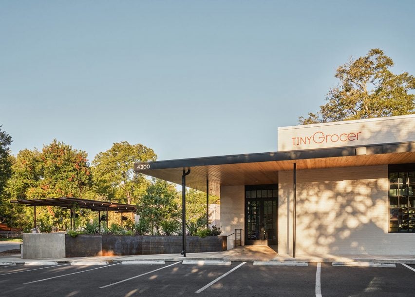
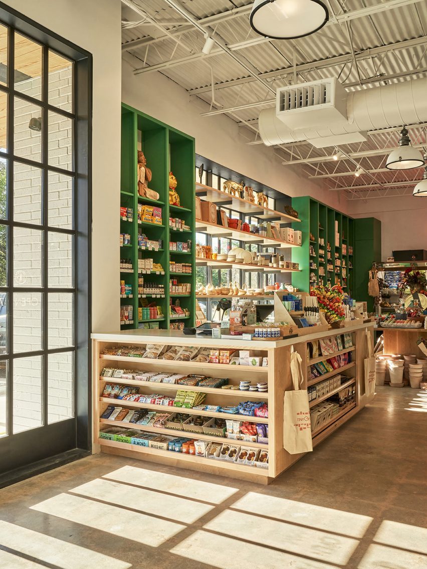
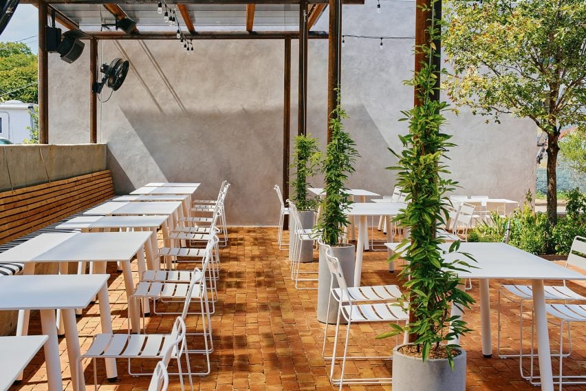
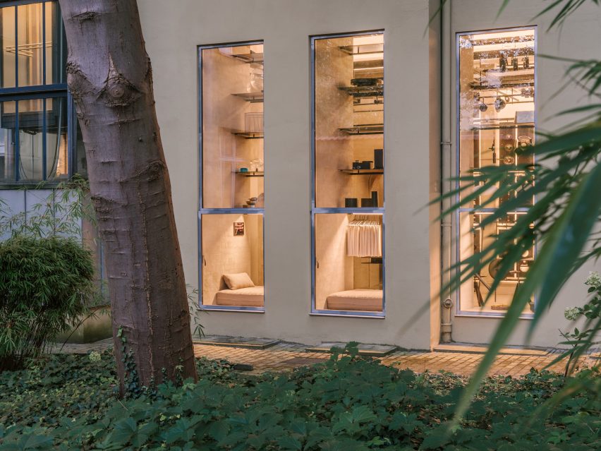
Texas architecture studio Side Angle Side has adapted a 1960s post office into a food market and restaurant in Austin.
Opened in October 2023 in the Hyde Park area, Tiny Grocer serves as a speciality market, bar and cafe while Bureau de Poste is a modern French bistro led by celebrity chef Jo Chan.
Side Angle Side has transformed a 1960s post office into a food market and restaurant
Austin-based commercial and residential architecture firm Side Angle Side renovated the 3,500-square foot (325-square metre) 1967 US Post Office building and added a 1,500-square foot (140-square metre) outdoor dining patio.
“The Hyde Park U.S. Post Office was an important neighborhood hub in the 1960s – so we were especially careful to keep the integrity and spirit of the mid-century-utilitarian design,” Arthur Furman, founding partner of Side Angle Side, told Dezeen.
The team sought to preserve the building’s history as a community hub
“As the anchor tenant in the space, Tiny Grocer continues to be the centre of the community, a place to gather, shop, eat and drink.”
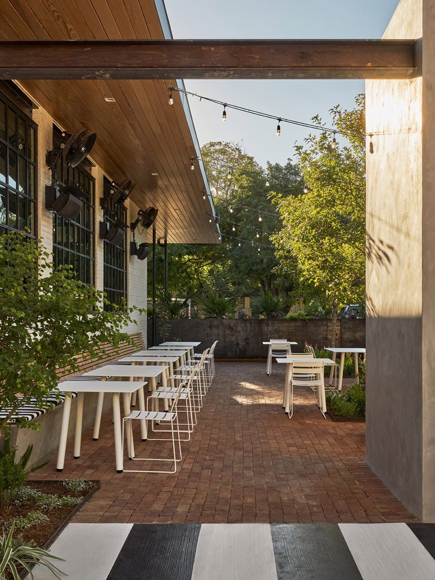
The shell of the white brick building was left intact, but the street-facing facade was previously used as a loading dock so the team transformed the back-of-house edge into a welcoming patio for the neighbourhood by removing the asphalt and adding two large live oak trees and a steel trellis and planters.
The exterior of the building was kept intact
A cast-in-place concrete banquette holds the edge of the patio that is paved with antique red brick.
The steel planter forms a boundary between the parking area and the dining space, while the other edge is held by a light grey-coloured stucco restroom building. White metal furniture from Isimar and Portofino was used to furnish the patio.
“The patio and wine garden is the real heart of the project,” the team said, mentioning that it wasn’t within the original scope of the project but added later when its larger value was realized. “This is where all the care and thought of the interior spills to the outside, creating a lively environment.”
The renovated building has exposed concrete floors from the original building
On the interior, Side Angle Side complemented the original ceiling and open web joists with metal decking and industrial warehouse pendants by AQ Lighting. The polished concrete floors expose the weathered imperfections and show the history of the building.
Upon entering, shoppers take in the colourful selection of curated products displayed on white oak mercantile shelving. Green millwork hugs one wall and the space widens to an open interior plan.
A patio and wine garden is at the heart of the project
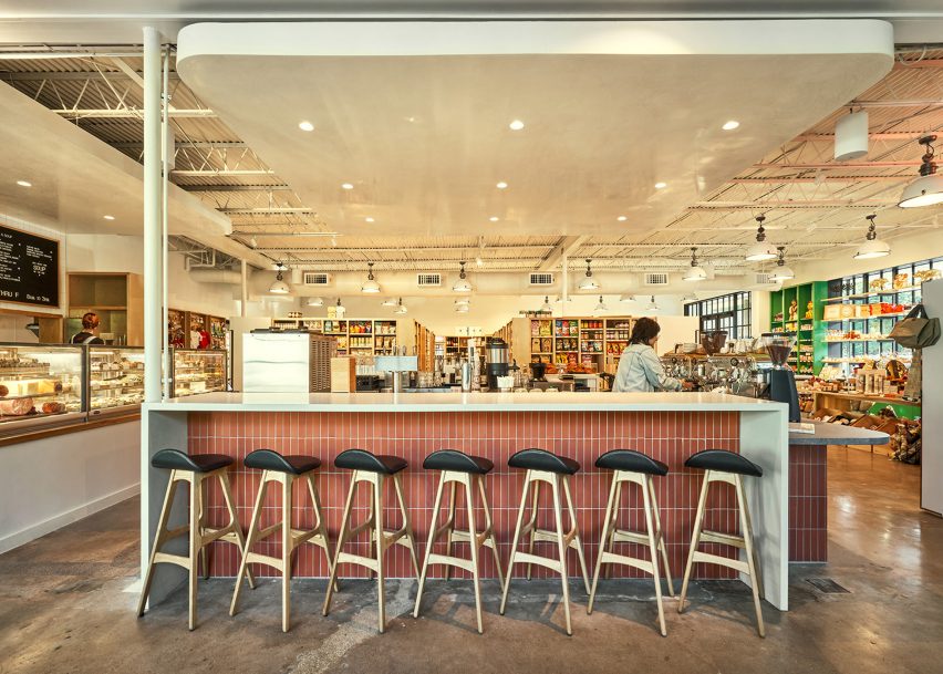
A central deli and coffee bar floats in the middle of the room and creates a transition from the market to the bistro. The bar is wrapped in Seneca terracotta tile and topped with grey and white quartz countertops. Wooden Soule barstools are tucked under the waterfall counter.
The back-of-house spaces hold a kitchen office, storage, and bar equipment.
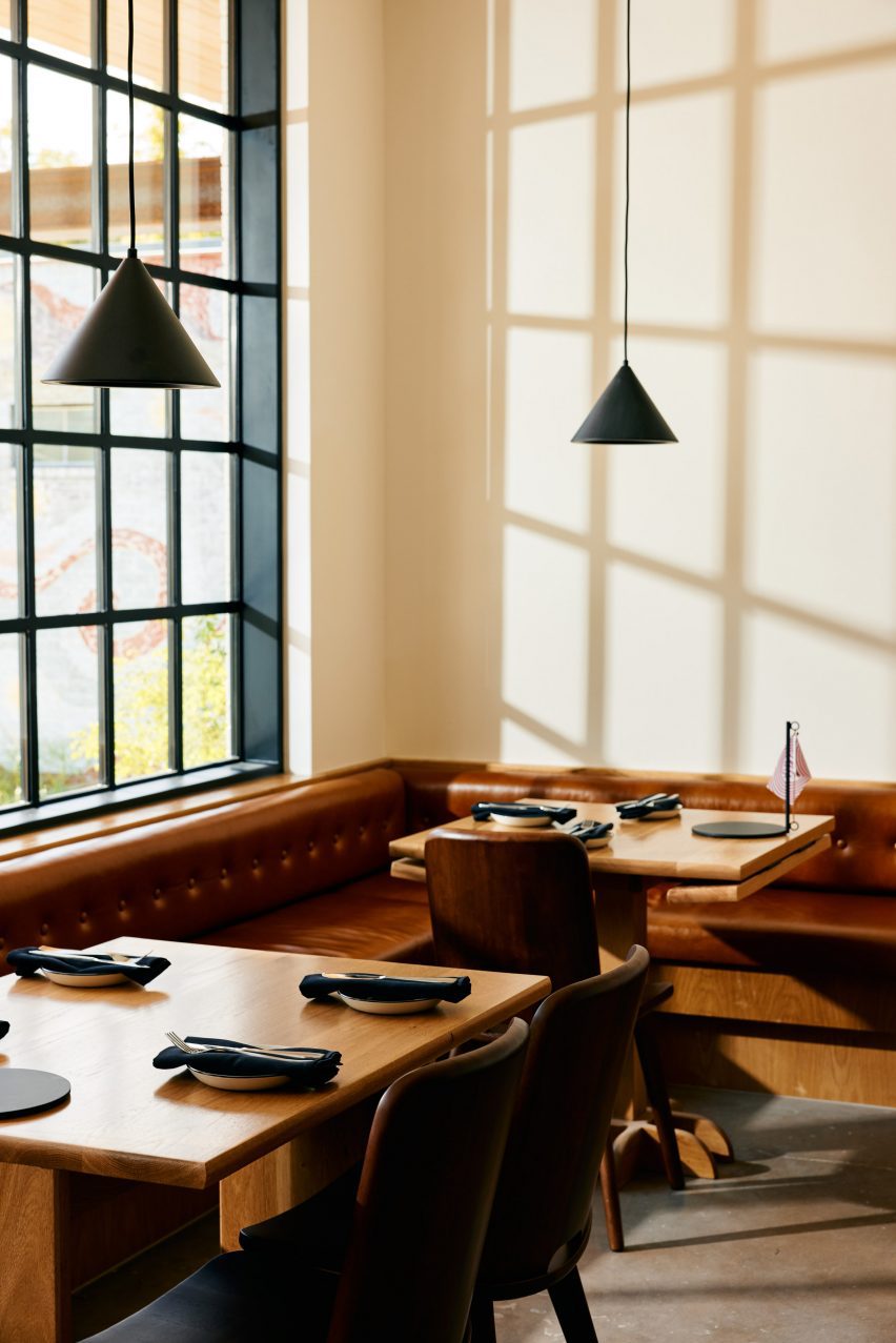
“Working closely with the owner, design finishes hint at the building’s midcentury past,” the team said, referencing the custom, built-in leather banquette by Undercover Austin Upholstery that lines the bistro’s back wall.
The patio features brick flooring and white metal furniture
“The single biggest sustainable feature of this project is one that is often overlooked,” the team said, noting the adaptation of the structure. “The ‘loose fit, long life’ style of these old buildings leads to more reuse and far less waste.”
Structural engineer: Creative Engineering MEP engineer: ATS Engineers Builder: Archive Properties Commercial interior design: Side Angle Side Architects: Side Angle Side Building shell: Thought Barn Studio Landscape design: Side Angle Side & Wild Heart Dirt Owner: Steph Steele
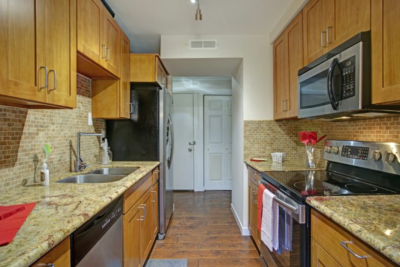
A galley kitchen is one with a long and narrow layout. Despite their unfavorable reputation, galley kitchens have a lot to offer because of their ergonomic layout and ability to fit into homes of varying sizes. Galley kitchens are an excellent way to maximize kitchen space in a small space. Furthermore, achieving it does not require sacrificing style. There are inventive ways to make the most of the practical shape while maintaining high style in a galley kitchen.
What is a Galley Kitchen?
The galley kitchen was named because of its similarity to the kitchens on a ship, where the limited space demanded a streamlined shape. Galley kitchens became popular in the 20th century, when kitchens moved from being a separate room and began to be integrated into the rest of the home. It became a popular kitchen style in the mid-20th century because of its streamlined appearance and modular style.
Galley kitchens are shaped like a long hallway with upper cabinets and lower cabinets on either side of the corridor. There are parallel counters on either side, with appliances interspersed throughout. Some galley kitchens have a dining area incorporated into the layout, either at the end of the cabinets or as an extension of the counter space in the form of a small island.
Pros:
Cost and design: The smaller square footage of most galley kitchens means they are less expensive and easier to design, build, and renovate.
Ergonomic: The shape of a galley kitchen makes food prep easier on the body because of the proximity of all the countertops and appliances to one another.
Accessibility: Everything is more accessible in a galley kitchen than it would be in a larger space.
Maintenance: Galley kitchens are easier and quicker to clean than kitchens that are larger.
Cons:
Narrow: Galley kitchens have a narrower layout. This makes it difficult for multiple people to be in the kitchen at the same time.
Lack of focal point: This type of kitchen layout can seem to lack an obvious focal point as the cabinets and appliances blend seamlessly together.
Resale: The resale value of homes with galley kitchens tends to be less than kitchen layouts that are larger.
Lack of space: Some small galley kitchens lack enough storage and counter space.
Small appliances: Standard sized appliances are best used in galley kitchens as there is less space for larger and custom appliances.
This galley kitchen from Jackson and LeRoy features painted kitchen cabinets and a wall of windows along one side with wall cabinets along the other. Even though this is a narrow space, the natural light makes the room seem more open. Further, the tall wall cabinet mixed with the open shelving breaks the hallway feel of the room.
Maximize it with Light Colors
A galley kitchen with light colors will look larger than a kitchen with dark colors. Even without windows to brighten the space, this white kitchen looks open and pleasant. Notice also the backsplash in a darker neutral tone. This gives the galley style kitchen some needed texture and greater depth. The dark wood flooring counterbalances and grounds the design to create a pleasing overall design.
Galley kitchen with peninsula
This galley kitchen uses a vivid color to distract from the small square footage. The bright blue subway tile offers a pleasing contrast to the gray cabinetry and stainless steel refrigerator and oven. A breakfast bar on a peninsula helps to make the most of this kitchen layout. The peninsula works better than a galley kitchen with an island as space is limited.
Patterned backsplash
This galley kitchen features a patterned backsplash with white cabinetry. The patterned tile backsplash creates a focal point that is interesting but not overwhelming to the design. The darker base cabinets provide some warm texture to the kitchen design to anchor it and give it more visual interest.
A Simple Floor Design
The sleek galley kitchen design has blue flooring that is as interesting as it is unexpected. The blue floor serves to ground the light colors of the kitchen space, while the white walls and natural wood cabinets keep the kitchen design bright.
This galley kitchen design from Heidi Caillier works well for a transitional or farmhouse galley kitchen style. The interior design creates contrast by using two colors on the cabinets, a soft gray green and ivory, and finishing them with warm wood countertops. The galley kitchen lighting is spare. Rather than use large overhead lights, Caillier has added task lighting where it is needed.
Open shelving
This galley kitchen is not spacious, yet the design uses every ounce of available space to make the most of the narrow layout. The open shelves and the checked flooring on the narrow walkway allow the small galley kitchen to create an outsized impression.
This galley kitchen from Lori Caldwell Designs features two rows of stunning wood faced cabinets. Both sides of the cabinetry reach to the ceiling. One side has a sink, but one wall consists primarily of floor-to-ceiling cabinets. This design decision gives this small kitchen ample storage. Notice the floor to ceiling window at the end of the room. Large windows that overlook a yard or garden can make a galley kitchen feel so much more open.
Wallpaper to Expand Visual Interest
This kitchen galley design features an accent wall with geometric wallpaper. The rest of the kitchen space is simple and clean, but the wall with the colorful pattern defines the whole area.
High storage
Consider adding vertical storage if you can’t add additional storage in your small kitchen because of the width. This owner has positioned the open shelving above the fridge. The shelves are wide and reach the ceiling This moves the focus away from the small space and adds extra storage at the same time.
Consider this galley kitchen with a colorful Turkish runner. The rug adds more than just color to the otherwise neutral kitchen; it also provides a warm texture that elevates the style of the entire room.
Arched opening
This modern galley kitchen features an arched opening to create more visual space in the closed room. The stainless steel cabinets, open shelves, and colors keep the design light and bright.
A pared-back palette of raw materials creates a calm backdrop for PSLab‘s lighting products inside the brand’s Berlin workshop and showroom space, designed in collaboration with Belgian firm B-bis architecten.
The newly opened studio occupies the ground floor and basement of a 1907 residential building in the city’s Charlottenburg district.
PSLab has opened a new workshop and showroom in Berlin
PSLab, which designs and manufactures light fixtures for architectural projects, set out to create a showroom where customers can experience lighting effects in a home-like environment.
“PSLab is not a digital platform where clients pick and buy products,” the company’s founder Dimitri Saddi told Dezeen. “Therefore the physical space as a ‘home’ is most important for one-on-one communication.”
“In Berlin, as with all our studios, we wanted to design a canvas to show the quality of our light and to show the process of our bespoke design approach by integrating a material library of endless opportunities and possibilities.”
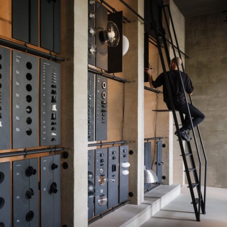
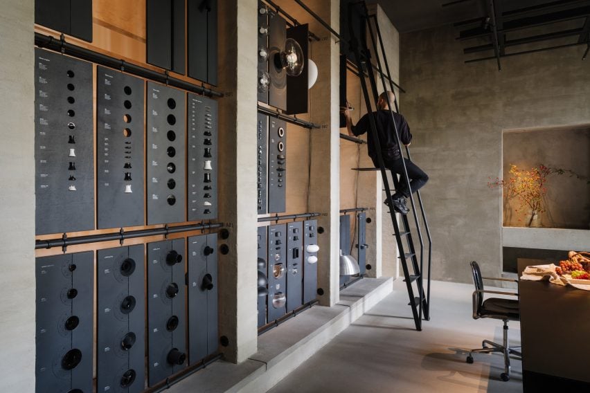
The space includes a materials library with a movable ladder
Working together with B-bis architecten, the design team looked to create a contemporary space that contrasts with Charlottenburg’s classical architecture whilst retaining references to common elements like colonnades, arches and symmetrical forms.
The entrance takes the form of a large zinc-and-glass sliding door that is set into the facade of the building on Niebuhrstrasse. Moving the door aside reveals a full-height opening that welcomes visitors into the studio.
The interior was designed to present the brand’s lighting to its best advantage
Inside, a double-height space with a six-metre-high ceiling allows lighting products to be hung in various heights and configurations.
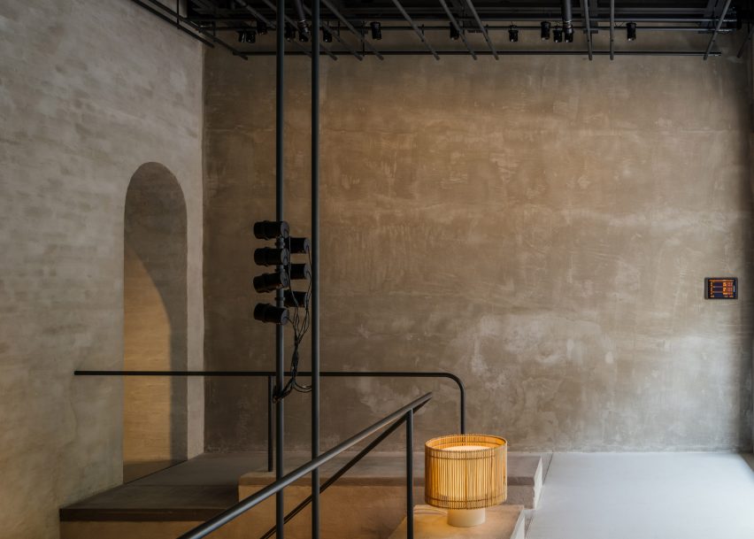
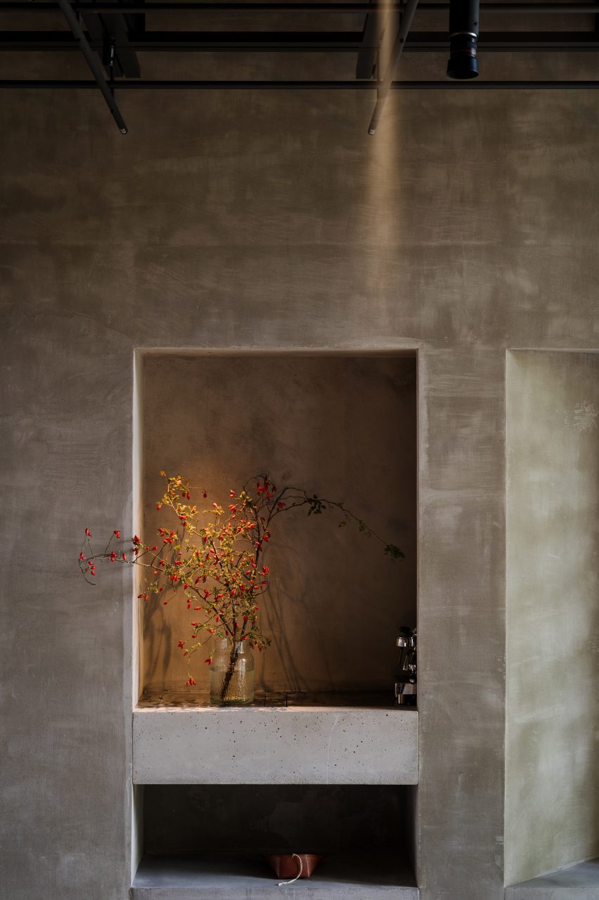
Arched openings on either side of the staircase void lead through to a garden room that looks onto a leafy courtyard. Daylight streams into the space through large windows to create a tranquil atmosphere.
The workshop space includes a materials library where visitors can touch and explore the physical qualities of the brand’s lighting products. A movable ladder provides access to items on the library’s upper rows.
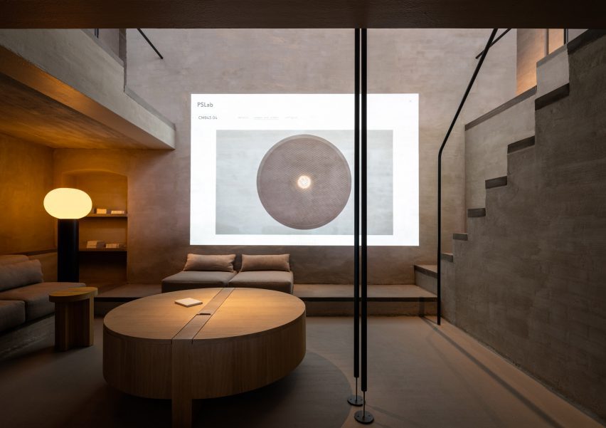
The cosy basement level is a place for informal conversations with clients. A projector in this parlour space also allows the team to display the company’s extensive digital library.
The basement serves as a cosy lounge
Throughout the studio, PSLab chose materials and finishes including lime wash, concrete, zinc and textiles that focus attention on how the space is lit rather than its architectural features to create a kind of “sacred place for light”.
“It is all about monochromatics and textures, which are specific to the location,” said Mario Weck, a partner at PSLab GmbH. “The atmosphere lets people focus on our approach.”
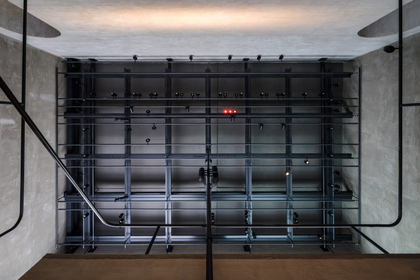
Gantries provide support for various light sources
On the ceiling of both the front room and garden room is a grey-steel gantry that helps unify the spaces whilst supporting various light sources as well as technical elements, much like on a theatre stage.
Furniture is mostly built in, with simple cushions providing casual seating while cylindrical wooden side tables and coffee tables offer somewhere to place a cup or catalogue.
The showroom is set in Berlin’s Charlottenburg
PSLab has studios in Antwerp, Bologna, London, Stuttgart and Beirut, where the firm originated. For its UK headquarters, the company commissioned JamesPlumb to convert a Victorian tannery into a space that evokes the “quiet brutalism” of the former industrial building.
Previously, the lighting brand has collaborated with Parisian studio Tolila+Gilliland on the design of an Aesop store in London featuring felt-covered walls and slim black pendant lights.
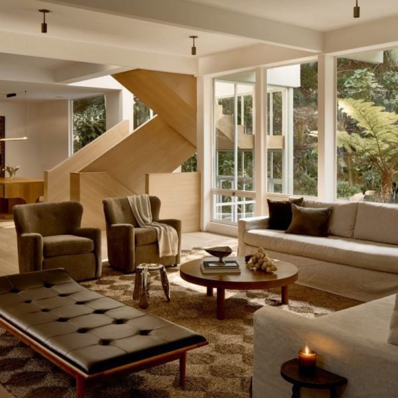
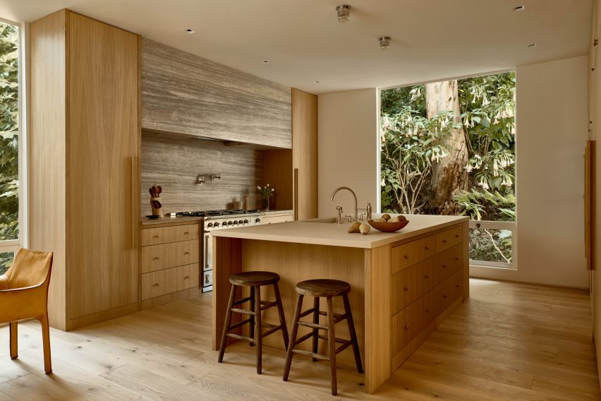
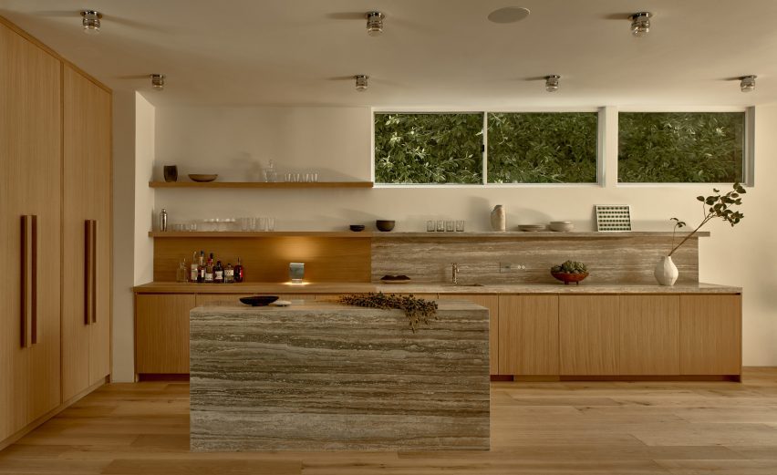
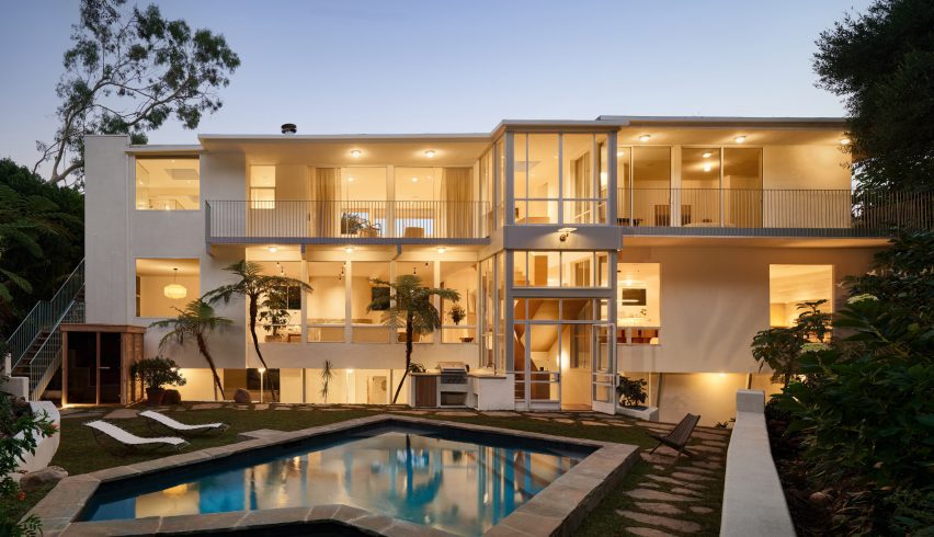
US studio Ome Dezin has renovated a large mid-century home in Brentwood, California, using a tonal colour palette and maximising the lush hillside views.
The six-bedroom 12221 Benmore residence was designed and constructed in 1960 by notable local architects A Quincy Jones and Frederick Emmon.
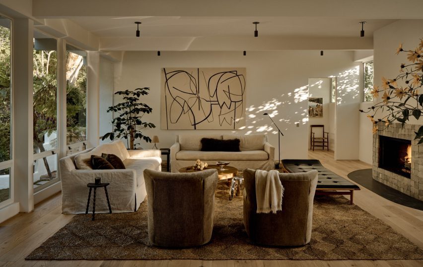
Natural materials and neutral colours were chosen throughout the home to highlight the lush views
When Jesse Rudolph and Joelle Kutner of Ome Dezin came to the project, it had undergone a 1990s remodel that had stripped away its character and style.
The team made it their mission to revive the home’s original charm and connection to the outdoors, bringing in natural tones and materials.
White oak and travertine are recurring materials, as seen in the bar area
“We have always been fans of A Quincy Jones and familiar with his work, which is what prompted us to see the home initially,” the duo told Dezeen.
“This one did not disappoint — it had the typical Quincy atrium-like living space centered across from the exterior which includes a 40-foot (12-metre) waterfall.”
The main living spaces all flow together and have expansive views onto the garden
Many of the existing fixtures were retained, including the fixed windows and doors, wherever possible.
To keep the focus on the views from the large windows, the interior was designed with “a more muted, streamlined aesthetic”.
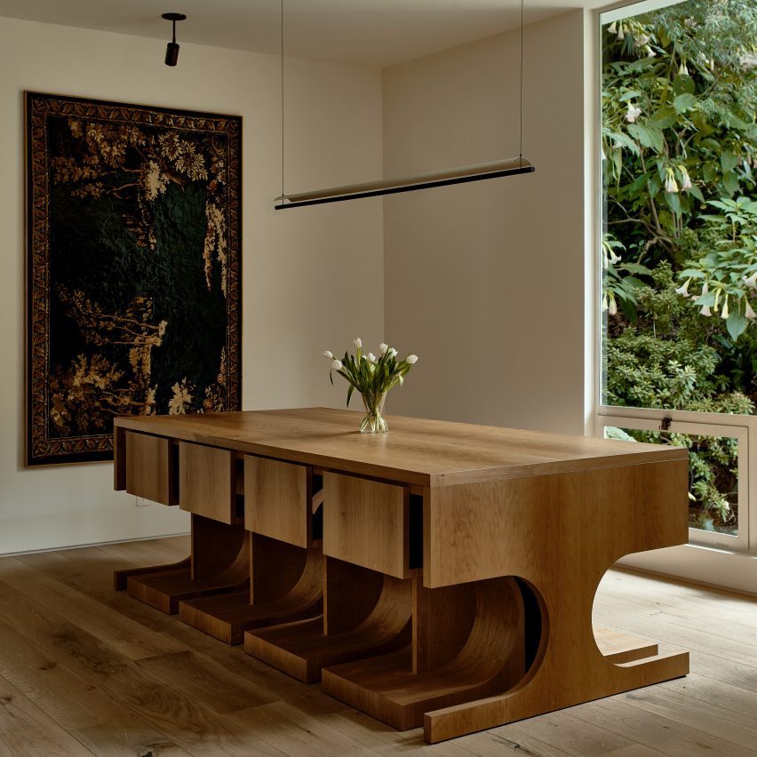
Custom pieces designed for the home include a dining table and chairs created in collaboration with Ben Willett
“We wanted to ensure the intention of Quincy was intact, so we aimed for a bit of brutalism and connection with nature,” said Rudolph and Kutner. “We opted for a limited material and color palette in favour of natural tones.”
The new white oak staircase designed for the three-storey atrium features rectangular forms and has an architectural presence, echoing the shape and style of the building.
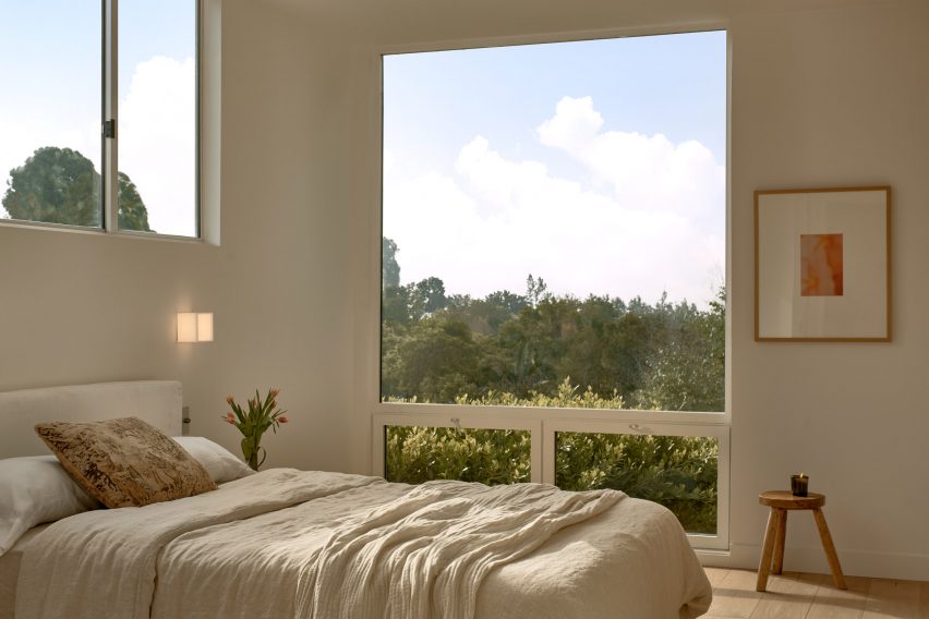
Large windows are found in almost every room, so the decor is kept minimal and sparse so as not to draw focus
It sits at the nexus of the living room, dining area, kitchen and bar, which all flow together and enjoy expansive views out the back of the house.
A den adjacent to these open spaces is furnished with a variety of midcentury pieces, in keeping with the building’s history.
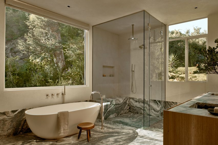
Dramatically patterned Cipollino stone in the bathroom echoes the grey tones of the rocks outside
Two types of stone were used throughout the home: travertine, which appears in the kitchen, bar area and powder room, and richly patterned Cipollino in the primary bathroom chosen to pick out the colours of the mountains visible through the windows.
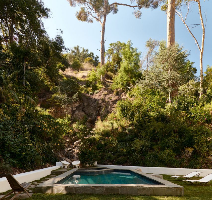
In the lower-floor bedrooms and around the fireplace, flagstones and cobblestones were laid to create a grounding quality and to connect the spaces to the rocky landscape outside and pavers around the swimming pool.
Custom pieces designed for the project include the dining table created with furniture designer Ben Willett, which allows all of the chairs to be tucked away neatly underneath.
Two 10-foot-high (three-metre) doors were custom-built for the living space and feature Jean Prouvé-influenced circular window cutouts that allow light to shine through.
The garden features a swimming pool and a 40-foot (12-metre) waterfall
“We paid special attention to the lighting in the home, mostly sourcing vintage lights to add charm and character,” the design team said.
“With such a large home, and lots of windows and tall ceilings, warm mood lighting really made the spaces feel intimate and magical, particularly in the evenings.”
The home was designed and constructed in 1960 by A Quincy Jones and Frederick Emmon
Rudolph and Kutner founded Ome Dezin as a design and development studio focused on residential restoration in and around Los Angeles.
California has no shortage of mid-century properties in need of revamping. Other recently completed examples include Studio Schicketanz’s renovation of modernist architect Henry Hill’s former seaside home, and Woods + Dangaran’s overhaul of a residence that once belonged to singer Bing Crosby’s manager.
Nets can be a fun way to link two storeys in the home. Featured below are examples from a New York apartment, a skinny house in Rotterdam and a small family residence in rural Vietnam, among others.
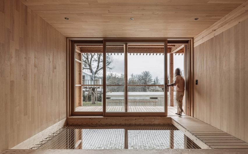
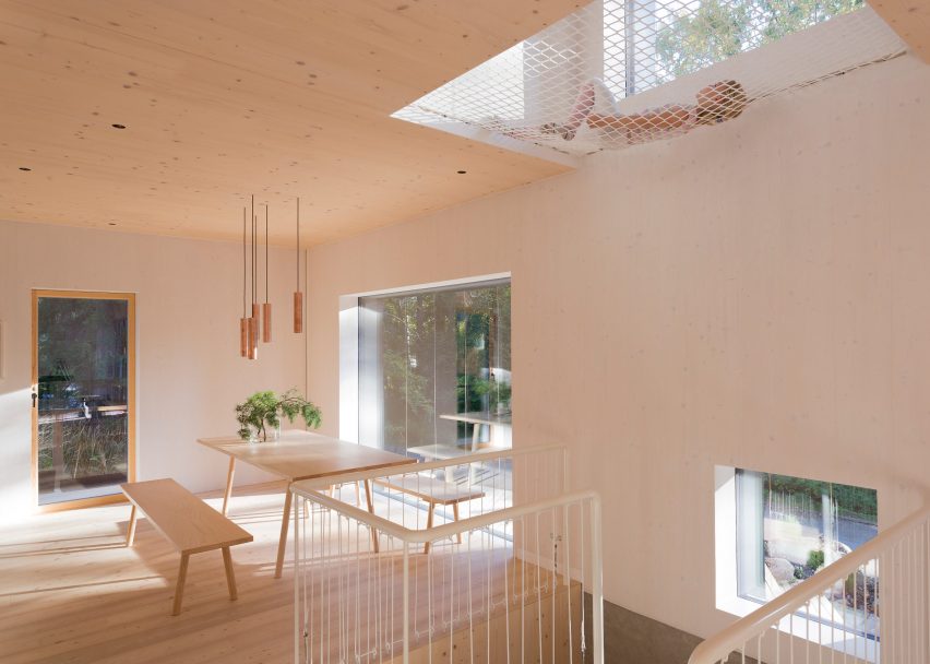
Timber-lined living spaces create a soothing atmosphere inside this house in the Austrian Alps, designed by local architecture studio Dunkelschwarz.
To encourage relaxation, a void above the dining area was covered with netting that can be used for lounging, while an adjacent walkway leads directly to a large balcony.
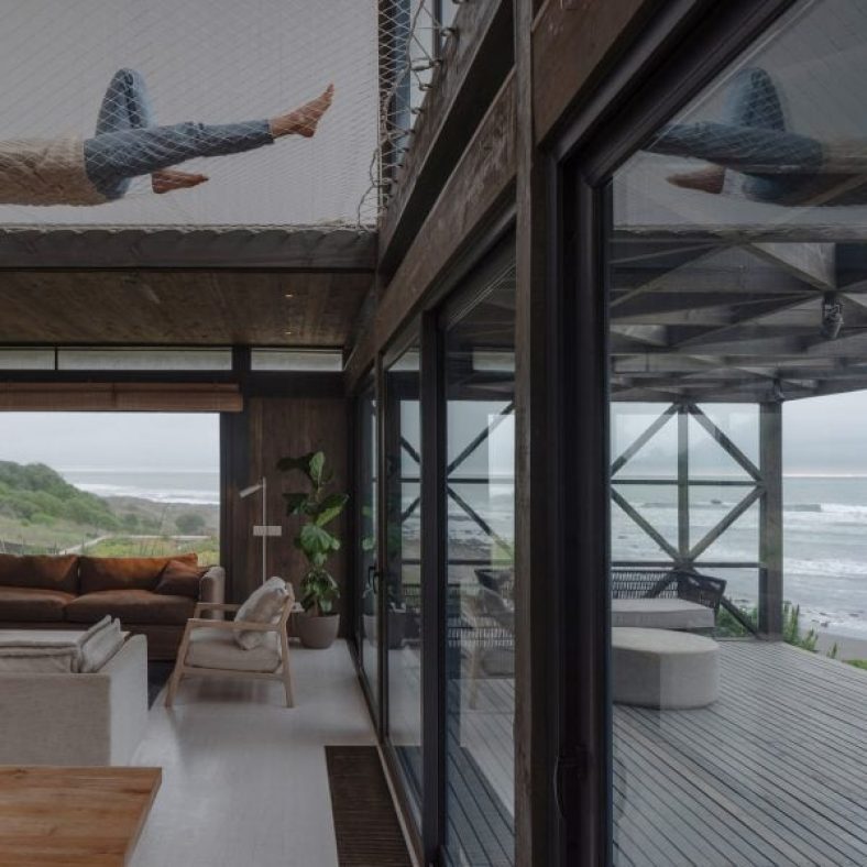
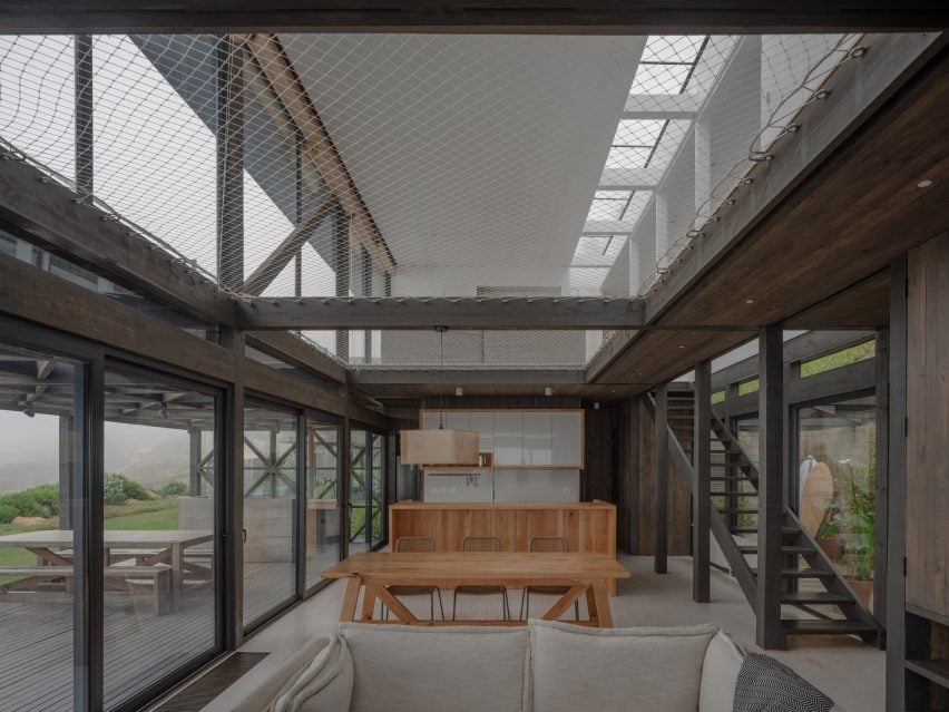
Chilean architecture studio Stanaćev Granados put two large cargo nets at the centre of this seaside house in Chorrillos overlooking the Pacific.
As well as providing an easily visible children’s play space above the open-plan living area, the net allows for a subtle transition between the darker wood cladding of the ground floor and the white-painted timber of the upper level.
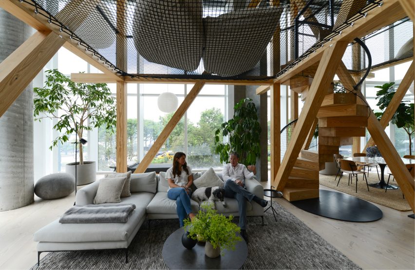
To make the vast living space of this apartment in New York’s West Village feel less chasmic, No Architecture constructed two “treehouses” from a series of timber beams.
Black netting strung between the beams creates an elevated chill-out space, accessed by a spiral staircase whose balustrade is made of the same mesh material.
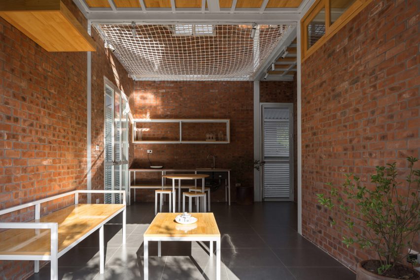
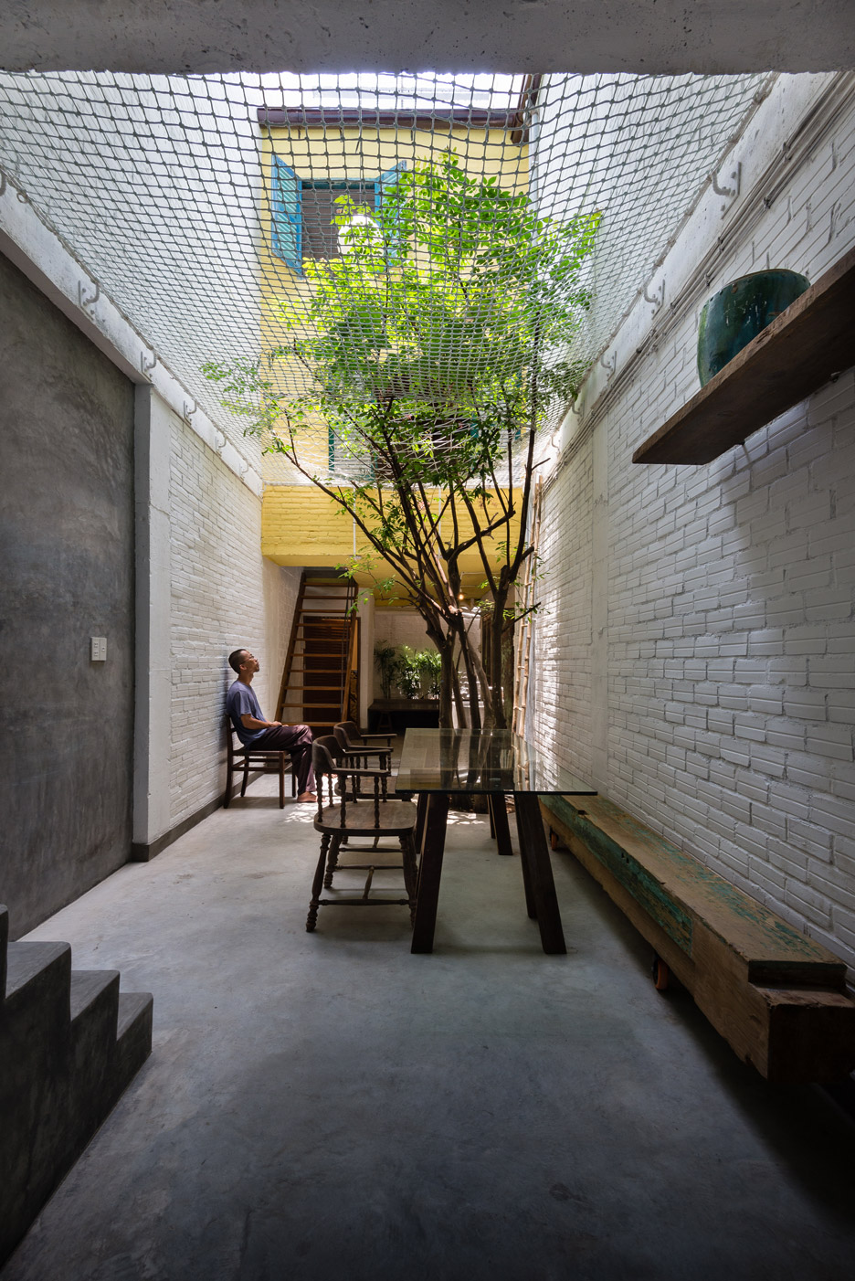
In this house in Vietnam designed by H&P Architects, a net floor contributes to the humble aesthetic created by its compact, open-plan layout and rough-and-ready materials like exposed brick and corrugated metal.
The net allows air to move freely through the home, helps to instil a sense of spaciousness and creates additional usable floor space.
Canadian studio Robitaille Curtis procured the expertise of famous circus company Cirque du Soleil to rig a trapeze-style net atop the high atrium inside this Montreal home.
The aim was to emphasise the drama of the space, with a tall bookcase accessed by a 5.5-metre ladder and vertical wooden slats also helping to direct the gaze upwards.
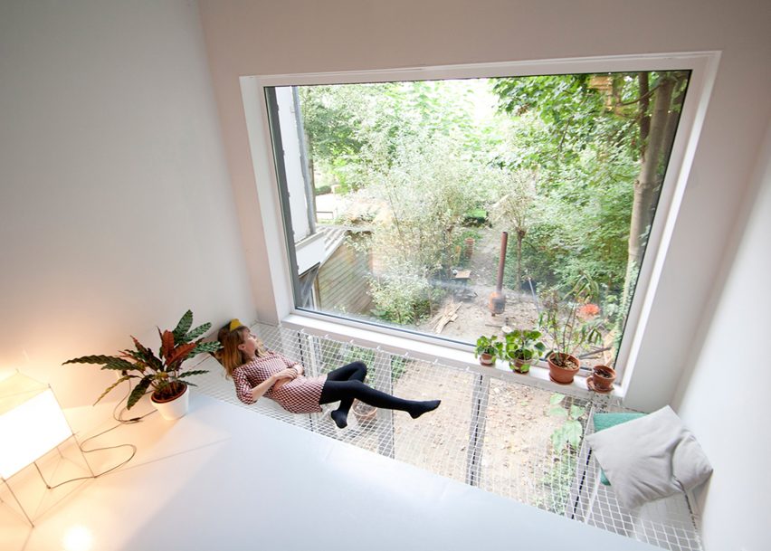
Dutch architects Gwendolyn Huisman and Marijn Boterman wanted to avoid “harsh boundaries” between living spaces in this skinny house in Rotterdam that they designed for themselves to live in.
To that end, they strung a modestly sized net next to a large window overlooking the garden, to act as a kind of static hammock next to the first-floor living room and above the dining room.
This family house in a forest near Helsinki features a number of child-friendly elements including a climbing wall, gymnastic apparatus and, of course, a net floor.
Local studio Ortraum Architects placed the net in a cut-out next to the first-floor landing, allowing light to filter down into the basement stairwell.
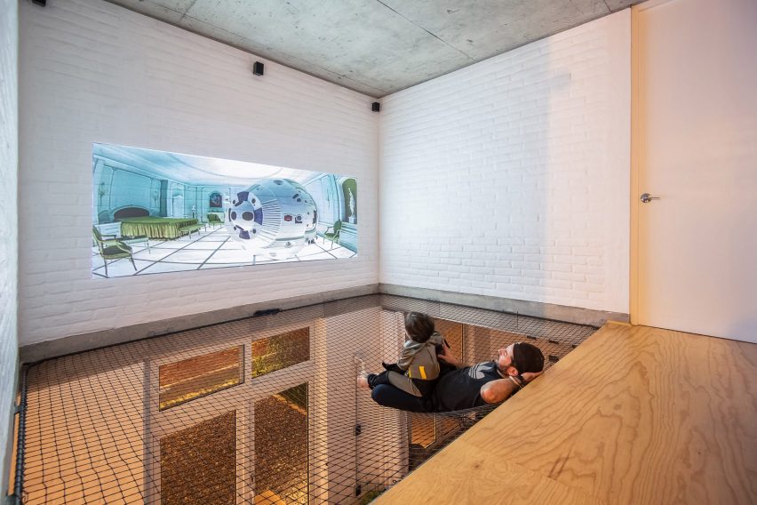
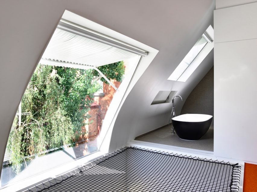
Austin Maynard Architects installed a netted platform with a view out of a large window and into the bathroom as part of its renovation of this formerly dilapidated stable in Melbourne.
The black mesh contrasts with the white corrugated metal of the window awning, the grey tiles of the bathroom and the orange carpet on the adjacent floor.
The large net in this Ho Chi Minh City house, designed by Vietnamese architecture office A21studio, is visible from almost everywhere in the four-storey building.
In addition to serving as a children’s play area, it helps create an impression of the ground floor as an outdoor courtyard – particularly as a tree bursts through the textile.