Hearing your dog whimper or yelp can definitely jar you. Seeing your pup limp can worry you. Witnessing your senior dog with arthritis gingerly walk up steps can make you cringe.
Like us, our dogs are not shielded from pain that is simply defined as any physical discomfort caused by injury or disease. Pain can be acute, such as suffering from a broken leg, or chronic, such as contending constantly with arthritis in the joints. And pain can definitely affect your dog’s behavior, shifting him from being energetic and happy to one who now hides, acts depressed or becomes a bit nippy if you touch a painful area on his body.
“Fixing pain is one of the most rewarding activities I’ve been involved in during my career, as it allows me to facilitate, enhance, lengthen and strengthen the precious family-pet relationship,” says Dr. Robin Downing, a veterinarian board-certified as a veterinary pain practitioner and canine rehabilitation practitioner, who heads The Downing Center for Animal Pain Management in Windsor, Colorado.
She points to a watershed moment during veterinary school in the 1980s when a professor advised to not take away all of the pain in dogs recovering from surgeries because the dogs would “move around and hurt themselves.”
“Even then, as a mere student, that did not sound right,” says Dr. Downing, who is now regarded as a leader in pain management for pets.
Fortunately for our dogs, pain management is garnering much-needed attention in recent years. The growing arsenal of pain-relieving options now ranges from medications, laser therapy, acupuncture, acupressure and hydrotherapy to joint supplements and basic warm-ups before vigorous hikes or runs followed by muscle- stretching cooldowns.
Let’s take a closer look at medications, therapies and supplements used for pain management. Here are four common medications prescribed to dogs to alleviate pain:
Prednisone
This steroid is used to replace or supplement glucocorticoids in dogs dealing with shock or Addison’s disease. It is also used as an anti-inflammatory for dogs experiencing pain, fevers or cancers, such as lymphoma.
“The pros of using a steroid are that it has great immediate effects of reducing pain and inflammation in our pets,” says Dr. Lindsay Butzer, a second-generation veterinarian at the Clint Moore Animal Hospital in Boca Raton, Florida, and PetMeds Partner. “The cons are that a steroid cannot be used long-term due to severe side effects, such as developing liver disease, Cushing’s disease, diabetes and because it suppresses the immune system.”
Tramadol
This opioid is used for pain control and blocks pain pathways in a dog’s body. It is often used to control post-surgical or chronic pain for dogs dealing with arthritis or hip dysplasia.
“The pros of tramadol are that it is a non-expensive pain drug with a wide margin or safety and minimal organ damage,” Dr. Butzer says. “The cons are that it can lower the threshold for seizures in dogs with a history of epilepsy and can cause moderate constipation.”
Gabapentin
This neuropathic pain medication is generally used as a sedative and pain medication. It helps keep dogs calm and relaxed.
“Gabapentin has been available as a low-cost generic for dogs for nearly 20 years,” Dr. Downing says.
Adds Dr. Butzer, “It has a wide margin of safety and there is very little organ dysfunction noticed on bloodwork after long-term use. The cons of gabapentin are minimal. Most dogs have no side effects.”
This pain category includes drugs Rimadyl, Galliprant, Previcox and Metacam — all formulated for dogs.
“NSAIDS remain the cornerstones of pain management, both acute and chronic,” Dr. Downing says. “They address pain and inflammation. There is no one ‘best’ NSAID, as the best NSAID is the one that works best for a specific patient.”
When paired with other pain-relieving products over time, veterinarians can safely lower the NSAID dose.
“This lowering provides potential protection of the organs responsible for clearing the drug from the body,” Dr. Downing says.
Major caution: Never give your dog human NSAIDs, such as ibuprofen or acetaminophen, as they can cause renal failure and even death.
“It is not safe to give your dog over-the-counter pain medicine, Tylenol or Advil for pain,” Dr. Downing says. “Ibuprofen is very toxic in dogs and can cause death. OTC meds from the human medicine cabinet are just not a good choice.”
Dr. Butzer acknowledges the rise in interest among pet parents to give their dogs CBD oil or joint supplements that contain glucosamine chondroitin.
“CBD has been used now for over a decade and has been showing great pain relief in pets with safe dosing margins,” Dr. Butzer says. “As for supplements, look for those with the NASC (National Animal Supplement Council) quality seal, as you can feel confident that this product comes from a company that is committed to quality and consistency.”
Dr. Downing says nutraceuticals are in their own class for pain relief in dogs but unleashes this advice:
“Buyer beware,” she says. “This is a relatively unregulated industry, although it has gotten better in recent years. We now have several safe and effective nutraceuticals that have study data to support their use.”
Verdict: Both say to always talk to your veterinarian before giving your dog any OTC product.
Expect pain management in dogs to continue evolving.
“Technology continues to advance, so who knows what additional options we will have available that utilize various types of energy or mechanics?” Dr. Downing says. “At some point, the holy grail of cartilage replacement will be discovered and that will be a game changer in osteoarthritis management.”
The healing power of touch can be effective in relieving pain in dogs. A pioneer in the use of
acupressure on pets is Sue Furman, PhD, founder of the Holistic Touch Therapy School of Canine Massage and Acupressure in Victoria, Texas.
“Acupressure is used to control pain, cure disease and promote healing,” Dr. Furman says. “The meridians or channels in a body are called Chi, which is considered life energy. When Chi gets blocked, it can initiate pain or discomfort or disease. If you stimulate particular points, you can initiate healing.”
For some canine patients, Dr. Downing combines the use of therapeutic laser (known as photobiomodulation) followed by acupuncture. She also has some pet parents use the tPEMF (Assisi loop) in between clinic sessions at home.
“All of these are safe physical modalities that play a role in canine chronic pain management,” she says. “They are safe, effective and grounded in good data.”
The beautiful kitchens you’ll find here represent the latest designs found in US households. designs. A kitchen is the most important room of any home. The spaces are designed with thee things mind: food preparation, cooking, and cleaning.
A report from the National Kitchen and Bathroom Association (NKBA) found that total kitchen spending had surpassed $67 billion in 2015, with $49.7 billion of that going to renovations.
View in gallery
A kitchen is the nucleus of a home. Work and daily life revolve around the space. It’s important that your kitchen is efficient first and foremost. Once you’ve figured that out, start focusing on designing a beautiful kitchen.
View in gallery
First, choose a base color. The color you paint the walls will greatly influence how your kitchen feels in the end. Once that is decided, you can choose which cabinet orientation gives the best flow and which flooring is the easiest to clean and if you should hang your pots and pans or store them in a cabinet.
100 Beautiful Kitchen Designs For 2022
There are a lot of decisions to make so take some time to scroll through these 100 beautiful kitchens to inspire your own kitchen makeover.
White Kitchens
The color white is the most popular kitchen color. With examples provided here, you’ll understand why.
1. Bright Kitchen
View in gallery
Designer Ann Decker knows that big windows make a white kitchen look bright and fresh, the way that white should look. So make sure you have plenty of natural light in your kitchen to set off the white walls.
la SHED should be applauded for creating this white kitchen. Focused on simplicity, it is a prime example of how neutral colors can complement each other.
4. Neutral Kitchen With Color Splashes
View in gallery
Here you have a bright yellow stove contrasting against dark cabinets and white walls. This color pop is an interior design favorite.
5. Dark Cabinets
View in gallery
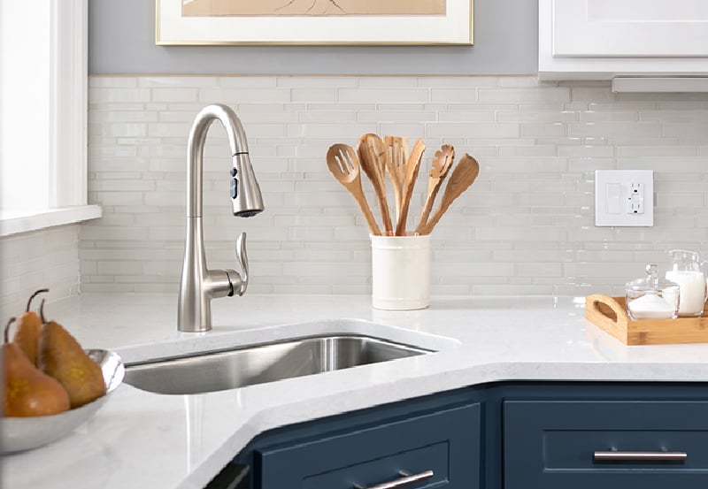
Just because your walls are white doesn’t mean your cabinets must be white too. Choosing a darker cabinet color like Brittany’s navy cabinets can set your space apart from basic kitchens.
6. Shiplap Rustic
View in gallery
Among beautiful modern kitchens, white shiplap is a favorite. When you cover your kitchen walls with it, you create a clean rustic look with similar wood tones. Courtney Bishop covers cabinet doors in shiplap for more continuity.
7. Kitchen Beams
View in gallery
Danish design company, Garde Hvalsoe, used wood with different shades to bring warmth into this kitchen. With beautiful traditional white kitchens, light wood hues are the best.
8. Wood Kitchen Flooring
View in gallery
Wood floors are popular in all kitchens, no matter the color. But by choosing wood for your white kitchen, you’re using a creative avenue to bring depth and texture into an otherwise plain space. Jen Langston chose a lighter stain for the floor to keep things feeling fresh. Beautiful farmhouse kitchens often feature white and wood colors, and with this example it’s easy to see why.
9. Warm Undertones
View in gallery
Those undertones say more than you think. If you’re are convinced to have white in your kitchen with shadowy corners, opt for a white with warmer undertones to make your space feel cozy and not dingy.
10. White on White
View in gallery
Naturally, we should all take a page out of POCO Designs‘ book and consider going white on white on white in our kitchens. White walls with a white floor and white cabinets put the focus where it really counts, on the people and the food.
Gray Kitchens
If you want a kitchen color that will curb your appetite, then go with gray.
11. Gray Kitchen
View in gallery
Gray gives us all the warm fuzzies with its homey color. So painting your kitchen in a shade of gray might just be the best option for a neutral but cozy kitchen that the whole family will flock to. (image from Ryan Wicks Photography)
12. Family-Friendly Kitchen
View in gallery
When you’re wanting to create a modern kitchen that is also family friendly, black or white is too stark when it comes to your color choices. Loves Interiors shows us that gray is much softer and yet still neutral enough to give your metallic pops and modern sensibilities.
13. Warm Gray Walls and Cabinets
View in gallery
When your home has wood floors, many times it just makes sense to keep the rest of your decor on the warm side. Like when Johnston Park Interiors used a lovely warm gray for both the walls and the cabinet. It’s a perfect kitchen for lingering over your morning coffee.
14. Sleek Gray Cabinets
View in gallery
Is your kitchen wall to wall cabinet space? That shouldn’t inhibit you at all. This kitchen by Modulnova Twenty painted all the sleek cabinet fronts a stormy gray to make them feel more accessible though no less modern.
15. Pastel Kitchen Colors
View in gallery
Since gray is basically pastel black, it seems only natural that you would lean towards other pastel colors in your gray kitchen. Light green, like the backsplash in this kitchen, is a soothing choice.
16. Bright Cabinets
View in gallery
If you’re feeling like the gray is too overwhelming, take a note from this happy Swedish kitchen and paint your cabinets a bright color that will complement your dusky walls.
17. Brick Flooring And Backsplashes
View in gallery
Yes, there are bricks that show off colors of black and cream and gray as well. When you’re dealing with those bricks in your kitchen, Dawn Hearn Interior Design teaches us to go for gray in the areas without bricks.
18. Gray Marble Kitchen
View in gallery
When you think of gray and chic, you probably come up with marble. Design practice De Rosee Sa uses marble to the fullest extent in this lovely gray kitchen. It doesn’t get much better than a completely marble kitchen island with seating and waterfall ends.
19. Boho Kitchen
View in gallery
In this example, Jill Frey Kitchen Design adds the basket shades to hanging pendants to give this kitchen a touch of personality.
If you want a soothing cooking environment, the color blue is just for you.
21. Blue Kitchen
View in gallery
Blue is a popular color, and is almost a neutral shade. Howell’s Architecture and Design covered the walls of this kitchen with blue tiles to bring out the relaxation.
22. Blue Cabinets
View in gallery
Blue tile might not be an option for your kitchen so you’ll have to find another way to get the color. Like painting your cabinet fronts blue. This kitchen shows us just how effective that can be when most of your kitchen space is covered by cabinets.
23. Blue Shades
View in gallery
Famous painter Claude Monet knew his colors. His kitchen is a prime example of how different shades of the same color can give your space lots of interest without feeling overwhelming. With beautiful vintage kitchens, you’ll notice how they aren’t afraid to take chances.
24. Navy Blue Kitchen
View in gallery
Navy is often overlooked and labeled too dark for many spaces. However, like EMI Interior Design suggests, being a darker color that isn’t black can make other elements in your kitchen really pop.
25. Pale Blue Kitchen
View in gallery
On the other end of the spectrum, many think that light blue only belongs in a nursery. Angie Keyes uses a pale blue to infuse this kitchen with some serious cottage vibes.
26. Blue Monochrome Kitchen
View in gallery
Sometimes you find a shade of blue that you just love so much and wish you could paint everything in sight that color. Plain English Design used the same shade to paint both walls and cabinets to create a very traditional feel in this traditional kitchen.
27. Blue Countertops
View in gallery
Here’s a kitchen that gets it right by giving the counter and backsplash a seamless surface. Beautiful galley kitchens are easier to create if you have a narrow cooking space, like this example. You can even have your kids help you keep that pretty blue countertop clean.
28. Tiny Tile Backsplash
View in gallery
You might think that smaller tiles belong in the bathroom, but Wynne Taylor Ford shows us otherwise. The backsplash in this kitchen is just stunning while the other blue accents pull the whole room together. Beautiful coastal kitchens often feature blue hues and light wood colors. When combined, colors offer a soothing effect.
29. Rustic Kitchen Backsplash
View in gallery
Blue looks great in texture too. The wavy surface and gradient tones of this backsplash really bring out the rusticity of the kitchen. Alexander and Co. definitely chose well when deciding what works best with those wood cabinets.
30. Beach Turquoise Kitchen
View in gallery
Let’s not leave out turquoise. Such a popular color is a great option for the kitchen as well. Greg Terbrock Design Build really went all out on this bright and happy kitchen. You would almost believe it’s a beach house.
Red Kitchens
31. A Modern Red Kitchen
View in gallery
When many people think of a red kitchen, a country kitchen comes to mind, complete with plaid valance and a rooster cookie jar. But this inspiring kitchen by Roselind Wilson Design shows us that red can absolutely complete a modern kitchen too. With minimal lines and shiny cabinet fronts, it banishes all thoughts of roosters from our minds.
32. Eclectic Red Kitchen
View in gallery
Red is a fun color for eclectic kitchens as well. Amazing Spaces’ choice of the bright lipstick red for these kitchen cabinets is a bright invitation to hang out and create together as a family.
33. Wine Red
View in gallery
Maybe you like red but you’re worried about putting it in your kitchen. Opt for a darker wine red instead. The backsplash in this Chai Design kitchen is just dark enough to feel chic and classy instead of bright and punchy.
34. Red and Black Kitchen
View in gallery
Speaking of chic and classy, Rysso Peters knows how to take chic to the next level. This contemporary kitchen uses red and black to give your eyes a good contrast. It will make you feel like your kitchen is much more expensive than it is.
35. Easy To Clean Kitchen
View in gallery
For a lighter look with the same eye drawing red, try this trick like Nissen Richards Studio. Paint the wall above your counter in your chosen shade of red and install sleek clear panels over top. You’ll get exactly the red you want in the modern style you want and still get the easy cleaning.
36. Tiled Backsplash
View in gallery
Not the DIY type? Then go for the tiled backsplash instead. Martins Camisuli Architects knows that just the pop of red will allow you to add all the red accents you want.
37. Spanish Kitchen
View in gallery
There’s just something about a Spanish styled kitchen that makes you want all those spicy nachos. These red cabinets in this Cheryl Ketner Interiors kitchen lay the foundation for the best Spanish styled kitchen you’ve ever seen. Just add terra cotta.
38. Purple And Deep Red Color
View in gallery
Of course, if the bright red doesn’t appeal to you, add a touch of purple to the paint for a deeper wine red color like these Harvey Jones Kitchen cabinets. Suddenly your kitchen will become the space for all your selfies.
39. Lipstick Red Appliances
View in gallery
Bright red is the color of retro. That’swhy they chose to install the lipstick red appliances in this retro kitchen.
40. Deep Country Red
View in gallery
But we can’t leave out that red french country kitchen because it’s not all bad. The kitchen in this Johnson Berman lodge is the perfect mix of deep country red and natural wood tones. Just where you want to be, sipping hot chocolate on a snowy evening.
Green Kitchens
41. A Calming Green Kitchen
View in gallery
Green, like blue, is a color many people gravitate to due to its calming properties. So if you are an experimental cook, painting your kitchen a lovely shade of green like this kitchen from Carlyn and Company Interiors and Design can help you relax while you’re working out the perfect cake.
42. Balance Out a Busy Kitchen
View in gallery
Rustic kitchens that contain a lot of natural textures like wood and stone can really benefit with a calming color to balance out the busyness. JKA Design infused this kitchen with a pale leafy green by giving the wood cabinets a once over, but only a once over so the wood grain still peeks through.
43. Modern Green Kitchen
View in gallery
Green is also a great shade for modern kitchens. Just raise the brightness a bit to get more pop against your modern style and, like Kitchen Designs by Ken Kelly Inc. already knows, you’ll have the best kitchen on the block.
44. Pair Marble With Green
View in gallery
You’ve probably already figured it out, but marble pairs so well with cooler colors. Greg Natale uses green for the cabinets in this marble covered kitchen which creates a very classic feel. Proof that green can solve so many problems.
45. Green Tinted Countertops
View in gallery
If you’re really serious about marble, you’ll be thrilled to see this green tinted countertops. Elegant Kitchens and Baths Inc. found an unexpected way to put more green into this kitchen and still keep the clean white look. A win win for everyone involved.
46. Opt for a Deeper Green Shade
View in gallery
Balt Atelier Limited opted for a deeper green than you see in most kitchens. But the dusky hue totally complements the modern additions without losing the traditional feel. It’s the perfect shade for a kitchen in an older home.
47. Green Farmhouse Kitchen
View in gallery
Farmhouse kitchens might be one of the most fun to decorate due to the simplicity and practicality of the space. Donald Lococo Architects covered everything in the same pale shade of green to create the image of continuity while still being the cutest kitchen ever.
48. Bright Backsplash
View in gallery
There’s nothing like a bright backsplash to stand out against your wooden cabinets. The bright green of this Nico van der Meulen Architects kitchen really stands out and makes the modern space seem more friendly.
49. Retro Kitchen
View in gallery
If walls, cabinets and backsplash weren’t enough, you can also put green on your kitchen floor. Design Studio West wisely uses green and white linoleum to keep the retro feel in this kitchen but the green creates less of a contrast than using black and white.
50. Sea Green
View in gallery
When all else fails in your little beach cottage, go for a sea green theme. This Mark Williams Design Associates kitchen is just the place you want to come into after a romp at the beach.
Black Kitchens
51. Chic Black Kitchen
View in gallery
When you hear the word chic, most likely you think of something the color of black. So when we say that black kitchens are the chicest you can get, you probably have no trouble believing us. This black kitchen by Surroundings creates a space that feels close and cozy.
52. A Black and Marble Kitchen
View in gallery
Black and marble? You betcha. Blakes London takes a dusty black and covers the beadboard of this kitchen with it. With those marble countertops and backsplash, you can have a date night in a kitchen like this no problem.
53. Black Cabinets and Matching Walls
View in gallery
Now here’s a kitchen that embraces all the black. Not only did they paint their walls in the blackest shade they could find, they also swathed the cabinets in it. It creates the perfect space to host cocktails on summer evenings and nurse hangovers the next morning.
54. Opt For a Black Floor Instead
View in gallery
Opting for a black floor instead of black walls will definitely help ground your space. In this kitchen they even installed black cabinets and appliances. When you’re wanting to make a statement, this is how to do it.
55. Black and Stainless Steel
View in gallery
So many modern kitchens are styled in white and stainless steel for a clean cut effect. But what if you used black to make your kitchen stand out from the rest of your home, like this one by William Burton Leopardi? You would definitely bring a new level to your modern styling ideas.
56. A Rustic Black Kitchen
View in gallery
Even rustic kitchens can boast black in some pretty spectacular ways. Katrin Arens embraces the shade in lieu of backsplash in this rustic space. Next to the wood, it brings a bit of industrial style to the table.
57. Black and Yellow Kitchen
View in gallery
While most people resort to white to show off a popping color, maybe you should consider black instead. Especially if you have a bright shade like the yellow in this Atticus and Milo kitchen, black can really give your favorite color the punch it needs.
58. Fun Textured Black Wall Tiles
View in gallery
Oh it’s blackest black, but those tiles have a wavy surface that make the black seem more approachable. Francois Berube Interiors uses them to make a statement among the glowing white cabinetry.
59. Smooth Black Subway Tiling
View in gallery
In a rustic kitchen that needs an inky statement, you don’t want the smooth black subway tile. So Erin Swift had the right idea when she chose a black backsplash with all that texture.
60. Modern Industrial Kitchen
View in gallery
Standard Studio definitely puts together kitchens that are anything but standard. All the sleek black cabinetry gives off the most modern vibes with just a touch of industrial charm. Perfect for the homeowner who’s looking for contemporary and natural at the same time.
Orange Kitchens
61. Happy Orange Kitchen
View in gallery
There is a slight problem for certain homeowners. When your favorite color is orange, it seems rather discouraged to decorate with it. However, the kitchen can be the perfect place to infuse with such a happy color, like this beauty with sleek cabinets from Applegate Interior Design Project.
62. Pair White and Orange Together
View in gallery
This kitchen by Dyna Contracting is proof that you can get a tile in any color you like. The orange here is not too bright to be glaring against the white cabinets but not too dark as to look like bricks either.
63. Fun Orange Accents
View in gallery
On the flip side, when your cabinets are a darker shade like these wood ones, you can get away with the brightest shade you can find. The popping orange of this kitchen makes the whole space feel bright and modern, a place to make you smile first thing in the morning.
64. Mid-Century Modern Kitchen
View in gallery
Orange is the reigning color of midcentury modern decor. But instead of covering the walls with it, Kropat Interior Design opted for orange countertops instead. We still get the midcentury modern feel but we aren’t accosted by orange either.
65. Reddish Orange Shade
View in gallery
Orange doesn’t have to feel midcentury modern. It can definitely be just plain ol’ modern, like in this sleek kitchen. The reddish orange paired with wood cabinets feels warm and welcoming for all your entertaining needs.
66. Orange Cabinets
View in gallery
Backsplash isn’t the only way to put orange in your kitchen. Orange cabinets like these in this Mark English Architects kitchen can be a great way to use your favorite shade in a space you inhabit for many hours in a week.
67. Bold Orange Appliances
View in gallery
For the diehard orange enthusiasts, did you know that they make orange appliances? Kingston Design Remodeling did and they utilized that resource to find a fridge that perfectly matches the orange backsplash in this tiny kitchen.
68. Orange Accent Wall
View in gallery
With a bit of orange paint, you probably can’t go wrong. By giving your kitchen an orange focal wall like this Covenant Kitchens & Baths, Inc. kitchen, you can easily imagine it’s summertime all year round in your bright happy space.
69. Pretty Orange Tiles
View in gallery
Isn’t that tile just glorious? The orange design chosen by Blossom Studio for this kitchen goes perfectly with the rest of the pastel shades in the home. It’s a great example of how orange can match with anything.
70. Orange Glow
View in gallery
Copper has been the in metal for a long time. Lucky for you orange people, it can give off an orange glow in your kitchen. Get stylish with this idea from Murdock Solon Architects and use copper as your backsplash. No need to decorate the rest of your kitchen because the copper alone will take your breath away.
Brown Kitchens
71. Gray Tinted Brown Kitchen
View in gallery
If you’re not quite ready to let it go, consider a gray tinted brown for your kitchen. Greige is a beautiful soft shade that will seemingly wrap you in a hug while you cook for your family, like this kitchen by Carter Kay Interiors.
72. Kitchen Art Space
View in gallery
If you look hard enough, you’ll notice that this kitchen is a work of art. Put white cabinet doors on dark brown cabinets for a spectacular contrast against against all that chocolatey brown.
73. Brown Shades
View in gallery
Marigo Design utilizes brown in several different shades in this lovely traditional kitchen. The light brown backsplash complements the cream cabinetry while the deep brown island table really stands out. And then there’s the wood floor underneath to bring it all together.
74. Dark Brown Cabinets
View in gallery
Take advantage of the light brown and install dark brown cabinets to give yourself a break from beige, like in this kitchen.
75. Dark Brown
View in gallery
Of course, you aren’t stuck with only light browns and dark cabinets for brown options in your kitchen. Feel free to follow A3‘s design and paint your walls a darker shade of brown to stand out against your white tile.
76. Brown Backsplash
View in gallery
We have to revisit the brown backsplash concept for a second because this kitchen is on point. Charisma chose a tile backsplash that includes five different shades of brown to pull together the other shades in the room.
77. Modern Kitchen
View in gallery
Modern kitchens require creative kitchen layout designs to help you keep a warm and homey feeling without losing the contemporary beauty. This kitchen by Rob Kennon Architects utilizes plywood to bring that textured brown into the space but keep things light and airy.
78. A Rustic Brown Kitchen
View in gallery
Rustic kitchens might be the best examples for brown kitchens. Holmes Hole Builders covered these kitchen walls in rustic wood for a quaint and cabin feel. The variating brown shades and all that wood grain really give this place a family friendly vibe. The blue kitchen island offers stability.
79. Rustic Wooden Kitchen
View in gallery
Talk about cabin vibes. This kitchen by Jersey Ice Cream Co. took a whole barn’s worth of rustic wood to put in the kitchen. It’s such a unique warm look that’s perfect for a little house in the woods.
80. Bright Cabinet Fronts
View in gallery
This Dorrington Atcheson Architects kitchen has a mid-century modern feel to it. The shade of wood against the bright cabinet fronts and built-in open shelving offers plenty of inspiration.
Yellow Kitchens
81. A Sunny Yellow Kitchen
View in gallery
Yellow kitchens just belong in happy houses, like this kitchen from Cottage Company. That butter yellow is the perfect shade tone to drink your coffee to every morning.
82. Contemporary Yellow
View in gallery
MN Builders shows us how yellow works in contemporary kitchens. The color combines the sleek lines of modern design with the traditional look of older homes.
83. Yellow Kitchen Cabinets
View in gallery
Think outside the box when painting your kitchen yellow like this example from McCall Design. Instead of painting the walls, they painted the cabinets so they could add a nice clean subway tile backsplash.
84. Yellow Kitchen Tile
View in gallery
Or… just find yourself a pretty yellow tile pattern to serve as your backsplash and all your food pictures on social media will include a dose of yellow. In this Adrienne DeRosa kitchen, there are two shades of yellow to bring some happiness to the eyes as well as the soul.
85. Yellow Statement Wall
View in gallery
Kitchens might be the best places to take advantage of the statement wall, probably because there isn’t much wall to begin with. Go for a brighter shade of yellow like this Lynda Miehe Associates kitchen and you’ll never be short of smiles while you cook.
86. Bright Yellow
View in gallery
If you aren’t a shy decorator, follow the lead of this contemporary kitchen and find the brightest yellow you can muster for your main kitchen color. This works for small kitchens that occupy a little corner of the house.
87. Yellow Retro
View in gallery
In this retro kitchen, designed by Jackson Design & Remodeling, butter yellow swaths the walls, backsplash, countertop, and floor. They even found pale yellow appliances to match, the real retro way.
88. Classic Kitchen Upgrade
View in gallery
In this example, Hendricks Churchill uses a bright sunny shade to cover the cabinets and trim in this farmhouse design. Rustic pendant light fixtures hand over the island to create a balanced look.
89. Pale Yellow Cabinets
View in gallery
Adeeni Design Group took a kitchen and breakfast nook and brought them together with pale yellow custom cabinetry. Against that marble countertop, it feels so classic and traditional.
90. Honey Yellow Cabinets
View in gallery
In this example, honey yellow cabinets are the perfect choice. The cabinets cover the bottom of the kitchen counters.
Pink Kitchens
If you want a feminine and fun touch, pink is your color.
91. Girly Pink Kitchen
View in gallery
This beauty by Jessica Buckley Interiors is extremely girly with its striped cushions and floral shade. Just right for a bachelorette’s apartment.
92. Pink Statement Wall
View in gallery
Pink is another great color for that. Here’s a kitchen that utilizes clear panels for the illusion of pink backsplash when it’s the wall behind them.
93. Bold Pink Cabinets
View in gallery
If you can get away with pink walls, why not pink cabinets instead? The glossy finish on the pink cabinets in this Leicht Westchester-Greenwich kitchen takes the feeling from baby nursery to modern chic.
94. Blush Kitchen
View in gallery
If your kitchen resembles a nursery, tone it down with a blush color. Middleton Bespoke Interiors knew that the warmer shade of pink will blend with the wood tones in this rustic kitchen.
95. Peach Kitchen
View in gallery
Take your blush, add a little orange tint and you’ve got a pink that’s very close to millennial pink, punchy, and pretty at the same time. Gisbert Poeppler pairs their pink with chic shades like black for a grown up look in an otherwise girly space.
The entire space offers a sleek hot pink element with a backsplash. It’s like creating the best accent wall you’ve ever seen.
98. Texture Space
View in gallery
If you have a pink kitchen and want a surface with the same color, this example by Mal Corboy Design offers plenty of inspiration. The surface adds texture to the space without making the surface hard to clean.
99. Pale Nursery Pink
View in gallery
Maybe you like the pale nursery pink. If that’s just your style, take a note from A1 Lofts and Extensions and embrace it. You’ll be happy to know that they even make pink appliances to fill your need.
According to the NKBA, kitchen remodels range between $1,000 for a single replacement to $20,000 for a complete remodel.
What Is The Most Popular Kitchen Renovation Item?
According to the NKBA, almost 50 percent of total kitchen renovation spending went to appliances and cabinetry. The average reno job cost roughly $4,000.
Which Kitchen Colors Impact Eating Habits?
Psychologists have found the color red will increase your appetite. If you want a color that will lower your appetite, gray would the best choice. And if you wanted to lower the rate at which you consumed food, the color blue would do the trick.
Which Kitchen Cabinet Style Is Most Popular?
Natural wood oak cabinets are making a comeback in US households. They were popular in the 50s, but it seems they’re becoming even more popular today.
Beautiful Kitchens Conclusion
The best kitchen design is one that is most efficient for your home. When painting, whichever color you choose, it will transform your space. Whether you are looking to create a contemporary or traditional kitchen design, you’ll find an idea here to help inspire your next beautiful kitchen makeover.
Tap your inner interior designer and don’t be afraid to let your imagination run wild. You know what’s best for your own kitchen. Feel free to incorporate the themes from your surrounding rooms.
Ever since we created our garage gym (AKA, the Barn Box), I’ve been crafting the perfect home gym playlist. The track list is a little bit funky, a lot 90s, a bit grungy, occasionally hipster, and a whole lot of booty-bopping fun.
With a little more than two hours of high-energy tunes, this playlist pairs well with just about any workout you’re doing — be it heavy weight-lifting, cardio, HIIT … anything! Heck, turn it on and dance your heart out. THAT could be your workout!
The rigors of the US presidency — anchored by a sprawling economy, consequential world affairs, and the necessity to remain in touch with millions of people — are a challenge for any individual who seeks to sit in the Oval Office.
President Joe Biden, who represented Delaware in the Senate for 36 years before serving as vice president for eight, knows the complexities of the office like few other people — owed to his years of lawmaking and current residency in the White House.
But as The New York Times recently reported, several White House aides keep an eye on the 79-year-old commander-in-chief, cognizant that he is attuned to official affairs, while still remaining mindful of his vigor.
“His energy level, while impressive for a man of his age, is not what it was, and some aides quietly watch out for him,” The Times reported.
The report stated that Biden sometimes “shuffles when he walks,” with some aides concerned that he could potentially fall at times. It also noted that some aides “hold their breath” when the president speaks during public events, hoping that he will get through his remarks without any major gaffes.
If Biden were to be reelected in 2024, he would be 82 years old at the time of his inauguration in January 2025, and he would be 86 at the end of his second term.
In recent months, some Democratic voters have expressed concerns with Biden’s age, with more than a few pointing to his more moderate and congenial brand of politics, which has fallen out of favor among the most fervent partisans who have been elected to Congress in recent years.
However, Biden has said that he intends to run in 2024, which could potentially set up a rematch with his 2020 opponent, former President Donald Trump.
Since my last post there’s been so many DMs about Skin + Me! You lot are full of questions about actives. When to start. What do they do. Are they safe. As it’s been so popular, they’re extending the exclusive 40% discount with a free trial of their cleanser and moisturiser, especially for us skin freaks!
To recap, I started using Skin + Me to treat hyperpigmentation and skin ageing. I recommend starting actives if you want to:
Treat a specific skin condition like acne, hyperpigmentation or rosacea.
Unclog pores and make them less visible. They’re not going anywhere but we can make sure they are de-clogged and avoid breakouts – thank you very much.
Reduce fine lines and wrinkles. Another battle we’re not winning, but we can do it (dis)gracefully and with confidence.
Improve elasticity and texture, aka get that glow. Light bouncing off a supple even texture and yes, actives can do that for you.
Boost collagen production. Collagen is the scaffolding that holds your skin up. I won’t insult you by saying anything else.
Reduce abnormal pigmentation. For PIH, hyperpigmentation or melasma actives and SUNSCREEN are the key.
Skin + Me offer free reformulation (at anytime), plus you can check-in with the dermatology team as often as you need so there’s ongoing expert support to put your mind at ease.
I’ve used the product on and off for almost two years now, so if you’re scared about starting actives… DON’T BE! Skin + Me is perfect for anyone nervous about taking the plunge because they start you out on low concentrations that gradually and gently build up over time. Plus their new barrier-boosting cleanser and moisturiser help your skin adjust to powerful actives.
Sign up before 28th of July 2022 and use code SKINFREAKS40 for 40% off your Daily Doser plus you can add a free trial of cleanser and moisturiser to your basket during sign up!
During our Zoom call last year, she was seated on the floor of her newly rented Cardiff flat, where she had finally been able to fulfil her long-standing dream of living by herself. “This is the first time I’ve lived alone, and I love it. It’s a whole new state of independence and excitement!” she exclaimed of this definitive milestone in her life. Within minutes, she opened up about a host of personal topics, including self-evaluated lapses in judgement. The earnestness was rimmed with a nervousness that I found surprising, given that she’s been talking to the press on and off since her teenage years. Yet she also drew succour from the more difficult lines of questioning, using the interview process as an instrument to leaf through and critique her trains of thought, in an effort to reaffirm her truth.
“I wouldn’t say I’m a private person,” she reflected. “But I’m not willing to go the conventional route and do every single interview, and it’s because of this moment at one of my gigs in 2017. The whole crowd was singing along to the words of my songs — which I hadn’t even put out in an album. I suddenly got a feeling and went, ‘Oh shit, this is a big deal!’ I realised that people are listening. And it hit me that this comes with a lot of responsibility.”
Singer-songwriter Aditi Saigal, who goes by her stage name, Dot., often finds herself at a tricky crossroads. Between promoting her material and stepping back to protect her privacy, between giving into lucrative corporate offers and preserving her values. Between obligation and free will. Ego and education. “It’s a give and take between what I want to create and what I have the freedom to create,” she tells me straight up.
Despite a self-admitted “tendency to seek the spotlight”, actually being in it took Saigal some getting used to. When her casual social media upload, Everybody Dances To Techno, went viral in 2017, she was 19. Along with widespread recognition came public glare and a multitude of pressures: to perform, to put out new music. And after a slew of gigs, when it became overwhelming, she found herself retreating from the same technology that had brought her fame. She resurfaced on her professional Instagram and YouTube channel after two-and-a-half years, a few months ahead of the release of her litmus test of a debut EP, Khamotion, which dropped in mid-July last year to positive reviews.
Image Courtesy: @dotandthesyllables/Instagram
Intentionally stepping away from the media arc lights that were trained on her — instead of capitalising on it — and coming back with an album she co-produced with like-minded collaborators, was a rather purposeful, maybe even prescient, move that belied Saigal’s years.
Her stellar debut EP certainly proved that good things come to those who wait but, more importantly, the time off provided her with a much-needed reset, equipping her with the tools to adjust to life in the limelight and replenish her creative juices. And now, having squared her shoulders, the 23-year-old is perfectly poised to create new career trajectories, as is evident in the recent reveal of her role in Zoya Akhtar’s newly-announced Netflix musical The Archies. The lack of over-exposure could have been a factor in her being cast as well, considering that one of the draws of the film is that it will be the debut vehicle for a bunch of young faces, and it does, interestingly, indicate a break from Saigal’s erstwhile reticence.
*************
I find Khamotion brimming with flavours: sweet, zesty, saucy, bittersweet.
The sheer power of her propulsive vocals, which she can slow down in the blink of an eye to create a sense of ebb and flow, coupled with her natural ability to alchemise words into poetry, resonates with me. It dawns on me that she is well attuned to her substantial talent, which is like second nature to her.
Don’t You Worry from Khamotion
The seven-track EP that is infused with elements of jazz and pop will take you on an exhilarating joyride that will leave you breathless. Engaging lyrics suffused with cheekiness — Somebody call Grace, pulchritudinous face, such beautiful hair, head as empty as air — are thrown in for ballast. In the love song Taxi Fare, where she goes — I don’t even care ’bout the taxi fare, forget about the tab, let’s just sit and gab for a while, I’ll be keeping all your memories, don’t need trinkets to put me at ease, and tomorrow if you forget me, I won’t believe you darling — she could well be alluding to the costs of journeying into stardom, which she lightly tosses aside in favour of her fondness for her niche organic fanbase.
The name Dot. was inspired by her mother (actor and theatre practitioner Shena Gamat), who had impressed on her the importance of the unassuming symbol while drawing dots outside the lines in a colouring book — Saigal recalls that she had only been 12 or 13 at the time, but this stayed with her. Dots, her mother had told her, increase the interest quotient. I suppose this is especially the case when they lie outside a formalised structure, defying its limits. Not unlike Saigal.
Dots, in my head, can be aesthetic or functional. Raza saw the bindu as a focal point. They could also signify an ending. Or, as in the case of an ellipsis, a pregnant pause or an unfinished thought. All of it signals the inevitability of re-emergence….
Edited excerpts from a Zoom conversation
Where do Dot. and Aditi Saigal intersect? Dot. is my stage name. But when I moved to the UK five years ago for university, I started introducing myself as Dot. Back home, everyone knows me as Aditi. I have been struggling with this identity question because they intersect all the time.
I’m the same person. I don’t change my personality depending on where I am. It is….[breaks off] What is it? It is a hard question. I changed my name because I thought I can be whoever I want in university — I could start over. If you’ve seen videos of me back then, I had a boy-cut. So, I cut my hair, and I changed my name. This is the first line of my song, Sunny Days — I’ve cut my hair and changed my name — and the line refers to this time in my life. I didn’t really change in terms of who I am, but I definitely gained confidence. Dot. represents a new me that is more present and self-aware.
What did you learn about yourself after going viral at 18? One, I have a tendency to seek the spotlight and think that I am a lot more than I am. I have to be very careful not to cross that line. If I start thinking that way, then the music suffers. And this has happened. After one-and-a-half years of being in the spotlight, I found I couldn’t really write. I need groundedness. And the second learning was that I am very self-aware. If I wasn’t, I would probably have continued on that path. I don’t know if that would have been a good idea for me as a person. Could have been great for my career…. I went to counselling, and I’m much better for it. And I’m really thankful that I caught myself at that point.
What are you trying to communicate about yourself through your online persona? It’s all about the music. I want to write music, and I want to perform and record it. I’m not really that fussed about whether I’m the next Madonna, and I’m largely doing it for myself. To some extent, I do want to make my channel bigger, but it can’t rule my life or be the main concern. It may sound cocky, but it’s actually coming from a place of honesty. Also, I’m a person before I am a musician, and that thought informs my approach to social media; I have to take care of myself even if it means going against the grain. So, when I share about how my plants are doing or about my crochet projects or my private space, it is really personal. I have pondered over it. The main reason I want to present this side of my life to the public is because there has been this narrative that has been shoved on me. There is a “passion narrative” when it comes to artistes. You only do music and that’s your whole life, you have to live and die on this promise of fame. My music is fed by these other aspects of my life. And there’s this famous quote — famous in my family — by the guitar player of HFT, Arjun Sen, a family friend, who says that you can only play what you have lived. It speaks to me.
Your fans often write to you and engage with you. What are some of the issues that concern you about social media, given the importance of internet presence in this day and age? Internet presence is everything; image is everything. And you can look at that in a negative way or you can take that as a positive, which is what I’ve decided to do. So, I’m thinking if internet presence is such a big deal, then how do I keep checks and balances so that I’m not losing myself in the chaos that is the internet? I’d rather talk to the few who are invested in connecting with me than millions who are half in it. My fans are dedicated, and they know obscure songs which I have taken down from YouTube or my SoundCloud that hasn’t existed for a long time now. On social media, there’s a huge temptation to slap on a filter, but for my own self-image, it was important for me to portray my real self.
I gathered from one of your Instagram posts that you can also sew clothes. Is this a new creative hobby? Are you a slow fashion enthusiast? I am trying to learn how to sew. I’m in the process of sewing a dress out of muslin [holds it up]. I don’t talk about it much but slow fashion has had a huge impact on my life. The shirt that I’m wearing is a charity shop shirt. I try to shop second-hand or sustainably when I can afford it. I have a capsule closet so I don’t overbuy; I used to have a lot of clothes but I chose to scale down. I try to make conscious choices and while sewing is a part of that, I don’t have a knack for it, like I do for crochet.
Image Courtesy: @dotandthesyllables/Instagram
Is it scary on some level to have people know so much about you? And especially before you had even come out with an album — before Khamotion happened? It is, because people know quite intimate details. I haven’t received a lot of hate, which will be another struggle when it comes — I’m sure it will come at some point. The bigger you get, the more that tends to happen. On the other hand, I’ve also had some deep, intimate conversations with complete strangers. Sometimes, I take screenshots and put them in a folder. These kinds of exchanges outweigh the fear and discomfort I feel about having my life out there.
What’s the story behind the name of your EP? “Khamotion” is basically a portmanteau of khamoshi [silence] and motion. And it’s essentially a simple but complex idea of being still but moving. Being peaceful and quiet but simultaneously rushing. Practically, what it embodies is a mode of transport. When you’re sitting in a train, it is moving but there’s a kind of a rocky silence. I love being on modes of transport — even just taking the bus or auto somewhere. What inspires me normally are the really ordinary things. Khamotion embodies the magic in the ordinary. So, it’s those kinds of juxtapositions.
It can also apply to contradictory life aspirations — the hustle and bustle, and slowing down; the applause and the quiet; materialism and inner peace. Are peace and ambition at odds with each other? Spot on.
Since we know that the idea of Khamotion was sparked during a commute to college and the experience of taking public transportation formed the larger inspiration behind the songs, how would you articulate your feelings about the pandemic when that part of life came to a stop? It’s so all-encompassing that I can’t fully comprehend it although I’ve had it so much easier than so many. A lot of my listeners have claimed that the song This Train has held a very strange significance during the pandemic, even though it was written before [the pandemic]. The idea of having to keep on moving, regardless of the fact that the world is completely frozen, has echoed for a lot of people. Life goes on, and although it’s a lot harder now, we have to carry on. I haven’t been able to see my mother in two years because of the pandemic. I’m lucky that I’m not a social creature, that I’m comfortable being on my own.
I could describe your sound as blues- and jazz-inspired. How would you (though I know you may not want to label it as a musician)? I used to claim that my music doesn’t belong to any particular genre, but I don’t think like that anymore. When you’re writing a book or an essay or a short story, half of the work is done by the writer and the other half by the reader. The work is not complete until the reader has read the words on the page. This philosophy borrows from the theory of Constructivism, which states that learning or interpretation happens exponentially when the learner has absorbed the learning as an active participant. Then, the cycle is complete. I put out whatever music comes to me — without thinking of the genre when I am writing — and my listeners have said that my music has got a bit of jazz, blues, pop, rock and, sometimes, soul or funk as well.
Who were your collaborators on this album? The album was such a great experience because of my collaborators. They took me out of my musical rut. I went in there with a head full of ideas of what I wanted, but I was also open to what the others could add.
I co-produced the album with James Gair, a fabulous recording and mixing engineer, who provided a lot of creative inputs.
Then there’s this band called The Armchair Captains, who are friends from university but now based in Liverpool. I wanted to work with them because we have a similar wavelength. We have Luke Lomax on drums, Joe Gordon-Potts on saxophone — he’s a multitalented musician who plays bass, piano and loads of other instruments — and Thomas Evans on trombone. He’s a crazy character, who came in with a broken trombone [laughs, her dimples deepening]. It was so broken that when he would play it, the slide would just come out! And then they were mock fighting with it, like they were in Star Wars — it was so stressful!
Then we had Jack Ledsham on trumpet, Owen Lloyd-Evans on double bass and Matt Bicknell on saxophone. He is actually a saxophonist but he said, “Shall I play some clarinet for you? I’m not really that good” and then he comes to the session and is done within five minutes.
We were going to do a livestream gig together but we haven’t been able to, for financial reasons. This is a new phase in my music and what I’m really getting into is what others can do to change my music and make it more interesting.
Image Courtesy: @dotandthesyllables/Instagram
And could you tell us a little bit about Labonie Roy, who is behind your album art? Labonie is a really good friend of mine and I’ve known her since I was little; we went to the same school in Delhi. I’ve always admired her art. She is currently engaged in creating environmental illustrations for schoolchildren, which I find really interesting. I would have approached her regardless of whether I knew her or not. She creates animal characters with humanoid characteristics, and they could be doing ballet or writing a book. I really wanted a character for myself. And when she asked me what animal I could most relate to, I thought of a squirrel, which she devised for me.
You have previously stated that the reason you haven’t dropped an album before this is because studios scare you. I was always made to feel really guilty for not using a click track. This is a big thing. Honestly, I don’t consider myself to be a singer or a piano player. I am not highly skilled at either of the two technically, say, in terms of form and breathing techniques. There are much better singers and piano players out there. First and foremost, I am a writer. For me, it’s all about the writing — the lyrics — and the music. So when the studios were telling me what to do, the songs were sounding clinical and overcompressed. I had a bad feeling that my kind of music and the sound I had in mind was just not going to be possible under those kinds of environments.
You studied music and creative writing from Bangor University, and you are currently pursuing a master’s in education, studying curriculum and policy from Glasgow University. Can you shed some light on what drew you towards these diverse choices? I’m genuinely interested in all the different ways in which my life could take shape. After my second year of university, I took up a job as a data analyst for a year. The reason I didn’t just pursue music at Bangor is because I wanted to have a broader kind of an education. I also took classes in game design and film. I thought about it for a long time and realised that getting into education — not in terms of a teaching degree, which is very specific and not my thing — and the way we learn is something I’ve always had a huge interest in. Learning is probably the single most important matter to me; it’s how I define myself, even before I say that I am a musician, who is Indian.
Sometimes, I think of becoming a researcher or getting into curriculum design and looking into the Indian education system. It doesn’t come across in my public persona that much — though I have posted about it a few times — but it’s a very important part of my life.
Your parents have worked in creative industries. As a child, what did you want to do when you grew up since you have so many interests? At first, I wanted to be an architect. At one point, I dreamt of opening my own music school. I shared my thought with a very close friend of my mother’s, who is a human rights activist, and she brought up the affordability factor. I understood that I would have to do it in a way that would make it accessible. Otherwise, there’s no point in opening a school. On one hand, we need schools that experiment and are not bound by the system, but on the other, the system is what’s accessible and one has to work within those frames in order to make the biggest impact.
What are your most enduring music-related memories growing up? I was a bit of a diva, and I took any opportunity to be on stage. I am a bit embarrassed about it, but I suppose I have always had that streak. I remember getting up on stage and singing Demi Lovato’s This Is Me when I was eight or nine, in Goa. I was obsessed with it! I even did the whole turn-around thing [laughs, demonstrating].
We’ve caught a couple of glimpses of you singing in Hindi and Garhwali. Have you ever considered writing in a second language? Initially, I didn’t write in Hindi because I speak very bolti or colloquial Hindi. It’s what you hear in the streets. When I speak to my friends, there is a lot of slang and gaali. I always thought that there is this one way to write in Hindustani, and that is in Urdu — although I don’t understand most of it, it is the more poetic side of Hindustani for me. But then I realised, if I write the way I speak, that’s more honest. And so now I’m writing three or four Hindi songs, with different sorts of influences. And it’s working. When we listen to music, we listen to unique perspectives. My unique perspective now is that I’m not going to worry about being poetic.
You’ve been reluctant to hire a promotional strategist or follow standard release cycles, fearing it would interfere with your personal process. How important is it for you to be able to assert creative control? My manager [Anirban Chakraborty, director at music publication Rock Street Journal that was founded by Saigal’s late father] completely understands that my aim is not to gain fame and fortune at this point but to produce good music that is accessible to people who want to listen to it. I would like to grow bigger, but I’m not in any hurry. So, we both decided together that an organic approach will work best for me. I cannot imagine someone handling my social media or telling me to produce a particular song by a certain date. Mujhse nahin hoga [I won’t be able to do it]. I can only write what I write when I write it, and I’m not bothered about gaining a huge following. What’s important to me is that the fans I do have are intimately connected with the music. My listeners are internalising my music, and that’s what I value. That doesn’t mean I don’t want to earn more from my music. But I’m not going to compromise on my values. I am taking up the corporate opportunities coming my way — because I need to earn — but I am picky. So even if big companies offer me a lot of money, I can say no. I’m very lucky that I don’t need a lot of money to survive. I have a job. I have a lot of other interests that I can pursue in terms of jobs.
At the core, would you say there is a deeper focus on self-fulfilment or self-care versus success? I’m going to be happy regardless of whether there are 10 or 10,000 people listening to me. What I really want is the freedom and space to write the kind of songs I want to write. If I wanted to write a beautiful jazz piece with a big horn section but didn’t have the platform I have now, I wouldn’t be able to afford to hire the musicians I want. So, there’s a bit of a give and take between caring for yourself and wanting to create. That’s where the tension is.
Almost sounds like your plan is to sidestep the conventional template for success. For me, success is a very complicated notion. It’s definitely not correlated to money or popularity. Ultimate success would be to be able to create whatever music I want, whenever I want [her eyes light up], and have people wanting to listen to it. By no means am I there yet. Being able to constantly learn would be a measure of my personal success. It’s really funny: when you’re 17, you think you know everything. I thought I was at the top of my game, but now that I am older, the main realisation has been that I don’t know anything [laughs].
Today we will analyze and tell a little of the background of the new Shokz OpenComm Open Ear headset. This particular headset is manufactured by the trailblazer company formerly known as Aftershokz which was founded on 2004 and started their addition on headsets back on October 2011, and by 2012 they were the pioneers in bringing a new technology known from them as bone conduction headset. This means that their headsets don’t go into the ear directly, but they stay at place and the sound goes thru the bone thru conduction and allowing you to hear without having anything in or on top of your ears, allowing the user to be aware of all the environment and keep the headset on place in a comfortable and discrete position.
By end of 2021 Aftershokz finally got a new logo and new name and the former one s now known as Shokz. Thanks to its technology Shokz is one of the only manufacturers that can offer swimming headphones as they don’t require to be inside the ear, but using their bone conduction technology. And now we are going to check the different headsets that they offer for remote workers as road warriors.
The Shokz OpenComm headset is the best wireless headset for road warriors as they can pair it to their smart phone or tablet via Bluetooth. It offers a 16 hour talk time and noise canceling microphone in a discrete boom arm. The headset offers open ear bone conduction technology and really easy to use, it comes with titanium band and frame that allows the headset to get durability. It offers IP55 Water Resistance, that translate into dust , moist and sweat repellant, allowing the user to take out for jogging or on a bicycle ride or even workout. Fully compatible with Android and iPhone cell phones as you can use either Google Voice, Sir or Alexa for voice commands.
A nice feature is that one size fit them all, so no need to worry about if its to big or to small as it rest on top of the ear and nothing goes into the ear. Special mention is to it’s magnetic induction charger, so no worries of having to plug anything on the headset, simply rest it in the charger and it will attach right away. The Shokz OpenComm headset comes with a 2 year manufacturer warranty, order yours HERE.
Shokz offers its OpenComm headset in form of UC, including its already pre paired Bluetooth Dongle, that allows you to use your OpenComm UC headset with any computer and with your smart phone at the same time. Coming with titanium band and frame for durability. Charge time of only 60 minutes and with its talk time of up to 16 hours and standby time of up to 14 days. The OpenComm UC headset comes with Bone Conduction Stereo Headset, Loop 100 USB-A Wireless Adapter, Magnetic Induction Charger and Hard Shell Carrying Case.
Noise canceling microphone in a very discrete design that allows the user to have the headset on all day and either stream music or podcasts with open ear technology that let know what is going around in the environment. And if wondering if any other people can hear what you are listening, the answer is no, this is thanks to Shokz Bone Conduction technology. It offers IP55 Water Resistance, this means that is not water proof but water resistant. Can tolerate dust, moisture and sweat which is a perfect fit for remote workers that need to get a slight workout or a quick jogging on a work break. The microphone boom arm can be swivel up and down and the OpenComm is fully compatible with PC and Mac. Get yours HERE.
You’ll need the following tools to trip nails at home. You can get these at a dog retail store or online at Chewy or Amazon.
Will trimming my dog’s nails hurt him?
Yes, if you trim the quick. The quick is located near the nail base and can be very painful and bleed. The quick can go up toward the center of the nail and is the most sensitive part because it’s full of blood vessels and nerves. You can quickly stop the bleeding by putting styptic powder on the nail. Avoid trimming the quick by trimming just the top of the nail above the quick. If you can’t see the quick because your dog’s nails are black, only trim a tiny bit or take your dog to a professional groomer.
Keep your dog in a well-lit and quiet environment to reduce outside stimuli. With an assistant, arrange him in a secure hold, such as in your lap or on his side.
Gently grasp your dog’s paw with your thumb over the top of his paw and press your index finger above his paw pad to extend the nails.
Locate the nail quick and cut one nail at a time above the quick, clipping only a small portion at a smooth side angle with the clippers. On light-colored nails, a small dark dot will appear in the middle after clipping, indicating the quick is close. That’s a good stopping point. Dew claws, located higher on the front legs, also require additional care.
If you do not see a small black dot after clipping, continue to cut further and watch for any cracking. Always work at a comfortable pace and stop anytime if needed.
If you accidentally hit your dog’s quick and cause bleeding, immediately wet a Q-tip lightly with water, dip it into styptic powder and press on the nail for 20 to 30 seconds to stop bleeding. It is also effective to press loose styptic powder on their nails. Keep monitoring this nail and do not clip any further.
Continue this process with each paw. You did it! Give your dog a big kiss and treat!
How to trim black dog nails
Unlike light-colored nails in dogs, black nails are usually prone to hide quicks or cracks, even in a well-lit environment. Take extra precaution with these black nails and cut only a little at a time while monitoring for any bleeding.
Fear not! If you slowly introduce your dog to nail clippers and continue to trim your dog’s nails in a relaxing setting with treats and praise, your dog will associate nail trims more positively, but it takes time and patience.
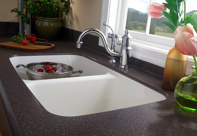
Stainless steel sinks have served as workhorses in the contemporary kitchen design world for over a century now. And, while they’ll always be a timeless feature – especially for those on a budget or who need a sink that can stand the test of time – some homeowners are bypassing stainless steel and looking towards the latest trends in kitchen sinks.
Now, don’t get us wrong. We’re not saying stainless steel sinks are going out of style; they’re similar to white kitchens – a.k.a. “always in style.” But, based on some of our customers’ recent choices, those that choose to pass on stainless sink options seem to prefer innovative alternatives that add a little more color to their kitchen design.
Scouring Different Sink Options for Your Kitchen Remodel
Here, we take a look at some trends that go beyond stainless steel and into alternative materials, as well as finishes, that can add a little something extra to your kitchen sink.
Farmhouse Sinks
Farmhouse sinks continue to trend because they really are versatile – working with both traditional and modern design styles. Plus their big, open container-like basins can accommodate dishes from even the busiest kitchens. Until recently, farmhouse sinks were largely available in either stainless steel or white porcelain. Now, they’re offered in a range of finishes, including fired clay, natural stone, copper and even wood!
Textured Apron Fronts
While we’re on the subject of farmhouse sink variety, we can’t ignore the increase in textured “apron fronts,” which are the facing section of the farmhouse sink exposed in the front of the countertop.
Most are part of the permanent sink design, but we appreciate the Elkay Crosstown Kitchen Sink Apron Cover for an interchangeable apron option. Stainless Steel Farmhouse Sink with Interchangeable Apron. Now you can have the best of all worlds, including apron fronts that reflect fluctuating kitchen design trends.
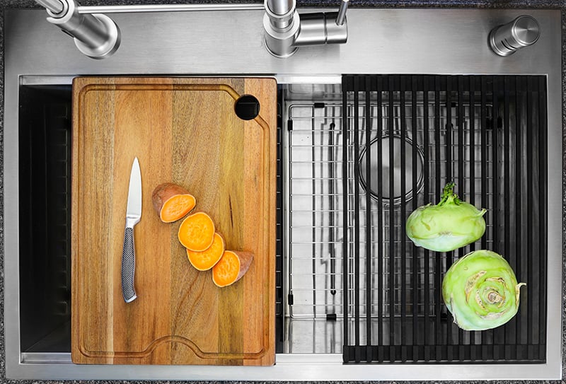
Work Station Sinks & Accessories
Workstation sinks enhance the function of any kitchen and are particularly beneficial in smaller spaces and accessible kitchen designs. Slide-over cutting boards, drainboards and colander inserts not only optimize functionality but also help to keep kitchen messes to a minimum. Accompanying racks can also keep food items or metal cook/dishware off the surface of the sink, which makes it easier to preserve the brand-new look of porcelain or other light-colored sink finishes.
Stone Finish Sinks
Speaking of different finishes, that leads us to granite sinks. While these aren’t actually made entirely of granite, composite sink options do include flecks and crystals from granite and other natural stones. As a result, homeowners can enjoy a non-porous (meaning more hygienic) sink in just about any shade and finish they desire, including natural stone looks.
Many homeowners who choose granite or quartz slabs appreciate the fact that their sink can blend seamlessly with their countertop. Another benefit of granite and quartz sinks? They can work in almost any space, making them extremely functional and available in unique styles and shapes.
Seamless Sink Integration
While traditional kitchen designs embrace more textures, decorative elements and a bit of eclectic “mix and matching” or “intentional imperfections,” devoted modernists and some homeowners simply prefer kitchens that are as seamless as possible.
If this is the case for you, go beyond the sink options you may know, and look to seamless sink integration. From a health-conscious standpoint, countertop and sink joints, or seams, are places where grime, food debris, moisture and mold/mildew can collect. So, we give kudos to DuPont for mastering the integrated Corian solid surface sink concept.
Ready for a Change?
If you like stainless steel sinks, we’re here for it. And, if stainless finishes aren’t your cup of tea, Kitchen Magic has plenty of other options to choose from. Our experts are here to help you make the most out of your kitchen remodel – no matter how big or small the project. Explore how you can change the way your kitchen looks and functions with a free design consultation. It’s fun, informative and completely free! Just give us a call at 866-525-7999, or click here to schedule your free design consultation with us today!
Take a quick look around you home. How relaxed, recharged, and happy does your space make you feel?
Because we’re all still (groan, we know!) spending a lot of time at home these days, we’ve got some great ways to make your home a more positive space from Laura May, digital editor at Just Another Magazine.
Your home environment should be a sanctuary where you can relax, recharge, and be most at peace. But this isn’t always the case. Many home environments feel cramped, creating a negative atmosphere that induces symptoms of stress.
Not to worry though! In this article we explore the following four ways you can make your home a more positive place to live:
Clear the clutter
Embrace structured simplicity
Make neutrals pop (and let in the sunshine)
Bring the outdoors inside
Read on as we explore these tips and help you create a more positive home space.
1. Bring the Outdoors Inside
Caring for plants and flowers has lots of relaxing properties — but have you dabbled with the idea of creating your very own indoor garden? Bringing the outdoors inside is a chance to get creative and be at one with nature.
According to an article by Forbes, greenery in your home reduces stress and can make you feel better. This is because indoor plants improve concentration, naturally purify the air around you, as well as improve your overall mood.
Best of all, many plant species require little fuss to look after, meaning you don’t have to be an experienced gardener to experience the benefits. With simplicity firmly in mind, here are some popular and widely recommended house plants:
Japanese peace lily
Blue star fern
Fishbone cactus
Spider plant
Aloe Vera
While being aesthetically pleasing, these various options are well adapted to home living and are particularly resilient, which means you can create a positive, nature-filled environment without the stress or worry of a more difficult species.
2. Clear the Clutter
Clear space, clear mind — a mantra that pairs a clean home with living a stress-free life.
Sometimes decluttering your home environment is all you need to make a more positive space. After all, trying to do work surrounded by a mess or tucking into a good book amongst yesterday’s laundry is enough to distract anybody.
While organized mess might benefit some personalities, unwieldy clutter is claustrophobic and overwhelming to many others. Spending time clearing the clutter around your home (home office included) makes your space feel calmer and more purposeful.
With this in mind, it pays to be clever with storage, especially if you’re dealing with confined areas like a long narrow living room, given you have less space to hide the mess. Instead of sweeping it all under the carpet, however, you’ll find many interior decorator experts (as in this article from FurnitureBox, for instance) recommend you make use of vertical space — this is because bookcases, shelves, and other cabinets can store and display anything you want without taking up much surface area.
3. Embrace Structured Simplicity
Cleared the clutter and still feel restricted? After months of lockdown living and working from home, you’ve likely grown tired of the same old scenery.
Monotony certainly doesn’t nourish the soul or mind, so now is the time to redecorate while still being mindful of a stripped-back, minimalist style. After all, loud accents and busy furniture aren’t conducive to creating a positive space either. Instead, you should embrace a trendy approach to home-living known as structured simplicity.
Structured simplicity refers to a popular Nordic design that adopts one core principle: create a refreshing, positive space devoid of clutter you can proudly call home.
Hence the name, structured simplicity places composition at the heart of design; your space should not feel crowded or loud, but rather well-planned and heartfelt. You should look to incorporate personal, happy memories like family pictures, cozy sinking sofas, and faded tones to help create a positive, relaxing environment.
4. Make Neutrals Pop (and Let in the Sunshine)
The aforementioned structured simplicity is at the heart of a clutter-free, positive home environment. But that is not to say you shouldn’t look to add a splash of color to brighten your day. After all, experts such as Healthline document that natural color and light increase the release of serotonin in your body, otherwise known as the happy hormone.
Picture nature and what do you see? Crisp blue skies, lush green forests, and white-capped mountain ranges? Neutral and pastel colours are the best way to represent nature in the composition of your home environment — so do your best to make them pop.
You can achieve this by incorporating lots of greens and blues into your layout: paint the walls, embrace accessories like pillows and throws, as well as take inspiration from what you see outside. But don’t overlook neutral tones either. Whites and greys are fantastic neutral colors that open up space for a classic, clean finish — this provides the illusion of a larger canvas in what may otherwise feel like a small, cramped environment.
Moreover, you should also look to let in the sunshine and a little fresh air by drawing curtains and opening a window or two. Ample access to sunlight and fresh air can alleviate depression symptoms, helping you feel brighter and more positive at home.
Making your home a more positive space is a great idea, especially after months of lockdown living. From clearing the clutter and embracing structured simplicity to making neutrals pop and adding some greenery — this is how you reclaim your home and make it a more positive space. —Laura May
Laura May is Digital Editor at Just Another Magazine. At Just Another Magazine they write about beauty, fashion, lifestyle, travel, trends and anything else that matters to their readers. Name throwing you off? Don’t take it too seriously — they intend to stand out from the crowd whilst creating content in their unique style.


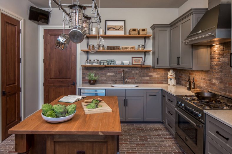

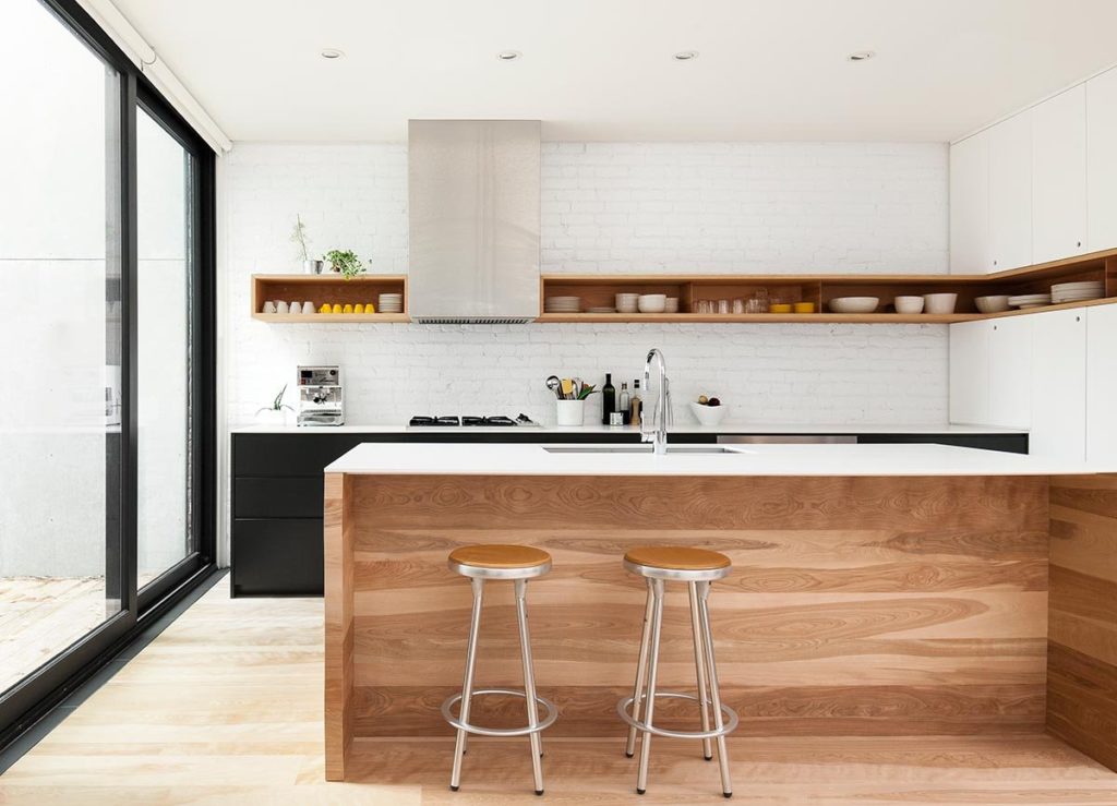


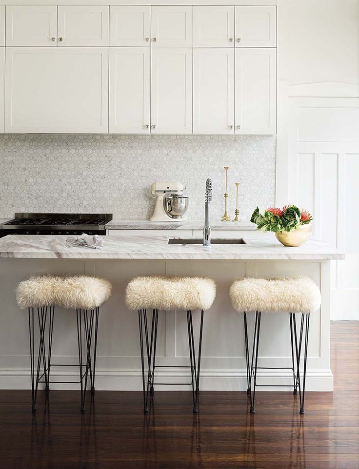


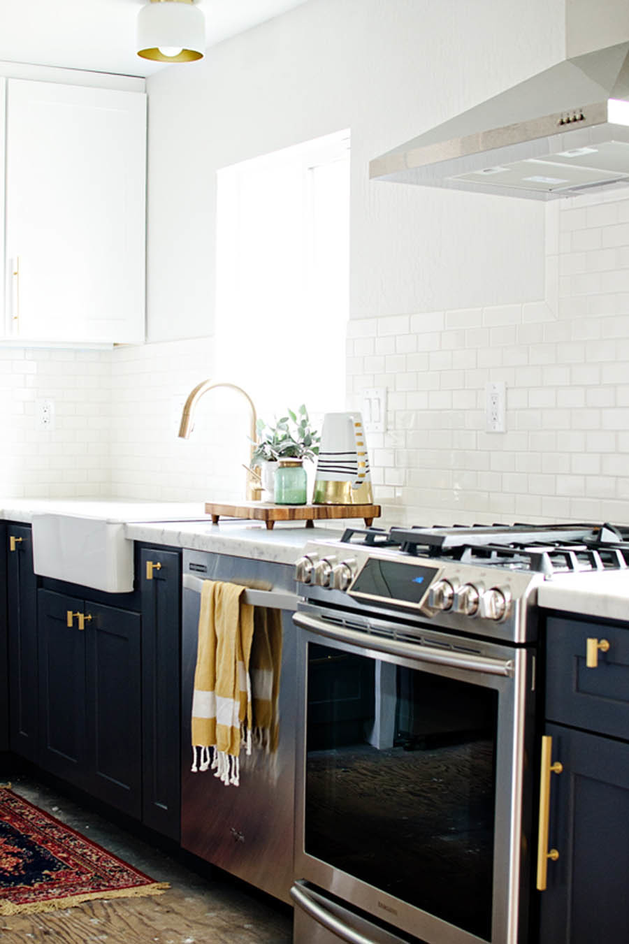


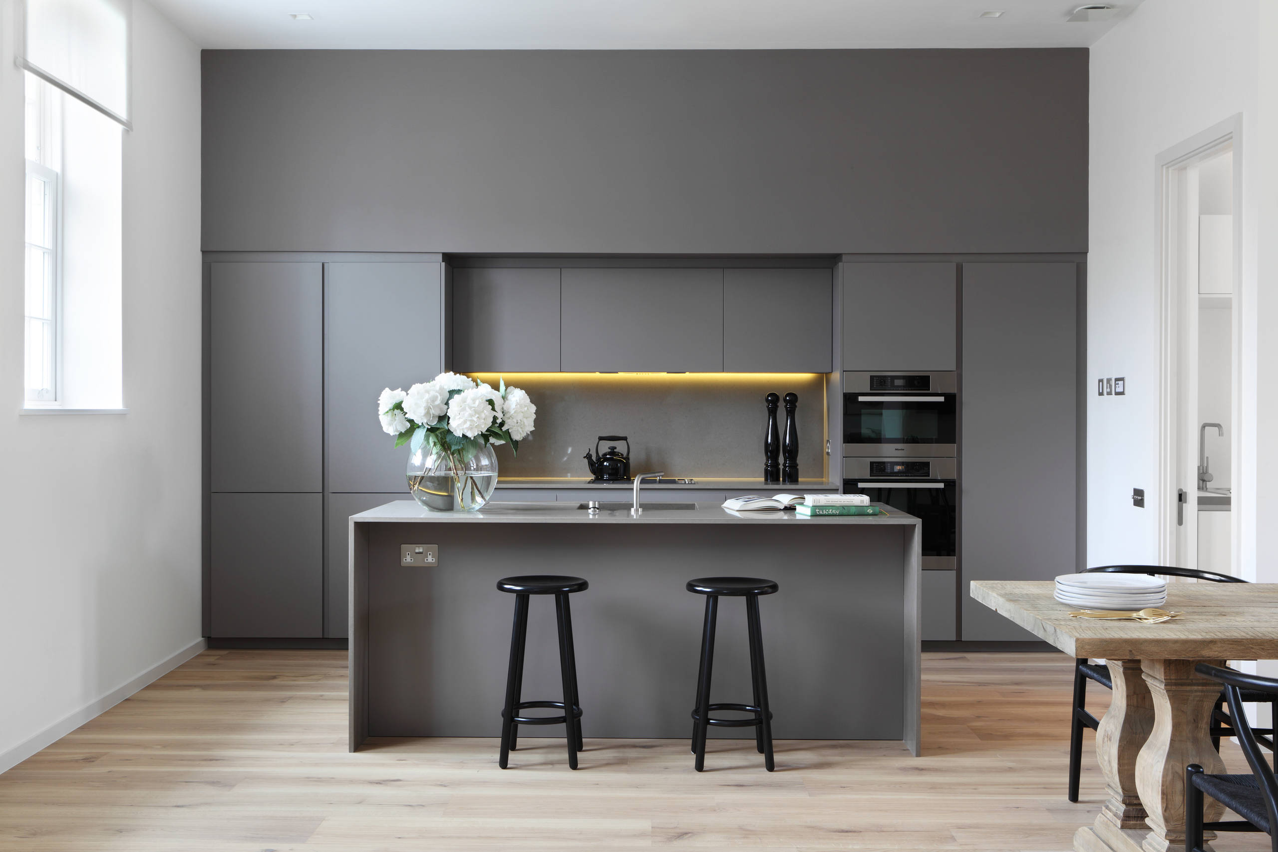


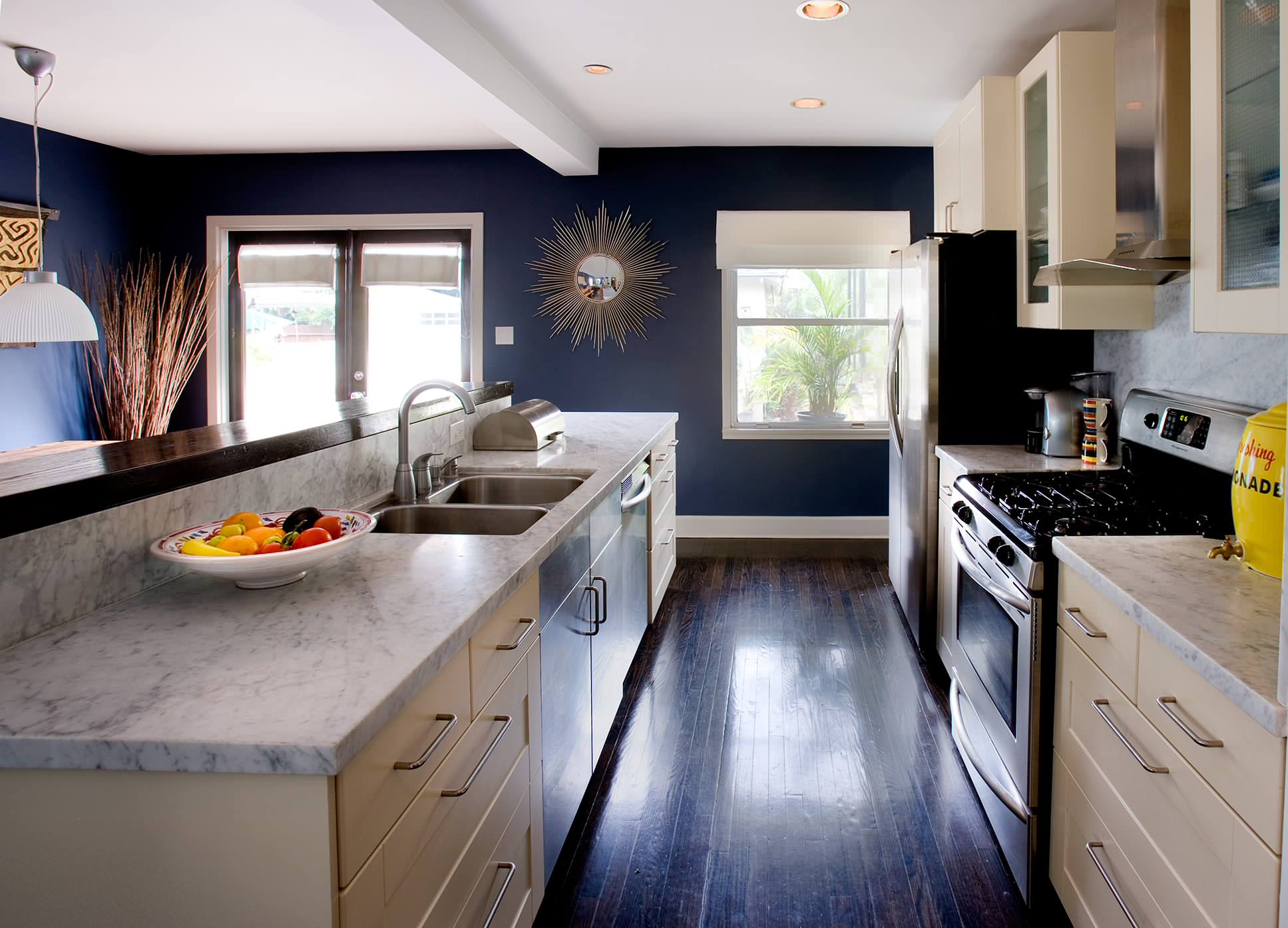
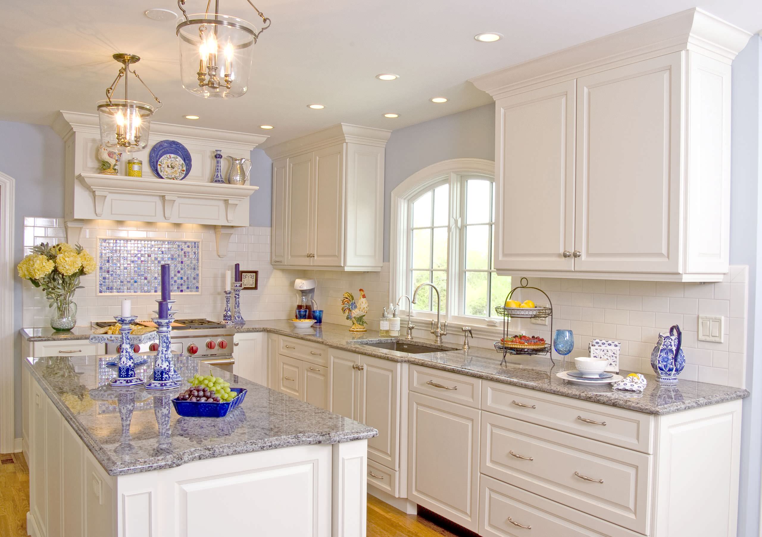


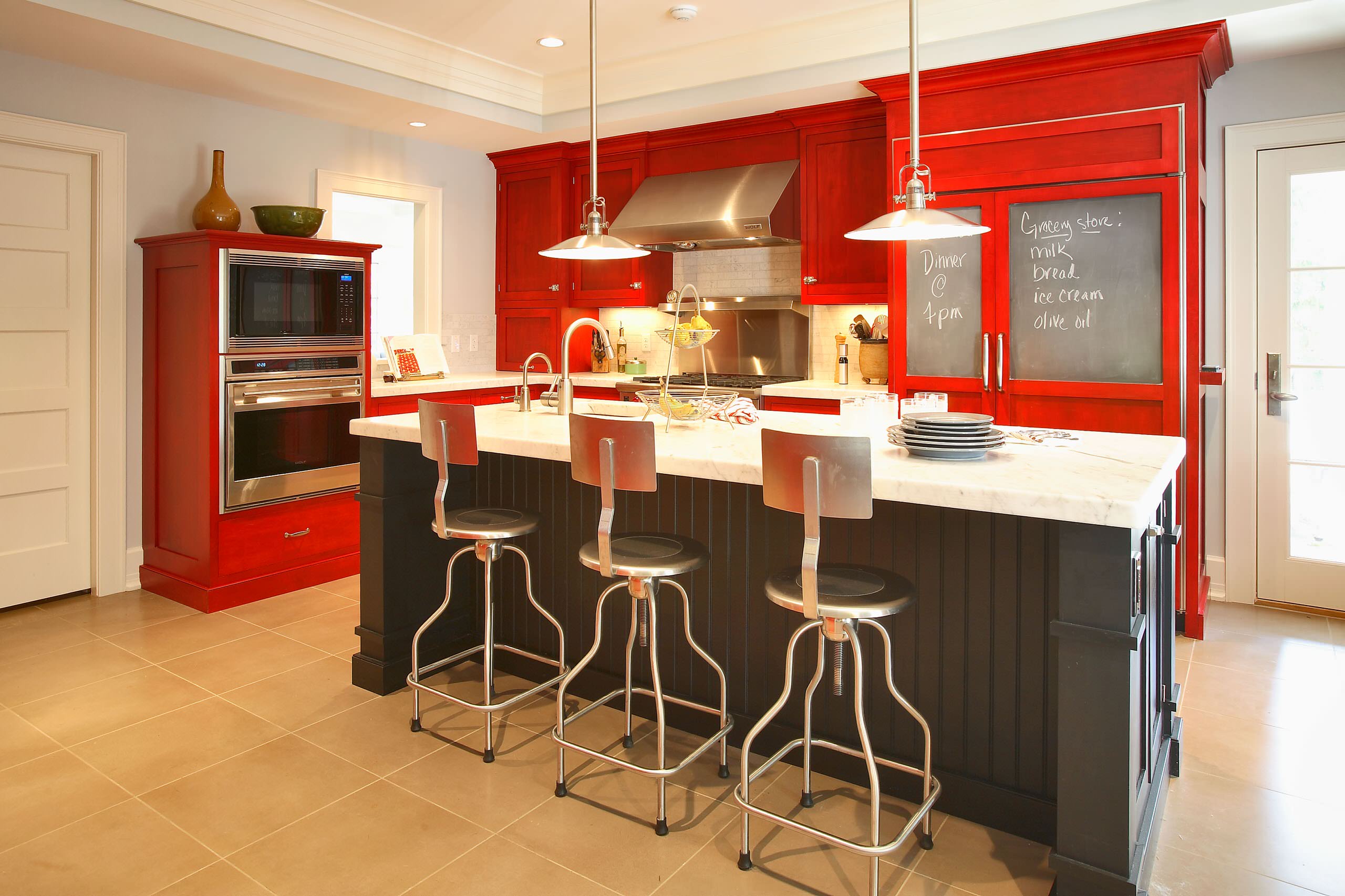


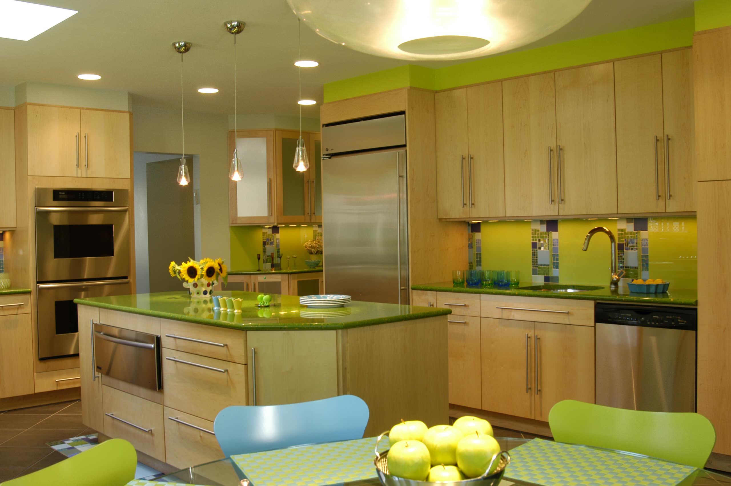


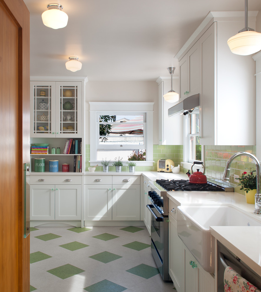


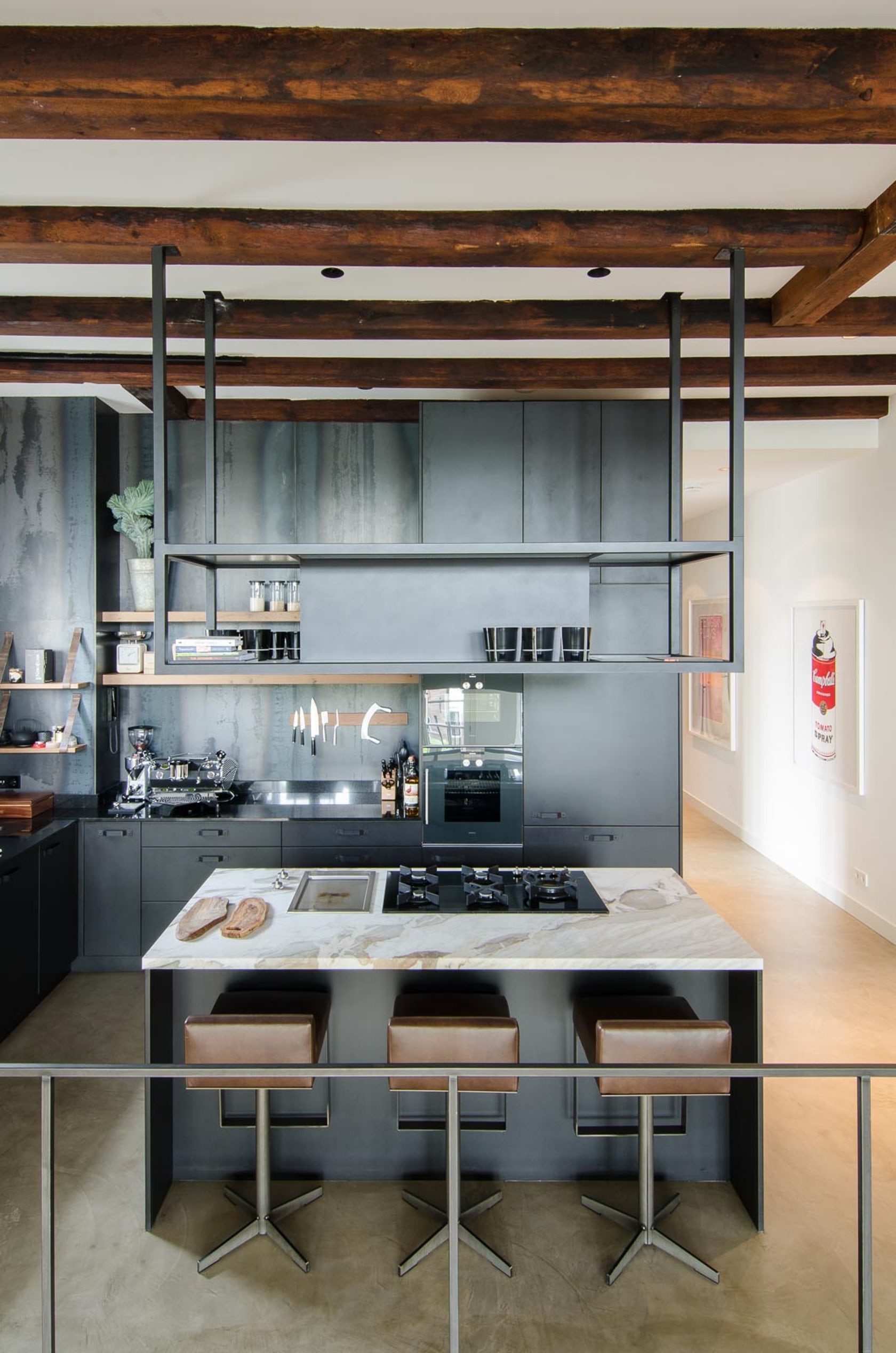


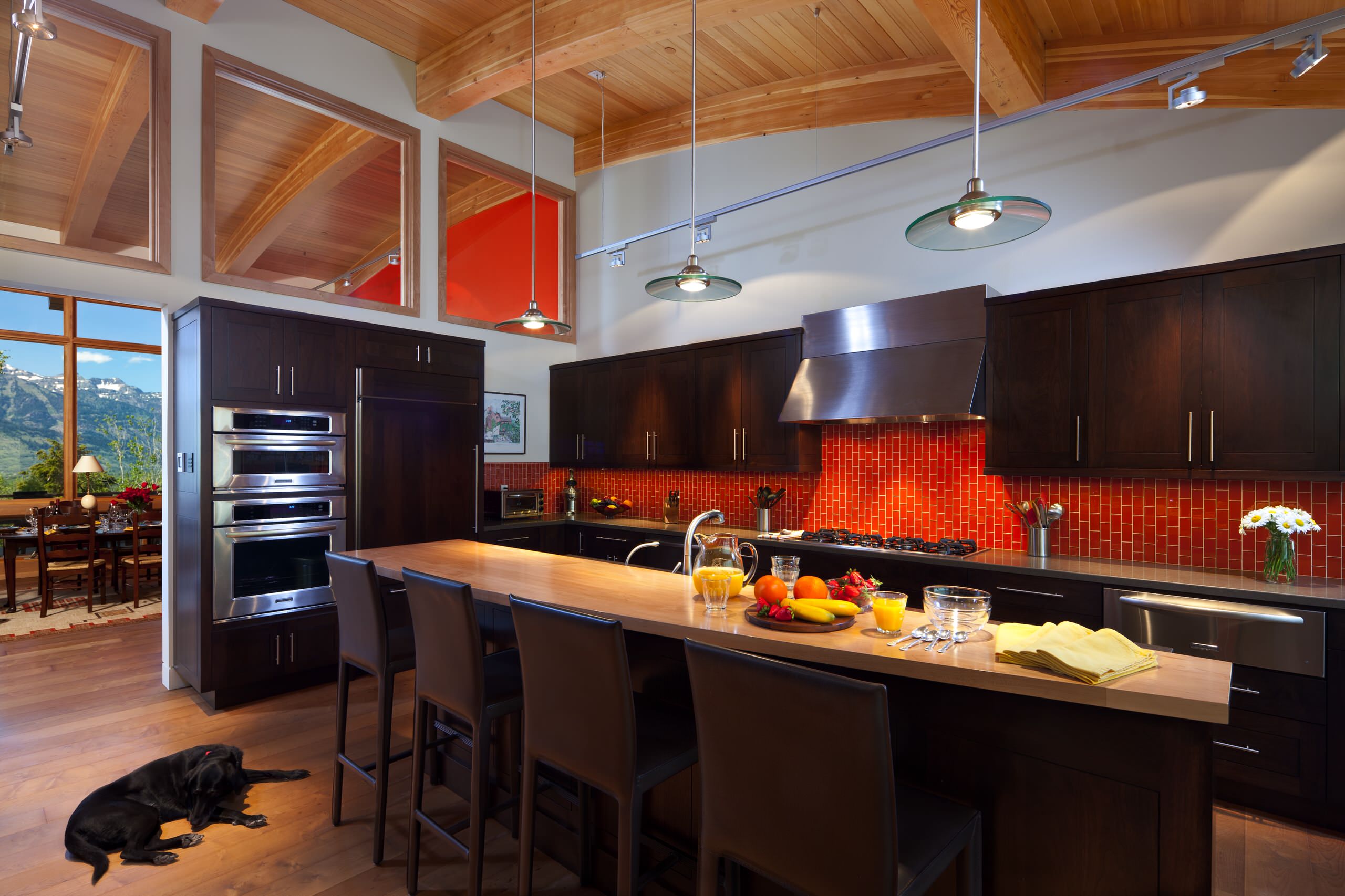


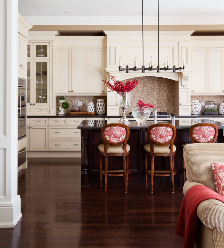


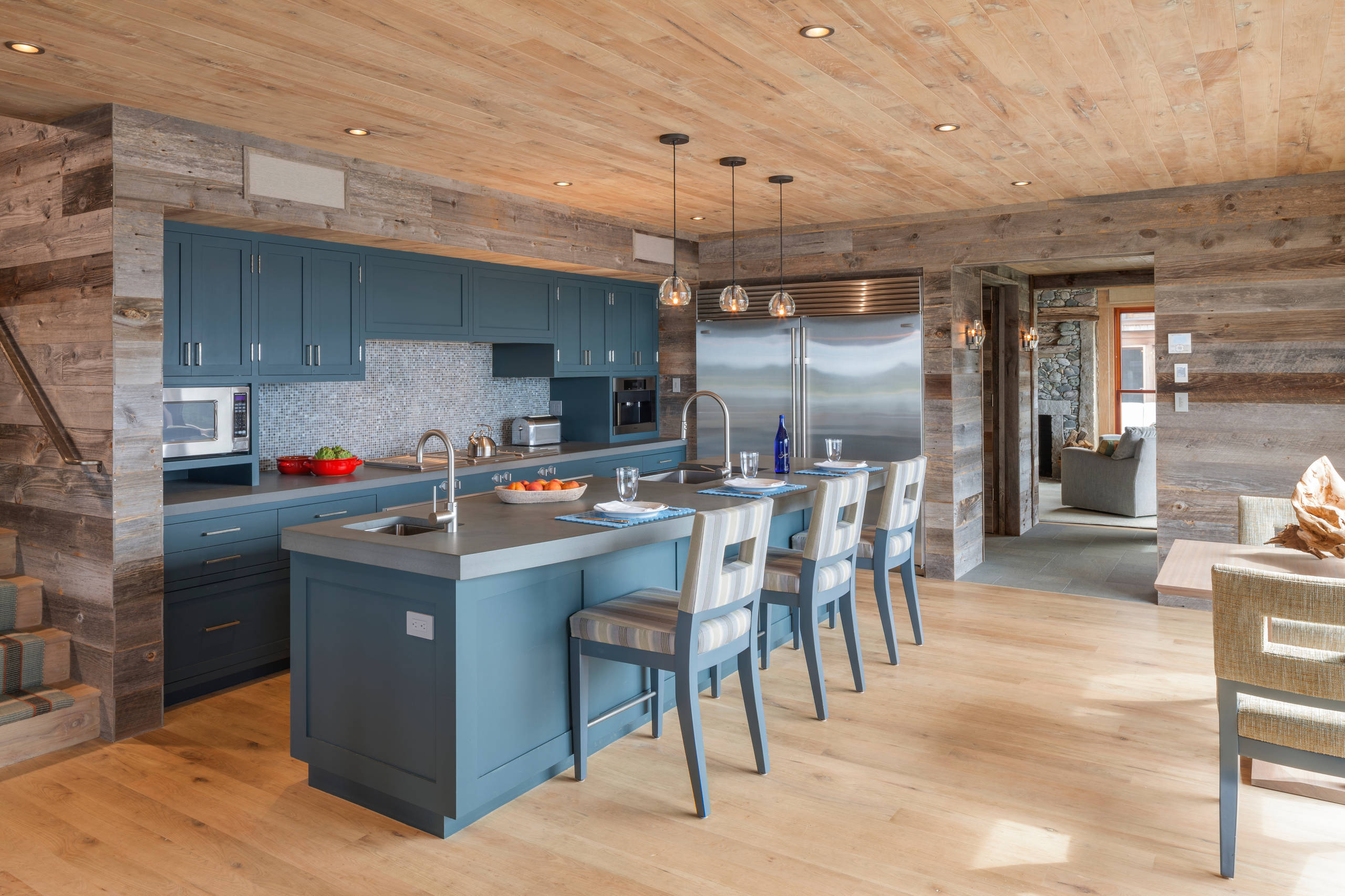


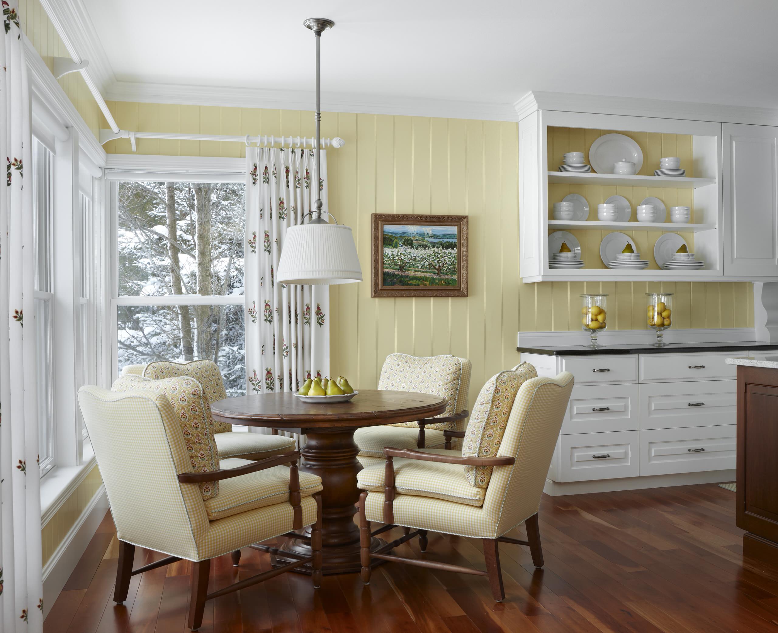

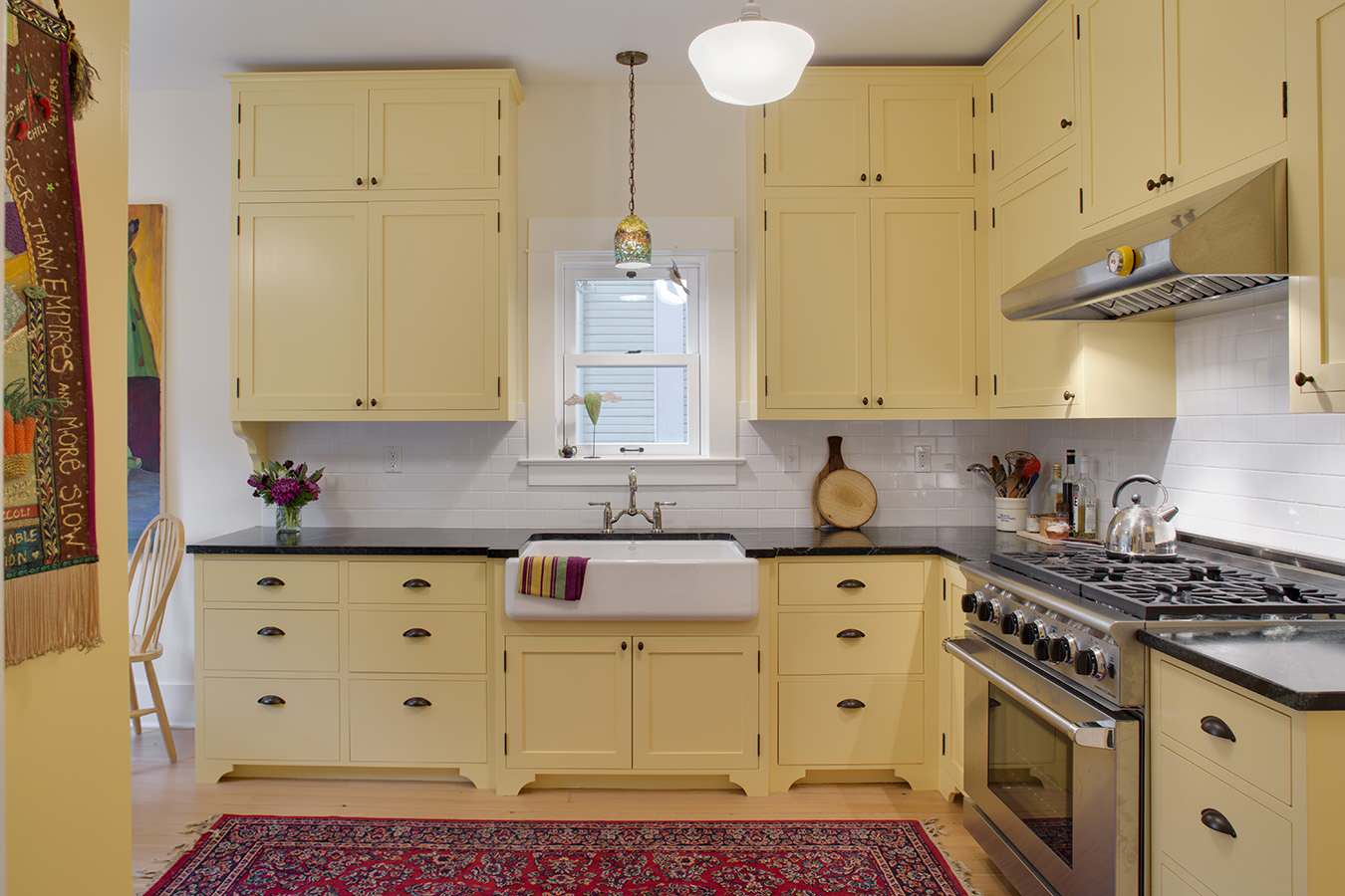

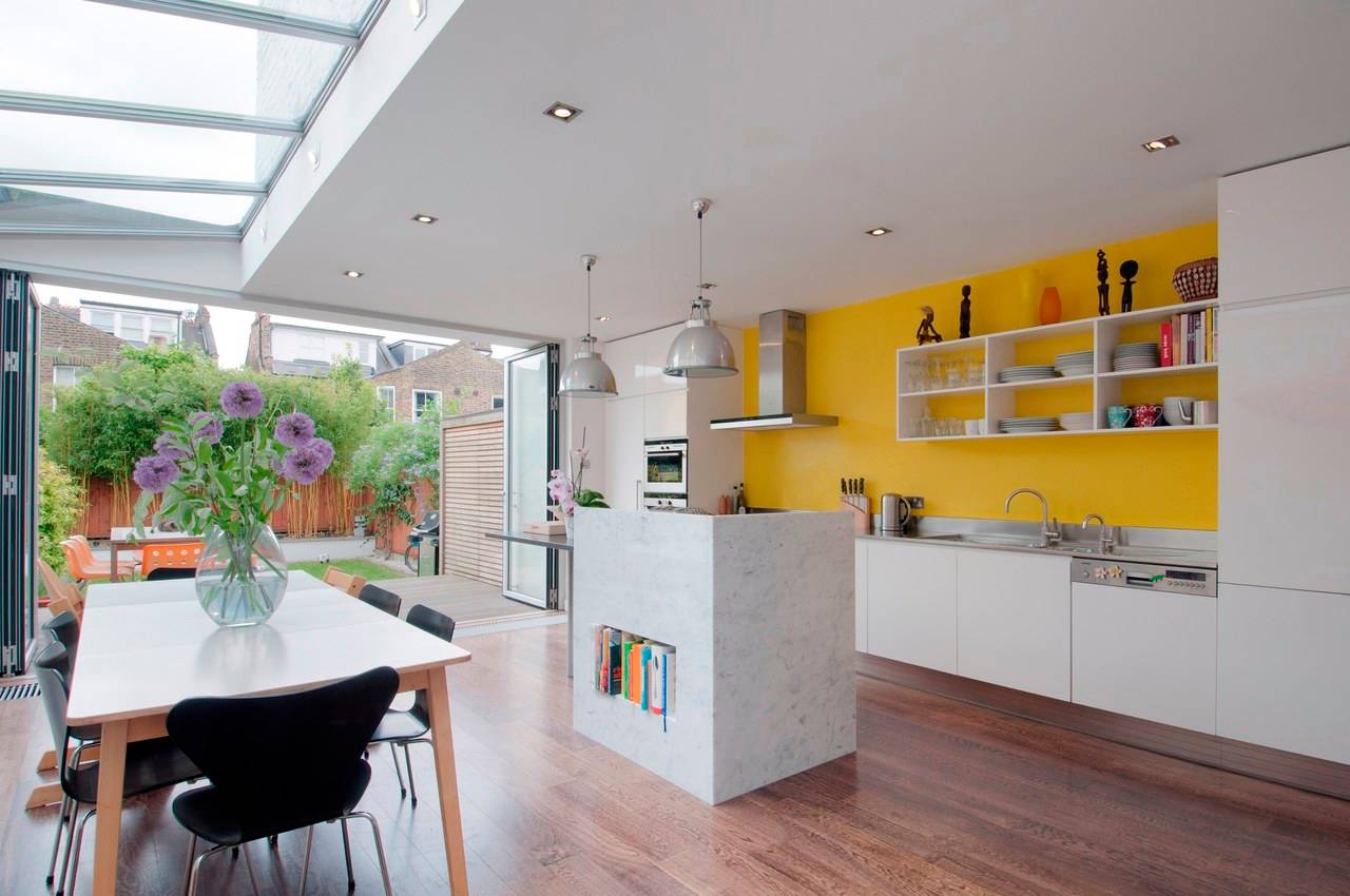


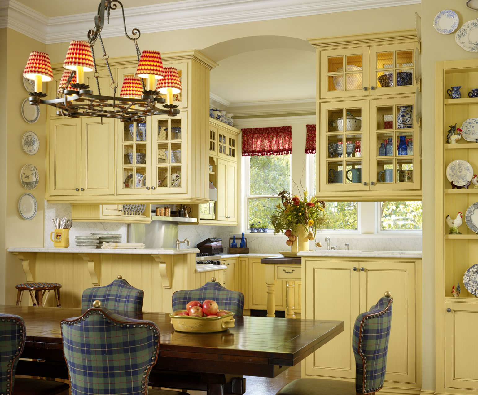


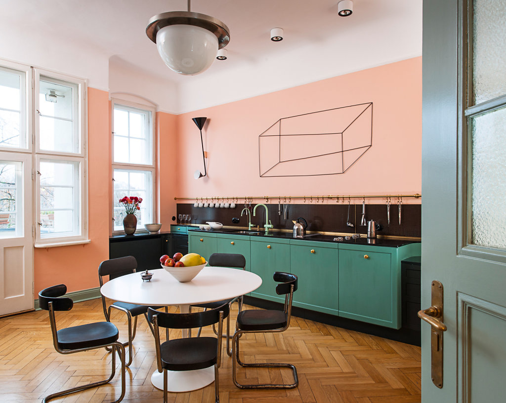


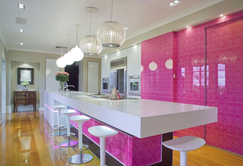


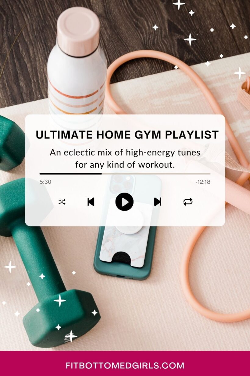


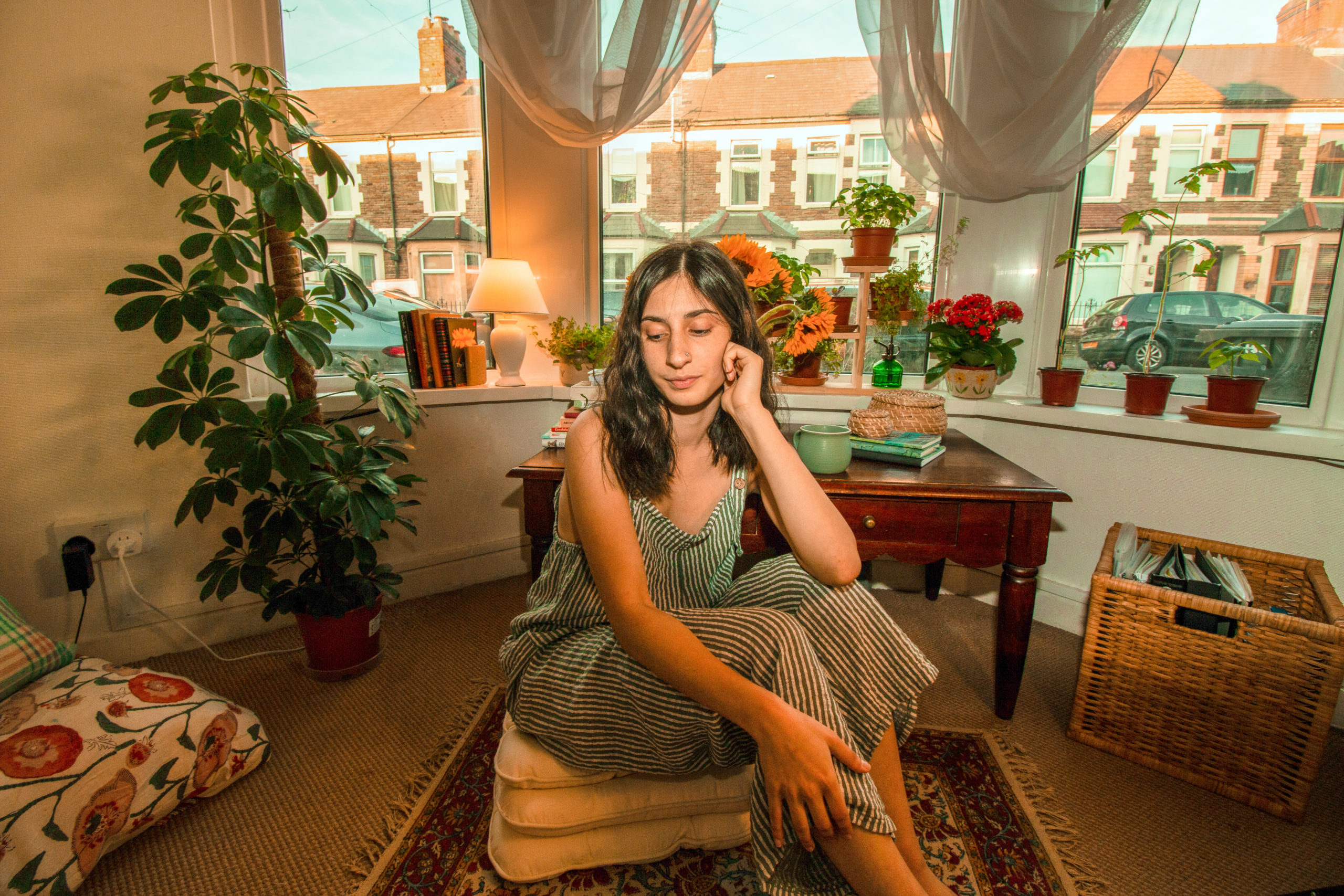

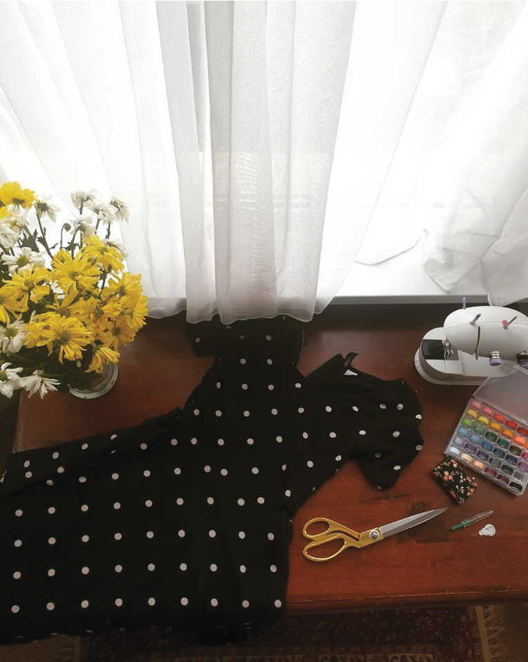


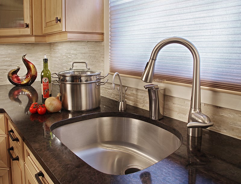 Stainless steel sinks have served as workhorses in the contemporary kitchen design world for over a century now. And, while they’ll always be a timeless feature – especially for those on a budget or who need a sink that can stand the test of time – some homeowners are bypassing stainless steel and looking towards the latest trends in kitchen sinks.